編輯:關於Android編程
一、問題在哪裡?
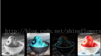
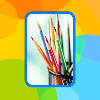
問題來源於app開發中一個很常見的場景——用戶頭像要展示成圓的:

二、怎麼搞?
機智的我,第一想法就是,切一張中間圓形透明、四周與底色相同、尺寸與頭像相同的蒙板圖片,蓋在頭像上不就完事了嘛,哈哈哈!
在背景純色的前提下,這的確能簡單解決問題,但是如果背景沒有這麼簡單呢?

在這種不規則背景下,有兩個問題:
1)、背景圖常常是適應手機寬度縮放,而頭像的尺寸又是固定寬高DP的,所以固定的蒙板圖片是沒法保證在不同機型上都和背景圖案吻合的。
2)、在這種非純色背景下,哪天想調整一下頭像位置就得重新換圖片蒙板,實在是太難維護了……
所以呢,既然頭像圖片肯定是方的,那就就讓ImageView圓起來吧。
三、開始干活
基本思路是,自定義一個ImageView,通過重寫onDraw方法畫出一個圓形的圖片來:
public class ImageViewPlus extends ImageView{
 private Paint mPaintBitmap = new Paint(Paint.ANTI_ALIAS_FLAG);
 private Bitmap mRawBitmap;
 private BitmapShader mShader;
 private Matrix mMatrix = new Matrix();

 public ImageViewPlus(Context context, AttributeSet attrs) {
 super(context, attrs);
 }

 @Override
 protected void onDraw(Canvas canvas) {
 Bitmap rawBitmap = getBitmap(getDrawable());
 if (rawBitmap != null){
  int viewWidth = getWidth();
  int viewHeight = getHeight();
  int viewMinSize = Math.min(viewWidth, viewHeight);
  float dstWidth = viewMinSize;
  float dstHeight = viewMinSize;
  if (mShader == null || !rawBitmap.equals(mRawBitmap)){
  mRawBitmap = rawBitmap;
  mShader = new BitmapShader(mRawBitmap, TileMode.CLAMP, TileMode.CLAMP);
  }
  if (mShader != null){
  mMatrix.setScale(dstWidth / rawBitmap.getWidth(), dstHeight / rawBitmap.getHeight());
  mShader.setLocalMatrix(mMatrix);
  }
  mPaintBitmap.setShader(mShader);
  float radius = viewMinSize / 2.0f;
  canvas.drawCircle(radius, radius, radius, mPaintBitmap);
 } else {
  super.onDraw(canvas);
 }
 }

 private Bitmap getBitmap(Drawable drawable){
 if (drawable instanceof BitmapDrawable){
  return ((BitmapDrawable)drawable).getBitmap();
 } else if (drawable instanceof ColorDrawable){
  Rect rect = drawable.getBounds();
  int width = rect.right - rect.left;
  int height = rect.bottom - rect.top;
  int color = ((ColorDrawable)drawable).getColor();
  Bitmap bitmap = Bitmap.createBitmap(width, height, Bitmap.Config.ARGB_8888);
  Canvas canvas = new Canvas(bitmap);
  canvas.drawARGB(Color.alpha(color), Color.red(color), Color.green(color), Color.blue(color));
  return bitmap;
 } else {
  return null;
 }
 }
}
分析一下代碼:
canvas.drawCircle 決定了畫出來的形狀是圓形,而圓形的內容則是通過 mPaintBitmap.setShader 搞定的。
其中,BitmapShader需要設置Bitmap填充ImageView的方式(CLAMP:拉伸邊緣, MIRROR:鏡像, REPEAT:整圖重復)。
這裡其實設成什麼不重要,因為我們實際需要的是將Bitmap按比例縮放成跟ImageView一樣大,而不是預置的三種效果。
所以,別忘了 mMatrix.setScale 和 mShader.setLocalMatrix 一起用,將圖片縮放一下。
四、更多玩法 —— 支持邊框
看下面的效果圖,如果想給圓形的頭像上加一個邊框,該怎麼搞呢?

public class ImageViewPlus extends ImageView{
 private Paint mPaintBitmap = new Paint(Paint.ANTI_ALIAS_FLAG);
 private Paint mPaintBorder = new Paint(Paint.ANTI_ALIAS_FLAG);
 private Bitmap mRawBitmap;
 private BitmapShader mShader;
 private Matrix mMatrix = new Matrix();
 private float mBorderWidth = dip2px(15);
 private int mBorderColor = 0xFF0080FF;

 public ImageViewPlus(Context context, AttributeSet attrs) {
 super(context, attrs);
 }

 @Override
 protected void onDraw(Canvas canvas) {
 Bitmap rawBitmap = getBitmap(getDrawable());
 if (rawBitmap != null){
  int viewWidth = getWidth();
  int viewHeight = getHeight();
  int viewMinSize = Math.min(viewWidth, viewHeight);
  float dstWidth = viewMinSize;
  float dstHeight = viewMinSize;
  if (mShader == null || !rawBitmap.equals(mRawBitmap)){
  mRawBitmap = rawBitmap;
  mShader = new BitmapShader(mRawBitmap, TileMode.CLAMP, TileMode.CLAMP);
  }
  if (mShader != null){
  mMatrix.setScale((dstWidth - mBorderWidth * 2) / rawBitmap.getWidth(), (dstHeight - mBorderWidth * 2) / rawBitmap.getHeight());
  mShader.setLocalMatrix(mMatrix);
  }
  mPaintBitmap.setShader(mShader);
  mPaintBorder.setStyle(Paint.Style.STROKE);
  mPaintBorder.setStrokeWidth(mBorderWidth);
  mPaintBorder.setColor(mBorderColor);
  float radius = viewMinSize / 2.0f;
  canvas.drawCircle(radius, radius, radius - mBorderWidth / 2.0f, mPaintBorder);
  canvas.translate(mBorderWidth, mBorderWidth);
  canvas.drawCircle(radius - mBorderWidth, radius - mBorderWidth, radius - mBorderWidth, mPaintBitmap);
 } else {
  super.onDraw(canvas);
 }
 }

 private Bitmap getBitmap(Drawable drawable){
 if (drawable instanceof BitmapDrawable){
  return ((BitmapDrawable)drawable).getBitmap();
 } else if (drawable instanceof ColorDrawable){
  Rect rect = drawable.getBounds();
  int width = rect.right - rect.left;
  int height = rect.bottom - rect.top;
  int color = ((ColorDrawable)drawable).getColor();
  Bitmap bitmap = Bitmap.createBitmap(width, height, Bitmap.Config.ARGB_8888);
  Canvas canvas = new Canvas(bitmap);
  canvas.drawARGB(Color.alpha(color), Color.red(color), Color.green(color), Color.blue(color));
  return bitmap;
 } else {
  return null;
 }
 }

 private int dip2px(int dipVal)
 {
 float scale = getResources().getDisplayMetrics().density;
 return (int)(dipVal * scale + 0.5f);
 }
}
看代碼中,加邊框實際上就是用實心純色的 Paint 畫了一個圓邊,在此基礎上畫上原來的頭像即可。
需要的注意的地方有三個:
1)、圓框的半徑不是 radius ,而應該是 radius - mBorderWidth / 2.0f 。想象著拿著筆去畫線,線其實是畫在右圖中白色圈的位置,只不過它很粗。
2)、在ImageView大小不變的基礎上,頭像的實際大小要比沒有邊框的時候小了,所以 mMatrix.setScale 的時候要把邊框的寬度去掉。
3)、畫頭像Bitmap的時候不能直接 canvas.drawCircle(radius, radius, radius - mBorderWidth, mPaintBitmap) ,這樣你會發現頭像的右側和下方邊緣被拉伸了(右圖)
為什麼呢?因為 Paint 默認是以左上角為基准開始繪制的,此時頭像的實際區域是右圖中的紅框,而超過紅框的部分(圓形的右側和下方),自然被 TileMode.CLAMP效果沿邊緣拉伸了。
所以,需要通過挪動坐標系的位置和調整圓心,才能把頭像畫在正確的區域(右圖綠框)中。
五、更多玩法 —— 支持xml配置
既然有了邊框,那如果想配置邊框的寬度和顏色該如何是好呢?
基本上兩個思路:
1)給ImageViewPlus加上set接口,設置完成之後通過 invalidate(); 重繪一下即可;
2)在xml裡就支持配置一些自定義屬性,這樣用起來會方便很多。
這裡重點說一下支持xml配置自定義屬性。
自定義控件要支持xml配置自定義屬性的話,首先需要在 \res\values 裡去定義屬性:
<?xml version="1.0" encoding="utf-8"?>
<resources>
 <attr name="borderColor" format="color" />
 <attr name="borderWidth" format="dimension" />

 <declare-styleable name="ImageViewPlus">
 <attr name="borderColor" />
 <attr name="borderWidth" />
 </declare-styleable>
</resources>
View attrs_imageviewplus.xml
然後在ImageViewPlus的構造函數中去讀取這些自定義屬性:
private static final int DEFAULT_BORDER_COLOR = Color.TRANSPARENT;
 private static final int DEFAULT_BORDER_WIDTH = 0;

 public ImageViewPlus(Context context, AttributeSet attrs) {
 super(context, attrs);
 //取xml文件中設定的參數
 TypedArray ta = context.obtainStyledAttributes(attrs, R.styleable.ImageViewPlus);
 mBorderColor = ta.getColor(R.styleable.ImageViewPlus_borderColor, DEFAULT_BORDER_COLOR);
 mBorderWidth = ta.getDimensionPixelSize(R.styleable.ImageViewPlus_borderWidth, dip2px(DEFAULT_BORDER_WIDTH));
 ta.recycle();
 }
在xml布局中使用自定義屬性:
<RelativeLayout xmlns:android="http://schemas.android.com/apk/res/android"
 xmlns:tools="http://schemas.android.com/tools"
 xmlns:snser="http://schemas.android.com/apk/res/cc.snser.imageviewplus"
 android:layout_width="match_parent"
 android:layout_height="match_parent"
 android:background="@drawable/wallpaper"
 android:orientation="vertical"
 tools:context="${relativePackage}.${activityClass}" >

 <cc.snser.imageviewplus.ImageViewPlus
 android:id="@+id/imgplus"
 android:layout_width="200dp"
 android:layout_height="300dp"
 android:layout_marginBottom="50dp"
 android:layout_centerHorizontal="true"
 android:layout_alignParentBottom="true"
 android:src="@drawable/img_square"
 snser:borderColor="#FF0080FF"
 snser:borderWidth="15dp" />

</RelativeLayout>
六、更多玩法 —— 圓角ImageView
搞定了圓形ImageView以及對應的邊框,那如何實現下面這種圓角的ImageView呢?
其實原理上一樣,把 canvas.drawCircle 對應改成 canvas.drawRoundRect 就OK了,直接貼代碼吧:
public class ImageViewPlus extends ImageView{
 /**
 * android.widget.ImageView
 */
 public static final int TYPE_NONE = 0;
 /**
 * 圓形
 */
 public static final int TYPE_CIRCLE = 1;
 /**
 * 圓角矩形
 */
 public static final int TYPE_ROUNDED_RECT = 2;

 private static final int DEFAULT_TYPE = TYPE_NONE;
 private static final int DEFAULT_BORDER_COLOR = Color.TRANSPARENT;
 private static final int DEFAULT_BORDER_WIDTH = 0;
 private static final int DEFAULT_RECT_ROUND_RADIUS = 0;

 private int mType;
 private int mBorderColor;
 private int mBorderWidth;
 private int mRectRoundRadius;

 private Paint mPaintBitmap = new Paint(Paint.ANTI_ALIAS_FLAG);
 private Paint mPaintBorder = new Paint(Paint.ANTI_ALIAS_FLAG);

 private RectF mRectBorder = new RectF();
 private RectF mRectBitmap = new RectF();

 private Bitmap mRawBitmap;
 private BitmapShader mShader;
 private Matrix mMatrix = new Matrix();

 public ImageViewPlus(Context context, AttributeSet attrs) {
 super(context, attrs);
 //取xml文件中設定的參數
 TypedArray ta = context.obtainStyledAttributes(attrs, R.styleable.ImageViewPlus);
 mType = ta.getInt(R.styleable.ImageViewPlus_type, DEFAULT_TYPE);
 mBorderColor = ta.getColor(R.styleable.ImageViewPlus_borderColor, DEFAULT_BORDER_COLOR);
 mBorderWidth = ta.getDimensionPixelSize(R.styleable.ImageViewPlus_borderWidth, dip2px(DEFAULT_BORDER_WIDTH));
 mRectRoundRadius = ta.getDimensionPixelSize(R.styleable.ImageViewPlus_rectRoundRadius, dip2px(DEFAULT_RECT_ROUND_RADIUS));
 ta.recycle();
 }

 @Override
 protected void onDraw(Canvas canvas) {
 Bitmap rawBitmap = getBitmap(getDrawable());

 if (rawBitmap != null && mType != TYPE_NONE){
  int viewWidth = getWidth();
  int viewHeight = getHeight();
  int viewMinSize = Math.min(viewWidth, viewHeight);
  float dstWidth = mType == TYPE_CIRCLE ? viewMinSize : viewWidth;
  float dstHeight = mType == TYPE_CIRCLE ? viewMinSize : viewHeight;
  float halfBorderWidth = mBorderWidth / 2.0f;
  float doubleBorderWidth = mBorderWidth * 2;

  if (mShader == null || !rawBitmap.equals(mRawBitmap)){
  mRawBitmap = rawBitmap;
  mShader = new BitmapShader(mRawBitmap, TileMode.CLAMP, TileMode.CLAMP);
  }
  if (mShader != null){
  mMatrix.setScale((dstWidth - doubleBorderWidth) / rawBitmap.getWidth(), (dstHeight - doubleBorderWidth) / rawBitmap.getHeight());
  mShader.setLocalMatrix(mMatrix);
  }

  mPaintBitmap.setShader(mShader);
  mPaintBorder.setStyle(Paint.Style.STROKE);
  mPaintBorder.setStrokeWidth(mBorderWidth);
  mPaintBorder.setColor(mBorderWidth > 0 ? mBorderColor : Color.TRANSPARENT);

  if (mType == TYPE_CIRCLE){
  float radius = viewMinSize / 2.0f;
  canvas.drawCircle(radius, radius, radius - halfBorderWidth, mPaintBorder);
  canvas.translate(mBorderWidth, mBorderWidth);
  canvas.drawCircle(radius - mBorderWidth, radius - mBorderWidth, radius - mBorderWidth, mPaintBitmap);
  } else if (mType == TYPE_ROUNDED_RECT){
  mRectBorder.set(halfBorderWidth, halfBorderWidth, dstWidth - halfBorderWidth, dstHeight - halfBorderWidth);
  mRectBitmap.set(0.0f, 0.0f, dstWidth - doubleBorderWidth, dstHeight - doubleBorderWidth);
  float borderRadius = mRectRoundRadius - halfBorderWidth > 0.0f ? mRectRoundRadius - halfBorderWidth : 0.0f;
  float bitmapRadius = mRectRoundRadius - mBorderWidth > 0.0f ? mRectRoundRadius - mBorderWidth : 0.0f;
  canvas.drawRoundRect(mRectBorder, borderRadius, borderRadius, mPaintBorder);
  canvas.translate(mBorderWidth, mBorderWidth);
  canvas.drawRoundRect(mRectBitmap, bitmapRadius, bitmapRadius, mPaintBitmap);
  }
 } else {
  super.onDraw(canvas);
 }
 }

 private int dip2px(int dipVal)
 {
 float scale = getResources().getDisplayMetrics().density;
 return (int)(dipVal * scale + 0.5f);
 }

 private Bitmap getBitmap(Drawable drawable){
 if (drawable instanceof BitmapDrawable){
  return ((BitmapDrawable)drawable).getBitmap();
 } else if (drawable instanceof ColorDrawable){
  Rect rect = drawable.getBounds();
  int width = rect.right - rect.left;
  int height = rect.bottom - rect.top;
  int color = ((ColorDrawable)drawable).getColor();
  Bitmap bitmap = Bitmap.createBitmap(width, height, Bitmap.Config.ARGB_8888);
  Canvas canvas = new Canvas(bitmap);
  canvas.drawARGB(Color.alpha(color), Color.red(color), Color.green(color), Color.blue(color));
  return bitmap;
 } else {
  return null;
 }
 }
}
View ImageViewPlus.java
<RelativeLayout xmlns:android="http://schemas.android.com/apk/res/android"
 xmlns:tools="http://schemas.android.com/tools"
 xmlns:snser="http://schemas.android.com/apk/res/cc.snser.imageviewplus"
 android:layout_width="match_parent"
 android:layout_height="match_parent"
 android:background="@drawable/wallpaper"
 android:orientation="vertical"
 tools:context="${relativePackage}.${activityClass}" >

 <cc.snser.imageviewplus.ImageViewPlus
 android:id="@+id/imgplus"
 android:layout_width="200dp"
 android:layout_height="300dp"
 android:layout_marginBottom="50dp"
 android:layout_centerHorizontal="true"
 android:layout_alignParentBottom="true"
 android:src="@drawable/img_rectangle"
 snser:type="rounded_rect"
 snser:borderColor="#FF0080FF"
 snser:borderWidth="10dp"
 snser:rectRoundRadius="30dp" />

</RelativeLayout>

View layout
<?xml version="1.0" encoding="utf-8"?>
<resources>
 <attr name="type">
 <enum name="none" value="0" />
 <enum name="circle" value="1" />
 <enum name="rounded_rect" value="2" />
 </attr>
 <attr name="borderColor" format="color" />
 <attr name="borderWidth" format="dimension" />
 <attr name="rectRoundRadius" format="dimension" />

 <declare-styleable name="ImageViewPlus">
 <attr name="type" />
 <attr name="borderColor" />
 <attr name="borderWidth" />
 <attr name="rectRoundRadius" />
 </declare-styleable>
</resources>

View attrs_imageviewplus.xml
以上就是本文的全部內容,希望對大家學習Android軟件編程有所幫助。
 Android編程之ICS式下拉菜單PopupWindow實現方法詳解(附源碼下載)
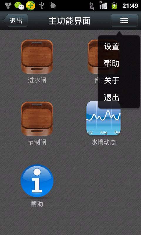
本文實例講述了Android編程之ICS式下拉菜單PopupWindow實現方法。分享給大家供大家參考,具體如下:運行效果截圖如下:右邊這個就是下拉菜單啦,看見有的地方叫
 CoordinatorLayout的使用如此簡單(Android)
曾在網上找了一些關於CoordinatorLayout的教程,大部分文章都是把CoordinatorLayout、AppbarLayout、CollapsingToolb
 Android提高之BLE開發Android手機搜索iBeacon基站
前面文章講述了Android手機與BLE終端之間的通信,而最常見的BLE終端應該是蘋果公司倡導的iBeacon基站。iBeacon技術基於BLE,它的特點是通過廣播對外發
 Android ViewPager實現選項卡切換
本文實例介紹了ViewPager實現選項卡切換,效果圖如下:步驟一:這裡使用兼容低版本的v4包進行布局,這裡eclipse沒有輸入提示,所以要手動輸入,文件名稱“acti