編輯:關於Android編程
本文實例為大家分享了Android自定義View之組合控件,仿電商app頂部欄的相關代碼,供大家參考,具體內容如下
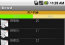
效果圖:
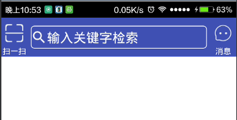
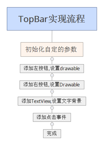
分析:左右兩邊可以是TextView和Button,設置drawableTop即可,中間的看著像是EditText,但是用過淘寶天貓等類似app的話會發現點擊搜索不是在當前Activit進行搜索的,是跳轉到另外的頁面進行的,所以用TextView然後設置背景即可. 實現流程
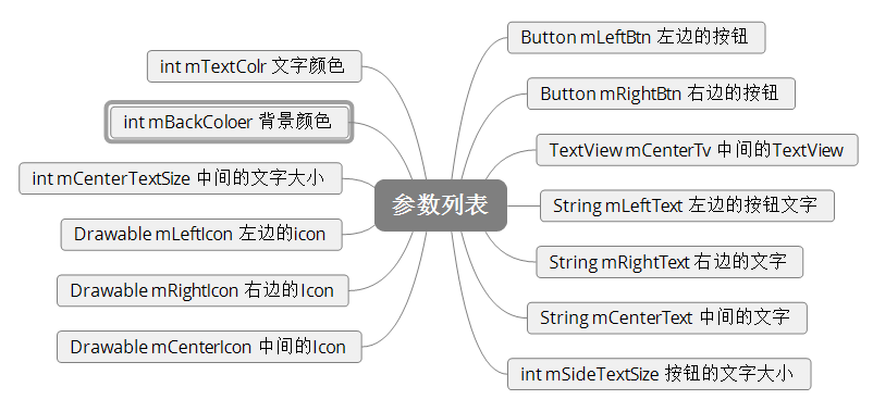
參數列表:
設置屬性文件:values下建立attrs.xml文件,添加需要自定義的屬性.
<?xml version="1.0" encoding="utf-8"?>
<resources>
  <declare-styleable name="TopBar">
    <attr name="left_text" format="string" />// 左邊文字
    <attr name="right_text" format="string" /> // 右邊文字
    <attr name="center_text" format="string" />// 中間文字
    <attr name="side_text_size" format="dimension" />//邊界按鈕大小
    <attr name="center_text_size" format="dimension" />//中間文字大小
    <attr name="text_color" format="color" />//文字顏色
    <attr name="back_color" format="color" />//背景顏色
    <attr name="left_icon" format="reference" />//左邊的icon
    <attr name="right_icon" format="reference" />//右邊的icon
    <attr name="center_icon" format="reference" />//中間的icon
  </declare-styleable>
</resources>
代碼中獲取布局文件中設置的屬性:
TypedArray array = getContext().obtainStyledAttributes(attrs, R.styleable.TopBar);
    mLeftText = array.getString(R.styleable.TopBar_left_text);
    mRightText = array.getString(R.styleable.TopBar_right_text);
    mCenterText = array.getString(R.styleable.TopBar_center_text);
    side_text_size = (int) array.getDimension(R.styleable.TopBar_side_text_size, 10);
    center_text_size = (int) array.getDimension(R.styleable.TopBar_center_text_size, 15);
    mLeft_icon = array.getDrawable(R.styleable.TopBar_left_icon);
    mRight_icon = array.getDrawable(R.styleable.TopBar_right_icon);
    mCenter_icon = array.getDrawable(R.styleable.TopBar_center_icon);
    text_color = array.getColor(R.styleable.TopBar_text_color, getResources().getColor(R.color.colorAccent));
    back_color = array.getColor(R.styleable.TopBar_back_color, getResources().getColor(R.color.colorPrimary));
    array.recycle();
設置背景顏色:
setBackgroundColor(back_color);
添加按鈕:
//設置內容
mLeftButton = new Button(getContext());//創建按鈕
mLeftButton.setText(mLeftText);//設置文字
mLeftButton.setTextSize(side_text_size);//設置文字大小
mLeftButton.setTextColor(text_color);//設置文字顏色
mLeftButton.setBackgroundColor(Color.TRANSPARENT);//設置按鈕的背景為透明
LayoutParams leftParams = new LayoutParams(80, 150);//設置布局
mLeft_icon.setBounds(0, 0, 55, 55); //設置icon的大小
mLeftButton.setCompoundDrawables(null, mLeft_icon, null, null); //添加icon
mLeftButton.setGravity(Gravity.CENTER);//設置置中
addView(mLeftButton, leftParams);//添加按鈕
//右按鈕類似,就不加注釋了
mRightButton = new Button(getContext());
mRightButton.setText(mRightText);
mRightButton.setTextSize(side_text_size);
mRightButton.setTextColor(text_color);
mRightButton.setBackgroundColor(Color.TRANSPARENT);
mRight_icon.setBounds(0, 0, 55, 55);
LayoutParams rightParams = new LayoutParams(80, 150);
mRightButton.setCompoundDrawables(null, mRight_icon, null, null);
mRightButton.setGravity(Gravity.CENTER);
addView(mRightButton, rightParams);
添加中間的TextView:(布局的排列是按添加順序的,所以中間TextVIew的添加應該是在兩個按鈕中間的):
mCenterTextView = new TextView(getContext());//初始化TextView
mCenterTextView.setText(mCenterText);//設置文字
mCenterTextView.setTextSize(center_text_size);//設置文字大小
mCenterTextView.setTextColor(text_color);//設置文字顏色
mCenterTextView.setGravity(Gravity.CENTER_VERTICAL | Gravity.LEFT);//設置文字靠左
mCenter_icon.setBounds(0, 0, 50, 50);//設置icon大小
mCenterTextView.setCompoundDrawables(mCenter_icon, null, null, null);//添加icon
LayoutParams params = new LayoutParams(0, 70);//創建布局屬性  mCenterTextView.setBackground(getResources().getDrawable(R.drawable.bg_search));//設置背景
params.weight = 1;//設置權重
params.gravity = Gravity.CENTER;//設置居中
params.setMargins(10, 0, 10, 0);//設置邊界
addView(mCenterTextView, params);//添加
處理高度的wrap_content屬性:
重寫onMeasure屬性,對wrap_content設置一個指定值
@Override
protected void onMeasure(int widthMeasureSpec, int heightMeasureSpec) {
    super.onMeasure(widthMeasureSpec, heightMeasureSpec);
    int specWidth = MeasureSpec.getSize(widthMeasureSpec);//獲取寬度
    int specHeight = MeasureSpec.getSize(heightMeasureSpec);//獲取高度
    int heightMode = MeasureSpec.getMode(heightMeasureSpec);//獲取高度的測量模式

    int height = 0;//初始化要設置的高度
    if (heightMode == MeasureSpec.EXACTLY) {//如果是確定的值,包括match_parent
      height = specHeight; //最終的值即為測量值
    } else {
      height = 120; //如果不是確定的值就設置為指定的高度
      if (heightMode == MeasureSpec.AT_MOST) {//如果是wrap_content就取測量值和指定值得最小值作為最終的值
        height = Math.min(specHeight, 120);
      }
    }
    setMeasuredDimension(specWidth, height);//設置寬高屬性
  }
添加點擊事件:
需要自定義一個回調
public interface onClick {
    void onLeftButtonClick();

    void onCenterButtonClick();

    void onRightButtonClick();
  }
創建一個回調並創建setX方法
private onClick onClick;

  public void setOnClick(TopBar.onClick onClick) {
    this.onClick = onClick;
  }
在添加按鈕的時候添加點擊事件
mLeftButton.setOnClickListener(new OnClickListener() {
      @Override
      public void onClick(View v) {
        if (onClick != null) {
          onClick.onLeftButtonClick();
        }
      }
    });
mCenterTextView.setOnClickListener(new OnClickListener() {
      @Override
      public void onClick(View v) {
        if (onClick != null) {
          onClick.onCenterButtonClick();
        }
      }
    });
 mRightButton.setOnClickListener(new OnClickListener() {
      @Override
      public void onClick(View v) {
        if (onClick != null) {
          onClick.onRightButtonClick();
        }
      }
    });
至此自定義的組合控件就完成了,下面貼一下使用的方法:
布局文件:
  <com.brioa.diyviewtest.view.TopBar xmlns:app="http://schemas.android.com/apk/res-auto"
    android:id="@+id/topBar"
    android:layout_width="match_parent"
    android:layout_height="wrap_content"
    android:layout_alignParentTop="true"
    app:center_icon="@mipmap/ic_search"
    app:center_text="輸入關鍵字檢索"
    app:center_text_size="10sp"
    app:left_icon="@mipmap/ic_scan"
    app:left_text="掃一掃"
    app:right_icon="@mipmap/ic_msg"
    app:right_text="消息"
    app:side_text_size="6sp"
    app:text_color="#ffff">

  </com.brioa.diyviewtest.view.TopBar>
代碼設置:
mTopBar = (TopBar) findViewById(R.id.topBar);
    mTopBar.setOnClick(new TopBar.onClick() {
      @Override
      public void onLeftButtonClick() {
        Toast.makeText(mContext, "LeftClick", Toast.LENGTH_SHORT).show();
      }

      @Override
      public void onCenterButtonClick() {
        Toast.makeText(mContext, "CenterClick", Toast.LENGTH_SHORT).show();

      }

      @Override
      public void onRightButtonClick() {
        Toast.makeText(mContext, "RightClick", Toast.LENGTH_SHORT).show();

      }
    });
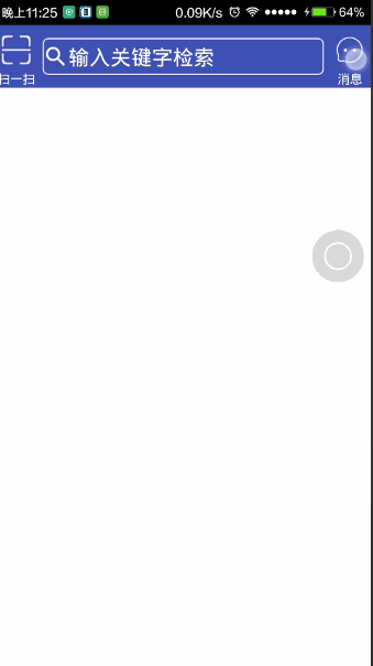
最終效果:
以上就是本文的全部內容,希望對大家學習Android軟件編程有所幫助,也希望大家多多支持本站。
 Android學習總結(3)——Handler深入詳解
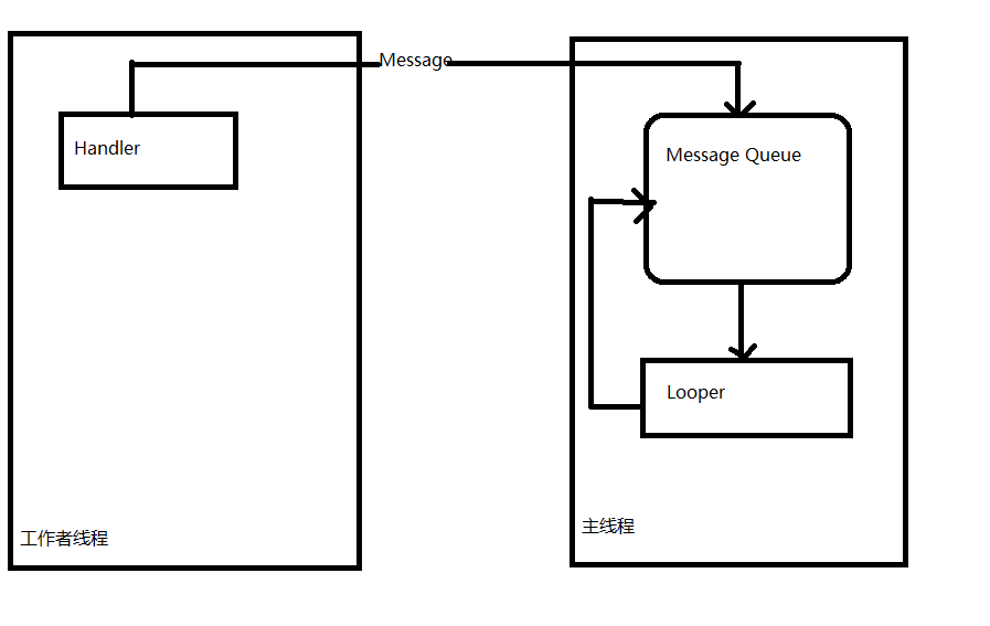
什麼是HandlerHandler是Android消息機制的上層接口,它為我們封裝了許多底層的細節,讓我們能夠很方便的使用底層的消息機制。Handler的最常見應用場景之
 Android編程之控件ListView使用方法
本文實例講述了Android編程之控件ListView使用方法。分享給大家供大家參考。具體分析如下:控件ListView是一個重要的控件,可以被用作用戶列表等顯示,下面進
 【React Native開發】React Native For Android環境配置以及第一個實例
(一)前言FaceBook早期開源發布了React Native For IOS,終於在2015年9月15日也發布了ReactNative for Android,雖然A
 Android 自定義 View 實現通訊錄字母索引(仿微信通訊錄)
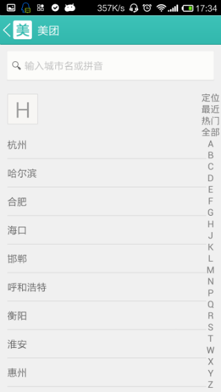
一、效果:我們看到很多軟件的通訊錄在右側都有一個字母索引功能,像微信,小米通訊錄,QQ,還有美團選擇地區等等。這裡我截了一張美團選擇城市的圖片來看看; 我們今天就來實現