編輯:關於Android編程
Android自定義Button按鈕主要可以分成兩種形式:
1.通過自定MyButton類來繼承Button,將所有效果在類中實現.
2.通過xml文件來改變Button的樣式和顏色.
今天我就先講通過xml文件,稍後封裝自定義Button類再補上.
TestcActivity
[html]
package com.example.blueapp;
import android.app.Activity;
import android.os.Bundle;
public class TestcActivity extends Activity {
@Override
protected void onCreate(Bundle savedInstanceState) {
// TODO Auto-generated method stub
super.onCreate(savedInstanceState);
setContentView(R.layout.testc);
}
}
package com.example.blueapp;
import android.app.Activity;
import android.os.Bundle;
public class TestcActivity extends Activity {
@Override
protected void onCreate(Bundle savedInstanceState) {
// TODO Auto-generated method stub
super.onCreate(savedInstanceState);
setContentView(R.layout.testc);
}
}
testc.xml
[html]
<?xml version="1.0" encoding="utf-8"?>
<LinearLayout xmlns:android="http://schemas.android.com/apk/res/android"
android:layout_width="match_parent"
android:layout_height="match_parent"
android:orientation="vertical" >
<Button
android:layout_width="fill_parent"
android:layout_height="wrap_content"
android:textSize="20dp"
android:text="測試按鈕"
android:background="@drawable/button_style"
/>
<Button
android:layout_width="fill_parent"
android:layout_height="wrap_content"
android:textSize="20dp"
android:text="原始按鈕"
/>
</LinearLayout>
button_style.xml
[html]
<?xml version="1.0" encoding="utf-8"?>
<selector xmlns:android="http://schemas.android.com/apk/res/android">
<item android:state_pressed="true">
<shape>
<gradient android:startColor="#0d76e1" android:endColor="#0d76e1"
android:angle="270" />
<stroke android:width="1dip" android:color="#f403c9" />
<corners android:radius="2dp" />
<padding android:left="10dp" android:top="10dp"
android:right="10dp" android:bottom="10dp" />
</shape>
</item>
<item android:state_focused="true">
<shape>
<gradient android:startColor="#ffc2b7" android:endColor="#ffc2b7"
android:angle="270" />
<stroke android:width="1dip" android:color="#f403c9" />
<corners android:radius="2dp" />
<padding android:left="10dp" android:top="10dp"
android:right="10dp" android:bottom="10dp" />
</shape>
</item>
<item>
<shape>
<gradient android:startColor="#000000" android:endColor="#ffffff"
android:angle="180" />
<stroke android:width="1dip" android:color="#f403c9" />
<corners android:radius="5dip" />
<padding android:left="10dp" android:top="10dp"
android:right="10dp" android:bottom="10dp" />
</shape>
</item>
</selector>
gradient 主體漸變 startColor開始顏色,endColor結束顏色 ,angle開始漸變的角度(值只能為90的倍數,0時為左到右漸變,90時為下到上漸變,依次逆時針類推)
stroke 邊框 width 邊框寬度,color 邊框顏色
corners 圓角 radius 半徑,0為直角
padding text值的相對位置
 Android Json數據的解析+ListView圖文混排+緩存算法Lrucache 仿知乎
前幾天心血來潮,打算根據看知乎的API自己做一個小知乎,定制的過程遇到ListView的優化問題及圖片未緩存重加載等等許多問題,解決了以後打算和博友分享一下。接口數據:h
 Android中進程間通信 (一)
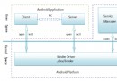
在Android系統中,每一個應用程序都是由一些Activity和Service組成的,這些Activity和Service有可能運行在同一個進程中,也有可能運行在不同的
 Android——ViewPager+Fragment+ListView之間
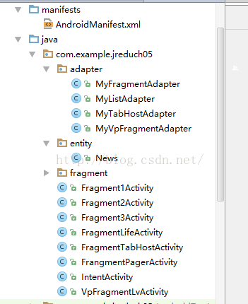
package com.example.jreduch05;import android.os.Bundle;import android.support.v
 Android實戰教程第四十三篇之上拉加載與下拉刷新
ListView的下拉刷新很常見,很多開源的框架都能做到這個效果,當然也可以自己去實現。本篇案例是基於xlistview的。布局:<RelativeLayout x