編輯:關於Android編程
一、說起進度條,必須說說條形進度條,經常都會使用到嘛,特別是下載文件進度等等,還有像騰訊QQ安裝進度條一樣,有個進度總給人良好的用戶體驗。
先來找圖看看,做這個圖完成不用圖片就可以做到了。

看下xml布局文件,其實就是直接用xml寫的在加兩個屬性設置一下就好了,一個style,另一個是background。
<ProgressBar
android:id=”@+id/pb_progressbar”
style=”@style/StyleProgressBarMini”
android:layout_width=”fill_parent”
android:layout_height=”wrap_content”
android:layout_margin=”30dp”
android:background=”@drawable/shape_progressbar_bg”
android:max=”100″
android:progress=”50″ />
先看style吧
<style name=”StyleProgressBarMini” parent=”@android:style/Widget.ProgressBar.Horizontal”>
< item name=”android:maxHeight”>50dip</item>
< item name=”android:minHeight”>10dip</item>
< item name=”android:indeterminateOnly”>false</item>
< item name=”android:indeterminateDrawable”>@android:drawable/progress_indeterminate_horizontal</item>
< item name=”android:progressDrawable”>@drawable/shape_progressbar_mini</item>
< /style>
這裡的progressDrawable又是引用一個自定義drawable,不是圖片哦。
shape_progressbar_mini.xml
<?xml version=”1.0″ encoding=”utf-8″?>
< layer-list xmlns:android=”http://schemas.android.com/apk/res/android” >
< !– 背景 –>
< item android:id=”@android:id/background”>
< shape>
< corners android:radius=”5dip” />
< gradient
android:angle=”270″
android:centerY=”0.75″
android:endColor=”#FFFFFF”
android:startColor=”#FFFFFF” />
< /shape>
< /item>
< item android:id=”@android:id/secondaryProgress”>
< clip>
< shape>
< corners android:radius=”0dip” /><gradient
android:angle=”270″
android:centerY=”0.75″
android:endColor=”#df0024″
android:startColor=”#df0024″ />
< /shape>
< /clip>
< /item>
< item android:id=”@android:id/progress”>
< clip>
< shape>
< corners android:radius=”5dip” />
< gradient
android:angle=”270″
android:centerY=”0.75″
android:endColor=”#de42ec”
android:startColor=”#de42ec” />
< /shape>
< /clip>
< /item>
< /layer-list>
再來看看shape_progressbar_bg.xml
<?xml version=”1.0″ encoding=”UTF-8″?>
< shape xmlns:android=”http://schemas.android.com/apk/res/android”
android:shape=”rectangle” ><!– 邊框填充的顏色 –>
< solid android:color=”#cecece” /><!– 設置進度條的四個角為弧形 –>
< !– android:radius 弧形的半徑 –>
< corners android:radius=”90dp” />
< !–
padding:邊界的間隔–>
< padding
android:bottom=”1dp”
android:left=”1dp”
android:right=”1dp”
android:top=”1dp” />
< /shape>
就這樣把一個漂亮的條形進度條做好了,在shape_progressbar_bg.xml中,邊框填充的顏色是一種挺好的方法,加了一個進度條的邊框。另外為了進度條四個角都是圓形的,就用了這個屬性<corners android:radius=”90dp” /> 。
搞定,這個時候可以開心一下了,去喝杯水先。
二、圓形進度條。另一個比較常用的就是圓形進度條,表示正在進行中。。。
來看2張小圖
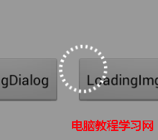
先看第一張,分析下代碼,用自定義的view,用pop來做的哦。LoadingDialog.java
public class LoadingDialog {
private Context context;
private PopupWindow popupDialog;
private LayoutInflater layoutInflater;
private RelativeLayout layout;
private RelativeLayout layout_bg;
private View circleView;
private RotateAnimation rotateAnim;
private AlphaAnimation alphaAnim_in;
private AlphaAnimation alphaAnim_out;
public LoadingDialog(Context context) {
layoutInflater = LayoutInflater.from(context);
this.context = context;
}
private void initAnim() {
rotateAnim = new RotateAnimation(0, 360, Animation.RELATIVE_TO_SELF, 0.5f, Animation.RELATIVE_TO_SELF, 0.5f);
rotateAnim.setDuration(2000);
rotateAnim.setRepeatMode(Animation.RESTART);
rotateAnim.setRepeatCount(-1);
rotateAnim.setInterpolator(new LinearInterpolator());
alphaAnim_in = new AlphaAnimation(0f, 1f);
alphaAnim_in.setFillAfter(true);
alphaAnim_in.setDuration(200);
alphaAnim_in.setInterpolator(new LinearInterpolator());
alphaAnim_out = new AlphaAnimation(1f, 0f);
alphaAnim_out.setFillAfter(true);
alphaAnim_out.setDuration(100);
alphaAnim_out.setInterpolator(new LinearInterpolator());
alphaAnim_out.setAnimationListener(new AnimationListener() {
@Override
public void onAnimationStart(Animation arg0) {
}
@Override
public void onAnimationRepeat(Animation arg0) {
}
@Override
public void onAnimationEnd(Animation arg0) {
dismiss();
}
});
}/**
* 判斷是否顯示
* @return
*/
public boolean isShowing() {
if (popupDialog != null && popupDialog.isShowing()) {
return true;
}
return false;
}/**
* 顯示
*/
public void show() {
dismiss();
initAnim();
layout = (RelativeLayout) layoutInflater.inflate(R.layout.view_loadingdialog, null);
circleView = (View) layout.findViewById(R.id.loading_dialog);
layout_bg = (RelativeLayout) layout.findViewById(R.id.bgLayout);
popupDialog = new PopupWindow(layout, LayoutParams.FILL_PARENT, LayoutParams.FILL_PARENT);
View parentView = ((Activity) context).getWindow().findViewById(Window.ID_ANDROID_CONTENT);
popupDialog.showAtLocation(parentView, Gravity.CENTER, 0, 0);layout_bg.startAnimation(alphaAnim_in);
circleView.startAnimation(rotateAnim);
}/**
* 隱藏
*/
public void dismiss() {
if (popupDialog != null && popupDialog.isShowing()) {
layout_bg.clearAnimation();
circleView.clearAnimation();
popupDialog.dismiss();
}
}
}
這裡呢引用了view_loadingdialog.xml,已作整個頁面的背景和loading框。
view_loadingdialog.xml
<?xml version=”1.0″ encoding=”utf-8″?>
< RelativeLayout xmlns:android=”http://schemas.android.com/apk/res/android”
android:layout_width=”match_parent”
android:layout_height=”match_parent” >
< RelativeLayout
android:id=”@+id/bgLayout”
android:layout_width=”match_parent”
android:layout_height=”match_parent”
android:background=”#66000000″ >
< View
android:id=”@+id/loading_dialog”
android:layout_width=”48dp”
android:layout_height=”48dp”
android:layout_centerInParent=”true”
android:background=”@drawable/shape_loading_dialog” />
< /RelativeLayout>
< /RelativeLayout>
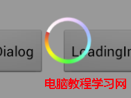
再看看這個shape_loading_dialog.xml,繪制轉動的圓形性狀,又不用圖片挺好的。
<?xml version=”1.0″ encoding=”utf-8″?>
< shape xmlns:android=”http://schemas.android.com/apk/res/android”
android:shape=”oval” >
< stroke
android:width=”3dp”
android:dashWidth=”2dp”
android:dashGap=”3dp”
android:color=”#fff”/>
< gradient
android:startColor=”#00ffffff”
android:endColor=”#00ffffff”
android:angle=”180″/>
< /shape>
就是這樣子,實現了第一個圓形進度條。
 View的事件分發
當你點擊一個view的時候,它的底層還有其他的View/ViewGroup,那麼這個點擊事件誰處理,它又是怎麼傳遞的在控件樹上?我們知道點擊事件是從Activity-&g
 Android實現跑馬燈效果的方法
本文實例講述了Android實現跑馬燈效果的方法。分享給大家供大家參考。具體如下:運行效果截圖如下:直接在布局裡寫代碼就好了:<TextView android
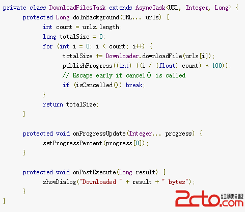 Android開發:AsyncTask源代碼完全解析
從事Java開發以來,接觸過很多的開源代碼,自己能夠明白代碼但是想要表達出來卻有點困難,從今天開始,逐漸開始對一些開源代碼進行解析並記錄成blog分享出來,希望以此提升自
 百度專車教程 百度專車詳細使用指南
百度專車是百度地圖最新推出的一項提供高品質用車的服務。百度憑借百度地圖龐大的用戶群體,開展這項專車服務,提供從經濟型到奢華型共5大類20余種車型供用戶選擇,