編輯:關於Android編程
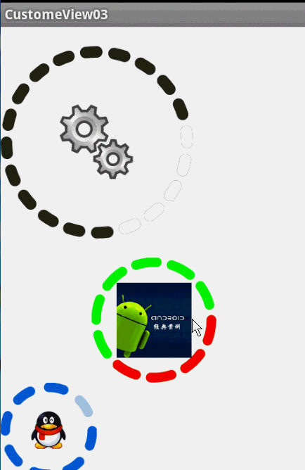
圓環交替、等待效果
效果就這樣,分析了一下,大概有這幾個屬性,兩個顏色,一個速度,一個圓環的寬度。
自定View的幾個步驟:
1、自定義View的屬性
2、在View的構造方法中獲得我們自定義的屬性
3、重寫onMesure
4、重寫onDraw
1、自定義屬性:
<?xml version="1.0" encoding="utf-8"?>
<resources>

  <attr name="firstColor" format="color" />
  <attr name="secondColor" format="color" />
  <attr name="circleWidth" format="dimension" />
  <attr name="speed" format="integer" />

  <declare-styleable name="CustomProgressBar">
    <attr name="firstColor" />
    <attr name="secondColor" />
    <attr name="circleWidth" />
    <attr name="speed" />
  </declare-styleable>

</resources>
2、在View的構造方法中獲得我們自定義的屬性
/**
   * 第一圈的顏色
   */
  private int mFirstColor;
  /**
   * 第二圈的顏色
   */
  private int mSecondColor;
  /**
   * 圈的寬度
   */
  private int mCircleWidth;
  /**
   * 畫筆
   */
  private Paint mPaint;
  /**
   * 當前進度
   */
  private int mProgress;

  /**
   * 速度
   */
  private int mSpeed;

  /**
   * 是否應該開始下一個
   */
  private boolean isNext = false;

  public CustomProgressBar(Context context, AttributeSet attrs)
  {
    this(context, attrs, 0);
  }

  public CustomProgressBar(Context context)
  {
    this(context, null);
  }

  /**
   * 必要的初始化,獲得一些自定義的值
   *
   * @param context
   * @param attrs
   * @param defStyle
   */
  public CustomProgressBar(Context context, AttributeSet attrs, int defStyle)
  {
    super(context, attrs, defStyle);
    TypedArray a = context.getTheme().obtainStyledAttributes(attrs, R.styleable.CustomProgressBar, defStyle, 0);
    int n = a.getIndexCount();

    for (int i = 0; i < n; i++)
    {
      int attr = a.getIndex(i);
      switch (attr)
      {
      case R.styleable.CustomProgressBar_firstColor:
        mFirstColor = a.getColor(attr, Color.GREEN);
        break;
      case R.styleable.CustomProgressBar_secondColor:
        mSecondColor = a.getColor(attr, Color.RED);
        break;
      case R.styleable.CustomProgressBar_circleWidth:
        mCircleWidth = a.getDimensionPixelSize(attr, (int) TypedValue.applyDimension(
            TypedValue.COMPLEX_UNIT_PX, 20, getResources().getDisplayMetrics()));
        break;
      case R.styleable.CustomProgressBar_speed:
        mSpeed = a.getInt(attr, 20);// 默認20
        break;
      }
    }
    a.recycle();
    mPaint = new Paint();
    // 繪圖線程
    new Thread()
    {
      public void run()
      {
        while (true)
        {
          mProgress++;
          if (mProgress == 360)
          {
            mProgress = 0;
            if (!isNext)
              isNext = true;
            else
              isNext = false;
          }
          postInvalidate();
          try
          {
            Thread.sleep(mSpeed);
          } catch (InterruptedException e)
          {
            e.printStackTrace();
          }
        }
      };
    }.start();

  }
3、直接重寫onDraw,這不需要重寫onMeasure
@Override
  protected void onDraw(Canvas canvas)
  {

    int centre = getWidth() / 2; // 獲取圓心的x坐標
    int radius = centre - mCircleWidth / 2;// 半徑
    mPaint.setStrokeWidth(mCircleWidth); // 設置圓環的寬度
    mPaint.setAntiAlias(true); // 消除鋸齒
    mPaint.setStyle(Paint.Style.STROKE); // 設置空心
    RectF oval = new RectF(centre - radius, centre - radius, centre + radius, centre + radius); // 用於定義的圓弧的形狀和大小的界限
    if (!isNext)
    {// 第一顏色的圈完整,第二顏色跑
      mPaint.setColor(mFirstColor); // 設置圓環的顏色
      canvas.drawCircle(centre, centre, radius, mPaint); // 畫出圓環
      mPaint.setColor(mSecondColor); // 設置圓環的顏色
      canvas.drawArc(oval, -90, mProgress, false, mPaint); // 根據進度畫圓弧
    } else
    {
      mPaint.setColor(mSecondColor); // 設置圓環的顏色
      canvas.drawCircle(centre, centre, radius, mPaint); // 畫出圓環
      mPaint.setColor(mFirstColor); // 設置圓環的顏色
      canvas.drawArc(oval, -90, mProgress, false, mPaint); // 根據進度畫圓弧
    }

  }
大功完成了,當然了,唯一比較糾結的地方就是兩個顏色何時切換,如何切換,我采用上面的辦法,你也可以自己想想怎麼實現。
視頻音量調控
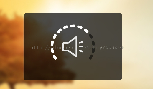
這樣一個效果使用自定義View來實現的話和圓環的思路差不多,所以我們一起來看:
1、先分許需要的屬性,兩個小塊的顏色、一張中間的圖片、間隙大小、一個多少個塊塊。分析完畢,開始寫attr.xml
<?xml version="1.0" encoding="utf-8"?>
<resources>

  <attr name="firstColor" format="color" />
  <attr name="secondColor" format="color" />
  <attr name="circleWidth" format="dimension" />
  <attr name="dotCount" format="integer" />
  <attr name="splitSize" format="integer" />
  <attr name="bg" format="reference"></attr>

  <declare-styleable name="CustomVolumControlBar">
    <attr name="firstColor" />
    <attr name="secondColor" />
    <attr name="circleWidth" />
    <attr name="dotCount" />
    <attr name="splitSize" />
    <attr name="bg" />
  </declare-styleable>

</resources>
2、在構造中獲取這些屬性:
/**
   * 第一圈的顏色
   */
  private int mFirstColor;

  /**
   * 第二圈的顏色
   */
  private int mSecondColor;
  /**
   * 圈的寬度
   */
  private int mCircleWidth;
  /**
   * 畫筆
   */
  private Paint mPaint;
  /**
   * 當前進度
   */
  private int mCurrentCount = 3;

  /**
   * 中間的圖片
   */
  private Bitmap mImage;
  /**
   * 每個塊塊間的間隙
   */
  private int mSplitSize;
  /**
   * 個數
   */
  private int mCount;

  private Rect mRect;

  public CustomVolumControlBar(Context context, AttributeSet attrs)
  {
    this(context, attrs, 0);
  }

  public CustomVolumControlBar(Context context)
  {
    this(context, null);
  }

  /**
   * 必要的初始化,獲得一些自定義的值
   *
   * @param context
   * @param attrs
   * @param defStyle
   */
  public CustomVolumControlBar(Context context, AttributeSet attrs, int defStyle)
  {
    super(context, attrs, defStyle);
    TypedArray a = context.getTheme().obtainStyledAttributes(attrs, R.styleable.CustomVolumControlBar, defStyle, 0);
    int n = a.getIndexCount();

    for (int i = 0; i < n; i++)
    {
      int attr = a.getIndex(i);
      switch (attr)
      {
      case R.styleable.CustomVolumControlBar_firstColor:
        mFirstColor = a.getColor(attr, Color.GREEN);
        break;
      case R.styleable.CustomVolumControlBar_secondColor:
        mSecondColor = a.getColor(attr, Color.CYAN);
        break;
      case R.styleable.CustomVolumControlBar_bg:
        mImage = BitmapFactory.decodeResource(getResources(), a.getResourceId(attr, 0));
        break;
      case R.styleable.CustomVolumControlBar_circleWidth:
        mCircleWidth = a.getDimensionPixelSize(attr, (int) TypedValue.applyDimension(
            TypedValue.COMPLEX_UNIT_PX, 20, getResources().getDisplayMetrics()));
        break;
      case R.styleable.CustomVolumControlBar_dotCount:
        mCount = a.getInt(attr, 20);// 默認20
        break;
      case R.styleable.CustomVolumControlBar_splitSize:
        mSplitSize = a.getInt(attr, 20);
        break;
      }
    }
    a.recycle();
    mPaint = new Paint();
    mRect = new Rect();
  }
3、重寫onDraw
@Override
  protected void onDraw(Canvas canvas)
  {
    mPaint.setAntiAlias(true); // 消除鋸齒
    mPaint.setStrokeWidth(mCircleWidth); // 設置圓環的寬度
    mPaint.setStrokeCap(Paint.Cap.ROUND); // 定義線段斷電形狀為圓頭
    mPaint.setAntiAlias(true); // 消除鋸齒
    mPaint.setStyle(Paint.Style.STROKE); // 設置空心
    int centre = getWidth() / 2; // 獲取圓心的x坐標
    int radius = centre - mCircleWidth / 2;// 半徑
    /**
     * 畫塊塊去
     */
    drawOval(canvas, centre, radius);

    /**
     * 計算內切正方形的位置
     */
    int relRadius = radius - mCircleWidth / 2;// 獲得內圓的半徑
    /**
     * 內切正方形的距離頂部 = mCircleWidth + relRadius - √2 / 2
     */
    mRect.left = (int) (relRadius - Math.sqrt(2) * 1.0f / 2 * relRadius) + mCircleWidth;
    /**
     * 內切正方形的距離左邊 = mCircleWidth + relRadius - √2 / 2
     */
    mRect.top = (int) (relRadius - Math.sqrt(2) * 1.0f / 2 * relRadius) + mCircleWidth;
    mRect.bottom = (int) (mRect.left + Math.sqrt(2) * relRadius);
    mRect.right = (int) (mRect.left + Math.sqrt(2) * relRadius);

    /**
     * 如果圖片比較小,那麼根據圖片的尺寸放置到正中心
     */
    if (mImage.getWidth() < Math.sqrt(2) * relRadius)
    {
      mRect.left = (int) (mRect.left + Math.sqrt(2) * relRadius * 1.0f / 2 - mImage.getWidth() * 1.0f / 2);
      mRect.top = (int) (mRect.top + Math.sqrt(2) * relRadius * 1.0f / 2 - mImage.getHeight() * 1.0f / 2);
      mRect.right = (int) (mRect.left + mImage.getWidth());
      mRect.bottom = (int) (mRect.top + mImage.getHeight());

    }
    // 繪圖
    canvas.drawBitmap(mImage, null, mRect, mPaint);
  }

  /**
   * 根據參數畫出每個小塊
   *
   * @param canvas
   * @param centre
   * @param radius
   */
  private void drawOval(Canvas canvas, int centre, int radius)
  {
    /**
     * 根據需要畫的個數以及間隙計算每個塊塊所占的比例*360
     */
    float itemSize = (360 * 1.0f - mCount * mSplitSize) / mCount;

    RectF oval = new RectF(centre - radius, centre - radius, centre + radius, centre + radius); // 用於定義的圓弧的形狀和大小的界限

    mPaint.setColor(mFirstColor); // 設置圓環的顏色
    for (int i = 0; i < mCount; i++)
    {
      canvas.drawArc(oval, i * (itemSize + mSplitSize), itemSize, false, mPaint); // 根據進度畫圓弧
    }

    mPaint.setColor(mSecondColor); // 設置圓環的顏色
    for (int i = 0; i < mCurrentCount; i++)
    {
      canvas.drawArc(oval, i * (itemSize + mSplitSize), itemSize, false, mPaint); // 根據進度畫圓弧
    }
  }
這裡需要注意下:
畫塊:首先根據塊數量和間隙計算,每個塊所占的比例。
畫圖:當圖比較大時,直接使用該環內切正方形大小進行約束,當圖片比較小時,在正中心的位置繪制。有些數學運算過程,樓主在草稿上畫了一會,不復雜,大家自己畫畫,我就不貼草稿了。
4、添加觸摸監聽:
/**
   * 當前數量+1
   */
  public void up()
  {
    mCurrentCount++;
    postInvalidate();
  }

  /**
   * 當前數量-1
   */
  public void down()
  {
    mCurrentCount--;
    postInvalidate();
  }

  private int xDown, xUp;

  @Override
  public boolean onTouchEvent(MotionEvent event)
  {

    switch (event.getAction())
    {
    case MotionEvent.ACTION_DOWN:
      xDown = (int) event.getY();
      break;

    case MotionEvent.ACTION_UP:
      xUp = (int) event.getY();
      if (xUp > xDown)// 下滑
      {
        down();
      } else
      {
        up();
      }
      break;
    }

    return true;
  }
觸摸監聽也得很簡單哈,基本能實現,大家也可以加個最小距離加速度什麼的,都行。
最後,效果圖:
 Android直播推流學習
第一部本文也主要是一步步分析spydroid源碼。 首先spydroid的采用的協議是RTSP,目前我知道支持RTSP協議的服務器是Darwin,但是Darwin比較復雜
 android中Handler的初步認識(三)
在上一個例子中,最終我們發現,其實用到的線程只有一個,那就是程序的主線程(UI線程)。那麼怎麼把那個例子改成用新建的線程來實現呢,今天我嘗試了一下,寫了下面這個小程序。
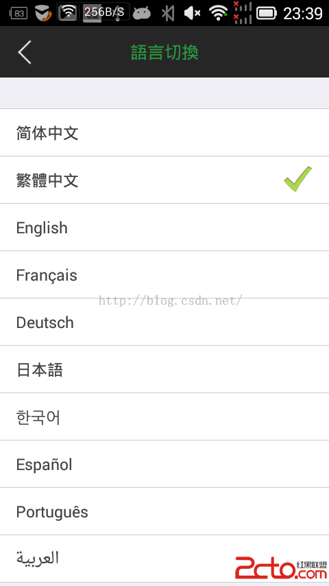 Android 史上最強多語言國際化,不僅第一次會跟隨系統,而且會保存用戶的語言設置
1.我等屌絲喜歡簡單粗暴,首先來一幅圖哥們我是大陸人,當然默認語言是 中文簡體,但是我剛剛切換成了繁體了 2.看下配置文件,按照這個格式 ,看圖吧,簡單粗暴,別
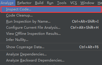 Android Studio使用Lint進行代碼檢查
Android Studio目前已經更新到1.4版本,它作為Google官方推薦的IDE,功能非常強大,其中提供了一套靜態代碼分析工具,它可以幫助我們檢查項目中存在的問題