編輯:關於Android編程
本文和大家一起做一個帶箭頭的圓角矩形菜單,大概長下面這個樣子:
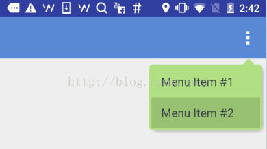
要求頂上的箭頭要對准菜單錨點,菜單項按壓反色,菜單背景色和按壓色可配置。
最簡單的做法就是讓UX給個三角形的圖片往上一貼,但是轉念一想這樣是不是太low了點,而且不同分辨率也不太好適配,干脆自定義一個ViewGroup吧!
自定義ViewGroup其實很簡單,基本都是按一定的套路來的。
一、定義一個attrs.xml
就是聲明一下你的這個自定義View有哪些可配置的屬性,將來使用的時候可以自由配置。這裡聲明了7個屬性,分別是:箭頭寬度、箭頭高度、箭頭水平偏移、圓角半徑、菜單背景色、陰影色、陰影厚度。
 <resources>
  <declare-styleable name="ArrowRectangleView">
    <attr name="arrow_width" format="dimension" />
    <attr name="arrow_height" format="dimension" />
    <attr name="arrow_offset" format="dimension" />
    <attr name="radius" format="dimension" />
    <attr name="background_color" format="color" />
    <attr name="shadow_color" format="color" />
    <attr name="shadow_thickness" format="dimension" />
  </declare-styleable>
</resources>
二、寫一個繼承ViewGroup的類,在構造函數中初始化這些屬性
這裡需要用到一個obtainStyledAttributes()方法,獲取一個TypedArray對象,然後就可以根據類型獲取相應的屬性值了。需要注意的是該對象用完以後需要顯式調用recycle()方法釋放掉。
 public class ArrowRectangleView extends ViewGroup {
  ... ...
  public ArrowRectangleView(Context context, AttributeSet attrs, int defStyleAttr) {
    super(context, attrs, defStyleAttr);

    TypedArray a = context.getTheme().obtainStyledAttributes(attrs,
        R.styleable.ArrowRectangleView, defStyleAttr, 0);
    for (int i = 0; i < a.getIndexCount(); i++) {
      int attr = a.getIndex(i);
      switch (attr) {
        case R.styleable.ArrowRectangleView_arrow_width:
          mArrowWidth = a.getDimensionPixelSize(attr, mArrowWidth);
          break;
        case R.styleable.ArrowRectangleView_arrow_height:
          mArrowHeight = a.getDimensionPixelSize(attr, mArrowHeight);
          break;
        case R.styleable.ArrowRectangleView_radius:
          mRadius = a.getDimensionPixelSize(attr, mRadius);
          break;
        case R.styleable.ArrowRectangleView_background_color:
          mBackgroundColor = a.getColor(attr, mBackgroundColor);
          break;
        case R.styleable.ArrowRectangleView_arrow_offset:
          mArrowOffset = a.getDimensionPixelSize(attr, mArrowOffset);
          break;
        case R.styleable.ArrowRectangleView_shadow_color:
          mShadowColor = a.getColor(attr, mShadowColor);
          break;
        case R.styleable.ArrowRectangleView_shadow_thickness:
          mShadowThickness = a.getDimensionPixelSize(attr, mShadowThickness);
          break;
      }
    }
    a.recycle();
  }
三、重寫onMeasure()方法
onMeasure()方法,顧名思義,就是用來測量你這個ViewGroup的寬高尺寸的。
我們先考慮一下高度:
•首先要為箭頭跟圓角預留高度,maxHeight要加上這兩項
•然後就是測量所有可見的child,ViewGroup已經提供了現成的measureChild()方法
•接下來就把獲得的child的高度累加到maxHeight上,當然還要考慮上下的margin配置
•除此以外,還需要考慮到上下的padding,以及陰影的高度
•最後通過setMeasuredDimension()設置生效
在考慮一下寬度:
•首先也是通過measureChild()方法測量所有可見的child
•然後就是比較這些child的寬度以及左右的margin配置,選最大值
•接下來還有加上左右的padding,以及陰影寬度
•最後通過setMeasuredDimension()設置生效
  @Override
  protected void onMeasure(int widthMeasureSpec, int heightMeasureSpec) {
    int count = getChildCount();
    int maxWidth = 0;
    // reserve space for the arrow and round corners
    int maxHeight = mArrowHeight + mRadius;
    for (int i = 0; i < count; i++) {
      final View child = getChildAt(i);
      final MarginLayoutParams lp = (MarginLayoutParams) child.getLayoutParams();
      if (child.getVisibility() != GONE) {
        measureChild(child, widthMeasureSpec, heightMeasureSpec);
        maxWidth = Math.max(maxWidth, child.getMeasuredWidth() + lp.leftMargin + lp.rightMargin);
        maxHeight = maxHeight + child.getMeasuredHeight() + lp.topMargin + lp.bottomMargin;
      }
    }

    maxWidth = maxWidth + getPaddingLeft() + getPaddingRight() + mShadowThickness;
    maxHeight = maxHeight + getPaddingTop() + getPaddingBottom() + mShadowThickness;

    setMeasuredDimension(maxWidth, maxHeight);
  }
看起來是不是很簡單?當然還有兩個小問題:
1. 高度為圓角預留尺寸的時候,為什麼只留了一個半徑,而不是上下兩個半徑?
其實這是從顯示效果上來考慮的,如果上下各留一個半徑,會造成菜單的邊框很厚不好看,後面實現onLayout()的時候你會發現,我們布局菜單項的時候會往上移半個半徑,這樣邊框看起來就好看多了。
2. Child的布局參數為什麼可以強轉成MarginLayoutParams?
這裡其實需要重寫另一個方法generateLayoutParams(),返回你想要布局參數類型。一般就是用MarginLayoutParams,當然你也可以用其他類型或者自定義類型。
   @Override
  public ViewGroup.LayoutParams generateLayoutParams(AttributeSet attrs) {
    return new MarginLayoutParams(getContext(), attrs);
  }
四、重寫onLayout()方法
onLayout()方法,顧名思義,就是用來布局這個ViewGroup裡的所有子View的。
實際上每個View都有一個layout()方法,我們需要做的只是把合適的left/top/right/bottom坐標傳入這個方法就可以了。
這裡就可以看到,我們布局菜單項的時候往上提了半個半徑,因此topOffset只加了半個半徑,另外右側的坐標也只減了半個半徑。
   @Override
  protected void onLayout(boolean changed, int l, int t, int r, int b) {
    int count = getChildCount();
    int topOffset = t + mArrowHeight + mRadius/2;
    int top = 0;
    int bottom = 0;
    for (int i = 0; i < count; i++) {
      final View child = getChildAt(i);
      top = topOffset + i * child.getMeasuredHeight();
      bottom = top + child.getMeasuredHeight();
      child.layout(l, top, r - mRadius/2 - mShadowThickness, bottom);
    }
  }
五、重寫dispatchDraw()方法
這裡因為我們是寫了一個ViewGroup容器,本身是不需要繪制的,因此我們就需要重寫它的dispatchDraw()方法。如果你重寫的是一個具體的View,那也可以重寫它的onDraw()方法。
繪制過程分為三步:
1. 繪制圓角矩形
這一步比較簡單,直接調用Canvas的drawRoundRect()就完成了。
2. 繪制三角箭頭
這個需要根據配置的屬性,設定一個路徑,然後調用Canvas的drawPath()完成繪制。
3. 繪制菜單陰影
這個說白了就是換一個顏色再畫一個圓角矩形,位置略有偏移,當然還要有模糊效果。
要獲得模糊效果,需要通過Paint的setMaskFilter()進行配置,並且需要關閉該圖層的硬件加速,這一點在API裡有明確說明。
除此以外,還需要設置源圖像和目標圖像的重疊模式,陰影顯然要疊到菜單背後,根據下圖可知,我們需要選擇DST_OVER模式。
其他細節看代碼就清楚了:
 @Override
  protected void dispatchDraw(Canvas canvas) {
    // disable h/w acceleration for blur mask filter
    setLayerType(View.LAYER_TYPE_SOFTWARE, null);

    Paint paint = new Paint();
    paint.setAntiAlias(true);
    paint.setColor(mBackgroundColor);
    paint.setStyle(Paint.Style.FILL);

    // set Xfermode for source and shadow overlap
    paint.setXfermode(new PorterDuffXfermode(PorterDuff.Mode.DST_OVER));

    // draw round corner rectangle
    paint.setColor(mBackgroundColor);
    canvas.drawRoundRect(new RectF(0, mArrowHeight, getMeasuredWidth() - mShadowThickness, getMeasuredHeight() - mShadowThickness), mRadius, mRadius, paint);

    // draw arrow
    Path path = new Path();
    int startPoint = getMeasuredWidth() - mArrowOffset;
    path.moveTo(startPoint, mArrowHeight);
    path.lineTo(startPoint + mArrowWidth, mArrowHeight);
    path.lineTo(startPoint + mArrowWidth / 2, 0);
    path.close();
    canvas.drawPath(path, paint);

    // draw shadow
    if (mShadowThickness > 0) {
      paint.setMaskFilter(new BlurMaskFilter(mShadowThickness, BlurMaskFilter.Blur.OUTER));
      paint.setColor(mShadowColor);
      canvas.drawRoundRect(new RectF(mShadowThickness, mArrowHeight + mShadowThickness, getMeasuredWidth() - mShadowThickness, getMeasuredHeight() - mShadowThickness), mRadius, mRadius, paint);
    }

    super.dispatchDraw(canvas);
  }
六、在layout XML中引用該自定義ViewGroup
到此為止,自定義ViewGroup的實現已經完成了,那我們就在項目裡用一用吧!使用自定義ViewGroup和使用系統ViewGroup組件有兩個小區別:
一、是要指定完整的包名,否則運行的時候會報找不到該組件。
二、是配置自定義屬性的時候要需要另外指定一個名字空間,避免跟默認的android名字空間混淆。比如這裡就指定了一個新的app名字空間來引用自定義屬性。
 <?xml version="1.0" encoding="utf-8"?>
<com.xinxin.arrowrectanglemenu.widget.ArrowRectangleView
    xmlns:android="http://schemas.android.com/apk/res/android"
    xmlns:app="http://schemas.android.com/apk/res-auto"
    android:layout_width="wrap_content"
    android:layout_height="wrap_content"
    android:orientation="vertical"
    android:background="@android:color/transparent"
    android:paddingLeft="3dp"
    android:paddingRight="3dp"
    android:splitMotionEvents="false"
    app:arrow_offset="31dp"
    app:arrow_width="16dp"
    app:arrow_height="8dp"
    app:radius="5dp"
    app:background_color="#ffb1df83"
    app:shadow_color="#66000000"
    app:shadow_thickness="5dp">
  <LinearLayout
    android:id="@+id/cmx_toolbar_menu_turn_off"
    android:layout_width="wrap_content"
    android:layout_height="42dp">
    <TextView
      android:layout_width="wrap_content"
      android:layout_height="wrap_content"
      android:layout_gravity="center_vertical"
      android:textSize="16sp"
      android:textColor="#FF393F4A"
      android:paddingLeft="16dp"
      android:paddingRight="32dp"
      android:clickable="false"
      android:text="Menu Item #1"/>
  </LinearLayout>
  <LinearLayout
    android:id="@+id/cmx_toolbar_menu_feedback"
    android:layout_width="wrap_content"
    android:layout_height="42dp">
    <TextView
      android:layout_width="wrap_content"
      android:layout_height="wrap_content"
      android:layout_gravity="center_vertical"
      android:textSize="16sp"
      android:textColor="#FF393F4A"
      android:paddingLeft="16dp"
      android:paddingRight="32dp"
      android:clickable="false"
      android:text="Menu Item #2"/>
  </LinearLayout>
</com.xinxin.arrowrectanglemenu.widget.ArrowRectangleView>
七、在代碼裡引用該layout XML
這個就跟引用正常的layout XML沒有什麼區別了,這裡主要是在創建彈出菜單的時候指定了剛剛那個layout XML,具體看下示例代碼就清楚了。
至此,一個完整的自定義ViewGroup的流程就算走了一遍了,後面有時間可能還會寫一些復雜一些的自定義組件,但是萬變不離其宗,基本的原理跟步驟都是相同的。本文就是拋磚引玉,希望能給需要自定義ViewGroup的朋友一些幫助。
源碼下載:http://xiazai.jb51.net/201607/yuanma/ArrowRectangleMenu(jb51.net).rar
以上就是本文的全部內容,希望對大家的學習有所幫助,也希望大家多多支持本站。
 Android自動提示文本框(AutoCompleteTextView)
自動提示文本框(AutoCompleteTextView)可以加強用戶體驗,縮短用戶的輸入時間(百度的搜索框就是這個效果)。 首先,在xml中定義AutoComplete
 詳解Android中使用Notification實現進度通知欄(示例三)
我們在使用APP的過程中,軟件會偶爾提示我們進行版本更新,我們點擊確認更新後,會在通知欄顯示下載更新進度(已知長度的進度條)以及安裝情況(不確定進度條),這就是我們今天要
 Activity啟動過程源碼分析
其實寫分析源碼文章總會顯得很復雜很乏味,但是梳理自己看源碼時的一些總結也是一種提高。這篇博客分析下Activity啟動過程源碼,我會盡量說得簡單點。個人的觀點是看源碼不能
 怎樣使用移動電源充電?移動電源怎樣用?
隨著手機的普及,移動電源也開始火起來了,非常的方便,出門沒電必備,能先將電充進移動電源裡,儲存在裡面,等手機沒電再用移動電源給手機充電。那麼小編現在就給大家