編輯:關於Android編程
TabLayout的默認樣式:
app:theme="@style/Widget.Design.TabLayout"
從系統定義的該樣式繼續深入:
 <style name="Widget.Design.TabLayout" parent="Base.Widget.Design.TabLayout">
  <item name="tabGravity">fill</item>
  <item name="tabMode">fixed</item>
 </style>
 <style name="Base.Widget.Design.TabLayout" parent="android:Widget">
  <item name="tabMaxWidth">264dp</item>
  <item name="tabIndicatorColor">?attr/colorAccent</item>
  <item name="tabIndicatorHeight">2dp</item>
  <item name="tabPaddingStart">12dp</item>
  <item name="tabPaddingEnd">12dp</item>
  <item name="tabBackground">?attr/selectableItemBackground</item>
  <item name="tabTextAppearance">@style/TextAppearance.Design.Tab</item>
  <item name="tabSelectedTextColor">?android:textColorPrimary</item>
 </style>
接著,看看系統定義Tab文本的樣式(注意textAllcaps這個屬性):
 <style name="TextAppearance.Design.Tab" parent="TextAppearance.AppCompat.Button">
  <item name="android:textSize">14dp</item>
  <item name="android:textColor">?android:textColorSecondary</item>
  <item name="textAllCaps">true</item>
 </style>
從系統定義TabLayout的默認樣式可以看出,我們可以改變TabLayout對應的系統樣式的屬性值來適配我們自己的需求.
TabLayout的基本用法
TabLayout獨立使用使用時,可以xml布局中靜態添加tab個數及其樣式,也可以動態添加Tab的個數及其樣式,如:
 <android.support.design.widget.TabLayout
  android:id="@+id/tablayout"
  android:background="@color/colorPrimary"
  android:layout_width="match_parent"
  android:layout_height="wrap_content">
  <android.support.design.widget.TabItem
   android:layout_width="match_parent"
   android:layout_height="wrap_content"
   android:text="Android"/>
  <android.support.design.widget.TabItem
   android:layout_width="match_parent"
   android:layout_height="wrap_content"
   android:icon="@mipmap/ic_launcher"/>
 </android.support.design.widget.TabLayout>
或者:
 <android.support.design.widget.TabLayout
  android:id="@+id/tablayout"
  android:background="@color/colorPrimary"
  android:layout_width="match_parent"
  android:layout_height="wrap_content"/>
private int[] images = new int[]{
R.drawable.ic_account_balance_wallet_black,
R.drawable.ic_android_black,
R.drawable.ic_account_box_black};
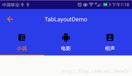
private String[] tabs = new String[]{"小說", "電影", "相聲"};
TabLayout tabLayout = (TabLayout) findViewById(R.id.tablayout);
tabLayout.addTab(tabLayout.newTab().setIcon(images[0]).setText(tabs[0]),true);
tabLayout.addTab(tabLayout.newTab().setIcon(images[1]).setText(tabs[1]),false);
tabLayout.addTab(tabLayout.newTab().setIcon(images[2]).setText(tabs[2]),false);
TabLayout在實際開發中最多的是與ViewPager聯合使用,實現TabLayout與ViewPager的聯動:
<android.support.design.widget.TabLayout
  android:id="@+id/tablayout"
  android:layout_width="match_parent"
  android:layout_height="wrap_content"
  android:background="@color/colorPrimary"
  app:tabGravity="fill"
  app:tabIndicatorColor="@android:color/holo_orange_dark"
  app:tabIndicatorHeight="2dp"
  app:tabMode="fixed"
  app:tabSelectedTextColor="@android:color/holo_orange_dark"
  app:tabTextAppearance="@style/CustomTabTextAppearanceStyle"
  app:tabTextColor="@android:color/white"
  app:theme="@style/Widget.Design.TabLayout"/>
 <android.support.v4.view.ViewPager
  android:id="@+id/view_pager"
  android:layout_width="match_parent"
  android:layout_height="match_parent"/>
 TabLayout tabLayout = (TabLayout) findViewById(R.id.tablayout);
 ViewPager viewPager = (ViewPager) findViewById(R.id.view_pager);
 viewPager.setAdapter(new TabPagerAdapter(getSupportFragmentManager()));
 tabLayout.setupWithViewPager(viewPager);
值得注意的是:
在TabPagerAdapter中需要實現getPagerTitle()否則,TabLayout的Tab將不顯示,先看TabLayout#setupWithPager()源碼,發現Tab的添加是在populateFromPagerAdapter()中實現,實現源碼如下,可以看出該方法調用了PagerAdpater#getPagerTitle()為Tab設置文本信息,如果我們自定義的Adapter沒有實現getPagerTitle()將會導致Tab不顯示文本信息.
void populateFromPagerAdapter() {
  removeAllTabs();
  if (mPagerAdapter != null) {
   final int adapterCount = mPagerAdapter.getCount();
   for (int i = 0; i < adapterCount; i++) {
    addTab(newTab().setText(mPagerAdapter.getPageTitle(i)), false);
   }
   // Make sure we reflect the currently set ViewPager item
   if (mViewPager != null && adapterCount > 0) {
    final int curItem = mViewPager.getCurrentItem();
    if (curItem != getSelectedTabPosition() && curItem < getTabCount()) {
     selectTab(getTabAt(curItem));
    }
   }
  }
 }
另外, 我們發現getPagerTitle()方法的返回值CharSequence而不是String,那麼Tab的文本信息的設置將變得更加靈活,比如設置一個SpanableString,將圖片和文本設置Tab的文本.
@Override
  public CharSequence getPageTitle(int position) {
   Drawable image = TablayoutActivity.this.getResources().getDrawable(images[position]);
   image.setBounds(0, 0, image.getIntrinsicWidth()/2, image.getIntrinsicHeight()/2);
   ImageSpan imageSpan = new ImageSpan(image, ImageSpan.ALIGN_BOTTOM);
   SpannableString ss = new SpannableString(" "+tabs[position]);
   ss.setSpan(imageSpan, 0, 1, Spannable.SPAN_EXCLUSIVE_EXCLUSIVE);
   return ss;
  }
但是Tab缺沒有顯示任何信息,一片空白,從上面提到的TabLayout的系統默認樣式中我們發現: <item name="textAllCaps">true</item>,這會阻止ImageSpan渲染出來,我們只需要將textAllCaps改為false即可,如下定義,再次運行,成功顯示
 <style name="CustomTabTextAppearanceStyle" parent="TextAppearance.Design.Tab">
  <item name="textAllCaps">false</item>
 </style>
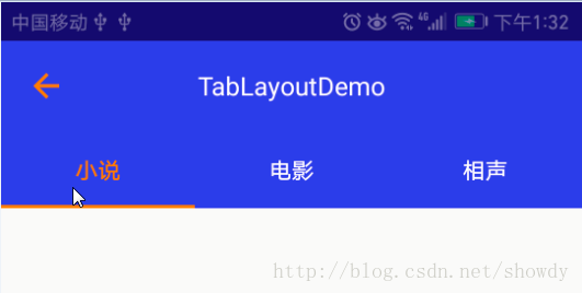
修改Indicator的長度:
從TabLayout的源碼可以看出Indicator的繪制,是在其內部類SlidingTabStrip中繪制,而SlingTabStrip類繼承LinearLayout,源碼如下:
 @Override
 public void draw(Canvas canvas) {
  super.draw(canvas);
  // Thick colored underline below the current selection
  if (mIndicatorLeft >= 0 && mIndicatorRight > mIndicatorLeft) {
   canvas.drawRect(mIndicatorLeft, getHeight() - mSelectedIndicatorHeight,
     mIndicatorRight, getHeight(), mSelectedIndicatorPaint);
  }
 }
在onDraw()中主要是就繪制一個Rect,並且寬度是根據mIndicatorLeft和mIndicatorRight設置的,而mIndicatorLeft等的寬度來自SlidingTabStrip的child,而Child就相當於一個Tab,這樣我們就通過修改Child的margin來設置mIndicatorLeft的值.
public void setIndicator(TabLayout tabs, int leftDip, int rightDip) {
  Class<?> tabLayout = tabs.getClass();
  Field tabStrip = null;
  try {
   tabStrip = tabLayout.getDeclaredField("mTabStrip");
  } catch (NoSuchFieldException e) {
   e.printStackTrace();
  }
  tabStrip.setAccessible(true);
  LinearLayout llTab = null;
  try {
   llTab = (LinearLayout) tabStrip.get(tabs);
  } catch (IllegalAccessException e) {
   e.printStackTrace();
  }
  int left = (int) TypedValue.applyDimension(TypedValue.COMPLEX_UNIT_DIP, leftDip, Resources.getSystem().getDisplayMetrics());
  int right = (int) TypedValue.applyDimension(TypedValue.COMPLEX_UNIT_DIP, rightDip, Resources.getSystem().getDisplayMetrics());
  for (int i = 0; i < llTab.getChildCount(); i++) {
   View child = llTab.getChildAt(i);
   child.setPadding(0, 0, 0, 0);
   LinearLayout.LayoutParams params = new LinearLayout.LayoutParams(0, LinearLayout.LayoutParams.MATCH_PARENT, 1);
   params.leftMargin = left;
   params.rightMargin = right;
   child.setLayoutParams(params);
   child.invalidate();
  }
 }
然後在代碼中調用即可,但是要注意,必須要在Tablayout渲染出來後調用,我們可以選擇view.post()方法來實現:
 tabLayout.post(new Runnable() {
   @Override
   public void run() {
    setIndicator(tabLayout, 20, 20);
   }
 });
最後得到效果圖如下:
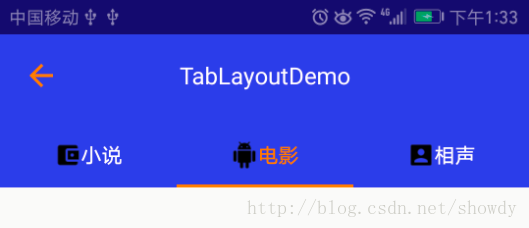
自定義TabLayout的TabItem及TabItem的點擊事件
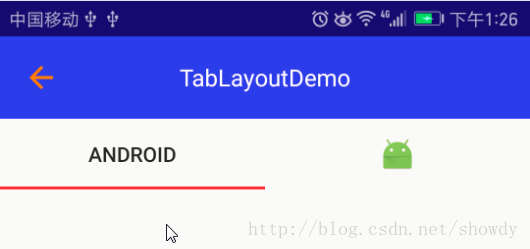
在TabLayout的Api是沒有提供TabItem點擊事件的方法,如果我們想實現如下效果圖,怎麼辦?
先自定義一個TabItem:
<?xml version="1.0" encoding="utf-8"?>
<LinearLayout xmlns:android="http://schemas.android.com/apk/res/android"
 android:layout_width="match_parent"
 android:layout_height="match_parent"
 android:gravity="center"
 android:orientation="horizontal">
 <TextView
  android:id="@+id/txt_title"
  android:layout_width="wrap_content"
  android:layout_height="wrap_content"
  android:gravity="center"
  android:textSize="14sp" />
 <ImageView
  android:id="@+id/img_title"
  android:src="@drawable/indicator"
  android:layout_width="wrap_content"
  android:layout_height="wrap_content"
  android:layout_marginLeft="5dp" />
</LinearLayout>
在自定義的Adapter中可以定義一個getTabView的方法:
 public View getTabView(int position){
  View view = LayoutInflater.from(context).inflate(R.layout.tab_item, null);
  TextView tv= (TextView) view.findViewById(R.id.textView);
  tv.setText(tabTitles[position]);
  ImageView img = (ImageView) view.findViewById(R.id.imageView);
  img.setImageResource(imageResId[position]);
  return view;
 }
重新設置點擊事件:
viewPager.setAdapter(pagerAdapter);
 tabLayout.setupWithViewPager(viewPager);
 for (int i = 0; i < tabLayout.getTabCount(); i++) {
  TabLayout.Tab tab = tabLayout.getTabAt(i);
  if (tab != null) {
   tab.setCustomView(pagerAdapter.getTabView(i));
   if (tab.getCustomView() != null) {
    View tabView = (View) tab.getCustomView().getParent();
    tabView.setTag(i);
    tabView.setOnClickListener(mTabOnClickListener);
   }
  }
 }
 viewPager.setCurrentItem(1);
以上所述是小編給大家介紹的TabLayout用法詳解及自定義樣式,希望對大家有所幫助,如果大家有任何疑問請給我留言,小編會及時回復大家的。在此也非常感謝大家對本站網站的支持!
 android利用zbar二維碼掃描-(解決中文亂碼及掃描區域定義)
寫在最前(這是對上一篇博文的問題做的更新【android利用zbar二維碼掃描】) 前天早上登陸CSDN時候一條消息:一網友提出了兩點疑惑 &
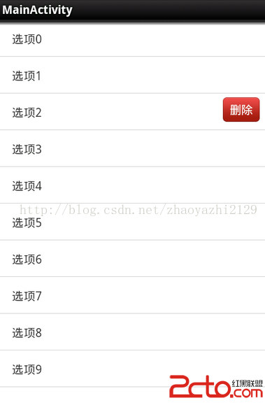 趙雅智_AndroidUI_listview的item滑動刪除效果
package com.example.listsildedel; import java.util.ArrayList; import java.util.List;
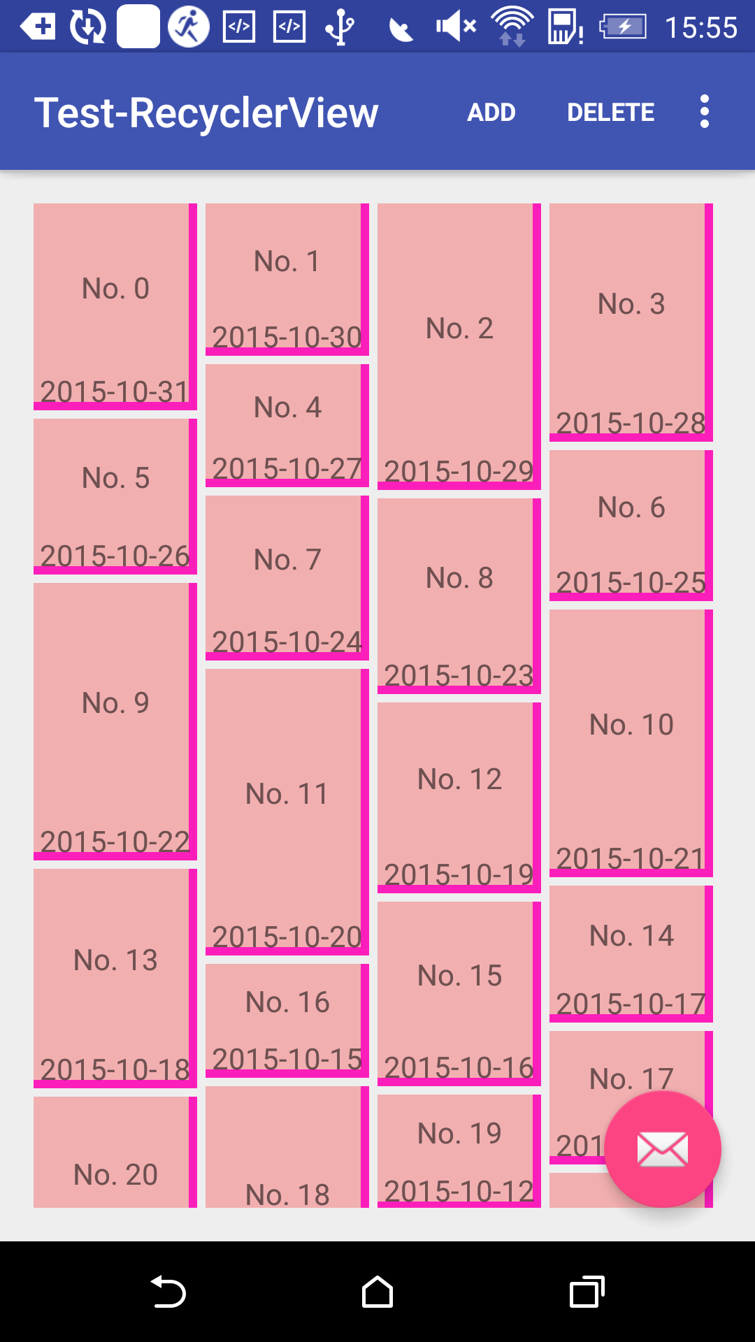 Android應用開發中RecyclerView組件使用入門教程
RecyclerView是一種列表容器, 發布很久了, 才想起來寫點什麼.RecyclerView相比於ListView, 在回收重用時更具有靈活性, 也就是低耦合, 並
 Android 學習之獲取網絡文本文件
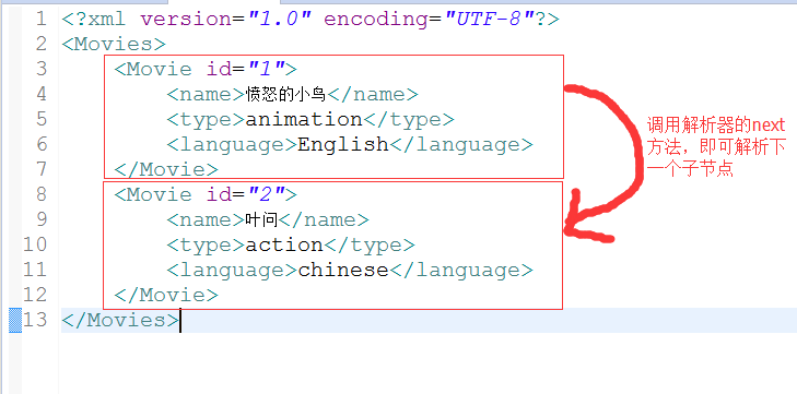
上次我們學習如何從網絡上獲取一張圖片,今天我們學習如何從網絡上獲取文本文件,以XML文件為例子。因為XML文件在實際開發中最為常見。我們以下面圖片為例子學習如何從網絡上獲