編輯:Android資訊
本文由碼農網 – 小峰原創翻譯,轉載請看清文末的轉載要求,歡迎參與我們的付費投稿計劃!
本文將介紹一種有效改變Android按鈕顏色的方法。
按鈕可以在狀態改變時改變其顏色(例如按下,禁用,高亮顯示)。但是,這需要一一說明每個狀態。這篇文章將提供你一個根據狀態變化輕松改變按鈕顏色的方法。如果你正在寫自定義視圖,那麼不妨也來讀一讀,因為中間我會涉及到如何用自定義屬性實現自定義視圖的相關內容。
Android提供了靈活的繪制選擇機制,可根據視圖狀態轉變視圖外觀。每個狀態通過一個單獨的部分而存在。例如:在正常、禁用、按下、高亮狀態下的按鈕有著不同的背景顏色。請看下面的代碼示例:
button_1_background.xml
<selector xmlns:android="http://schemas.android.com/apk/res/android"> <!— pressed state --> <item android:drawable="@drawable/button_1_selected" android:state_pressed="true"/> <!-- focused state --> <item android:drawable="@drawable/button_1_focused" android:state_focused="true"/> <!-- default state --> <item android:drawable="@drawable/button_1_normal"/> </selector>
每個狀態drawables的屬性(button_1_selected, button_1_focused,button_1_normal)必須定義在相應的在drawables目錄下:
button_1_normal.xml
<shape xmlns:android="http://schemas.android.com/apk/res/android">
    <solid android:color="@color/button_1_normal_background"/>
    <corners android:radius="10dip"/>
</shape>
button_1_focused.xml
<shape xmlns:android="http://schemas.android.com/apk/res/android">
    <solid android:color="@color/button_1_focused_background"/>
    <corners android:radius="10dip"/>
</shape>
button_1_selected.xml
<shape xmlns:android="http://schemas.android.com/apk/res/android">
    <solid android:color="@color/button_1_selected_background"/>
    <corners android:radius="10dip"/>
</shape>
然後設置按鈕背景:
android:background="@drawable/button_1_background"
這種方法非常靈活。但是,當你的app有許多按鈕,而每個按鈕的顏色又各不相同時,維護每個按鈕的上述所有XML文件就會變得異常困難起來。如果你改變正常狀態的按鈕顏色,那麼你必須改變其他狀態的顏色。在上面的例子中,每個按鈕需要4個XML文件。那麼如果你的應用程序有10個或更多個按鈕呢?
為了清楚說明我的意思,請看下面的截圖:
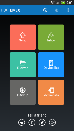
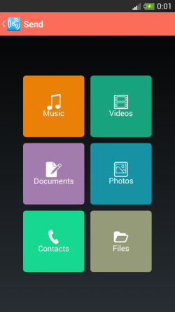
這些截圖來自於一款免費產品BMEX。
這兩張圖片分別是app的主屏幕和發送屏幕。兩個屏幕都采用了Metro風格。每個屏幕都有6個不同顏色的按鈕。並且按鈕的顏色會根據狀態的改變而改變。共計12個按鈕,所以我們需要12個drawable selector XML文件和24個drawable state XML文件。並且隨著app的發展,軟件還得允許新的屏幕和新的按鈕的添加。維護這些內容可不是一項簡單的任務。
為了使過程更加簡單和高效,我們另尋了一種更有效的解決方案——並且已經實現在自定義按鈕視圖中。這是一個容易初始化的按鈕。我們稱之為RoundButton,因為它支持圓角。
在另一個產品中,我們需要高亮功能,但是,又不想因此單獨創建自定義視圖。所以,我們把它添加到RoundButton中。請看下面的截圖:
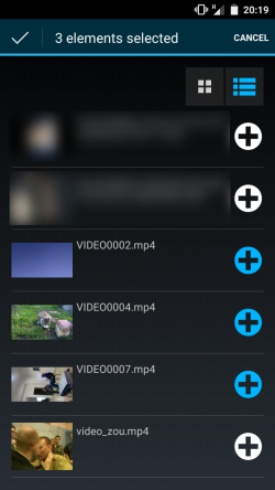
正如你所見,我們可以選擇也可以不選屏幕上的按鈕(頂部的列表圖表和每個元素後面的添加圖標)。當按鈕被選中後,它的highlighted狀態就被設置為true,反之,則為false。並且按鈕的外觀會作適當改變。在上面的例子中,高亮模式使用了“image”。在這種模式下,圖像的可見象素會被繪制為高亮顏色。
首先,我們為RoundButton定義屬性集。這是一組可以通過布局XML設置的屬性。
attrs_round_button.xml
<resources>

    <declare-styleable name="RoundButton">
        <attr name="image" format="reference"/>
        <attr name="bgcolor" format="color"/>
        <attr name="text" format="string"/>

        <attr name="radius" format="float"/>

        <attr name="highlightColor" format="color"/>
        <attr name="highlightMode" format="enum">
            <enum name="none" value="0"/>
            <enum name="image" value="1"/>
            <enum name="background" value="2"/>
        </attr>
    </declare-styleable>

</resources>
我們增加了 image,bgcolor,text,邊框圓角半徑,highlightColor和highlightMode屬性。按下狀態的顏色會從bgcolor導出(後面會描述的)。
首先,我們需要實現構造函數和解析參數。我們創建了3個不同的構造函數:
public RoundButton(Context context, AttributeSet attrs, int defStyle) {
	super(context, attrs, defStyle);

	init(attrs, defStyle);
}

public RoundButton(Context context, AttributeSet attrs) {
	super(context, attrs);

	init(attrs, 0);
}

public RoundButton(Context context) {
	super(context);

	init(null, 0);
}
所有這些構造函數調用init方法。
現在,我們需要實現init方法。它將屬性集和默認樣式作為輸入參數。在init方法中,我們獲取屬性值,並初始化內部變量。如果屬性集為null,那就使用默認值。
private void init(AttributeSet attrs, int defStyle) {
	Drawable image;
	int bgcolor;
	String text;

	if (attrs != null) {
		final TypedArray a = getContext().obtainStyledAttributes(attrs,
				R.styleable.RoundButton, defStyle, 0);

		image = a.getDrawable(R.styleable.RoundButton_image);

		bgcolor = a.getColor(R.styleable.RoundButton_bgcolor, 0xffffffff);

		text = a.getString(R.styleable.RoundButton_text);

		radius = a.getFloat(R.styleable.RoundButton_radius, 12.0f);

		highlightMode = HighlightMode.getValue(a.getInt
		(R.styleable.RoundButton_highlightMode, HighlightMode.None.ordinal()));

		highlightColor = a.getColor(R.styleable.RoundButton_highlightColor, 0xff00b5ff);

		a.recycle();
	}
	else {
		image = null;

		text = "";

		bgcolor = 0xff808080;

		radius = 12.0f;

		highlightMode = HighlightMode.None;

		highlightColor = 0xff00b5ff;
	}

	init(image, bgcolor, text);
}
然後,我們創建另一個init方法。這個方法用於創建對象,並需要渲染按鈕的內容。 此處的init方法聲明為public,因為創建RoundButton時需要調用它。它創建了背景和按下時的“噴漆(paint)”——繪制正常和按下狀態時的背景的對象。按下的顏色選取比bgcolor更亮的顏色。使顏色變亮的的方法,稍後會進行說明。這裡初始化了高亮模式。如果背景設置為高亮,那就創建高亮噴漆,用於繪制高亮時的按鈕背景。如果圖像模式設置為高亮,那就創建高亮圖像。在createHighlightImage方法中創建圖像的代碼,之後會一一給出。
public void init(Drawable image, int bgcolor, String text) {
	this.image = image;

	bgpaint = new Paint(Paint.ANTI_ALIAS_FLAG);
	bgpaint.setColor(bgcolor);

	pressedBgpaint = new Paint(Paint.ANTI_ALIAS_FLAG);
	pressedBgpaint.setColor(brighter(bgcolor));

	if (text == null)
		text = "";

	this.text = text;

	textPaint = new Paint(Paint.ANTI_ALIAS_FLAG);
	textPaint.setColor(0xffffffff);
	textPaint.setTextAlign(Paint.Align.CENTER);
	textPaint.setTextSize(pixelsToSp(getContext(), textSize));

	if (highlightMode == HighlightMode.Background) {
		highlightPaint = new Paint(Paint.ANTI_ALIAS_FLAG);
		highlightPaint.setColor(highlightColor);
	}
	else if (highlightMode == HighlightMode.Image) {
		highlightImage = createHighlightImage();
	}

	setClickable(true);
}
要獲得按下狀態的色值,我們創建了brighter方法。它將顏色作為參數,並返回比該顏色更亮的顏色。這個方法也很簡單:
public void init(Drawable image, int bgcolor, String text) {
	this.image = image;

	bgpaint = new Paint(Paint.ANTI_ALIAS_FLAG);
	bgpaint.setColor(bgcolor);

	pressedBgpaint = new Paint(Paint.ANTI_ALIAS_FLAG);
	pressedBgpaint.setColor(brighter(bgcolor));

	if (text == null)
		text = "";

	this.text = text;

	textPaint = new Paint(Paint.ANTI_ALIAS_FLAG);
	textPaint.setColor(0xffffffff);
	textPaint.setTextAlign(Paint.Align.CENTER);
	textPaint.setTextSize(pixelsToSp(getContext(), textSize));

	if (highlightMode == HighlightMode.Background) {
		highlightPaint = new Paint(Paint.ANTI_ALIAS_FLAG);
		highlightPaint.setColor(highlightColor);
	}
	else if (highlightMode == HighlightMode.Image) {
		highlightImage = createHighlightImage();
	}

	setClickable(true);
}
接下來的方法是createHighlightImage。當圖像設置為高亮模式時,它會調用上面所示的方法。但是開頭有一些比較棘手的代碼。它需要得到圖像的像素。然後處理像素 ——如果像素是不透明的(alpha != 0),就用高亮色值取代它,但是如果像素是透明的,那就不用改動。通過這種操作,我們創建了更高亮的圖像。然後,我們將修改後的像素放回位圖。並且在方法的最後,創建並返回BitmapDrawable。
private Drawable createHighlightImage() {
	int width = image.getIntrinsicWidth();
	int height = image.getIntrinsicHeight();

	Bitmap bitmap = Bitmap.createBitmap(width, height, Bitmap.Config.ARGB_8888);

	Canvas canvas = new Canvas(bitmap);
	image.setBounds(0, 0, width, height);
	image.draw(canvas);

	int count = bitmap.getWidth() * bitmap.getHeight();
	int pixels[] = new int[count];

	bitmap.getPixels(pixels, 0, bitmap.getWidth(), 0, 0, bitmap.getWidth(), bitmap.getHeight());
	for (int n = 0; n < count; n++) {
		boolean v = (Color.alpha(pixels[n])) != 0;

		if (v) {
			int pixel = pixels[n];

			int alpha = Color.alpha(pixel);
			int red = Color.red(highlightColor);
			int green = Color.green(highlightColor);
			int blue = Color.blue(highlightColor);

			int color = Color.argb(alpha, red, green, blue);

			pixels[n] = color;
		}
	}

	bitmap.setPixels(pixels, 0, bitmap.getWidth(), 0, 0, bitmap.getWidth(), bitmap.getHeight());

	return new BitmapDrawable(getResources(), bitmap);
}
為了處理狀態變化,我們需要處理觸摸事件。所以需要實現觸摸處理。當我們觸摸按鈕時,它的狀態就會變為pressed(按下),並重繪按鈕中的內容。當按鈕沒有被觸摸,那它的pressed標志就設置為false,並重繪按鈕中的內容。
@Override
public boolean onTouchEvent(MotionEvent event) {
	int action = event.getActionMasked();

	switch (action) {
	case MotionEvent.ACTION_DOWN:
		pressed = true;
		invalidate();
		break;
	case MotionEvent.ACTION_UP:
		pressed = false;
		invalidate();
		break;
	case MotionEvent.ACTION_CANCEL:
	case MotionEvent.ACTION_OUTSIDE:
	case MotionEvent.ACTION_HOVER_EXIT:
		pressed = false;
		invalidate();
		break;
	}

	return super.onTouchEvent(event);
}
然後,我們實現onDraw按鈕方法。此方法繪制了按鈕的內容。自定義視圖首次展示以及每次重繪時就調用這個onDraw方法。
protected void onDraw(Canvas canvas) {
	RectF bounds = new RectF(0, 0, getWidth(), getHeight());

	Drawable image = null;
	Paint bgPaint = null;

	switch (highlightMode) {
	case None:
		image = this.image;
		bgPaint = pressed ? pressedBgpaint : this.bgpaint;
		break;
	case Background:
		image = this.image;
		if (pressed)
			bgPaint = pressedBgpaint;
		else
			bgPaint = highlighted ? highlightPaint : this.bgpaint;
		break;
	case Image:
		image = highlighted ? highlightImage : this.image;
		bgPaint = pressed ? pressedBgpaint : this.bgpaint;
		break;
	}

	if (radius != 0.0f)
		canvas.drawRoundRect(bounds, radius, radius, bgPaint);
	else
		canvas.drawRect(bounds, bgPaint);

	Rect textBounds = new Rect();
	if (text.length() > 0)
		textPaint.getTextBounds(text, 0, text.length(), textBounds);

	float h_dst = ((image != null) ? image.getMinimumHeight() +
	((text.length() > 0) ? spacing : 0) : 0) + textBounds.height();

	float xd = (bounds.width() - ((image != null) ? image.getMinimumWidth() : 0)) / 2;
	float yd = (bounds.height() - h_dst) / 2;

	if (image != null) {
		image.setBounds((int) xd, (int) yd, (int)
		(xd + image.getMinimumWidth()), (int) (yd + image.getMinimumHeight()));
		image.draw(canvas);
	}

	float xt = (bounds.width() - 0 * textBounds.width()) / 2;
	float yt = yd + ((image != null) ? image.getMinimumHeight() +
	((text.length() > 0) ? spacing : 0) : textBounds.height());// + textBounds.height();

	canvas.drawText(text, xt, yt, textPaint);

	if (checked && checkable && checkedImage != null) {
		checkedImage.setBounds((int) (bounds.width() -
		checkedImage.getMinimumWidth()), (int) (bounds.height() - checkedImage.getMinimumHeight()),
				(int) bounds.width(), (int) bounds.height());
		checkedImage.draw(canvas);
	}
}
為了整合RoundButton到代碼,你需要下載源代碼文件。在源代碼文件中,有Eclipse項目,源代碼和XML資源文件。你可以將它們復制到你的app項目中。或者編譯RoundButton項目並將其作為庫添加到你的項目。
如果你使用的是可視化編輯器,那就直接從控件列表中選擇RoundButton,在添加它之後,設置其屬性。
除了可視化編輯器,RoundButton既可以從布局XML,也可以從代碼中插入。從布局XML添加的話,你可以這麼使用。示例如下:
<RelativeLayout xmlns:android="http://schemas.android.com/apk/res/android"
    android:layout_width="match_parent"
    android:layout_height="wrap_content"
    android:focusable="false"
    android:focusableInTouchMode="false"
    android:descendantFocusability="blocksDescendants"
    android:orientation="horizontal"
    xmlns:app="http://schemas.android.com/apk/res/com.bitgriff.bamp">

   	<com.bitgriff.bamp.helpers.RoundButton
        android:id="@+id/button"
        app:radius="0"
    	app:image="@drawable/ic_addtomedialibrary"
        app:bgcolor="@color/transparent"
        app:highlightMode="image"
        android:layout_width="40dip"
        android:layout_height="80dip"
        android:layout_centerVertical="true"
        android:layout_alignParentRight="true"/>

</RelativeLayout>
從代碼添加RoundButton,可以創造新的RoundButton實例。調用它的init方法傳遞圖像(可為null),bgcolo和text。並添加RoundButton到你的ViewGroup:
roundButton = new RoundButton(context);
roundButton.init(image, bgcolor, text);
此外,我們還可以改變RoundButton的形狀。例如,制作圓形按鈕,正如現在很多Android app中所見的那樣。也可能配置圖像位置(left、right、top、bottom)。等等。
這篇文章主要描述了如何實現根據狀態改變背景的自定義按鈕。這個簡單的組件能為我們節省很多時間。希望能對你有用。
RoundButton源代碼
這篇文章,以及相關源代碼和文件,都是經過The BSD License許可的。
 Android 開發人員必知的 50 個秘訣、技巧和資源
作者撰寫本文的初衷,是為了羅列出Android Studio有用的提示、技巧、快捷方式和參考資源,將提高您的整體效率和操作性能。 顯然,還有很多優化、快捷方式等,
 使用 Lambda 取代 Android 中的匿名類
Lambda Lambda是第十一個希臘字母,大寫Λ,小寫λ,額,跑題了…Lambda表達式 是Java8的新特性之一: Lambda表達式 函數式
 GreenDroid:增強型Android UI類庫
本文由碼農網 – 小峰原創,轉載請看清文末的轉載要求,歡迎參與我們的付費投稿計劃! GreenDroid是一款很不錯的開源Android UI類庫,利用G
 為什麼Android App質量不高並且卡頓崩潰
和前幾年iOS能夠憑籍App數量將安卓壓倒在地、安卓嬌喘吁吁起身不能的情況不同,現在安卓的App數量對比iOS平台可謂是有過之而無不及。2009年安卓系統起航伊始