編輯:Android技術基礎
本節給大家帶來的是Andoird基本UI控件中的RadioButton和Checkbox; 先說下本節要講解的內容是:RadioButton和Checkbox的
1.基本用法
2.事件處理;
3.自定義點擊效果;
4.改變文字與選擇框的相對位置;
5.修改文字與選擇框的距離
其實這兩個控件有很多地方都是類似的,除了單選和多選,事件處理,其他的都是類似的! 另外還有一個ListView上Checkbox的錯位的問題,我們會在ListView那一章對這個問題進行 解決,好的,開始本節內容~ 本節官方文檔API:RadioButton;CheckBox;
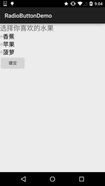
如題單選按鈕,就是只能夠選中一個,所以我們需要把RadioButton放到RadioGroup按鈕組中,從而實現 單選功能!先熟悉下如何使用RadioButton,一個簡單的性別選擇的例子: 另外我們可以為外層RadioGroup設置orientation屬性然後設置RadioButton的排列方式,是豎直還是水平~
效果圖:
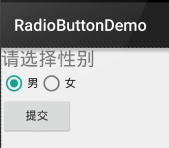
PS:筆者的手機是Android 5.0.1的,這裡的RadioButton相比起舊版本的RadioButton,稍微好看一點~
布局代碼如下:
<LinearLayout xmlns:android="http://schemas.android.com/apk/res/android"
    xmlns:tools="http://schemas.android.com/tools"
    android:id="@+id/LinearLayout1"
    android:layout_width="match_parent"
    android:layout_height="match_parent"
    android:orientation="vertical"
    tools:context=".MainActivity" >

    <TextView
        android:layout_width="wrap_content"
        android:layout_height="wrap_content"
        android:text="請選擇性別"
        android:textSize="23dp"
        />

    <RadioGroup
        android:id="@+id/radioGroup"
        android:layout_width="wrap_content"
        android:layout_height="wrap_content"
        android:orientation="horizontal">

        <RadioButton
            android:id="@+id/btnMan"
            android:layout_width="wrap_content"
            android:layout_height="wrap_content"
            android:text="男"
            android:checked="true"/>

        <RadioButton
            android:id="@+id/btnWoman"
            android:layout_width="wrap_content"
            android:layout_height="wrap_content"
            android:text="女"/>
    </RadioGroup>

    <Button
        android:id="@+id/btnpost"
        android:layout_width="wrap_content"
        android:layout_height="wrap_content"
        android:text="提交"/>

</LinearLayout>
獲得選中的值:
這裡有兩種方法,
第一種是為RadioButton設置一個事件監聽器setOnCheckChangeListener
例子代碼如下:
RadioGroup radgroup = (RadioGroup) findViewById(R.id.radioGroup);
        //第一種獲得單選按鈕值的方法
        //為radioGroup設置一個監聽器:setOnCheckedChanged()
        radgroup.setOnCheckedChangeListener(new OnCheckedChangeListener() {
            @Override
            public void onCheckedChanged(RadioGroup group, int checkedId) {
                RadioButton radbtn = (RadioButton) findViewById(checkedId);
                Toast.makeText(getApplicationContext(), "按鈕組值發生改變,你選了" + radbtn.getText(), Toast.LENGTH_LONG).show();
            }
        });
運行效果圖:


PS:另外有一點要切記,要為每個RadioButton添加一個id,不然單選功能會生效!!!
第二種方法是通過單擊其他按鈕獲取選中單選按鈕的值,當然我們也可以直接獲取,這個看需求~
例子代碼如下:
Button btnchange = (Button) findViewById(R.id.btnpost);
        RadioGroup radgroup = (RadioGroup) findViewById(R.id.radioGroup);
        //為radioGroup設置一個監聽器:setOnCheckedChanged()
        btnchange.setOnClickListener(new OnClickListener() {
            @Override
            public void onClick(View v) {
                for (int i = 0; i < radgroup.getChildCount(); i++) {
                    RadioButton rd = (RadioButton) radgroup.getChildAt(i);
                    if (rd.isChecked()) {
                        Toast.makeText(getApplicationContext(), "點擊提交按鈕,獲取你選擇的是:" + rd.getText(), Toast.LENGTH_LONG).show();
                        break;
                    }
                }
            }
        });
運行效果圖:

代碼解析: 這裡我們為提交按鈕設置了一個setOnClickListener事件監聽器,每次點擊的話遍歷一次RadioGroup判斷哪個按鈕被選中我們可以通過下述方法獲得RadioButton的相關信息!
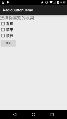
如題復選框,即可以同時選中多個選項,至於獲得選中的值,同樣有兩種方式: 1.為每個CheckBox添加事件:setOnCheckedChangeListener 2.弄一個按鈕,在點擊後,對每個checkbox進行判斷:isChecked();
運行效果圖:
實現代碼:
public class MainActivity extends AppCompatActivity implements View.OnClickListener,CompoundButton.OnCheckedChangeListener{

    private CheckBox cb_one;
    private CheckBox cb_two;
    private CheckBox cb_three;
    private Button btn_send;

    @Override
    protected void onCreate(Bundle savedInstanceState) {
        super.onCreate(savedInstanceState);
        setContentView(R.layout.activity_main);

        cb_one = (CheckBox) findViewById(R.id.cb_one);
        cb_two = (CheckBox) findViewById(R.id.cb_two);
        cb_three = (CheckBox) findViewById(R.id.cb_three);
        btn_send = (Button) findViewById(R.id.btn_send);

        cb_one.setOnCheckedChangeListener(this);
        cb_two.setOnCheckedChangeListener(this);
        cb_three.setOnCheckedChangeListener(this);
        btn_send.setOnClickListener(this);

    }

    @Override
    public void onCheckedChanged(CompoundButton compoundButton, boolean b) {
       if(compoundButton.isChecked()) Toast.makeText(this,compoundButton.getText().toString(),Toast.LENGTH_SHORT).show();
    }

    @Override
    public void onClick(View view) {
        String choose = "";
        if(cb_one.isChecked())choose += cb_one.getText().toString() + "";
        if(cb_two.isChecked())choose += cb_two.getText().toString() + "";
        if(cb_three.isChecked())choose += cb_three.getText().toString() + "";
        Toast.makeText(this,choose,Toast.LENGTH_SHORT).show();
    }
}
雖然5.0後的RadioButton和Checkbox都比舊版本稍微好看了點,但是對於我們來說 可能還是不喜歡或者需求,需要自己點擊效果!實現起來很簡單,先編寫一個自定義 的selctor資源,設置選中與沒選中時的切換圖片~!
實現效果圖如下:
PS:這裡素材的原因,有點小...
<?xml version="1.0" encoding="utf-8"?>
<selector xmlns:android="http://schemas.android.com/apk/res/android">
    <item
        android:state_enabled="true"
        android:state_checked="true"
        android:drawable="@mipmap/ic_checkbox_checked"/>
    <item
        android:state_enabled="true"
        android:state_checked="false"
        android:drawable="@mipmap/ic_checkbox_normal" />
</selector>
寫好後,我們有兩種方法設置,也可以說一種吧!你看看就知道了~
①android:button屬性設置為上述的selctor
android:button="@drawable/rad_btn_selctor"
②在style中定義一個屬性,然後通過android style屬性設置,先往style添加下述代碼:
    <style name="MyCheckBox" parent="@android:style/Widget.CompoundButton.CheckBox">
        <item name="android:button">@drawable/rad_btn_selctor</item>
    </style>
然後布局那裡:
這個實現起來也很簡單,還記得我們之前學TextView的時候用到的drawableXxx嗎? 要控制選擇框的位置,兩部即可!設置:
Step 1. android:button="@null"
Step 2. android:drawableTop="@android:drawable/btn_radio"
當然我們可以把drawableXxx替換成自己喜歡的效果!
有時,我們可能需要調節文字與選擇框之間的距離,讓他們看起來稍微沒那麼擠,我們可以:
1.在XML代碼中控制: 使用android:paddingXxx = "xxx" 來控制距離
2.在Java代碼中,稍微好一點,動態計算paddingLeft!
示例代碼如下:
rb.setButtonDrawable(R.drawable.rad_btn_selctor);
int rb_paddingLeft = getResources().getDrawable(R.mipmap.ic_checkbox_checked).getIntrinsicWidth()+5;
rb.setPadding(rb_paddingLeft, 0, 0, 0);
好的,關於RadioButton和Checkbox就講到這裡,如果有什麼寫得不對的,不好的,或者有好的建議歡迎指出 萬分感激~謝謝...
 第38章、開關控件Switch和ToggleButton(從零開始學Android)
Switch和ToggleButtn都是開關按鈕,我們在WLAN、GPS常用開關控制。一、設計界面 1、打開“res/layout/activity_mai
 9.1 使用SoundPool播放音效(Duang~)
本節引言:第九章給大家帶來的是Android中的多媒體開發,與其說是多媒體開發還不如是多媒體相關API的的使用,說下實際開發中我們做了一些和多媒體搭
 第70章、初識Intent-打開另一個Activity:雙向傳值(從零開始學Android)
在Android應用中實現activity之間的跳轉使用intent機制。本例子簡單地簡紹如何利用intent使程序由MainActivity跳轉到另一個OtherAct
 2.4.9 ListView的數據更新問題
本節引言:我們前面已經學習了ListView的一些基本用法咧,但是細心的你可能發現了,我們的數據一開始定義好的,都是靜態的,但是實際開發中,我們的數