你可以在你的布局中使用三種方式創建按鈕,取決於你是否想創建文本按鈕,突變按鈕或者兩者都有:
設置文本,使用Button類:
[html]
<Button
android:layout_width="wrap_content"
android:layout_height="wrap_content"
android:text="@string/button_text"
... />
設置圖標,使用ImageButton類:
[html
<ImageButton
android:layout_width="wrap_content"
android:layout_height="wrap_content"
android:src="@drawable/button_icon"
... />
設置文本和圖標,使用Button類的android:drawableLeft屬性:
[html]
<Button
android:layout_width="wrap_content"
android:layout_height="wrap_content"
android:text="@string/button_text"
android:drawableLeft="@drawable/button_icon"
... />
響應點擊事件
——————————————————————————————————————————————
當用戶點擊一個按鈕,button對象獲取一個on-click時間。
為按鈕定義時間處理程序,在你的XML布局中的<Button>元素添加android:onClick屬性。這個屬性的值必須和你想調用響應點擊事件的方法的名稱相同。顯示這個布局的Activity必須然後實現相應的方法。
例如,下面是一個布局,包含一個使用android:onClick屬性的按鈕:
[html]
<?xml version="1.0" encoding="utf-8"?>
<Button xmlns:android="http://schemas.android.com/apk/res/android"
android:id="@+id/button_send"
android:layout_width="wrap_content"
android:layout_height="wrap_content"
android:text="@string/button_send"
android:onClick="sendMessage" />
在顯示這個布局的Activity中,下面的方法處理這個點擊事件:
[html]
/** Called when the user touches the button */
public void sendMessage(View view) {
// Do something in response to button click
}
你在android:onClick屬性中宣布的方法,必須和上面所顯示有擁有相同的名稱。 特別的,這個方法必須:
是public
返回void
定義一個View對象,作為唯一的參數(它將是被點擊的View對象)
使用OnClickListener
——————————————————————————————————————————————
你也可以更務實的聲明點擊時間,而不是在一個XML布局文件中。如果你在運行時實例化Button對象或者你需要在Fragmetn的子類中聲明點擊行為,這個可能就是必須的。
編程聲明事件處理,創建一個View.onClickListener對象,並且通過調用setOnClickListener(View.OnClickListener)方法將它指派給按鈕。例如:
[html]
Button button = (Button) findViewById(R.id.button_send);
button.setOnClickListener(new View.OnClickListener() {
public void onClick(View v) {
// Do something in response to button click
}
});
設計你的按鈕
——————————————————————————————————————————————
你的按鈕的外表(背景圖片和前段)可能從一台設備到另一個而不同,因為不同制造廠商的設備通常擁有不同的默認輸入控件風格。
你可以精確控制你的控件使用的樣式主題,你將它應用在你的整個應用。例如,為了在你的應用程序匯中,確保所有運行Android 4.0和以上的設備使用Holo主題,在你的Mainfest文件中的<application>元素中聲明android:theme=”@android:style/Theme.Hoho“。你也可以參閱博客Holo Everywhere信息,關於使用Holo主題支持老的設備。
為了使用不同的背景自定義自己的按鈕,使用一個Drawable或者Color資源指定android:background屬性。作為另外一種選擇,你可以為按鈕設置一種樣式,它的工作方式類似於HTML樣式,定義如背景,字體,大小和其它等多種樣式屬性。關於應用樣式的更多的信息,請查閱Stypes and Themes。
無邊框按鈕
——————————————————————————————————————————————
一種非常有用的設計師”無邊框“按鈕。無邊框按鈕類似於基本的按鈕,除了他們沒有邊框或者背景,但是當不同的狀態的時候一直改變顯示,例如當它被點擊的時候。
為了創建一個無邊框的按鈕,給按鈕應用borderlessButtonStyle屬性,例如:
[html]
<Button
android:id="@+id/button_send"
android:layout_width="wrap_content"
android:layout_height="wrap_content"
android:text="@string/button_send"
android:onClick="sendMessage"
style="?android:attr/borderlessButtonStyle" />
自定義背景
——————————————————————————————————————————————————
如果你想真正定義你的按鈕的外表,你可以指定自定義的背景。替代應用簡單的位圖或顏色,然而,你的背景應該是一個state list resource,它基於按鈕當前的狀態改變顯示。
你可以在XML文件當中定義state list,定義三種不同的圖片或者顏色用於不同的按鈕狀態。
為你的按鈕創建一個state list drawable:
為你的按鈕的背景創作三個位圖,它代表default,pressed和focused按鈕狀態。為了去確保你的圖片適應按鈕的各種大小,創建Nine-path位圖。
將位圖放於你的項目的/res/drawable目錄下。確保每個位圖被合適的命名,去映射按鈕的每一種顯示狀態,例如button_default.9.png,button_pressed.9.png和button_focused.9.png。
創建一個xml文件,在res/drawable/目錄下(命令如button_custom.xml)。
插入如下XML:
[html]
<?xml version="1.0" encoding="utf-8"?>
<selector xmlns:android="http://schemas.android.com/apk/res/android">
<item android:drawable="@drawable/button_pressed"
android:state_pressed="true" />
<item android:drawable="@drawable/button_focused"
android:state_focused="true" />
<item android:drawable="@drawable/button_default" />
</selector>
這個定了一個單獨的位圖資源,它將會改變它的圖片,基於按鈕的當前狀態。
第一個<item>定義了用於按鈕被點擊的時候的位圖(Activited)
第二個<item>定義了用於按鈕獲取焦點的時候的位圖(當用戶滾動球或方向鍵高亮顯示按鈕時)
第三個<item>定義了用於按鈕默認狀態的時候的位圖(既沒有被點擊也沒有獲取焦點)
注意:<item>元素的順序是重要的。當位圖被引用的時候,<item>元素遍歷順序來決定哪個適合當前的按鈕的狀態。因為默認的位圖是在最後,只有當android:state_pressed和android:state_focused的狀態都被認為false的時候才使用。
XML文件現在代表一個單獨的位圖資源,並且被一個Button作為它的background引用,圖片將會基於三種狀態而改變。
4. 然後簡單將drawable XML文件應用於Button bakgroud:
[html]
<Button
android:id="@+id/button_send"
android:layout_width="wrap_content"
android:layout_height="wrap_content"
android:text="@string/button_send"
android:onClick="sendMessage"
android:background="@drawable/button_custom" />
關於XML語法的更多信息,包含如何定義一個不可用的,循環的,或者其它按鈕狀態,閱讀State List Drawable。
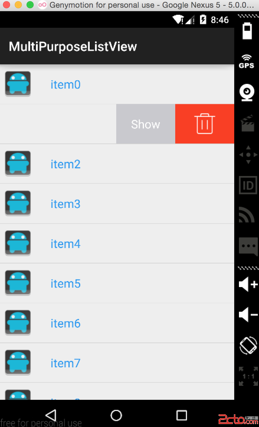 Android源碼解析--SwipeMenuListView仿QQ聊天左滑
 快速搭建Android開發環境ADT-Bundle及Hello World
 Android五大布局Layout
 Android應用中使用ViewPager和ViewPager指示器來制作Tab標簽