android 控件眾多 , 額 , 具體多少個呢? 貌似有那麼幾十個吧,也沒做個統計,嘿嘿!......
有木有朋友感覺寫了那麼長時間的android代碼,有時候想寫點自己的東西的時候卻發現自己好像離不開網絡耶,什麼都需要先到網絡上遨游一番才能解決自己的問題。思前想後,個人覺得還是有必要鞏固一下自己學習過的東西——想想以前這些東西,自己都寫過一遍了,但是折騰一段時間下來都不知道放哪裡去了........
好了,廢話不多說了,這次准備重新學習一下android的常用控件TextView、EditText、AutoCompleteTextView、Button、CalendarView、CheckBox、Chronometer、CompoundButton、DatePicker、DigitalClock、ExpandableListView、Gallery、GridView、HorizontalScrollView、ImageButton、ImageSwitcher、ImageView、ListPopupWindow、ListView、MultiAutoCompleteTextView、NumberPicker、PopupMenu、PopupWindow、ProgressBar、QuickContactBadge、RadioButton、RadioGroup、RatingBar、RemoteViews、ScrollView、SearchView、SeekBar、SlidingDarwer、Switch、TableHost、TextClock、TextSwitcher、TimePicker、Toast、ToggleButton、VideoView、ViewFlipper、ViewSwitcher、ZoomButton等控件。
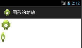
今天學習Button控件,button的相關屬性如:style、android:text 、android:gravity 、 android:layout_weight 等就自己去研究,今天主要講一下自定義button背景和selector的使用。先看一看效果圖(注意:本文中的代碼寫在工程SelfDefineWidget中),具體內容參見一步一步學android控件(之一) —— 開始篇
目前看到途中的效果是點擊了“使用自定義的Drawable定義button背景” 後的效果。
使用button常常需要我們使用selector,所以本文中所有自定義button背景都使用自定義的selector。
由於Button中的字體和TextView中的字體變化方法類似,這裡就不在做了。本文主要涉及到使用單一顏色定義Button背景和自定義Drawable定義背景。從上圖中看到有兩個按鈕:
1、點擊按鈕 “使用單一色定義button背景”, 將看到一個以 顏色#BBBBBB為背景的button。
2、點擊“使用自定義的Drawable定義button背景”看到如圖效果——是一個自定義的drawable對象,詳細內容見下文。
上述自定義的背景也可以在layout文件中使用android:background 屬性指定。
下面就一步一步實現上述功能(對下述內容有疑問的請參見一步一步學android控件(之一) —— 開始篇)。
1、在strings.xml文件中添加需要的字串,
[html]
<!-- strings for Button -->
<string name="default_Button_str">這是默認的Button的樣式</string>
<string name="customer_bg_color_str">使用單一色定義button背景</string>
<string name="customer_bg_drawable_str">使用自定義的Drawable定義buton背景</string>
<!-- end -->
2、在widget_color.xml(該文件的創建參見 一步一步學android控件(之二) —— TextView)添加如下顏色值
[html]
<color name="button_normal_color">#BBBBBB</color>
<color name="button_focused_color">#333333</color>
<color name="button_pressed_color">#CC6633</color>
<color name="button_drawable_normal_start">#666666</color>
<color name="button_drawable_normal_center">#9966CC</color>
<color name="button_drawable_normal_end">#666666</color>
<color name="button_drawable_focused_start">#CC66CC</color>
<color name="button_drawable_focused_center">#990033</color>
<color name="button_drawable_focused_end">#CC66CC</color>
<color name="button_drawable_pressed_start">#99CC00</color>
<color name="button_drawable_pressed_center">#FF3300</color>
<color name="button_drawable_pressed_end">#99CC00</color>
3、在res/layout目錄創建button_detail.xml,內容如下
[html]
<?xml version="1.0" encoding="utf-8"?>
<RelativeLayout xmlns:android="http://schemas.android.com/apk/res/android"
android:layout_width="match_parent"
android:layout_height="match_parent"
android:gravity="center_horizontal" >
<LinearLayout
android:id="@+id/linearLayout1_button"
android:layout_width="match_parent"
android:layout_height="wrap_content"
android:layout_alignParentLeft="true"
android:layout_alignParentTop="true" >
<Button
android:id="@+id/customer_bg_color"
style="?android:attr/buttonStyleSmall"
android:layout_width="wrap_content"
android:layout_height="wrap_content"
android:text="@string/customer_bg_color_str" />
</LinearLayout>
<LinearLayout
android:layout_width="match_parent"
android:layout_height="wrap_content"
android:layout_below="@+id/linearLayout1_button" >
<Button
android:id="@+id/customer_bg_drawable"
style="?android:attr/buttonStyleSmall"
android:layout_width="wrap_content"
android:layout_height="wrap_content"
android:text="@string/customer_bg_drawable_str" />
</LinearLayout>
<Button
android:id="@+id/show_button_detail"
android:layout_width="match_parent"
android:layout_height="wrap_content"
android:layout_alignParentBottom="true"
android:layout_marginBottom="100dp"
android:singleLine="true"
android:text="@string/default_Button_str" />
</RelativeLayout>
其中show_button_detail是用來顯示效果的button,即上圖中最底端的button。
4、基本布局文件創建好後,就該添加進入到該界面的控件和事件響應
4.1 創建activity——WidgetButtonActivity.java
[java]
package com.xy.zt.selfdefinewieget;
import android.app.Activity;
import android.os.Bundle;
import android.view.View;
import android.view.View.OnClickListener;
import android.widget.Button;
public class WidgetButtonActivity extends Activity implements OnClickListener{
private Button mBgColor ;
private Button mBgDrawable ;
private Button mShowBtn;
@Override
public void onCreate(Bundle savedInstanceState) {
super.onCreate(savedInstanceState);
setContentView(R.layout.button_detail);
init();
}
private void init(){
mBgColor = (Button) findViewById(R.id.customer_bg_color);
mBgColor.setOnClickListener(this);
mBgDrawable = (Button) findViewById(R.id.customer_bg_drawable);
mBgDrawable.setOnClickListener(this);
mShowBtn = (Button) findViewById(R.id.show_button_detail);
}
public void onClick(View v) {
switch(v.getId()){
case R.id.customer_bg_color:
mShowBtn.setText(R.string.customer_bg_color_str);
mShowBtn.setBackgroundResource(R.drawable.widget_button_pure_color);
break;
case R.id.customer_bg_drawable:
mShowBtn.setText(R.string.customer_bg_drawable_str);
mShowBtn.setBackgroundResource(R.drawable.widget_button_drawable);
break;
}
mShowBtn.invalidate();
}
}
activity中的內容很簡單,對兩個按鈕 mBgDrawable 和mBgColor 做點擊響應,用mShowBtn顯示定義的效果。
4.2 在ViewData.java 指示將要學習button控件的資源,添加button後ViewData內容如下:
[java]
package com.xy.zt.selfdefinewieget.data;
import java.util.ArrayList;
final public class ViewData {
public final static ArrayList<ViewData> View_Datas = new ArrayList<ViewData>();
public static final int TEXT_VIEW_ID = 90000;
public static final String TEXT_VIEW_NAME = "TextView";
public static final int BUTTON_ID = TEXT_VIEW_ID + 1;
public static final String BUTTON_NAME = "Button";
private static final ViewData mTextView = new ViewData(TEXT_VIEW_NAME,
TEXT_VIEW_ID);
private static final ViewData mButton = new ViewData(BUTTON_NAME, BUTTON_ID);
public final String mViewName;
public final int mViewId;
private ViewData(String name, int id) {
mViewName = name;
mViewId = id;
}
static {
View_Datas.add(mTextView);
View_Datas.add(mButton);
}
}
4.3 資源添加好了後到WidgetsAdapter.java中添加事件響應內容,handleItemClicked函數內容變為如下:
[java]
private void handleItemClicked(int action) {
Intent intent = new Intent();
switch (action) {
case ViewData.TEXT_VIEW_ID:
intent.setClass(mContext, WidgetTextView.class);
mContext.startActivity(intent);
break;
case ViewData.BUTTON_ID:
intent.setClass(mContext, WidgetButtonActivity.class);
mContext.startActivity(intent);
break;
}
}
5、事件響應內容添加完成,為了是程序能夠正常運行我們看到WidgetButtonActivity.java中除了前面已經定義的資源還使用了R.drawable.widget_button_pure_color 和 R.drawable.widget_button_drawable。下面是個文件的內容:
5.1 widget_button_pure_color.xml
[html]
<?xml version="1.0" encoding="utf-8"?>
<selector xmlns:android="http://schemas.android.com/apk/res/android" android:enterFadeDuration="300" android:exitFadeDuration="300">
<item android:drawable="@color/button_normal_color" android:state_window_focused="false"/>
<item android:drawable="@color/button_focused_color" android:state_focused="true"/>
<item android:drawable="@color/button_pressed_color" android:state_pressed="true"/>
<item android:drawable="@color/button_normal_color" android:state_enabled="true"/>
</selector>
5.2 widget_button_drawable.xml
[html]
<?xml version="1.0" encoding="utf-8"?>
<selector xmlns:android="http://schemas.android.com/apk/res/android" android:enterFadeDuration="300" android:exitFadeDuration="300" android:variablePadding="true">
<item android:drawable="@drawable/button_bg_normal" android:state_window_focused="false"/>
<item android:drawable="@drawable/button_bg_focused" android:state_focused="true"/>
<item android:drawable="@drawable/button_bg_pressed" android:state_pressed="true"/>
<item android:drawable="@drawable/button_bg_normal" android:state_enabled="true"/>
</selector>
代碼中使用到了button_bg_normal 、button_bg_focused 、button_bg_pressed 三個文件,他們都在drawable目錄下創建。一下是他們的內容,
button_bg_normal.xml
[html]
<?xml version="1.0" encoding="utf-8"?>
<shape xmlns:android="http://schemas.android.com/apk/res/android"
android:shape="rectangle" >
<gradient
android:startColor="@color/button_drawable_normal_start"
android:centerColor="@color/button_drawable_normal_center"
android:endColor="@color/button_drawable_normal_end"
android:angle="90"
android:type="linear"/>
</shape>
button_bg_focused.xml
[html]
<?xml version="1.0" encoding="utf-8"?>
<shape xmlns:android="http://schemas.android.com/apk/res/android"
android:shape="rectangle" >
<gradient
android:startColor="@color/button_drawable_focused_start"
android:centerColor="@color/button_drawable_focused_center"
android:endColor="@color/button_drawable_focused_end"
android:angle="90"
android:type="linear"/>
</shape>
button_bg_pressed.xml
[html]
<?xml version="1.0" encoding="utf-8"?>
<shape xmlns:android="http://schemas.android.com/apk/res/android"
android:shape="rectangle" >
<gradient
android:startColor="@color/button_drawable_pressed_start"
android:centerColor="@color/button_drawable_pressed_center"
android:endColor="@color/button_drawable_pressed_end"
android:angle="90"
android:type="linear"/>
</shape>
自定義button背景到這裡就結束了。下一個控件EditText。
 Android Selector和Shape的使用方法
 Android中使用ShareSDK功能學習
 Android——Fragment和Activity之間的通信+Frangment生命周期
 Android 讀取assets和raw文件內容實例代碼