編輯:關於Android編程
在《Qt on Android: Qt Quick 事件處理之信號與槽》一文中介紹自定義信號時,舉了一個簡單的例子,定義了一個顏色選擇組件,當用戶在組建內點擊鼠標時,該組件會發出一個攜帶顏色值的信號,當時我使用 Connections 對象連接到組件的 colorPicked 信號,改變文本的顏色。 當時用到的 Component 、 Loader 兩個特性,一直沒來得及介紹,可能很多人都還在霧裡看花呢。這次呢,我們就來仔仔細細地把他們講清楚。
Component 是由 Qt 框架或開發者封裝好的、只暴露了必要接口的 QML 類型,可以重復利用。一個 QML 組件就像一個黑盒子,它通過屬性、信號、函數和外部世界交互。
一個 Component 即可以定義在獨立的 qml 文件中,也可以嵌入到其它的 qml 文檔中來定義。通常我們可以根據這個原則來選擇將一個 Component 定義在哪裡:如果一個 Component 比較小且只在某個 qml 文檔中使用或者一個 Component 從邏輯上看從屬於某個 qml 文檔,那就可以采用嵌入的方式來定義該 Component 。你也可以與 C++ 的嵌套類對比來理解。
《Qt on Android: Qt Quick 事件處理之信號與槽》一文中使用到 Component 的示例 QML 代碼如下:
import QtQuick 2.0
import QtQuick.Controls 1.1

Rectangle {
    width: 320;
    height: 240;
    color: #C0C0C0;

    Text {
        id: coloredText;
        anchors.horizontalCenter: parent.horizontalCenter;
        anchors.top: parent.top;
        anchors.topMargin: 4;
        text: Hello World!;
        font.pixelSize: 32;
    }

    Component {
        id: colorComponent;
        Rectangle {
            id: colorPicker;
            width: 50;
            height: 30;
            signal colorPicked(color clr);
            MouseArea {
                anchors.fill: parent
                onPressed: colorPicker.colorPicked(colorPicker.color);
            }
        }
    }

    Loader{
        id: redLoader;
        anchors.left: parent.left;
        anchors.leftMargin: 4;
        anchors.bottom: parent.bottom;
        anchors.bottomMargin: 4;
        sourceComponent: colorComponent;
        onLoaded:{
            item.color = red;
        }
    }

    Loader{
        id: blueLoader;
        anchors.left: redLoader.right;
        anchors.leftMargin: 4;
        anchors.bottom: parent.bottom;
        anchors.bottomMargin: 4;
        sourceComponent: colorComponent;
        onLoaded:{
            item.color = blue;
        }
    }

    Connections {
        target: redLoader.item;
        onColorPicked:{
            coloredText.color = clr;
        }
    }

    Connections {
        target: blueLoader.item;
        onColorPicked:{
            coloredText.color = clr;
        }
    }
}
其中,顏色選擇組件的定義代碼如下:
    Component {
        id: colorComponent;
        Rectangle {
            id: colorPicker;
            width: 50;
            height: 30;
            signal colorPicked(color clr);
            MouseArea {
                anchors.fill: parent
                onPressed: colorPicker.colorPicked(colorPicker.color);
            }
        }
    }
定義一個 Component 與定義一個 QML 文檔類似, Component 只能包含一個頂層 item ,而且在這個 item 之外不能定義任何數據,除了 id 。比如上面的代碼中,頂層 item 是 Rectangle 對象,在 Rectangle 之外我定義了 id 屬性,其值為 colorComponent 。而頂層 item 之內,則可以包含更多的子元素來協同工作,最終形成一個具有特定功能的組件。
Component 通常用來給一個 view 提供圖形化組件,比如 ListView::delegate 屬性就需要一個 Component 來指定如何顯示列表的每一個項,又比如 ButtonStyle::background 屬性也需要一個 Component 來指定如何繪制 Button 的背景。
Component 不是 Item 的派生類,而是從 QQmlComponent 繼承而來,雖然它通過自己的頂層 item 為其它的 view 提供可視化組件,但它本身是不可見元素。你可以這麼理解:你定義的組件是一個新的類型,它必須被實例化以後才可能顯示。而要實例化一個嵌入在 qml 文檔中定義的組件,則可以通過 Loader 。後面我們詳細講述 Loader ,這裡先按下不表,我們要來看如何在一個文件中定義組件了。
很多時候我們把一個 Component 單獨定義在一個 qml 文檔中,比如 Qt Quick 提供的 BusyIndicator 控件,其實就是在 BusyIndicator.qml 中定義的一個組件。下面是 BusyIndicator.qml 文件的內容:
Control {
    id: indicator

    property bool running: true

    Accessible.role: Accessible.Indicator
    Accessible.name: busy

    style: Qt.createComponent(Settings.style + /BusyIndicatorStyle.qml, indicator)
}
BusyIndicator 組件的代碼非常簡單,只是給 Control 元素(Qt Quick 定義的私有元素,用作其它控件的基類,如 ComboBox 、 BusyIndicator 等)增加了一個屬性、設置了幾個屬性的值,僅此而已。
不知你是否注意到了, BusyIndicator.qml 文件中的頂層 item 是 Control ,而我們使用時卻是以 BusyIndicator 為組件名(類名)。這是我們定義 Component 時要遵守的一個約定:組件名字必須和 qml 文件名一致。好嘛,和 Java 一樣啦,類名就是文件名。還有一點,組件名字的第一個字母必須是大寫。對於在文件中定義一個組件,就這麼簡單了,再沒有其它的特殊要求。 Qt Quick 提供的多數基本元素和特性,你都可以在定義組件時使用。
一旦你在文件中定義了一個組件,就可以像使用標准 Qt Quick 元素一樣使用你的組件。比如我們給顏色選擇組件起個名字叫 ColorPicker ,對應的 qml 文件為 ColorPicker.qml ,那麼你就可以在其它 QML 文檔中使用 ColorPicker {...} 來定義 ColorPicker 的實例。
好啦,現在讓我們來看看在單獨文件中定義的 ColorPicker 組件:
import QtQuick 2.0
import QtQuick.Controls 1.1

Rectangle {
    id: colorPicker;
    width: 50;
    height: 30;
    signal colorPicked(color clr);

    function configureBorder(){
        colorPicker.border.width = colorPicker.focus ? 2 : 0;
        colorPicker.border.color = colorPicker.focus ? #90D750 : #808080;
    }

    MouseArea {
        anchors.fill: parent
        onClicked: {
            colorPicker.colorPicked(colorPicker.color);
            mouse.accepted = true;
            colorPicker.focus = true;
        }
    }
    Keys.onReturnPressed: {
        colorPicker.colorPicked(colorPicker.color);
        event.accepted = true;
    }
    Keys.onSpacePressed: {
        colorPicker.colorPicked(colorPicker.color);
        event.accepted = true;
    }

    onFocusChanged: {
        configureBorder();
    }

    Component.onCompleted: {
        configureBorder();
    }
}
請注意上面的代碼,它和嵌入式定義有明顯不同: Component 對象不見咧!對,就是醬紫滴:在單獨文件內定義組件,不需要 Component 對象,只有在其它 QML 文檔中嵌入式定義組件時才需要 Component 對象。另外,為了能夠讓多個 ColorPicker 組件可以正常的顯示焦點框,我還使用了 onClicked 信號處理器,新增了 onFocusChanged 信號處理器,在它們的實現中調用 configureBorder() 函數來重新設置邊框的寬度和顏色,新增 onReturnPressed 和 onSpacePressed 以便響應回車和空格兩個按鍵。
你可以使用 Item 或其派生類作為組件的根 item 。 ColorPicker 組件使用 Rectangle 作為根 Item 。現在讓我們看看如實在其它文件中使用新定義的 ColorPicker 組件。我修改了上節的示例,新的 qml 文件被我命名為 component_file.qml ,內容如下:
import QtQuick 2.0
import QtQuick.Controls 1.1

Rectangle {
    width: 320;
    height: 240;
    color: #EEEEEE;

    Text {
        id: coloredText;
        anchors.horizontalCenter: parent.horizontalCenter;
        anchors.top: parent.top;
        anchors.topMargin: 4;
        text: Hello World!;
        font.pixelSize: 32;
    }

    function setTextColor(clr){
        coloredText.color = clr;
    }

    ColorPicker {
        id: redColor;
        color: red;
        focus: true;
        anchors.left: parent.left;
        anchors.leftMargin: 4;
        anchors.bottom: parent.bottom;
        anchors.bottomMargin: 4;

        KeyNavigation.right: blueColor;
        KeyNavigation.tab: blueColor;
        onColorPicked:{
            coloredText.color = clr;
        }
    }

    ColorPicker {
        id: blueColor;
        color: blue;
        anchors.left: redColor.right;
        anchors.leftMargin: 4;
        anchors.bottom: parent.bottom;
        anchors.bottomMargin: 4;

        KeyNavigation.left: redColor;
        KeyNavigation.right: pinkColor;
        KeyNavigation.tab: pinkColor;
    }

    ColorPicker {
        id: pinkColor;
        color: pink;
        anchors.left: blueColor.right;
        anchors.leftMargin: 4;
        anchors.bottom: parent.bottom;
        anchors.bottomMargin: 4;

        KeyNavigation.left: blueColor;
        KeyNavigation.tab: redColor;
    }

    Component.onCompleted:{
        blueColor.colorPicked.connect(setTextColor);
        pinkColor.colorPicked.connect(setTextColor);
    }
}
可以看到, component_file.qml 使用 ColorPicker 組件的方式與使用 Rectangle 、 Button 、 Text 等標准 Qt Quick 組件完全一致:可以給組件指定唯一的 id ,可以使用錨布局,可以使用 KeyNavigation 附加屬性……總之,自定義的組件和 Qt Quick 組件並無本質不同。不過需要注意的是,組件實例的 id 和組成組件的頂層 item 的 id 是各自獨立的,以上面的例子來看, redColor 和 colorPicker 是兩個不同的 id ,前者指代組件對象(雖然組件的定義沒有使用 Component ),後者指代 ColorPicker 的 Rectangle 對象。
上面的代碼還演示兩種使用 qml 自定義信號的方式, redColor 使用信號處理器, greeColor 和 pinkColor 則使用了 signal 對象的 connect() 方法連接到 setTextColor() 方法上。
我把 ColorPicker.qml 和 component_file.qml 放在同一個文件下面,否則可能會報錯。圖 1 是運行 qmlscene component_file.qml 命令 的效果:
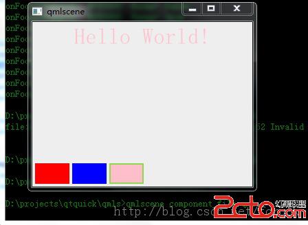
圖 1 在文件中定義組件並使用
對於定義在單獨文件中的 Component ,除了可以像剛剛介紹的那樣使用,也可以使用 Loader 來動態加載,根據需要再創建對象。下面我們就來看 Loader 究竟是何方妖怪。
Loader 用來動態加載 QML 組件。
Loader 可以使用其 source 屬性加載一個 qml 文檔,也可以通過其 sourceComponent 屬性加載一個 Component 對象。當你需要延遲一些對象直到真正需要才創建它們時, Loader 非常有用。 當 Loader 的 source 或 sourceComponent 屬性發生變化時,它之前加載的 Component 會自動銷毀,新對象會被加載。將 source 設置為一個空字符串或將 sourceComponent 設置為 undefined ,將會銷毀當前加載的對象,相關的資源也會被釋放,而 Loader 對象則變成一個空對象。
Loader 的 item 屬性指向它加載的組件的頂層 item ,比如 Loader 加載了我們的顏色選擇組件,其 item 屬性就指向顏色選擇組件的 Rectangle 對象。對於 Loader 加載的 item ,它暴露出來的接口,如屬性、信號等,都可以通過 Loader 的 item 屬性來訪問。所以我們才可以這麼使用:
    Loader{
        id: redLoader;
        anchors.left: parent.left;
        anchors.leftMargin: 4;
        anchors.bottom: parent.bottom;
        anchors.bottomMargin: 4;
        sourceComponent: colorComponent;
        onLoaded:{
            item.color = red;
        }
    }
上面的代碼在 Loader 對象使用 sourceComponent 屬性來加載 id 為 colorComponent 的組件對象,然後在 onLoaded 信號處理器中使用 item 屬性來設置顏色選擇組件的顏色。對於信號的訪問,我們則可以使用 Connections 對象,如下面的 qml 代碼所示:
    Connections {
        target: redLoader.item;
        onColorPicked:{
            coloredText.color = clr;
        }
    }
雖然 Loader 本身是 Item 的派生類,但沒有加載 Component 的 Loader 對象是不可見的,沒什麼實際的意義。而一旦你加載了一個 Component , Loader 的大小、位置等屬性卻可以影響它所加載的 Component 。如果你沒有顯式指定 Loader 的大小,那麼 Loader 會將自己的尺寸調整為與它加載的可見 item 的尺寸一致;如果 Loader 的大小通過 width 、 height 或 錨布局顯式設置了,那麼它加載的可見 item 的尺寸會被調整以便適應 Loader 的大小。不管是哪種情況, Loader 和它所加載的 item 具有相同的尺寸,這確保你使用錨來布局 Loader 就等同於布局它加載的 item 。
我們改變一下顏色選擇器示例的代碼,兩個 Loader 對象,一個設置尺寸一個不設置,看看是什麼效果。新的 qml 文檔我們命名為 loader_test.qml ,內容如下:
import QtQuick 2.0
import QtQuick.Controls 1.1

Rectangle {
    width: 320;
    height: 240;
    color: #C0C0C0;

    Text {
        id: coloredText;
        anchors.horizontalCenter: parent.horizontalCenter;
        anchors.top: parent.top;
        anchors.topMargin: 4;
        text: Hello World!;
        font.pixelSize: 32;
    }

    Component {
        id: colorComponent;
        Rectangle {
            id: colorPicker;
            width: 50;
            height: 30;
            signal colorPicked(color clr);
            MouseArea {
                anchors.fill: parent
                onPressed: colorPicker.colorPicked(colorPicker.color);
            }
        }
    }

    Loader{
        id: redLoader;
        width: 80; // [1]
        height: 60;// [2]
        anchors.left: parent.left;
        anchors.leftMargin: 4;
        anchors.bottom: parent.bottom;
        anchors.bottomMargin: 4;
        sourceComponent: colorComponent;
        onLoaded:{
            item.color = red;
        }
    }

    Loader{
        id: blueLoader;
        anchors.left: redLoader.right;
        anchors.leftMargin: 4;
        anchors.bottom: parent.bottom;
        anchors.bottomMargin: 4;
        sourceComponent: colorComponent;
        onLoaded:{
            item.color = blue;
        }
    }

    Connections {
        target: redLoader.item;
        onColorPicked:{
            coloredText.color = clr;
        }
    }

    Connections {
        target: blueLoader.item;
        onColorPicked:{
            coloredText.color = clr;
        }
    }
}
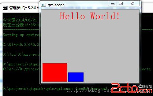
圖 2 Loader 尺寸
如果 Loader 加載的 item 想處理按鍵事件,那麼必須將 Loader 對象的 focus 屬性置 true 。又因為 Loader 本身也是一個焦點敏感的對象,所以如果它加載的 item 處理了按鍵事件,應當將事件的 accepted 屬性置 true ,以免已經被吃掉的事件再傳遞給 Loader 。我們來修改下 loader_test.qml ,加入對焦點的處理,當一個顏色組件擁有焦點時,繪制一個邊框,此時如果你按下回車或空格鍵,會觸發其 colorPicked 信號。同時我們也處理左右鍵,在不同的顏色選擇組件之間切換焦點。將新代碼命名為 loader_focus.qml ,內容如下:
import QtQuick 2.0
import QtQuick.Controls 1.1

Rectangle {
    width: 320;
    height: 240;
    color: #EEEEEE;

    Text {
        id: coloredText;
        anchors.horizontalCenter: parent.horizontalCenter;
        anchors.top: parent.top;
        anchors.topMargin: 4;
        text: Hello World!;
        font.pixelSize: 32;
    }

    Component {
        id: colorComponent;
        Rectangle {
            id: colorPicker;
            width: 50;
            height: 30;
            signal colorPicked(color clr);
            property Item loader;
            border.width: focus ? 2 : 0;
            border.color: focus ? #90D750 : #808080;
            MouseArea {
                anchors.fill: parent
                onClicked: {
                    colorPicker.colorPicked(colorPicker.color);
                    loader.focus = true;
                }
            }
            Keys.onReturnPressed: {
                colorPicker.colorPicked(colorPicker.color);
                event.accepted = true;
            }
            Keys.onSpacePressed: {
                colorPicker.colorPicked(colorPicker.color);
                event.accepted = true;
            }
        }
    }

    Loader{
        id: redLoader;
        width: 80;
        height: 60;
        focus: true;
        anchors.left: parent.left;
        anchors.leftMargin: 4;
        anchors.bottom: parent.bottom;
        anchors.bottomMargin: 4;
        sourceComponent: colorComponent;
        KeyNavigation.right: blueLoader;
        KeyNavigation.tab: blueLoader;

        onLoaded:{
            item.color = red;
            item.focus = true;
            item.loader = redLoader;
        }
        onFocusChanged:{
            item.focus = focus;
        }
    }

    Loader{
        id: blueLoader;
        anchors.left: redLoader.right;
        anchors.leftMargin: 4;
        anchors.bottom: parent.bottom;
        anchors.bottomMargin: 4;
        sourceComponent: colorComponent;
        KeyNavigation.left: redLoader;
        KeyNavigation.tab: redLoader;

        onLoaded:{
            item.color = blue;
            item.loader = blueLoader;
        }
        onFocusChanged:{
            item.focus = focus;
        }
    }

    Connections {
        target: redLoader.item;
        onColorPicked:{
            coloredText.color = clr;
        }
    }

    Connections {
        target: blueLoader.item;
        onColorPicked:{
            coloredText.color = clr;
        }
    }
}
首先我讓顏色選擇組件處理按鍵事件(如忘記請參看《Qt on Android: Qt Quick事件處理之鼠標、鍵盤、定時器》),收到回車和空格鍵時發出 colorPicked 信號。我還給顏色選擇組件定義了一個名為 loader 的屬性,以便鼠標點擊顏色選擇組件時可以改變 Loader 對象的焦點屬性。我們在 Loader 的 onLoaded 信號處理器中給顏色選擇組件的 loader 屬性賦值。
顏色選擇組件根據焦點狀態決定是否繪制邊框,當有焦點時繪制寬度為 2 的邊框。
對於 Loader ,我設置了 KeyNavigation 附加屬性,指定左右鍵和 tab 鍵如何切換焦點,而當焦點變化時,同步改變顏色選擇組件的焦點。最後我設置 redLoader 擁有初始焦點。
圖 2 是運行效果圖:
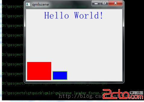
圖 3 loader與按鍵、焦點
你可以使用 qmlscene loader_focus.qml 命令運行看看效果,鼠標點擊某個顏色選擇組件,會觸發焦點切換和邊框變化,左右鍵、 tab 鍵也會觸發焦點變化,而當一個顏色選擇組件擁有焦點時,回車、空格鍵都可以觸發 Hello World! 改變顏色。
之前介紹 Loader 時,我們以嵌入式定義的 Component 為例子說明 Loader 的各種特性和用法,現在我們來看如何從文件加載組件。
對於定義在一個獨立文件中的 Component ,同樣可以使用 Loader 來加載,只要指定 Loader 的 source 屬性即可。現在再來修改下我們的例子,使用 Loader 來加載 ColorPicker 組件。
新的 qml 文檔我命名為 loader_component_file.qml ,內容如下:
import QtQuick 2.0
import QtQuick.Controls 1.1

Rectangle {
    width: 320;
    height: 240;
    color: #EEEEEE;

    Text {
        id: coloredText;
        anchors.horizontalCenter: parent.horizontalCenter;
        anchors.top: parent.top;
        anchors.topMargin: 4;
        text: Hello World!;
        font.pixelSize: 32;
    }

    Loader{
        id: redLoader;
        width: 80;
        height: 60;
        focus: true;
        anchors.left: parent.left;
        anchors.leftMargin: 4;
        anchors.bottom: parent.bottom;
        anchors.bottomMargin: 4;
        source: ColorPicker.qml;
        KeyNavigation.right: blueLoader;
        KeyNavigation.tab: blueLoader;

        onLoaded:{
            item.color = red;
            item.focus = true;
        }

        onFocusChanged:{
            item.focus = focus;
        }
    }

    Loader{
        id: blueLoader;
        focus: true;
        anchors.left: redLoader.right;
        anchors.leftMargin: 4;
        anchors.bottom: parent.bottom;
        anchors.bottomMargin: 4;
        source: ColorPicker.qml;
        KeyNavigation.left: redLoader;
        KeyNavigation.tab: redLoader;

        onLoaded:{
            item.color = blue;
        }

        onFocusChanged:{
            item.focus = focus;
        }
    }

    Connections {
        target: redLoader.item;
        onColorPicked:{
            coloredText.color = clr;
            if(!redLoader.focus){
                redLoader.focus = true;
                blueLoader.focus = false;
            }
        }
    }

    Connections {
        target: blueLoader.item;
        onColorPicked:{
            coloredText.color = clr;
            if(!blueLoader.focus){
                blueLoader.focus = true;
                redLoader.focus = false;
            }
        }
    }
}
一處是將 sourceComponent 修改為 source ,其值為 ColorPicker.qml 。
一處是兩個 Connections 對象,在 onColorPicked 信號處理器中,設置了 Loader 的焦點屬性,因為 只有 Loader 有焦點,它加載的 item 才會有焦點,如果你鼠標點擊某個顏色選擇組件而加載它的 Loader 沒有焦點,那麼雖然顏色可以改變,但是焦點框出不來。
使用 Loader 加載定義在 qml 文檔中的組件,比直接使用組件名構造對象要繁瑣得多,但如果你的應用會根據特定的情景來決定某些界面元素是否顯示,這種方式也許可以滿足你。
現在我們看看如何動態創建、銷毀組件。下面是 dynamic_component.qml :
import QtQuick 2.0
import QtQuick.Controls 1.1

Rectangle {
    width: 320;
    height: 240;
    color: #EEEEEE;
    id: rootItem;
    property var colorPickerShow : false;

    Text {
        id: coloredText;
        anchors.horizontalCenter: parent.horizontalCenter;
        anchors.top: parent.top;
        anchors.topMargin: 4;
        text: Hello World!;
        font.pixelSize: 32;
    }

    Button {
        id: ctrlButton;
        text: Show;
        anchors.left: parent.left;
        anchors.leftMargin: 4;
        anchors.bottom: parent.bottom;
        anchors.bottomMargin: 4;

        onClicked:{
           if(rootItem.colorPickerShow){
               redLoader.source = ;
               blueLoader.source = ;
               rootItem.colorPickerShow = false;
               ctrlButton.text = Show;
           }else{
               redLoader.source = ColorPicker.qml;
               redLoader.item.colorPicked.connect(onPickedRed);
               blueLoader.source = ColorPicker.qml;
               blueLoader.item.colorPicked.connect(onPickedBlue);
               redLoader.focus = true;
               rootItem.colorPickerShow = true;
               ctrlButton.text = Hide;
           }
        }
    }

    Loader{
        id: redLoader;
        anchors.left: ctrlButton.right;
        anchors.leftMargin: 4;
        anchors.bottom: ctrlButton.bottom;

        KeyNavigation.right: blueLoader;
        KeyNavigation.tab: blueLoader;

        onLoaded:{
            if(item != null){
                item.color = red;
                item.focus = true;
            }
        }

        onFocusChanged:{
            if(item != null){
                item.focus = focus;
            }
        }
    }

    Loader{
        id: blueLoader;
        anchors.left: redLoader.right;
        anchors.leftMargin: 4;
        anchors.bottom: redLoader.bottom;

        KeyNavigation.left: redLoader;
        KeyNavigation.tab: redLoader;

        onLoaded:{
            if(item != null){
                item.color = blue;
            }
        }

        onFocusChanged:{
            if(item != null){
                item.focus = focus;
            }
        }
    }

    function onPickedBlue(clr){
        coloredText.color = clr;
        if(!blueLoader.focus){
           blueLoader.focus = true;
           redLoader.focus = false;
        }
    }

    function onPickedRed(clr){
        coloredText.color = clr;
        if(!redLoader.focus){
           redLoader.focus = true;
           blueLoader.focus = false;
        }
    }
}
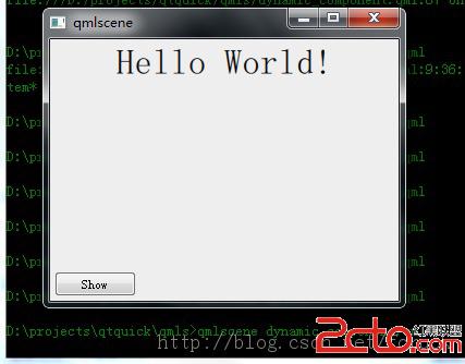
圖 4 動態創建組件初始效果
當你點擊 Show 按鍵,代碼通過設置 redLoader 和 blueLoader 的 source 來創建顏色選擇組件,連接顏色組件的 colorPicked 信號到相應的方法,同時將改變按鈕文字,也改變 rootItem 維護的顏色組件是否顯示的標志位以便下次再點擊按鈕可以正常顯示。圖 5 是顏色選擇組件顯示後的效果圖:
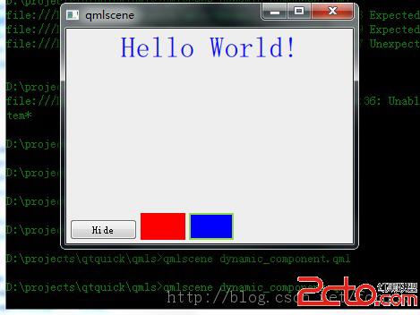
圖 5 顏色組件創建後的效果
使用 Loader 控制組件的動態創建與銷毀,只是 Qt Quick 提供的動態維護對象的兩種方式中的一種。還有一種,是在 JavaScript 中動態創建 QML 對象。
QML 支持在 JavaScript 中動態創建對象。這對於延遲對象的創建、縮短應用的啟動時間都是有幫助的。同時這種機制也使得我們可以根據用戶的輸入或者某些事件來動態的將可見元素添加到應用場景中。
在 JavaScript 中,有兩種方式可以動態地創建對象:
使用 Qt.createComponent() 動態地創建一個組件對象,然後使用 Component 的 createObject() 方法創建對象使用 Qt.createQmlObject() 從一個 QML 字符串直接創建一個對象
如果你在一個 qml 文件中定義了一個組件(比如我們的 ColorPicker ),而你想動態地創建它的實例,使用 Qt.createComponent() 是比較好的方式;而如果你的 QML 對象本身是在應用運行時產生的,那 Qt.createQmlObject() 可能是比較好的選擇。
Qt 對象的 createComponent() 方法可以根據 QML 文件動態的創建一個組件。一旦你擁有了組件對象,就可以調用它的 createObject() 方法創建一個組件的實例。下面是我們新的示例, qml 文件是 qt_create_component.qml :
import QtQuick 2.0
import QtQuick.Controls 1.1

Rectangle {
    id: rootItem;
    width: 360;
    height: 300;
    property var count: 0;
    property Component component: null;

    Text {
        id: coloredText;
        text: Hello World!;
        anchors.centerIn: parent;
        font.pixelSize: 24;
    }

    function changeTextColor(clr){
        coloredText.color = clr;
    }

    function createColorPicker(clr){
        if(rootItem.component == null){
            rootItem.component = Qt.createComponent(ColorPicker.qml);
        }
        var colorPicker;
        if(rootItem.component.status == Component.Ready) {
            colorPicker = rootItem.component.createObject(rootItem, {color : clr, x : rootItem.count *55, y : 10});
            colorPicker.colorPicked.connect(rootItem.changeTextColor);
        }

        rootItem.count++;
    }

    Button {
        id: add;
        text: add;
        anchors.left: parent.left;
        anchors.leftMargin: 4;
        anchors.bottom: parent.bottom;
        anchors.bottomMargin: 4;
        onClicked: {
            createColorPicker(Qt.rgba(Math.random(), Math.random(), Math.random(), 1));
        }
    }
}
圖 6 是示例啟動後的界面:
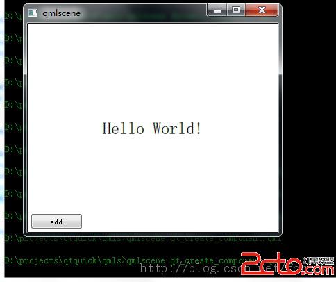
圖 6 qt create component 初始效果
圖 7 是我點擊了 6 次 add 按鈕後的效果:
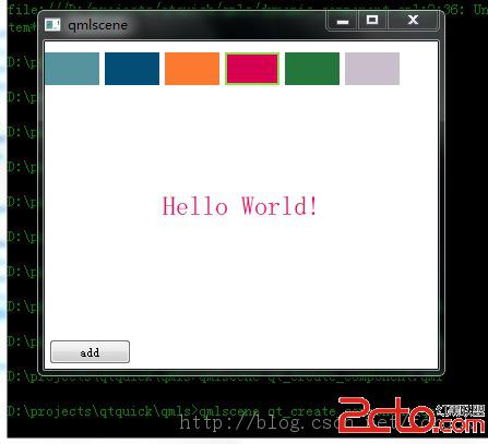
圖 7 動態創建了顏色選擇組件
好啦,現在讓我們來看看代碼。
我在 qt_create_component.qml 中定義了 createColorPicker() 函數,該函數的參數是顏色值,它根據顏色值來創建一個顏色選擇組件實例。首先它判斷 rootItem 的 component 屬性如果為 null ,就調用 Qt.createComponent() 創建一個 ColorPicker 組件,然後調用 Component.createObject() 創建一個顏色選擇組件實例。 createObject() 方法有兩個參數,第一個參數用來指定創建出來的 item 的 parent ,第二個參數用來傳遞初始化參數給待創建的 item ,這些參數以 key - value 的形式保存在一個對象中。我在創建顏色組件實例時,傳遞顏色、 x 、 y 三個屬性給待創建的 item ,於是你看到了,那些色塊都在界面頂部。創建了顏色選擇組件實例,我調用 colorPicked 信號的 connect() 方法,連接 rootItem 的 changeTextColor 方法,以便用戶點擊色塊時改變 Hello World! 文本的顏色。
再來看 add 按鈕,它的 onClicked 信號處理器,調用 Math 對象的隨機函數 random() 和 Qt.rgba() ,隨機生成一個 Color 對象,傳遞給 createColorPicker() 方法來創建指定顏色的顏色選擇組件實例。
提一下,對於嵌入在 qml 文檔內定義的 Component ,因為 Component 對象是現成的,可以略去 Qt.createComponent() 調用,直接使用 createObject() 方法創建組件實例。
代碼就這麼簡單,解說到此為止。現在讓我們看看怎麼使用 Qt.createQmlObject() 來創建對象。
var newObject = Qt.createQmlObject('import QtQuick 2.0; Rectangle {color: red; width: 20; height: 20}',
    parentItem, dynamicSnippet1);
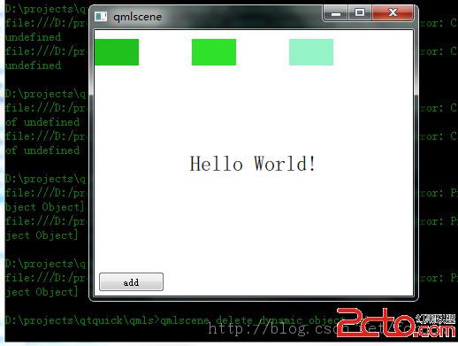
對於動態創建的對象,該如何銷毀呢?
import QtQuick 2.0
import QtQuick.Controls 1.1

Rectangle {
    id: rootItem;
    width: 360;
    height: 300;
    property var count: 0;
    property Component component: null;

    Text {
        id: coloredText;
        text: Hello World!;
        anchors.centerIn: parent;
        font.pixelSize: 24;
    }

    function changeTextColor(clr){
        coloredText.color = clr;
    }

    function createColorPicker(clr){
        if(rootItem.component == null){
            rootItem.component = Qt.createComponent(ColorPicker.qml);
        }
        var colorPicker;
        if(rootItem.component.status == Component.Ready) {
            colorPicker = rootItem.component.createObject(rootItem, {color : clr, x : rootItem.count *55, y : 10});
            colorPicker.colorPicked.connect(rootItem.changeTextColor);
            //[1] add 3 lines to delete some obejcts
            if(rootItem.count % 2 == 1) {
                colorPicker.destroy(1000);
            }
        }

        rootItem.count++;
    }

    Button {
        id: add;
        text: add;
        anchors.left: parent.left;
        anchors.leftMargin: 4;
        anchors.bottom: parent.bottom;
        anchors.bottomMargin: 4;
        onClicked: {
            createColorPicker(Qt.rgba(Math.random(), Math.random(), Math.random(), 1));
        }
    }
}
import QtQuick 2.0
import QtQuick.Controls 1.1

Rectangle {
    id: rootItem;
    width: 360;
    height: 300;
    property var count: 0;
    property Component component: null;
    property var dynamicObjects: new Array();

    Text {
        id: coloredText;
        text: Hello World!;
        anchors.centerIn: parent;
        font.pixelSize: 24;
    }

    function changeTextColor(clr){
        coloredText.color = clr;
    }

    function createColorPicker(clr){
        if(rootItem.component == null){
            rootItem.component = Qt.createComponent(ColorPicker.qml);
        }
        var colorPicker;
        if(rootItem.component.status == Component.Ready) {
            colorPicker = rootItem.component.createObject(rootItem, {color : clr, x : rootItem.dynamicObjects.length *55, y : 10});
            colorPicker.colorPicked.connect(rootItem.changeTextColor);
            rootItem.dynamicObjects[rootItem.dynamicObjects.length] = colorPicker;
            console.log(add, rootItem.dynamicObject.length = , rootItem.dynamicObjects.length);
        }
    }

    Button {
        id: add;
        text: add;
        anchors.left: parent.left;
        anchors.leftMargin: 4;
        anchors.bottom: parent.bottom;
        anchors.bottomMargin: 4;
        onClicked: {
            createColorPicker(Qt.rgba(Math.random(), Math.random(), Math.random(), 1));
        }
    }
    Button {
        id: del;
        text: del;
        anchors.left: add.right;
        anchors.leftMargin: 4;
        anchors.bottom: add.bottom;
        onClicked: {
            console.log(rootItem.dynamicObject.length = , rootItem.dynamicObjects.length);
            if(rootItem.dynamicObjects.length > 0){
                var deleted = rootItem.dynamicObjects.splice(-1, 1);
                deleted[0].destroy();
            }
        }
    }
}
 Android利用ViewPager實現滑動廣告板實例源碼
•android-support-v4.jar,這是谷歌官方給我們提供的一個兼容低版本Android設備的軟件包,裡面包囊了只有在Android3.0以上可以
 Android——Fragment介紹及兩種基本使用方法
今天在調ViewPager的時候,感覺ViewPager+Fragment這種做法更靈活,所以,現在拿出來Fragment再整理下。 一,為什麼要用
 Android中AutoCompleteTextView與TextWatcher結合小實例
AutoCompleteTextView是實現動態匹配輸入內容的一種輸入框(EditText),如輸入“and”時,會提示“Android”效果圖:實現代碼:packag
 使用數據源碼解析Android中的Adapter、BaseAdapter、ArrayAdapter、SimpleAdapter和SimpleCursorAdapter
Adapter相當於一個數據源,可以給AdapterView提供數據,並根據數據創建對應的UI,可以通過調用AdapterView的setAdapter方法使得Adapt