編輯:關於Android編程
This lesson teaches you to
1.Use an Android Theme
2.Customize the Background
3.Customize the Text Color
4.Customize the Tab Indicator
You should also read
•Styles and Themes
•Android Action Bar Style Generator
這節課教你
1.使用Android的主題
2.自定義背景
3.自定義文本顏色
4.自定義選項卡指示器
你也應該閱讀
•樣式和主題
•Android的操作欄樣式生成器
The action bar provides your users a familiar and predictable way to perform actions and navigate your app, but that doesn't mean it needs to look exactly the same as it does in other apps. If you want to style the action bar to better fit your product brand, you can easily do so using Android's style and theme resources.
操作欄中提供了用戶熟悉的和可預測的方式來進行操作和浏覽您的應用程序,但是,這並不意味著它必須看起來完全因為它在其他應用程序一樣。如果你想樣式化操作欄,以更好地滿足您的產品商標,你可以很容易做到使用Android的風格和主題資源。
Android includes a few built-in activity themes that include dark or light action bar styles. You can also extend these themes to further customize the look for your action bar.
Android包括一些內置活動主題,包括“黑暗dark”或“輕light”操作欄的樣式。您還可以擴展這些主題進一步定制的外觀為您操作欄。
Note: If you are using the Support Library APIs for the action bar, then you must use (or override) the Theme.AppCompat family of styles (rather than the Theme.Holo family, available in API level 11 and higher). In doing so, each style property that you declare must be declared twice: once using the platform's style properties (the android: properties) and once using the style properties included in the Support Library (the appcompat.R.attr properties—the context for these properties is actually your app). See the examples below for details.
注:如果您使用的是支持庫的API操作欄中,則必須使用(或重寫)的Theme.AppCompat家族的風格(而不是Theme.Holo家庭,提供API級別11或更高)。這樣做,你聲明每個樣式屬性必須被聲明兩次:一次使用平台的樣式屬性(是Android:屬性),一旦使用的樣式屬性包含在支持庫(該appcompat.R.attr屬性 - 的上下文這些特性實際上是你的應用程序)。詳情參見下面的例子。
--------------------------------------------------------------------------------
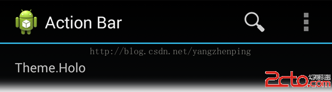
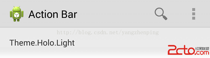
Android includes two baseline activity themes that dictate the color for the action bar:
•Theme.Holo for a dark theme.
•Theme.Holo.Light for a light theme.
Android的包括兩個基本的活動主題,決定了操作欄的顏色:
•Theme.Holo一個“黑暗drak”的主題。
•Theme.Holo.Light一個“光light”的主題。
You can apply these themes to your entire app or to individual activities by declaring them in your manifest file with the android:theme attribute for the element or individual elements.
您可以通過聲明他們在您的manifest清單文件與為元素或獨立的元素的android:theme屬性來適用於您的整個應用程序或單獨活動。
For example:
例如:
You can also use a dark action bar while the rest of the activity uses the light color scheme by declaring the Theme.Holo.Light.DarkActionBar theme.
您也可以使用深色操作欄,而活動的其余部分通過聲明Theme.Holo.Light.DarkActionBar主題使用光的配色方案。
When using the Support Library, you must instead use the Theme.AppCompat themes:
•Theme.AppCompat for the dark theme.
•Theme.AppCompat.Light for the light theme.
•Theme.AppCompat.Light.DarkActionBar for the light theme with a dark action bar.
當使用支持庫,則必須改用Theme.AppCompat主題:
•Theme.AppCompat為“黑暗dark”的主題。
•Theme.AppCompat.Light為“光light”的主題。
•Theme.AppCompat.Light.DarkActionBar為主題的光light與暗的操作欄。
Be sure that you use action bar icons that properly contrast with the color of your action bar. To help you, the Action Bar Icon Pack includes standard action icons for use with both the Holo light and Holo dark action bar.
請確保您使用的操作欄圖標,適當的和你的操作欄的顏色對比。為了幫助您的操作欄圖標包包括標准動作圖標同時與Holo light光與黑暗drak 操作欄使用。
--------------------------------------------------------------------------------
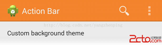
To change the action bar background, create a custom theme for your activity that overrides the actionBarStyle property. This property points to another style in which you can override the background property to specify a drawable resource for the action bar background.
要改變操作欄背景,創建自定義主題為您的活動,覆蓋actionBarStyle屬性。此屬性指向另一種風格中,你可以重寫background屬性來指定動作欄背景繪制的資源。
If your app uses navigation tabs or the split action bar, then you can also specify the background for these bars using the backgroundStacked and backgroundSplit properties, respectively.
如果你的應用程序使用的導航選項卡或拆分操作欄,那麼你也可以指定背景這些酒吧使用backgroundStacked和backgroundSplit屬性,分別。
Caution: It's important that you declare an appropriate parent theme from which your custom theme and style inherit their styles. Without a parent style, your action bar will be without many style properties unless you explicitly declare them yourself.
注意:這是你聲明的合適的父主題,從您的自定義主題和風格繼承他們的風格是很重要的。如果沒有父母樣式化,你的操作欄將不很多樣式屬性,除非你明確自己聲明它們。
When supporting Android 3.0 and higher only, you can define the action bar's background like this:
當支持Android的3.0和更高版本,可以定義操作欄的背景是這樣的:
res/values/themes.xml
{C}
{C}
Then apply your theme to your entire app or individual activities:
那麼你的主題應用到整個應用程序或個人活動:
When using the Support Library, the same theme as above must instead look like this:
當使用支持庫,與上面相同的主題,而必須是這樣的:
res/values/themes.xml
{C}
{C}
Then apply your theme to your entire app or individual activities:
那麼你的主題應用到整個應用程序或個人活動:
--------------------------------------------------------------------------------
To modify the color of text in the action bar, you need to override separate properties for each text element:
要修改操作欄中文本的顏色,你需要重寫每一個文本元素單獨的屬性:
•Action bar title: Create a custom style that specifies the textColor property and specify that style for the titleTextStyle property in your custom actionBarStyle.
•操作欄標題:創建一個自定義樣式,指定textColor屬性,並指定風格的自定義actionBarStyle的titleTextStyle屬性。
Note: The custom style applied to titleTextStyle should use TextAppearance.Holo.Widget.ActionBar.Title as the parent style.
注:適用於titleTextStyle自定義風格應該使用TextAppearance.Holo.Widget.ActionBar.Title父風格。
•Action bar tabs: Override actionBarTabTextStyle in your activity theme.
•操作欄選項卡:在您的活動主題覆蓋actionBarTabTextStyle。
•Action buttons: Override actionMenuTextColor in your activity theme.
•動作按鈕:在您的活動主題覆蓋actionMenuTextColor。
When supporting Android 3.0 and higher only, your style XML file might look like this:
當支持Android的3.0和更高版本,你的風格XML文件可能是這樣的:
res/values/themes.xml
{C}
{C}
{C}
{C}
When using the Support Library, your style XML file might look like this:
當使用支持庫,你的風格XML文件可能是這樣的:
res/values/themes.xml
{C}
{C}
{C}
{C}
--------------------------------------------------------------------------------
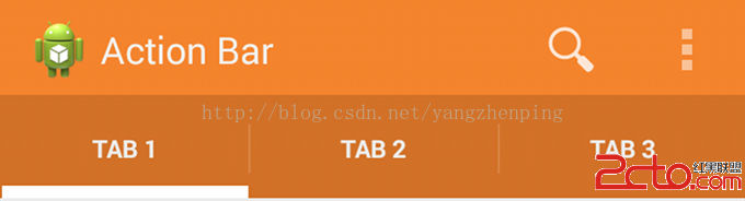
To change the indicator used for the navigation tabs, create an activity theme that overrides the actionBarTabStyle property. This property points to another style resource in which you override the background property that should specify a state-list drawable.
要更改用於導航標簽的指示,創建一個活動主題,覆蓋actionBarTabStyle屬性。此屬性指向在其中覆蓋應該指定一個狀態的列表繪制背景屬性另一種風格的資源。
Note: A state-list drawable is important so that the tab currently selected indicates its state with a background different than the other tabs. For more information about how to create a drawable resource that handles multiple button states, read the State List documentation.
注:狀態列表繪制很重要,這樣當前選擇的選項卡指示比其他標簽不同背景的狀態。有關如何創建一個處理多個按鈕狀態的可繪制資源的更多信息,請閱讀狀態列表文件。
For example, here's a state-list drawable that declares a specific background image for several different states of an action bar tab:
例如,這裡有一個狀態列表繪制聲明一個操作欄選項卡的幾種不同的狀態特定的背景圖片:
res/drawable/actionbar_tab_indicator.xml
android:drawable=@drawable/tab_unselected />
android:drawable=@drawable/tab_selected />
android:drawable=@drawable/tab_unselected_focused />
android:drawable=@drawable/tab_selected_focused />
android:drawable=@drawable/tab_unselected_pressed />
android:drawable=@drawable/tab_selected_pressed />
android:drawable=@drawable/tab_unselected_pressed />
android:drawable=@drawable/tab_selected_pressed />
When supporting Android 3.0 and higher only, your style XML file might look like this:
當支持Android的3.0和更高版本,你的風格XML文件可能是這樣的:
res/values/themes.xml
When supporting Android 3.0 and higher only, your style XML file might look like this:
當支持Android的3.0和更高版本,你的風格XML文件可能是這樣的:
res/values/themes.xml
When using the Support Library, your style XML file might look like this:
當使用支持庫,你的風格XML文件可能是這樣的:
res/values/themes.xml
More resources
•See more style properties for the action bar are listed in the Action Bar guide.
•Learn more about how themes work in the Styles and Themes guide.
•For even more complete styling for the action bar, try the Android Action Bar Style Generator.
更多資源
•請參閱列在操作欄引導更多的樣式屬性的操作欄。
•了解更多關於主題的樣式和主題指導如何工作的。
•為了更完整造型的操作欄,嘗試了Android操作欄樣式生成器。
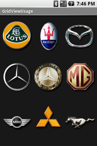 Android應用開發中使用GridView網格布局的代碼示例
基本布局演示1. 定義包含GridView 的 main.xmk<?xml version=1.0 encoding=utf-8?><L
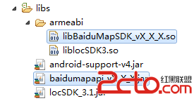 百度地圖 Android SDK - Hello Baidu Map
如下內容主要向廣大開發者介紹如何利用百度地圖Android SDK來構建一個最基本的地圖應用! 第一步,創建Android工程,將百度地圖Android SDK的開發包導
 Android自定義鍵盤之漢字鍵盤
一、軟鍵盤介紹實現軟鍵盤主要用到了系統的兩個類:Keyboard和KeyboardView。Keyboard類源碼的介紹是: Listener for virtual k
 微信怎麼群發消息 微信群發信息教程
現在大家很少用短信和飛信發信息了,自從微信出現後,微信可以說已經慢慢替代了短信,飛信,QQ等通信方式,很多朋友都選擇使用微信和朋友們溝通和交流,在節假日的時