布局是用來裝控件,也是規定控件的排列方式的;
五大布局:FrameLayout (幀布局)
LinearLayout (線性布局)
AbsoluteLayout(絕對布局)
RelativeLayout(相對布局)
TableLayout(表格布局)
FrameLayout:所有東西依次都放在左上角,會重疊,這個布局比較簡單,也只能放一點比較簡單的東西。
LinearLayout:線性布局,每一個LinearLayout裡面又可分為垂直布局(android:orientation="vertical")和水平布局 (android:orientation="horizontal" )。當垂直布局時,每一行就只有一個元素,多個元素依次垂直往下;水平布局時,只有一行,每一個元素依次向右排列。
AbsoluteLayout:絕對布局用X,Y坐標來指定元素的位置,這種布局方式也比較簡單,但是在屏幕旋轉時,往往會出問題,而且多個元素的時候,計算比較麻煩。
RelativeLayout:相對布局可以理解為某一個元素為參照物,來定位的布局方式。主要屬性有:相對於某一個元素android:layout_below、 android:layout_toLeftOf相對於父元素的地方android:layout_alignParentLeft、android:layout_alignParentRigh;
TableLayout:表格布局,每一個TableLayout裡面有表格行TableRow,TableRow裡面可以具體定義每一個元素。每一個布局都有自己適合的方式,這五個布局元素可以相互嵌套應用,做出美觀的界面。
View的屬性
View及其子元素常用屬性:(各種布局及控件的共同屬性)
android:id @+id/名字 @id/名字
android:background 背景圖或背景色
#rbg
#argb alpha ===透明度
#rrggbb 與 #rgb區別 16進制 ff=256
#aarrggbb
#圖片
android:onClick 為該控件的單擊事件綁定監聽器 --Button講
android:padding 設置控件四周的填充區域 內邊距
android:paddingBottom="@dimen/activity_vertical_margin"
android:paddingLeft="@dimen/activity_horizontal_margin"
android:paddingRight="@dimen/activity_horizontal_margin"
android:paddingTop= 四個屬性 == android:padding
如果寫在布局裡就是控制控件相對布局的邊距
如果寫在控件裡就是控制控件內容相對控件的邊距
android:visibility 設置該控件是否可見
visible 可見
invisible 不可見 但是占著位置
gone 不可見 不占位
android:alpha 設置該組件透明度(0-1)
android:layout_height 組件的布局高度
android:layout_width 組件的布局寬度
定值 單位 dp match_parent fill_parent 2.2過時 推薦使用 match_parent
wrap_content 包裹內容 推薦使用 用屏幕適配
android:layout_margin 設置子組件的 --外邊距
一般應用於聊天界面 聊天內容句圖片的邊界
線性布局屬性:
1.android:orientation vertical 、 horizontal 規定子控件 和組件的排列方式 只有水平和垂直 如果已經到屏幕邊緣也不會拐彎
2.android:layout_weight 設置控件的權重。 屏幕適配*** 重要 按比例分
1. 把android:layout_width或者android:layout_height = 0dp 再android:layout_weight屬性 水平寬 垂直高
2. LineearLayout權重總值 等於android:weightSum="2"值 如果 android:weightSum 不存在 才等於子空間權重值的和
3. 權重屬性 控件本身寬度或者高度 + 布局剩余寬度或者高度所占權重比
0 + (1-(0+0))/3 = 1/3
0 + (1-(0+0))/3*2 = 2/3
1 + (1-(1+1))/3 = 2/3
1 + (1-(1+1))/3*2 = 1/3
1 + (1-(3))/8*3 = 1/4
1 + (1-(3))/8*2 = 2/4
1 + (1-(3))/8*3 = 1/4
3.android:gravity
父對子 屬性寫在父裡 控制子控件或者內容的排列位置
例如: 寫在Layout 控制子控件的位置
寫在控件裡 控制內容的位置
bottom top left right center_vertical center_horizontal center
屬性可以拼接 需要 | 分開 center_vertical|center_horizontal相當於 center
相對布局 線性布局都可用 控件也可用
4.android:layout_gravity
子對父 屬性寫在子裡 控制子控件本身相對於父布局的位置
注意:layout_gravity需要看父布局的排列方向(android:orientation)
if 父布局是vertical layout_gravity值 和垂直有關的屬性不能生效
if 父布局是horizontal layout_gravity值 和水平有關的屬性不能生效
RelativeLayout 相對布局
布局對布局的相對位置
控件對布局的相對位置 屬性寫在 子控件裡邊的
控件對控件相對的位置
A、第一組:指兄弟控件之間的相對位置。該組屬性的值是另一個控件的id。
layout_toRightOf 該控件在哪個控件的右側
layout_toLeftOf 該控件在哪個控件的左側
layout_above 該控件在哪個控件的上側
layout_below 該控件在哪個控件的下側
B、第二組:指兄弟控件之間的對齊關系。該組屬性的值是另一個控件的id。
layout_alignRight 該控件與哪個控件的右對齊
layout_alignLeft 該控件與哪個控件的左對齊
layout_alignTop 該控件與哪個控件的頂對齊
layout_alignBottom 該控件與哪個控件的底對齊
C、第三組:指控件與父布局之間的對齊關系。該組屬性的值是true或者false。
layout_alignParentRight 該控件與父布局控件的右對齊嗎?
layout_alignParentLeft 該控件與父布局控件的左對齊嗎?
layout_alignParentTop 該控件與父布局控件的頂端對齊嗎?
layout_alignParentBottom 該控件與父布局控件的底部對齊嗎?
layout_centerInParent 該控件位於父布局控件的中心位置嗎?
layout_centerVertical 該控件位於父布局控件的垂直中心位置嗎?
layout_centerHorizontal 該控件位於父布局控件的水平中心位置嗎?
android基礎控件
TextView 文本視圖
EditText 文本編輯框
Button 按鈕
ImageView、Gallery 圖像視圖、畫廊(建議過期)
ImageButton 圖片按鈕
ToggleButton 、Switch 開關按鈕、開關
RadioButton 單選按鈕
CheckBox 多選框
Spinner 下拉列表
AutoCompleteTextView 自動完成文本框
ProgressBar 進度條 用戶體驗度 很重要
SeekBar 拖動條
RatingBar 星級評分條
TimePicker、DatePicker 時間選擇器、日期選擇器
AnalogClock、DigitalClock 模擬時鐘、數字時鐘
Dialog(AlertDialog、ProgressDialog、TimePickerDialog、DatePickerDialog)提示對話框、進度對話框、時間選擇對話框、日期選擇對話框
ListView、GridView 列表視圖【最重要的UI組件】、 網格視圖
ScrollView 滾動視圖
ExpandableListView 可展開列表視圖
WebView 網頁視圖
SearchView 搜索框
TabHost 書簽選項卡
Notification 、Toast 通知 、 吐司輕量級的提示(短時提醒)
Menu(OptionMenu /SubMenu、ContextMenu) 菜單(選項菜單、上下文菜單)
ImageSwitcher、TextSwitcher 圖像切換器、文本切換器 CardView
ActionBar 動作導航條 ToolBar
TextView
android:textColor 設置文本的顏色
android:textSize 設置文本的字體大小(sp)
android:inputType 設置文本的類型。例如是普通文本,還是email,password,數字等等。 最終目的 就是為了提高用戶體驗度 最常用: textPassword phone number numberPassWord
android:singleLine 設置文本是否是單行顯示。
開發使用: 用於單行商品介紹,防止布局錯位
android:gravity 設置文本框內文本的對齊方式。可選項有:top、bottom、left、right、center、fill、center_vertical、
android:drawableLeft 用於在文本框左側繪制圖片。該屬性值通過“@drawable/圖片文件名”來設置。
android:drawableRight 用於在文本框右側繪制圖片。該屬性值通過“@drawable/圖片文件名”來設置。
android:drawableTop 用於在文本框上側繪制圖片。該屬性值通過“@drawable/圖片文件名”來設置。
android:drawableBottom 用於在文本框下側繪制圖片。該屬性值通過“@drawable/圖片文件名”來設置。
用做底部導航欄 例如微信底部
android:autoLink 給指定的文本增加可單擊的超鏈接。可選項為:none、web、phone 和all。多個選項之間使用“|”分隔,也可以使用all。根據你制定類型 跳轉到指定的程序 : 如 phone類型 android:text=“1111” 回跳到撥號界面
android:hint 設置當文本框內文本內容為空時,默認顯示的提示性文字。 用在 EditText 提示輸入內容
android:textColorHint="" 虛提示的顏色
android:textAllCaps="true" 設置所有字母都大寫
2、 文字過長,設置省略號。可選項:start , end ,middle,marquee
android:ellipsize="start" 省略號在開頭
android:ellipsize="middle" 省略號在中間
android:ellipsize="end" 省略號在結尾
1.width 為固定值 10dp match_parent 文本內容必須要長於width
2.singleLine = true
【備注:】要實現跑馬燈效果。要同時具有以下屬性。
android:ellipsize="marquee"
android:singleLine="true"
android:focusable="true" 是否可以獲取焦點
android:focusableInTouchMode="true" 當觸摸的時候是否獲取焦點
android:marqueeRepeatLimit="marquee_forever" 跑馬燈的模式
跑馬燈的條件:
width 為固定值 10dp match_parent 文本內容必須要長於width
2.singleLine = true
Button EditText 他們的父類是TextView
android:background="@null" 去輸入框下劃線
android:inputType=""
只要類型前面帶 text 例如:textPassword 彈出軟件盤類型是 文本類型
只要類型前面不帶 text 例如 number 彈出數字類型
但是:phone 和 number date time 有一些不同
只要類型後面帶PassWord 你輸入的內容會自動隱藏 --》 用來做登陸密碼
Button
監聽你點擊Button 這就叫點擊監聽
1. onClick屬性方法 //當需要點擊監聽控件少於2個的時候 建議用
(1)在XMLLayout中 給控件添加 android:onClick = "方法名"
(2)在Acticity中 定義一個類型為public類型的方法 參數為View 例如 public void xml中onClick裡的方法名(View v){執行方法體}
android:clickable="true" 是否可以點擊
Button 默認可以點擊 。 TextView默認不可以點擊,如果需要在布局中 聲明onClick 需要同時寫 android:clickable="true"
不需要在Activity中聲明控件,但需要控件的點擊監聽方法
2. 直接設置監聽者 利用匿名內部類 //當需要點擊監聽控件少於2個的時候 建議用
signButton.setOnClickListener(new OnClickListener() {
@Override //當你點按鈕 就走這裡 v就是你點擊的那個按鈕
public void onClick(View v) {
// TODO Auto-generated method stub
//v強轉成button再獲取text再轉成字符串
String str = ((Button)v).getText().toString();
//Toast提示 上下文對象 內容 顯示時間 顯示
Toast.makeText(MainActivity.this, str, Toast.LENGTH_LONG).show();
}
});
3. Activty impelements OnClickListener //當頁面需要點擊監聽的控件多的時候 用它,開發中也是最常用的
1.Activity 實現 OnClickListener
2.添加未實現的方法 : onClick(View v)
3.給控件添加監聽事件 控件.setOnClickListener(this)
如何獲取View id
//獲取View id
int id = v.getId();
ImageView ImageButton
scaleType
matrix 從圖片的左上角開始繪制,當圖片大於ImageView 圖片不會壓縮 也顯示不全 能顯示多大就多大,當圖片小於於ImageView 圖片不會放大 在ImageView的左上角開始顯示
fitxy 會放大或縮小圖片 全部顯示在ImageView 但不會按原來的筆記縮放或者放大 能填滿就行
***開發中 :最長使用的
fitStart 按比例縮放,當圖片 寬>高 ImageView 寬會被填滿 高會有剩余 ,ImageView沒沾滿 圖片顯示全,當圖片 寬<高 ImageView 高會被填滿 寬會有剩余 ,ImageView沒沾滿 圖片顯示全
fitEnd 正好和fitStart相反
fitCenter 默認模式 當圖片寬高比不為1:1 圖片顯示全了 比例沒改變 ImageView顯示不全
當圖片寬或者高到達 ImageView的邊框時 圖片顯示就固定了
center 圖片和ImageView中心對齊 圖片大 就截取ImageView邊框大小部分的圖片
圖片小 在ImageView中間全部顯示
centerCrop 以圖片的小邊基准 填充ImageView 按原比例,大邊溢出的部分修剪掉
圖片顯示不全---》大邊部分顯示不全
centerInside 以圖片的大邊基准 填充ImageView 按原比例,圖片會顯示完全 ImageView沒占滿
在代碼中改變圖片顯示
//方法比較簡單 直接引用資源ID R.drawable.圖片名 顯示res下邊的圖片 Assets無法顯示
1.imageView.setImageResource(R.drawable.ic_launcher);
2.setImageBitmap();
/**
* 拿到Aseets包下的一張圖片 轉成Bitmap 最後賦給ImageView
* Aseets 不會在R文件生成索引
* 通過Stream去拿
* 1.獲取 AssetManager 也就是 Assets管理器
* 2.利用 AssetManager 的open方法去打開一個文件 等到一個流
* BitmapFactory 通過位圖工場 把輸入流轉成一個Bitmap圖片
*/
AssetManager manager = this.getAssets();
InputStream inputStream;
try { //fileName 全稱
inputStream = manager.open("bg.png");
Bitmap bitmap = BitmapFactory.decodeStream(inputStream);
imageView.setImageBitmap(bitmap);
} catch (IOException e) {
// TODO Auto-generated catch block
e.printStackTrace();
}
****getResources() 獲取res資源
3.imageView.setImageDrawable(getResources().getDrawable(R.drawable.ic_launcher));
CheckBox
android:checked="true" 是否選中
isChecked() 它就是判斷checkBox是否選中
setChecked(boolean) checkBox設置是否選中
點擊監聽事件 OnClickListener
* 選中監聽事件 CompoundButton 是 CheckBox 父類 onCheckedChanged
* onCheckedChanged OnClickListener 區別: 1.監聽狀態 2.監聽動作
RadioGroup RadioButton 單選框
setBackgroundColor 放背景顏色
setBackground 設置背景Drawable
View getChildAt(int index)
Returns the view at the specified position in the group.
int getChildCount()
Returns the number of children in the group.
//獲取RadioGroup 被選中狀態的RadioButton 相當於監聽事件的第二個參數
group.getCheckedRadioButtonId();
Selector 選擇器 ***用戶體驗度 每個項目必須要做的
checked 選中狀態 長時間保持
pressed 按壓狀態 即時 在按壓的時候生效
1.數據框架重復顯示
Spinner下拉框
XML Attributes
Attribute Name Related Method Description
android:dropDownHorizontalOffset setDropDownHorizontalOffset(int) Amount of pixels by which the drop down should be offset horizontally.
android:dropDownSelector List selector to use for spinnerMode="dropdown" display.
android:dropDownVerticalOffset setDropDownVerticalOffset(int) Amount of pixels by which the drop down should be offset vertically.
android:dropDownWidth setDropDownWidth(int) Width of the dropdown in spinnerMode="dropdown".
android:gravity setGravity(int) Gravity setting for positioning the currently selected item.
android:popupBackground setPopupBackgroundResource(int) Background drawable to use for the dropdown in spinnerMode="dropdown".
android:prompt The prompt to display when the spinner's dialog is shown.
android:spinnerMode Display mode for spinner options.
1.//填補數據
android:entries
1.1 數據來源
res 自己定義的資源文件 --》 values--> strings.xml
- 值1
- 值2
1.2形勢分析:
1、簡單 方便 快捷
劣勢:
無法動態改變顯示內容
1.2 xml中賦值
android:entries=“@array/數組名字”
android:prompt
1.數據來源
不能直接帶xml中寫入,需要引用res-values-strings
注意: spinnerMode (dropdown,dialog) 只用模式是dialog的時候才會顯示提示!!!!
android:spinnerMode
模式種類
dropdown 下拉框
dialog 彈出框
android:dropDownHorizontalOffset 在4.0以後不生效 android:padiingLeft
Spinner src中使用:
1. 三要素: AdapterView , Data Adapter
2. Adapter類型:
1.ArraAdapter ---》 顯示單條內容為文本的時候 使用它
ArraAdapter
adapter = new ArraAdapter( 1, 2 ,3 );
1.Context 上下文對象 Activity.this
2.單條布局 ---》 TextView --> android.R.layout.simpler_item_list_1
3.Data --> collection 數組和集合
動態添加數據:
adapter.addAll(數組或者集合);
adapter.add(字符串);
2.SimpleAdapter
可以顯示 圖文混排,但是,這裡的圖片只能是來之res-drawable的圖片 如果網絡圖片 BaseAdapter
3.CursorSimpleAdapter
Cursor數據庫數據 CursorSimpleAdapter專門用來顯示數據庫查到的數據的,數據裡必須要有一個字段_id;
select id _id from dbName where
4.BaseAdapter
可以顯示 圖文混排,還自定義單條視圖,例如QQ聊天單條視圖等, 比SimpleAdapter好處是,可以顯示網絡圖片
3.如何顯示讓Spinner/AdapterView顯示
1.定義Adapter
2.數據給Adapter
3.AdapterView.setAdapter(適配器);
4.Spinner監聽事件:
OnItemSelectListener 四個參數: AdapterView , View ,Position,Id
AdapterView : 你點擊的那個AdapterView
View : 點擊的單條視圖
Position : 點擊了第幾條
Id : 每條都會定義一個Id ,Id默認和Position相同
SimpleAdapter
數據類型
List
>
/***
* context: 上下文對象
* data : 數據
* resource: 自定義item布局
* from: 單條map的key
* to : 單條map的Values對應的控件Id 切記 一一對應
*/
final SimpleAdapter adapter =
new SimpleAdapter
(MainActivity.this, list, R.layout.spinner_item,
new String []{"pic","name"}, new int []{R.id.fruit_pic,R.id.fruit_name});
AutoCompleteTextView
android:completionThreshold 從第幾個開始提示
android:dropDownAnchor 在某個控件的下方提示下拉框
textView.addTextChangedListener(new TextWatcher() {
//*** onTextChanged beforeTextChanged 方法裡 不可以對文本進行操作 避免死循環
@Override //光標的位置 //改變後還剩幾個 //改變數量
public void onTextChanged(CharSequence s, int start, int before, int count) {
// TODO Auto-generated method stub
Log.e("onTextChanged", "s:"+s+" start"+start+" before:"+before+" count:"+count);
}
@Override //改後的數量
public void beforeTextChanged(CharSequence s, int start, int count,
//改變之前有幾個
int after) {
// TODO Auto-generated method stub
Log.e("beforeTextChanged", "s:"+s+" start"+start+" before:"+after+" count:"+count);
}
@Override
public void afterTextChanged(Editable s) {
// TODO Auto-generated method stub
Log.e("afterTextChanged", "s:"+s);
//判斷輸入長度
try {
Integer.parseInt(s.toString());
} catch (Exception e) {
// TODO: handle exception
Toast.makeText(MainActivity.this, "你輸入的不是數字", 1).show();
}
}
});
 Android View系統解析(上)
 Key-Value Observing (鍵值監測)
 【Android】RecyclerView詳解(一)
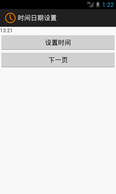 Android開發之時間日期操作實例