編輯:關於Android編程
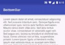
尋尋覓覓終於等到你,Material Design系列BottomBar開源庫你值得擁有。從我接觸android開發遇到tabhost,到radioGroup+ViewPage/FrameLayout的演變,再到官方重做tabhost,縱觀歷史演變,淡看風雲變幻,我心依舊,BottomBar你一直都是我的唯一!!


as項目導入(需要注意該庫的sdk限制: minSdkVersion 11)
compile 'com.roughike:bottom-bar:1.3.2'
① 通過添加menu>item資源
* ② Activity內調用我們需要先保存我們的BottomBar狀態,同時也要恢復BottomBar的狀態,具體做法如下:*
     //將BottomBar綁定到你的活動,抬高你的布局。
     mBottomBar = BottomBar.attach(this, savedInstanceState);

    //...................................

    @Override
    protected void onSaveInstanceState(Bundle outState) {
        super.onSaveInstanceState(outState);

        // 需要恢復BottomBar的狀態
        mBottomBar.onSaveInstanceState(outState);
    }
③ 設置不同選項卡對應不同的顏色,Rcolor.colorAccent系統默認主題相關的控件顏色
  mBottomBar.mapColorForTab(0, ContextCompat.getColor(this, R.color.colorAccent));
  mBottomBar.mapColorForTab(1, 0xFF5D4037);
  mBottomBar.mapColorForTab(2, "#7B1FA2");
  mBottomBar.mapColorForTab(3, "#FF5252");
  mBottomBar.mapColorForTab(4, "#FF9800");
④ 對於MenuItem選中的監聽設置自定義的接口OnMenuTabClickListener
  mBottomBar.setItemsFromMenu(R.menu.bottombar_menu, new OnMenuTabClickListener() {
            @Override
            public void onMenuTabSelected(@IdRes int menuItemId) {

            }

            @Override
            public void onMenuTabReSelected(@IdRes int menuItemId) {

            }
        });
⑤ 如果BottomBar的功能僅此而已還不值得我為此點贊,導航Tab在Im通信領域的消息count顯示,BottomBar也為我們做了很好地實現
       //tab對應消息count以及顏色設定
        BottomBarBadge unreadMessages = mBottomBar.makeBadgeForTabAt(0, "#FF0000", 13);
       // 控制顯示與否
        unreadMessages.show();
       // unreadMessages.hide();

       // 動態單獨改變現實個數
        unreadMessages.setCount(4);

       // 改變顯示隱藏的動畫時間
        unreadMessages.setAnimationDuration(200);

      // 是否沒有選中也要現實消息
        unreadMessages.setAutoShowAfterUnSelection(true);
⑥ BottomBar還提供了定制化開發
       //禁用左側邊導航
        mBottomBar.noTabletGoodness();

       // 顯示所有標題即使有超過三個選項卡。
        mBottomBar.useFixedMode();

        // 使用黑暗的主題。
        mBottomBar.useDarkTheme();

       // 為活動選項卡設置顏色。忽略了在移動時超過三個選項卡。
        mBottomBar.setActiveTabColor("#009688");

        // 使用自定義文本出現在選項卡相關配置。
        mBottomBar.setTextAppearance(R.style.MyTextAppearance);

       // 設置assets目錄下的字體
        mBottomBar.setTypeFace("MyFont.ttf");
⑦ BottomBar在界面發生滑動的時候可以把他隱藏,在滑動結束後在顯示出來,不過這樣就需要改變BottomBar保存狀態的方法
 mBottomBar = BottomBar.attachShy((CoordinatorLayout) findViewById(R.id.myCoordinator),
    findViewById(R.id.myScrollingContent), savedInstanceState);
而xml文件這裡使用CoordinatorLayout為例已對照上列代碼
⑧ BottomBar除了可以通過Menu xml文件導入,我們還可以通過代碼的方式導入項目
mBottomBar.setItems(
  new BottomBarTab(R.drawable.ic_recents, "Recents"),
  new BottomBarTab(R.drawable.ic_favorites, "Favorites"),
  new BottomBarTab(R.drawable.ic_nearby, "Nearby")
);

// Listen for tab changes
mBottomBar.setOnTabClickListener(new OnTabClickListener() {
    @Override
    public void onTabSelected(int position) {
        // The user selected a tab at the specified position
    }

    @Override
    public void onTabReSelected(int position) {
        // The user reselected a tab at the specified position!
    }
});
⑨ BottomBar雖然不能用xml直接布局,但你仍然可以把它放在任何地方的視圖層次。只要把它綁定到任何你想要的任何視圖位置:
mBottomBar.attach(findViewById(R.id.myContent), savedInstanceState);
⑩ 如果你覺得透明的底部導航讓你覺得不開心,你可以禁用它,但是你必須得注意,該方法必須在填充Item前調用否則會拋出異常(更多使用方法請參照API自行了解)
mBottomBar.noNavBarGoodness();
看完上面的使用簡介,我們再來細嚼慢咽品源碼,我一直相信多學習別人的開源項目我們可以收獲很多,今天一定會斬獲良多。廢話不多說,先看開源項目的結構目錄,我們層層滲入。
BadgeCircle BottomBar BottomBarBadge BottomBarFragment BottomBarItemBase BottomBarTab MisicUtils OnMenuTabClickListener OnSizeDeterminedListener OnTabClickListener OnTabSelectedListener BottomNavigationBehavior VerticalScrollingBehavior
① BadgeCircle輔助類創建一個圓形背景圖,涉及到知識點Drawable系列,shape直接子類OvalShape,而Drawable子類ShapeDrawable構造函數傳入OvaShape實例化創建指定大小顏色的背景圖片。
public class BadgeCircle {
    /**
     * Creates a new circle for the Badge background.
     *
     * @param size  the width and height for the circle
     * @param color the color for the circle
     * @return a nice and adorable circle.
     */
    protected static ShapeDrawable make(int size, int color) {
        ShapeDrawable indicator = new ShapeDrawable(new OvalShape());
        indicator.setIntrinsicWidth(size);
        indicator.setIntrinsicHeight(size);
        indicator.getPaint().setColor(color);
        return indicator;
    }
}
② 在了解其他類之前我們得先來看看MiscUtils工具類
class MiscUtils {

    /**
     * 獲取主題顏色
     */
    protected static int getColor(Context context, int color) {
        TypedValue tv = new TypedValue();
        context.getTheme().resolveAttribute(R.attr.colorPrimary, tv, true);
        return tv.data;
    }

    /**
     * Converts dps to pixels nicely.
     * dp轉px
     * @param context the Context for getting the resources
     * @param dp      dimension in dps
     * @return dimension in pixels
     */
    protected static int dpToPixel(Context context, float dp) {
        Resources resources = context.getResources();
        DisplayMetrics metrics = resources.getDisplayMetrics();
        return (int) (dp * (metrics.densityDpi / 160f));
    }

    /**
     * Returns screen width.
     * 獲取屏幕寬度
     * @param context Context to get resources and device specific display metrics
     * @return screen width
     */
    protected static int getScreenWidth(Context context) {
        DisplayMetrics displayMetrics = context.getResources().getDisplayMetrics();
        return (int) (displayMetrics.widthPixels / displayMetrics.density);
    }

    /**
     * A hacky method for inflating menus from xml resources to an array
     * of BottomBarTabs.
     * 從Menu引入BottomBarTab[]資源
     * @param activity the activity context for retrieving the MenuInflater.
     * @param menuRes  the xml menu resource to inflate
     * @return an Array of BottomBarTabs.
     */
    protected static BottomBarTab[] inflateMenuFromResource(Activity activity, @MenuRes int menuRes) {
        // A bit hacky, but hey hey what can I do
        PopupMenu popupMenu = new PopupMenu(activity, null);
        Menu menu = popupMenu.getMenu();
        activity.getMenuInflater().inflate(menuRes, menu);

        int menuSize = menu.size();
        BottomBarTab[] tabs = new BottomBarTab[menuSize];

        for (int i = 0; i < menuSize; i++) {
            MenuItem item = menu.getItem(i);
            BottomBarTab tab = new BottomBarTab(item.getIcon(),
                    String.valueOf(item.getTitle()));
            tab.id = item.getItemId();
            tabs[i] = tab;
        }

        return tabs;
    }

    /**
     * A method for animating width for the tabs.
     * 執行該動畫通過LayoutParams動態改變BottomTabs的寬高
     * @param tab tab to animate.
     * @param start starting width.
     * @param end final width after animation.
     */
    protected static void resizeTab(final View tab, float start, float end) {
        ValueAnimator animator = ValueAnimator.ofFloat(start, end);
        animator.setDuration(150);
        animator.addUpdateListener(new ValueAnimator.AnimatorUpdateListener() {
            @Override
            public void onAnimationUpdate(ValueAnimator animator) {
                ViewGroup.LayoutParams params = tab.getLayoutParams();
                if (params == null) return;

                /***
                 * 1. Math.ceil()用作向上取整。
                 * 2. Math.floor()用作向下取整。
                 * 3. Math.round() 我們數學中常用到的四捨五入取整。
                 */
                params.width = Math.round((float) animator.getAnimatedValue());
                tab.setLayoutParams(params);
            }
        });
        animator.start();
    }

    /**
     * Animate a background color change. Uses Circular Reveal if supported,
     * otherwise crossfades the background color in.
     * 設備支持(API21)圓形擴散波紋,就用這種方式改變背景,否則就通過淡入淡出背景色的方式
     *
     * 觸摸點擊view
     * @param clickedView    the view that was clicked for calculating the start position for the Circular Reveal.
     * 當前展示的背景色
     * @param backgroundView the currently showing background color.
     * 覆蓋後的背景色
     * @param bgOverlay      the overlay view for the new background color that will be
     *                       animated in.
     * 新的顏色
     * @param newColor       the new color.
     */
    @TargetApi(Build.VERSION_CODES.LOLLIPOP)
    protected static void animateBGColorChange(View clickedView, final View backgroundView,
                                               final View bgOverlay, final int newColor) {
        int centerX = (int) (ViewCompat.getX(clickedView) + (clickedView.getMeasuredWidth() / 2));
        int centerY = clickedView.getMeasuredHeight() / 2;
        int finalRadius = backgroundView.getWidth();

        backgroundView.clearAnimation();
        bgOverlay.clearAnimation();

        Object animator;

        if (Build.VERSION.SDK_INT >= Build.VERSION_CODES.LOLLIPOP) {
            if (!bgOverlay.isAttachedToWindow()) {
                return;
            }
            // api 21 後引入圓形縮放動畫效果,效果圖如下圖
            animator = ViewAnimationUtils
                    .createCircularReveal(bgOverlay, centerX, centerY, 0, finalRadius);
        } else {
           //如果是低版本的僅僅透明度的變化
            ViewCompat.setAlpha(bgOverlay, 0);
            animator = ViewCompat.animate(bgOverlay).alpha(1);
        }

        if (animator instanceof ViewPropertyAnimatorCompat) {
            ((ViewPropertyAnimatorCompat) animator).setListener(new ViewPropertyAnimatorListenerAdapter() {
                @Override
                public void onAnimationEnd(View view) {
                    onCancel();
                }

               //******************此處略*******************

        bgOverlay.setBackgroundColor(newColor);
        bgOverlay.setVisibility(View.VISIBLE);
    }

    /**
     * A convenience method for setting text appearance.
     * 一種設置文本的方便方法,通過傳入文本相關配置對應的資源id
     * @param textView a TextView which textAppearance to modify.
     * @param resId    a style resource for the text appearance.
     */
    @SuppressWarnings("deprecation")
    protected static void setTextAppearance(TextView textView, int resId) {
        if (Build.VERSION.SDK_INT >= Build.VERSION_CODES.M) {
            textView.setTextAppearance(resId);
        } else {
            textView.setTextAppearance(textView.getContext(), resId);
        }
    }

    /**
     * Determine if the current UI Mode is Night Mode.
     *
     * @param context Context to get the configuration.
     * @return true if the night mode is enabled, otherwise false.
     * 判斷是否是夜間模式
     */
    protected static boolean isNightMode(Context context) {
        int currentNightMode = context.getResources().getConfiguration().uiMode
                & Configuration.UI_MODE_NIGHT_MASK;
        return currentNightMode == Configuration.UI_MODE_NIGHT_YES;
    }
}
以上Utils有著我們不得不了解的知識點(當然如果你已經知道了可以略過)ViewAnimationUtils.createCircularReveal方法創建圓形擴散波紋,該方法在API21引入,效果如下圖

如果要在低版本實現上圖效果,具體采用辦法請參考http://www.cnblogs.com/linguanh/p/4610174.html?utm_source=tuicool&utm_medium=referral
③ Tab導航添加消息count顯示,這裡用到的是自定義TextView控件 BottomBarBadge,內部實現setCount重新調用setText賦值,hide、 show方法實現控件自身的隱藏和顯示(本質是縮放0-1),還提供了一個屬性autoShowAfterUnSelection,對外公開get set,以便於外部判斷調用
    /**
     * Controls whether you want this Badge to be shown automatically when the
     * BottomBar tab containing it is unselected.
     * 設置Tab沒有被選中時,是否顯示該控件,默認不顯示
     * @param autoShowAfterUnSelection false if you don't want to this Badge reappear every time
     *                                 the BottomBar tab containing it is unselected.
     */
    public void setAutoShowAfterUnSelection(boolean autoShowAfterUnSelection) {
        this.autoShowAfterUnSelection = autoShowAfterUnSelection;
    }
我們再來了解一下內部構造方法具體實現
    protected BottomBarBadge(Context context, int position, final View tabToAddTo, // Rhyming accidentally! That's a Smoove Move!
                             int backgroundColor) {
        super(context);

        ViewGroup.LayoutParams params = new ViewGroup.LayoutParams(
                ViewGroup.LayoutParams.WRAP_CONTENT, ViewGroup.LayoutParams.WRAP_CONTENT);

        setLayoutParams(params);
        setGravity(Gravity.CENTER);
        MiscUtils.setTextAppearance(this,
                R.style.BB_BottomBarBadge_Text);

        int three = MiscUtils.dpToPixel(context, 3);
        //設置消息背景
        ShapeDrawable backgroundCircle = BadgeCircle.make(three * 3, backgroundColor);
        setPadding(three, three, three, three);
        //分支適配設置drawable
        setBackgroundCompat(backgroundCircle);

        FrameLayout container = new FrameLayout(context);
        container.setLayoutParams(params);

        //先移除child 重新build後重新添加,並添加OnGlobalLayoutListener,從而達到調整位置和大小的目的
        ViewGroup parent = (ViewGroup) tabToAddTo.getParent();
        parent.removeView(tabToAddTo);

        container.setTag(tabToAddTo.getTag());
        container.addView(tabToAddTo);
        container.addView(this);

        parent.addView(container, position);

        container.getViewTreeObserver().addOnGlobalLayoutListener(new ViewTreeObserver.OnGlobalLayoutListener() {
            @SuppressWarnings("deprecation")
            @Override
            public void onGlobalLayout() {
                adjustPositionAndSize(tabToAddTo);
            }
        });
④ BottomBarItemBase對象用戶配置BottomBar的基本屬性,比如文字、圖片。內部提供方法沒什麼特別的,不過還是讓我有所發現ContextCompat.getDrawable(Context mContext,int id)方法,以前我都用getDrawabale(id)然而有版本兼容問題,要走分支getDrawable(Context,id),而這部分代碼以前都是自己手寫,當我發現了Compat系列的ContextCompat,一切都變得簡單了,相信很多類似的Compat類都有很多很不錯的方法實現,空余時間可以多看看
    /**
     * Return a drawable object associated with a particular resource ID.
     *
* Starting in {@link android.os.Build.VERSION_CODES#LOLLIPOP}, the returned * drawable will be styled for the specified Context's theme. * * @param id The desired resource identifier, as generated by the aapt tool. * This integer encodes the package, type, and resource entry. * The value 0 is an invalid identifier. * @return Drawable An object that can be used to draw this resource. */ public static final Drawable getDrawable(Context context, int id) { final int version = Build.VERSION.SDK_INT; if (version >= 21) { return ContextCompatApi21.getDrawable(context, id); } else { return context.getResources().getDrawable(id); } }
⑥ BottomBarTab只是對於BottomBarItemBase的繼承,沒做跟多的操作,修改了多種創建方式,這裡不作多介紹了
由淺入深,我們接著來看看這些接口定義到底有什麼作用,當然OnMenuTabSelectedListener、OnTabSelectedListener以及BottomBarFragment這些過時類就不了解了,順便提一句,讓類或者方法過時直接在其上面添加注解@Deprecated即可。(這個開源項目廢棄已有的接口原因在於Tab的重復選擇監聽)
/**
 * updateSelectedTab()方法內部通過notifyRegularListener()進行回調
 **/
public interface OnTabClickListener {
    /**
     * The method being called when currently visible {@link BottomBarTab} changes.
     * BottomBarTab方式被引入,當前Tab被選中
     * This listener is fired for the first time after the items have been set and
     * also after a configuration change, such as when screen orientation changes
     * from portrait to landscape.
     *
     * @param position the new visible {@link BottomBarTab}
     */
    void onTabSelected(int position);

    /**
     * The method being called when currently visible {@link BottomBarTab} is
     * reselected. Use this method for scrolling to the top of your content,
     * as recommended by the Material Design spec
     * BottomBarTab方式被引入,當前Tab被重新選中
     * @param position the {@link BottomBarTab} that was reselected.
     */
    void onTabReSelected(int position);
}

/**
 * updateSelectedTab()方法內部通過notifyMenuListener()進行回調
 **/
public interface OnMenuTabClickListener {
    /**
     * The method being called when currently visible {@link BottomBarTab} changes.
     *
     * This listener is fired for the first time after the items have been set and
     * also after a configuration change, such as when screen orientation changes
     * from portrait to landscape.
     * Menu布局xml方式被引入,第一次選中
     * @param menuItemId the new visible tab's id that
     *                   was assigned in the menu xml resource file.
     */
    void onMenuTabSelected(@IdRes int menuItemId);

    /**
     * The method being called when currently visible {@link BottomBarTab} is
     * reselected. Use this method for scrolling to the top of your content,
     * as recommended by the Material Design spec
     * Menu布局xml方式被引入,重新選中
     * @param menuItemId the reselected tab's id that was assigned in the menu
     *                   xml resource file.
     */
    void onMenuTabReSelected(@IdRes int menuItemId);
}
漫長的篇幅還沒看到核心部位,請君息怒!!BottomBar告訴我,我們必須的在了解Behavior才行,Behavior是位於CoordinatorLayout下面的抽象類,先開始我們的解讀CoordinatorLayout之旅,從該開源項目結構目錄發現,用到了Nested系列的知識,so 我們必須了解下面這幾個類:NestedScrollingParentHelper 、NestedScrollingParent 、NestedScrollingChildHelper、NestedScrollingChild
NestedScrollingParent接口定義解讀:
/**
 * 這個接口應該實現由{ @link android.view。ViewGroup ViewGroup }子類希望支持滾動操作委托由一個嵌套的子
 * 實現類內部調用了ViewCompat 、ViewGroupCompat的靜態方法(版本分支兼容) ,這樣可以確保與嵌套滾動視圖在5.0 + - 的兼容
 **/
public interface NestedScrollingParent {
    /**
     * 該方法表示滑動開始的調用,直到滑動結束調用onStopNestedScroll方法的調用
     * @param child 當前ViewGroup直接的子View
     * @param 開始嵌套滾動的視圖View
     * @param 需要嵌套滾動的軸:水平、垂直{@link ViewCompat#SCROLL_AXIS_HORIZONTAL},{@link ViewCompat#SCROLL_AXIS_VERTICAL} or both
     * @return true 如果這個ViewParent接受嵌套滾動操作返回boolean值true
     */
    public boolean onStartNestedScroll(View child, View target, int nestedScrollAxes);

    /**
     * 如果onStartNestedScroll(View, View, int) onStartNestedScroll} returns true.則會調用該方法,表示接受了嵌套滾動
     */
    public void onNestedScrollAccepted(View child, View target, int nestedScrollAxes);

    /**
     *  MotionEvent.ACTION_UP or MotionEvent.ACTION_CANCEL表示滑動結束,回調該函數
     */
    public void onStopNestedScroll(View target);

    /**
     * 嵌套滑動進度,
     *
     * @param target The descendent view controlling the nested scroll
     * @param dxConsumed 已經水平滾動了得距離
     * @param dyConsumed 已經垂直滾動了得距離
     * @param dxUnconsumed 水平還能滾動的距離
     * @param dyUnconsumed 垂直還能滾動的距離
     */
    public void onNestedScroll(View target, int dxConsumed, int dyConsumed,
            int dxUnconsumed, int dyUnconsumed);

    /**
     * 每次滑動前,Child 先詢問 Parent 是否需要滑動,即 dispatchNestedPreScroll(),
     * 這就回調到 Parent 的 onNestedPreScroll(),在這裡可以攔截child的滑動
     *
     * @param target View that initiated the nested scroll
     * @param dx 水平滾動距離
     * @param dy 垂直滾動距離
     * @param consumed Output. The horizontal and vertical scroll distance consumed by this parent
     */
    public void onNestedPreScroll(View target, int dx, int dy, int[] consumed);

    /**
     * 當進行fling滑動時回調
     *
     * @param target View that initiated the nested scroll
     * @param velocityX 水平滑動速度
     * @param velocityY 垂直滑動速度
     * @param consumed true if the child consumed the fling, false otherwise
     * @return true if this parent consumed or otherwise reacted to the fling
     */
    public boolean onNestedFling(View target, float velocityX, float velocityY, boolean consumed);

    /**
     * 處理fling動作的,我們在滑動松開手的時候,視圖還繼續滑動一會,這種效果onNestedPreFling就派上用場了
     * @param target View that initiated the nested scroll
     * @param velocityX 水平滑動速度
     * @param velocityY 垂直滑動速度
     * @return true if this parent consumed the fling ahead of the target view
     */
    public boolean onNestedPreFling(View target, float velocityX, float velocityY);

    /**
     * 獲取當前滑動的方向
     * @see ViewCompat#SCROLL_AXIS_HORIZONTAL
     * @see ViewCompat#SCROLL_AXIS_VERTICAL
     * @see ViewCompat#SCROLL_AXIS_NONE
     */
    public int getNestedScrollAxes();
}
NestedScrollingChild接口定義解讀
/**
 * 支持嵌套滾動調度
 * 方法處理基本由NestedScrollingChildHelper代理
 */
public interface NestedScrollingChild {
    /**
     * 啟用或禁用嵌套滾動視圖。
     * 如果這個屬性被設置為true視圖將允許嵌套滾動操作與兼容的父視圖在當前的層次結構。
     * 如果這視圖沒有實現嵌套滾動這將沒有影響。
     *
     * @see #isNestedScrollingEnabled()
     */
    public void setNestedScrollingEnabled(boolean enabled);


    public boolean isNestedScrollingEnabled();

    /**
     * 開始嵌套滾動,傳入嵌套滾動方向
     * 告訴 Parent,你要准備進入滑動狀態了,調用startNestedScroll()。
     */
    public boolean startNestedScroll(int axes);

    /**
     * 停止嵌套滾動
     */
    public void stopNestedScroll();

    /**
     * 該嵌套滾動視圖是否有父布局.
     */
    public boolean hasNestedScrollingParent();

    /**
     * 派遣嵌套滾動視圖的滾動進度
     * 如果父類滑動了一定距離,你需要重新計算一下父類滑動後剩下給你的滑動距離余量。
     * 然後,你自己進行余下的滑動。最後,如果滑動距離還有剩余,你就再問一下,Parent
     * 是否需要在繼續滑動你剩下的距離,也就是調用dispatchNestedScroll()。
     *
     * @param dxConsumed     水平滾動距離
     * @param dyConsumed     垂直滾動距離
     * @param dxUnconsumed   水平還能滾動的距離
     * @param dyUnconsumed   垂直還能滾動的距離
     * @param offsetInWindow 可選項
     */
    public boolean dispatchNestedScroll(int dxConsumed, int dyConsumed,
                                        int dxUnconsumed, int dyUnconsumed, int[] offsetInWindow);

    /**
     * 在滑動之前,先問一下你的 Parent 是否需要滑動,也就是調用dispatchNestedPreScroll()。
     *
     * @param dx
     * @param dy
     * @param consumed
     * @param offsetInWindow View的窗體偏移量
     */
    public boolean dispatchNestedPreScroll(int dx, int dy, int[] consumed, int[] offsetInWindow);

    /***************略***************

}
NestedScrollingParentHelper類內部方法的實現主要在改變變量:mViewGroup、mNestedScrollAxes,不做過多解釋,NestedScrollingChildHelper對NestedScrollingChild接口的代理實現,方法的實現主要以Compat系列的靜態方法調用為主,ViewCompatImpl、ViewParentCompatImpl根據SDK對應不同的實現
自定義抽象類VerticalScrollingBehavior內部主要注解了滑動方向重寫父類方法,修改滑動方向
public abstract class VerticalScrollingBehavior extends CoordinatorLayout.Behavior {

 @Retention(RetentionPolicy.SOURCE)
 @IntDef({ScrollDirection.SCROLL_DIRECTION_UP, ScrollDirection.SCROLL_DIRECTION_DOWN})
 public @interface ScrollDirection {
        int SCROLL_DIRECTION_UP = 1;
        int SCROLL_DIRECTION_DOWN = -1;
        int SCROLL_NONE = 0;
 }

 @Override
 public void onNestedScroll(CoordinatorLayout coordinatorLayout, V child, View target, int    dxConsumed, int dyConsumed, int dxUnconsumed, int dyUnconsumed) {
        super.onNestedScroll(coordinatorLayout, child, target, dxConsumed, dyConsumed, dxUnconsumed, dyUnconsumed);
        if (dyUnconsumed > 0 && mTotalDyUnconsumed < 0) {
            mTotalDyUnconsumed = 0;
            mOverScrollDirection = ScrollDirection.SCROLL_DIRECTION_UP;
        } else if (dyUnconsumed < 0 && mTotalDyUnconsumed > 0) {
            mTotalDyUnconsumed = 0;
            mOverScrollDirection = ScrollDirection.SCROLL_DIRECTION_DOWN;
        }
        mTotalDyUnconsumed += dyUnconsumed;
        onNestedVerticalOverScroll(coordinatorLayout, child, mOverScrollDirection, dyConsumed, mTotalDyUnconsumed);
    }

 @Override
 public void onNestedPreScroll(CoordinatorLayout coordinatorLayout, V child, View target, int dx, int dy, int[] consumed) {
        super.onNestedPreScroll(coordinatorLayout, child, target, dx, dy, consumed);
        if (dy > 0 && mTotalDy < 0) {
            mTotalDy = 0;
            mScrollDirection = ScrollDirection.SCROLL_DIRECTION_UP;
        } else if (dy < 0 && mTotalDy > 0) {
            mTotalDy = 0;
            mScrollDirection = ScrollDirection.SCROLL_DIRECTION_DOWN;
        }
        mTotalDy += dy;
        onDirectionNestedPreScroll(coordinatorLayout, child, target, dx, dy, consumed, mScrollDirection);
    }


 @Override
 public boolean onNestedFling(CoordinatorLayout coordinatorLayout, V child, View target, float velocityX, float velocityY, boolean consumed) {
        super.onNestedFling(coordinatorLayout, child, target, velocityX, velocityY, consumed);
        mScrollDirection = velocityY > 0 ? ScrollDirection.SCROLL_DIRECTION_UP : ScrollDirection.SCROLL_DIRECTION_DOWN;
        return onNestedDirectionFling(coordinatorLayout, child, target, velocityX, velocityY, mScrollDirection);
    }
}
VerticalScrollingBehavior 的具體實現類BottomNavigationBehavior,根據滑動是調用handleDirection方法判斷是否可以滑動以及滑動方向,最後調用animateOffset動畫實現位移translationY
public class BottomNavigationBehavior extends VerticalScrollingBehavior {
 @Override
 public void onDirectionNestedPreScroll(CoordinatorLayout coordinatorLayout, V child, View target, int dx, int dy, int[] consumed, @ScrollDirection int scrollDirection) {
        handleDirection(child, scrollDirection);
    }

 private void handleDirection(V child, int scrollDirection) {
        if (!mScrollingEnabled) return;
        if (scrollDirection == ScrollDirection.SCROLL_DIRECTION_DOWN && hidden) {
            hidden = false;
            animateOffset(child, mDefaultOffset);
        } else if (scrollDirection == ScrollDirection.SCROLL_DIRECTION_UP && !hidden) {
            hidden = true;
            animateOffset(child, mBottomNavHeight + mDefaultOffset);
        }
    }

 @Override
 protected boolean onNestedDirectionFling(CoordinatorLayout coordinatorLayout, V child, View target, float velocityX, float velocityY, @ScrollDirection int scrollDirection) {
        handleDirection(child, scrollDirection);
        return true;
    }

 private void animateOffset(final V child, final int offset) {
        ensureOrCancelAnimator(child);
        mTranslationAnimator.translationY(offset).start();
    }

 private void ensureOrCancelAnimator(V child) {
        if (mTranslationAnimator == null) {
            mTranslationAnimator = ViewCompat.animate(child);
            mTranslationAnimator.setDuration(300);
            mTranslationAnimator.setInterpolator(INTERPOLATOR);
        } else {
            mTranslationAnimator.cancel();
        }
    }

}
BottomBar內部源碼篇幅太長,提煉出一下幾點核心方法,具體代碼實現自己查看源碼吧一眼看穿就不做過多解釋了
① clearItems();
② updateItems(mItems);
③ unselectTab(oldTab, animate);
④ selectTab(newTab, animate);
⑤ updateSelectedTab(position);
⑥ shiftingMagic(oldTab, newTab, false);
⑦ setDefaultTabPosition()
⑧ setBarVisibility()
⑨ useDarkTheme()
⑩ notifyMenuListener()
? notifyRegularListener()
 Android 自定義View視圖
創建全新的視圖將滿足我們獨特的UI需求。 本文介紹在指南針開發中會用到的羅盤的界面UI,通過繼承View類實現的自定義視圖,以此來深刻了解自定義視圖。 實現效果圖:
 Android開發之天氣趨勢折線圖
先來看下效果:控件內容比較簡單,就是一個普通的折線圖,上下分別帶有數字,點擊的時候顯示當天溫度的差值。 創建一個類繼承自View,並添加兩個構造方法:publi
 [better practice系列]Android處理好activity正確情況下的生命周期和意外情況下的生命周期淺析
前言:Activity生命周期是每一個Android開發者接觸Android之始就會學習的東西,每個人都會說出點什麼,我想任何一個經驗老道高級語言開發程序員談到生命周期這
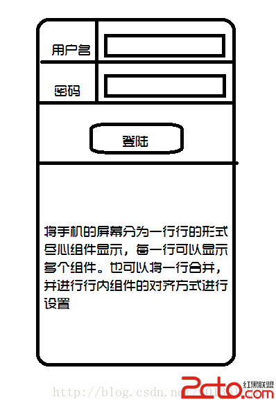 從零開始學android(Tablelayout表格布局.十五.)
TableLayout就是將手機的屏幕分為一行行的形式進行數據的顯示,並且一行可以多個控件 並且可以設置控件的對齊方式,和是否為可收縮行 下面通過一行圖和一個簡單的例子來