編輯:關於Android編程
這篇博客稍微講解下React-Native中的布局。比較簡單。RN的而布局是用css中的flexbox布局,所以布局起來與android傳統的布局樣式有點像。接下來就結合圖片一起來看看。
RN的flexbox主要有以下幾個屬性alignItems,alignSelf,flex,flexDirection,flexWrap,justifyContent。
該屬性用於指定主軸的方向。即指定子view的布局方向。它有兩個值可設置。
row:橫向布局。 column:縱向布局。這個屬性很簡單,先看row的代碼段:
<code class=" hljs xml">render:function(){
  return(
   <view style="{styles.flexStyle}">
    <view style="{styles.flexSub}/">
    <view style="{styles.flexSub}/">
    <view style="{styles.flexSub}/">
    <view style="{styles.flexSub}/">
    </view>
  );
}
…………
var styles = StyleSheet.create({

  flexStyle:{
    height:600,
    flexDirection:'row',
  },
    flexSub:{
    flex:1,
    height:300,
      backgroundColor:'#333333',
      marginRight:10,
  },
)}</view></view></view></view></code>
一個View裡有四個小View,小View的底色是黑的,看下效果圖:

可以看到,四個view橫向的進行布局。那改成column呢,樣式修改如下:
var styles = StyleSheet.create({
   flexStyle:{
    height:600,
    flexDirection:'column',
  },
  flexSub:{
    flex:1,
    height:100,
      backgroundColor:'#333333',
      marginBottom:10,
  },
)}
看下效果圖:

就是縱向布局。
用於定義子組件在垂直方向上的對齊方式。有四個屬性可設置:flex-start,flex-end,center,stretch。
flex-start:與父組件的頂部對齊。 flex-end:與父組件的底部對齊。 center:處於父容器的中間位置。 stretch:豎直上填充整個容器。首先來看下flex-start,順便改了下子組件的顏色,代碼如下:
return(


  );
  ……
var styles = StyleSheet.create({

  flexStyle:{
    height:600,
    flexDirection: 'row',
      alignItems:'flex-start',
  },
  flexSub:{
    flex:1,
    height:300,
      backgroundColor:'#333333',
      marginBottom:10,
  },
  flexSelf1:{
    flex:1,
    height:300,
      backgroundColor:'#ff0000',
      marginRight:10,
  },
  flexSelf2:{
    flex:1,
    height:300,
      backgroundColor:'#00ff00',
      marginRight:10,
  },
  flexSelf3:{
    flex:1,
      height:300,
      backgroundColor:'#0000ff',
      marginRight:10,
  },
  flexSelf4:{
    flex:1,
    height:300,
      backgroundColor:'#333333',
      marginRight:10,
  }
});
看下效果圖:

就是和父容器頂部對齊。
看下flex-end屬性,代碼就不貼出來了,只要改alignItems屬性就好了。效果圖如下:

可以看到,和底部對齊了。
再看下center,這個可以說是用的最多的屬性,它會讓子組件位於父容器的中間位置,看下效果圖:

stretch就是豎直填充,前提是子組件沒有設置height屬性。看下效果圖:

有豎直就水平。justifyContent和alignItems是相對的。它有五個屬性可以設置,分別是flex-start,flex-end,center,space-between,space-around。
* flex-start:伸縮項目與父容器左端靠齊。
* flex-end:與父容器右端靠齊。
* center:水平居中。
* space-between:第一個子組件位於父容器左端,最後一個子組件位於父容器最右端。然後平均分配在父容器水平方向上。
* space-around:所有子組件平均分配在父容器的水平方向上,左右都有留空隙。
先看水平居中(center)的,先看下代碼:
<code class=" hljs cs"> return(
    <view style="{styles.flexStyle}">
    <view style="{styles.flexSub}/">

    </view>
  );
  ……
  var styles = StyleSheet.create({

  flexStyle:{
    height:600,
    width:400,
    flexDirection: 'row',
    alignItems:'center',
    justifyContent:'center',
  },
  flexSub:{
    width:100,
    height:300,
      backgroundColor:'#333333',
      marginBottom:10,
  },
  });</view></code>
父容器設置了justifyContent:’center’屬性,所以理論上子組件應該會水平劇中,來看下是否正確。如下:

justifyContent:’flex-start’,水平居左:

justifyContent:’flex-end’,水平居右:

這些都挺簡單的,來看下space-between和space-around的區別,先看下space-between的效果圖:

可以看到它左右都不留空隙。均勻分布。
再看下space-around的效果圖:

它左右都留有空隙,是平均的位於整個界面的水平方向上。
該屬性用來設置單獨組件的豎直對齊方式,與alignItem有點像。有五個屬性可以設置,auto,flex-start,flex-end,center,streth。
* auto:按照自身設置的寬高來顯示,如果沒設置,效果跟streth一樣。
* flex-start:與父容器頂部對齊。
* flex-end:與父容器底部對齊。
* center:位於垂直位置。
* streth:垂直拉伸。
這個用法跟上面的很像,只是它用於單個組件,如本例子的子View中,看下代碼:
<code class=" hljs cs"> return(
    <view style="{styles.flexStyle}">
    <view style="{styles.flexSelf1}/">
    <view style="{styles.flexSelf2}/">
    <view style="{styles.flexSelf3}/">
    <view style="{styles.flexSelf4}/">
    </view>
  );
……
var styles = StyleSheet.create({
  flexStyle:{
    height:600,
    flexDirection:'row',
  },

  flexSelf1:{
    flex:1,
    alignSelf:'flex-start',

    height:300,
      backgroundColor:'#ff0000',
      marginRight:10,
  },
  flexSelf2:{
    flex:1,
    alignSelf:'flex-end',

    height:300,
      backgroundColor:'#00ff00',
      marginRight:10,
  },
  flexSelf3:{
    flex:1,
    alignSelf:'stretch',

      backgroundColor:'#0000ff',
      marginRight:10,
  },
  flexSelf4:{
    flex:1,
    alignSelf:'auto',
    height:300,
      backgroundColor:'#333333',
      marginRight:10,
  },
  )}</view></view></view></view></code>
以上幾個子View設置了不同的樣式 ,看下效果圖:

看到了,flex-start就是頂部對齊,flex-end就是與底部對齊。第三個View是streth,垂直拉伸了。第四個View是auto,因為設置了高度,所以顯示如圖所示。沒有顯示center,但它的效果可想而知,就不再演示啦。
flex指設置伸縮項目的伸縮樣式,可以把它類比成android中的weight屬性。
看一個代碼就清楚它的用法了。
<code class=" hljs cs">  return(
    <view style="{styles.flexStyle}">
    <view style="{styles.flexSelf1}/">
    <view style="{styles.flexSelf1}/">
    <view style="{styles.flexSelf2}/">
    <view style="{styles.flexSelf3}/">
    </view>
  );
  ……
var styles = StyleSheet.create({

  flexStyle:{
    height:600,
    flexDirection: 'row',
    flex:1,
  },
  flexSub:{

    height:300,
      backgroundColor:'#333333',
      marginBottom:10,
  },
  flexSelf1:{
    flex:1,
      backgroundColor:'#ff0000',
      marginRight:10,
  },
  flexSelf2:{
    flex:2,

      backgroundColor:'#00ff00',
      marginRight:10,
  },
  flexSelf3:{
    flex:4,

      backgroundColor:'#0000ff',
      marginRight:10,
  },
  });</view></view></view></view></code>
效果圖如下:

可以看到,flex為2的組件寬度為flex為1寬度的兩倍,flex為4組件寬度則為flex為1的組件寬度的4倍。
其實這些屬性都是CSS原有的屬性,只是RN只支持了部分的屬性。flexWrap用於設置是否可換行,有兩個屬性可設置nowrap和wrap。
nowrap:即使空間不夠也不換行。 wrap:空間不夠的話自動換行。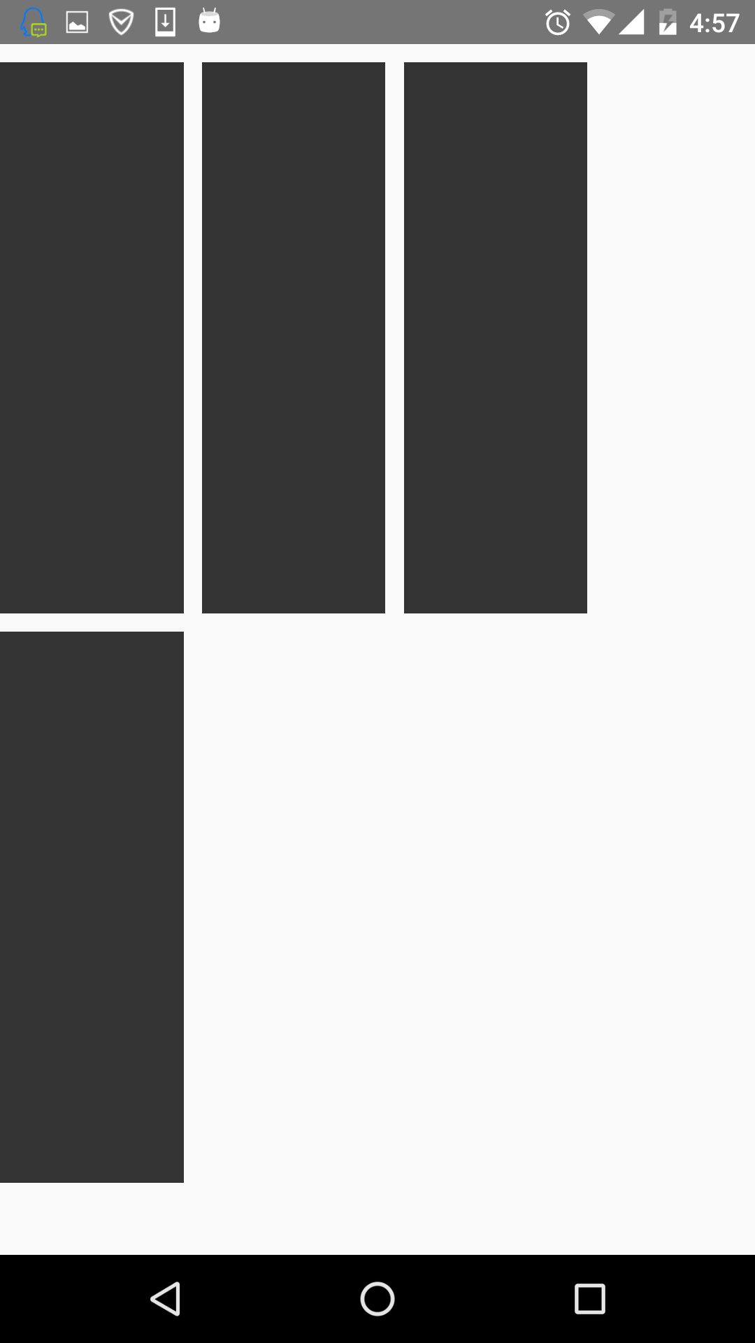
 Android 使用OpenCV之編譯環境非CygWin方式(Win7+Eclipse+ADT+CDT+NDK)
只有簡單的三步,官網寫的非常簡明全面,非常佩服 【准備】 1. Eclipse(Indigo) 2. ADT: 這個不說了,無非就是eclipse添加個an
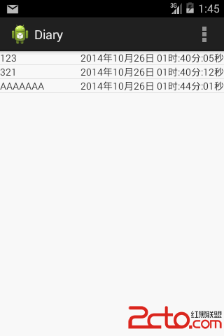 android開發使用SQLite之寫日記
使用數據庫實現對數據的存儲。 下面上一個小例子,寫日記。 效果如下: 當LIstView中沒有數據顯示時,我們需要告訴用戶沒有數據.
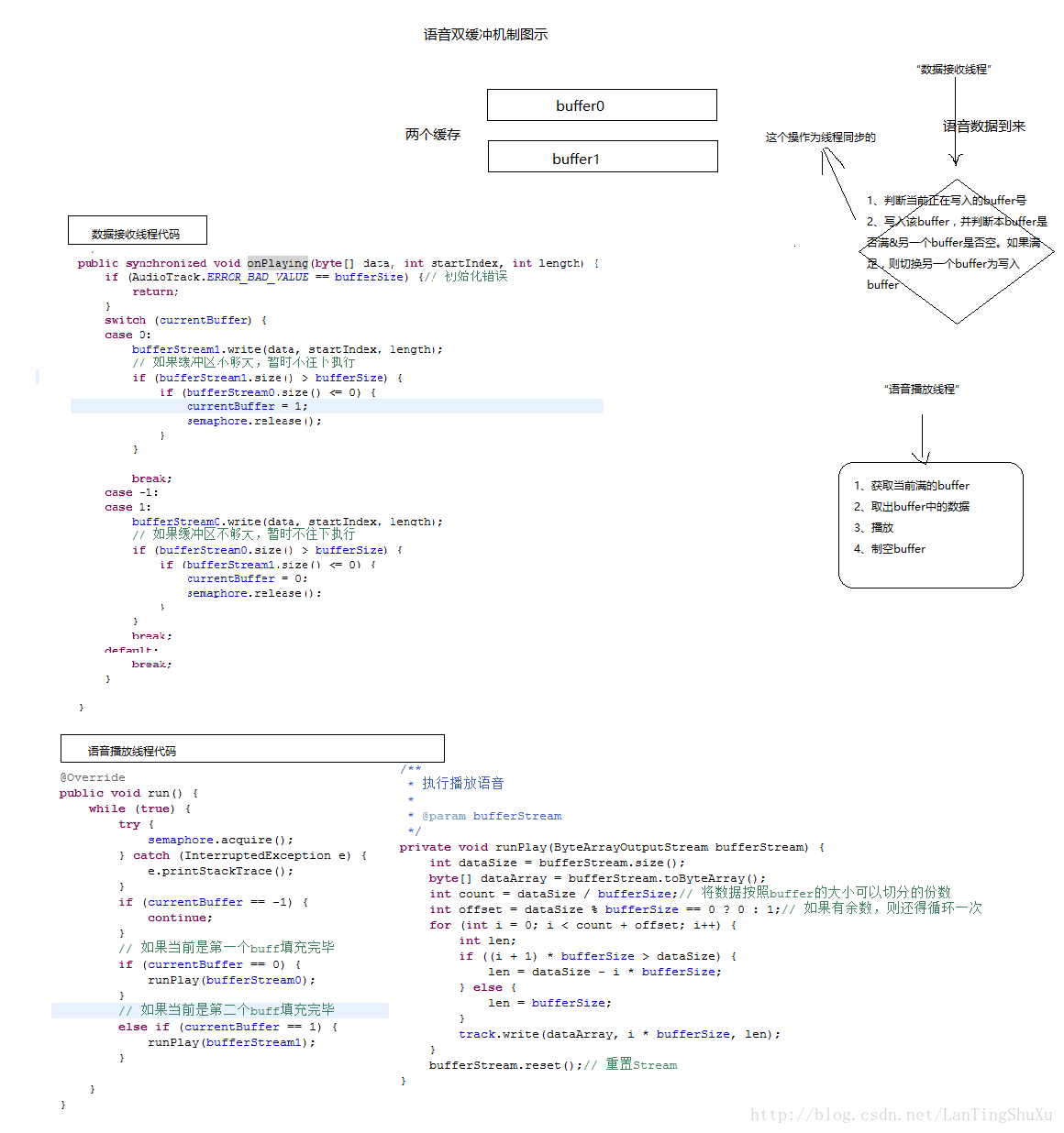 【android開發】實現語音數據實時采集/播放
【android開發】實現語音數據實時采集/播放。今天無意中看到一篇關於android實現語音數據實時采集/播放的文章,感覺寫得非常棒,挺全面的,所以特地轉載了,還有其實
 刷機精靈的rom可以卡刷嗎
安卓系統的刷機包分線刷包和卡刷包兩種,一般後綴為ROM的是線刷包,卡刷包的後綴名是ZIP壓縮文件,本身ROM的格式上就有區別,那麼用刷機精靈的rom可以卡刷