編輯:關於Android編程
讀前須知:PPK寫這篇文章的時候,IPhone還沒有生產出4S之後的產品。所以,這篇文章中提到的IPhone,都是指IPhone4S及之前的手機。
This page contains my tests for the various directives in the meta viewport tag.
本文涵蓋了我關於meta標簽中的viewport屬性的所有規則(directives)的研究
The @viewport construct is not part of this research. I’ll phase it in later when I know how it should behave.
@viewport的概念不在本文討論范圍之內,我將在研究清楚它的工作原理後再作說明
The meta viewport tag contains instructions to the browser in the matter of viewports and zooming. In particular, it allows web developers to set the width of the layout viewport relative to which CSS declarations such as width: 20% are calculated.
viewport元信息標簽向浏覽器指明了viewport大小和頁面縮放比例的信息。而且,它允許web開發人員設置layout viewport的寬度,這個寬度可以是相對於CSS聲明(如width:20%)的計算結果。
The meta viewport has the following syntax:
viewport元信息標簽的語法如下:
Every name/value pair is a directive. (The word is my own invention.) There are six of them in total:
每一個名/值對就是一個規則(這個說法是我創建的),共有6個規則:
width. Sets the width of the layout viewport.
width:用於設置layout viewport(布局視口)的寬度
initial-scale. Sets the initial zoom of the page AND the width of the layout viewport.
initial-scale:設置頁面的初始縮放比和 layout viewport(布局視口)的寬度
minimum-scale. Sets the minimum zoom level (i.e. how much the user can zoom out).
minimum-scale:設置頁面最小縮放比例,即用戶能將頁面縮小多少
maximum-scale. Sets the maximum zoom level (i.e. how much the user can zoom in).
maximum-scale:設置頁面最大縮放比例,即用戶能將頁面放大多少
height. Is supposed to set the height of the layout viewport. It is not supported anywhere.
height:應該是用於設置layout viewport(布局視口)的高度,但該屬性無效
user-scalable. When set to no prevents the user from zooming. This is an abomination that MUST NOT be used.
user-scalable:當設置為no時,可禁止用戶縮放頁面。但請不要這樣去做。
There is one special value: device-width for the width directive. It sets the layout viewport width to the ideal viewport width.
width規則下有一個特殊的值device-width,通過設置width=device-width可以將layout viewport(布局視口)的寬度等於 ideal viewport(理想視口)的寬。
In theory there’s a similar device-height value, but it doesn’t seem to work EXCEPT.
理論上,有一個類似的device-height的值,但它不起作用。
Ages ago I reported that mobile browsers have two viewports: the visual one and the layout one. Re-read this article if necessary; I assume knowledge of these two viewports in what is to follow.
幾年前,我在一篇文章中說過“手機浏覽器有2個viewport:visual viewport(可視視口)和layout viewport(布局視口)”。如果大家覺得有必要,請再閱讀一下這篇文檔:
原作
本人譯作
以下內容將在2個viewport知識的基礎上繼續討論。
It turns out that there’s a third viewport, which I decided to call the ideal viewport. It gives the ideal size of a web page on the device. Thus, the dimensions of the ideal viewport differ per device.
事實證明,還有第三個viewport,我稱之為理想視口( ideal viewport)。它給出了移動設備上一個網頁的理想大小。因此,理想視口( ideal viewport)的尺寸在每一個設備上都是不同的。
點擊這個頁面可以查看一些設備的理想視口的尺寸
On old or cheap devices with non-retina screens the ideal viewport is equal to the physical number of pixels, but that’s not a requirement. Newer devices with higher physical pixel densities may well retain the old ideal viewport, because it’s ideally suited to the device.
在一些老舊或者低端的非Retina屏的移動設備上,理想視口( ideal viewport)的大小等於其物理像素,但這並非一定正確。擁有較高的物理像素密度的一些新設備也可能保留了老版本手機的理想視口( ideal viewport)大小,因為這個尺寸很適合這些設備。
Up to and including the 4S, the iPhone ideal viewport is 320x480, regardless of whether it has a retine screen or not. That’s because 320x480 is the ideal size for web pages on these iPhones.
包括4S在內的早期IPhone手機,不論它們是否有Retina屏,它們的理想視口( ideal viewport)都是320x480。這是因為320x480是這些手機設備上網頁的理想尺寸。
There are two important things about the ideal viewport:
1、The layout viewport can be set to ideal viewport values. The width=device-width and initial-scale=1 directives do so.
2、All scale directives are relative to the ideal viewport, and not to whatever width the layout viewport has. So maximum-scale=3 means the maximum zoom is 300% of the ideal viewport.
關於理想視口( ideal viewport),有如下2個重要的說明:
1、使用 width=device-width 和initial-scale=1兩個規則,可以將 layout viewport的值設置為 ideal viewport的大小。
2、所有的縮放規則都是相對於 ideal viewport而言的,而與layout viewport多寬無關。因此maximum-scale=3的含義就是頁面最多放大到 ideal viewport的3倍。
It might occasionally be useful to be able to read out the ideal viewport dimensions. Tough luck.
如果幸運的話,偶爾讀出來的 ideal viewport的尺寸是有用的。
Well, you can do it. Give a page the following meta tag and read out document.documentElement.clientWidth/Height:
在一個頁面上使用下面的的meta標簽,讀取出document.documentElement.clientWidth document.documentElement.clientHeight
的值就是ideal viewport的尺寸。
If that’s not an option you have no way of reading out the ideal viewport dimensions. I hoped screen.width/height might be helpful here, but only BlackBerry gives the correct information. The other browsers resort to various shades of unhelpfulness.
如果沒法讀出 ideal viewport的尺寸不是你的選項(即必須要讀出 ideal viewport的尺寸),通過screen.width/height的值來獲取ideal viewport的尺寸也可以,但這種方式只有在黑莓(BlackBerry)設備上才有效,在其他浏覽器上都是些無用值。
Open question: should screen.width/height give the ideal viewport dimensions?
Pro: the properties would at last contain useful information.
Con: ideal viewport size does not necessarily equate physical pixels on the device.
Open question:通過screen.width/height應該獲取到ideal viewport的尺寸嗎?
贊成:這個屬性最終應該包含ideal viewport尺寸的有用信息
反對:ideal viewport的大小並不一定等同於設備的物理像素
ideal viewport的兼容性
Here is all of the above in easy table format.
現在用表格表示一下上述內容的兼容性

上表中的英語內容的譯文如下:
Before rendering the page, the browser needs to know how wide the layout viewport is. This is the viewport relative to which CSS declarations such as width: 20% are calculated.
在渲染網頁之前,浏覽器得知道layout viewport的寬度。這個視口的寬度是根據CSS聲明的寬度(例如width:20%)計算得出的。
Without any further instructions the browsers pick a width themselves. In six of the eight tested browsers this is 980px, in BlackBerry and IE10 it’s 1024px. There’s no right or wrong here; this is just the browser vendors making a choice.
當浏覽器沒有獲得更詳細的設置信息時,它們會自主決定layout viewport的寬度。在測試的8個浏覽器中的6個上,這個值是980px,在BlackBerry 和IE10上是1024px。取哪個值由浏覽器廠商決定,沒什麼對錯之說。
When you use width=400 or another numerical value in the meta viewport tag, the layout viewport’s width is set to that value. We already knew that.
我們已經知道,當在viewport元信息標簽中設置width=400或者其他數值時,layout viewport的寬度就等於這個數值。
However, Android WebKit’s and IE’s minimal viewport is 320px. When you go below 320px they revert to the ideal viewport width.
但是,在Android浏覽器的webkit內核和IE上,layout視口的最小值是320px。當這個視口小於320px時,它們會恢復到ideal viewport的寬度。
Then there’s the case when the layout viewport becomes equal to the ideal viewport. This happens when you do width=device-width or initial-scale=1. It’s complicated, since there are bugs in Safari and IE10 and there’s a catch to using initial-scale, but this is the general rule.
因此,當layout viewport的尺寸等於ideal viewport時,會出現一種很復雜的情況(這種情況發生在當設置width=device-width 或者initial-scale=1時):在Safari和IE10上會有一個bug,它們只識別initial-scale(但這只是一般規律)。
The maximum width of the layout viewport is 10,000 pixels. I don’t entirely trust that number, since the browsers do not allow you to zoom out to this amount. Still, for now I accept this official value.
layout viewport的最大寬度是10,000px,我不完全相信這個數值,因為浏覽器不允許頁面縮放到這個大。但盡管不相信,目前我接受這個官方數值。
The minimum width of the layout viewport is about 1/10th of the ideal viewport, which is also the maximum zoom level. (I.e. the layout viewport never becomes smaller than the smallest possible visual viewport.) Exceptions: Android WebKit and IE, which never go below 320px.
layout viewport的最小寬度大約是ideal viewport的十分之一,這也是最大的縮放程度了。layout viewport永不會變得比最小的visual viewport更小。但有一個例外情況:Android WebKit內核和IE浏覽器的layout viewport永不會小於320px。
現在用表格表示一下上述內容的兼容性

上表中的英語內容的譯文如下:
Zoom is tricky. In theory it sounds simple: determine the zoom factors that the user can zoom in or out to. The problem is two-fold:
1、We cannot directly read out the zoom factor. Instead, we have to read out the width of the visual viewport, which has an inverse relation to the zoom factor. The larger the zoom factor, the smaller the visual viewport width.
So the minimum zoom factor determines the maximum visual viewport width, and vice versa.
2、It turns out that all zoom factors are relative to the ideal viewport, no matter what the current size of the layout viewport is.
縮放很麻煩,盡管在理論上它聽起來很簡單:決定能放大或縮小的縮放因子。
1、無法直接獲取縮放因子。事實上,我們得先獲得visual viewport的寬,它與縮放因子呈反比例關系。縮放因子越大,visual viewport的寬度越小。所以最小縮放因子決定了最大視覺視口的寬度,反之亦然。
2、事實證明,所有的縮放因子都與ideal viewport存在關系,而不論當時layout viewport的大小是多少。
Then there is the matter of the name. In Apple-speak, zoom is scale, and the meta viewport directives are thus called initial-scale, minimum-scale, and maximum-scale. The other browsers were forced to comply in order to retain compatibility with iPhone-specific websites.
還有一個關於名稱的問題。在蘋果系統上,zoom稱為scale,所以在viewport meta標簽中,規則就寫成:initial-scale,minimum-scale和maximum-scale。其他浏覽器被迫遵守這條規則,以兼容特定於IPhone端的網頁。
The three directives expect a zoom factor, where for instance 2 means “zoom to 200% of the ideal viewport width.”
使用這三個規則規定了一個縮放因子。例如縮放因子為2表示縮放到ideal viewport寬的200%。
Let’s define the formulas first:
先定義公式:
visual viewport width = ideal viewport width / zoom factor
zoom factor = ideal viewport width / visual viewport width
.
Thus, with a ideal viewport width of 320px and a zoom factor of 2 we get a visual viewport width of 160px. The width of the layout viewport plays no part in this calculation.
因此,已知ideal viewport的寬為320px,縮放因子為2,就可以算出visual viewport寬等於160px (=320px/2)。layout viewport的寬度在這個公式中沒有作用。
What are the minimum and maximum zoom factors the browsers support?
浏覽器支持的縮放因子的最小值和最大值是多少?
First, a restriction. The visual viewport can never become wider than the layout viewport, so in most practical cases the minimum zoom factor is ideal viewport width / layout viewport width.
首先說一個約束:visual viewport永不會比layout viewport更寬。
在大多數實際情況下,最小縮放因子等於 ideal viewport的寬 / layout viewport的寬。
Still, in these tests I can use absurd layout viewport widths such as 5,000. I did so, and the results are:
然而在這些測試中,我用了一個荒誕的layout viewport寬度值—5000,得到如下結果:
1、Android WebKit’s minimum zoom factor is 0.25 and its maximum 4. This cannot be changed. HOWEVER, it uses 640 / 0.25 = 2,560px, which is correct for landscape, even in portrait mode.
2、IE’s maximum visual viewport width is 1024px. Its maximum zoom factor is 6 in portrait and 6 and 2/3 in landscape. This cannot be changed.
3、In the other browsers, without any zoom directives, the minimum zoom factor is about 0.25 and the maximum about 5.
4、Adding directives such as a huge layout viewport width or a huge maximum-scale causes the minimum factor to go to about 0.1 and the maximum to about 10.
1、Android WebKit內核浏覽器的最小縮放因子是0.25,最大值是4。這個值不可修改。通過640 / 0.25得到的2,560px這個值在橫屏和豎屏模式下都是正確的。
2、IE浏覽器的最大visual viewport寬是1024px,最大縮放因子在豎屏下是6,在橫屏下是20/3。這個值不可修改。
3、在其他浏覽器, 不寫任何縮放規則時,最小縮放因子大約是0.25,最大大約是5。
4、增加這樣一條縮放規則:當layout viewport無限寬或maximum-scale無限大的情況下,最小縮放因子約是0.1,最大約10
There are slight differences in these factors; see the table below.
這些縮放規則在不同設備上有些細微差別,詳見下圖。
So in theory the iPhone’s visual viewport width can be anything between 32px (zoom factor 10) and 3200px (zoom factor 0.1).
因此,理論上IPhone的visual viewport寬可以是介於32px(縮放因子為10)和3200px(縮放因子為0.1)之間的任意值。
I did some extra tests on the Huawei C8813, Android 4.1.1, because it has a landscape ideal viewport width of 569.
Here, too, the minimum and maximum zoom factors were 0.25 and 4. So these powers of 4 are actually a general Android WebKit rule, and not just an artifact of the specific 640px width of the Samsung and HTC test phones.
The maximum visual viewport width here is 2277px, which is about 4 x 569.
我額外在Huawei C8813, Android 4.1.1上做了些測試。因為它們橫屏模式下的ideal viewport寬是569。同樣,它們最小和最大縮放因子也是0.25和4。因此,上述4條規則是Android WebKit內核浏覽器的通用規則,而不只是三星、HTC等測試手機在640px這個特定寬度下結果。
同樣,最大visual viewport寬是2277px,大體上等於4 x 569。
現在用表格表示一下上述內容的兼容性


上表中的英語內容的譯文如下:
Setting the initial-scale directive actually does two things:
1.It sets the initial zoom factor of the page to the defined value, calculated relative to the ideal viewport. Thus it generates a visual viewport width.
2.It sets the layout viewport width to the visual viewport width it just calculated.
設置 initial-scale這條規則實際上做了如下2件事:
1、將頁面初始縮放因子設置為給定的值,計算出相對於ideal viewport,得到visual viewport的寬。
2、設置layout viewport的寬等於剛剛計算出來的visual viewport的寬
So let’s say we have an iPhone in portrait mode and give it an initial-scale=2 without any further instructions. By now, it shouldn’t surprise you that this sets the visual viewport width to 160px (= 320 / 2). That’s how the scaling directives work.
如果一個IPhone手機處於豎屏模式,設置其initital-scale=2並且沒有其他設置。那麼不要奇怪,它其實是設置了visual viewport的寬為160px (=320px/2),這就是縮放規則的工作方式。
However, it also sets the width of the layout viewport to 160px. So we now have an 160px wide page in minimum zoom. (The visual viewport cannot become larger than the layout viewport, so zooming out is not possible.)
而且,它同時也設置了layout viewport的寬度為160px。因此我們現在擁有一個在最小縮放比例下160px寬的網頁。(visual viewport不能比layout viewport大,所以頁面不可能放大了)
And now, this doesn’t make the slightest bit of sense. If asked for my candid opinion I’d probably mumble something like “completely fucking batshit insane.” Still, there’s no doubt that browsers behave like this.
但是,這好像沒什麼意義。如果你問我的真實想法是什麼,我會說“完全TMD沒用”,但毫無疑問,浏覽器就是這麼干了。
Except for Android WebKit. Obviously. Android WebKit allows initial-scale to set the layout viewport width only if the value is 1 AND there is no width directive. So only initial-scale=1 without any other directives works.
As to IE, it applies the wrong ideal viewport (320x320 instead of 320x480), and also pretends any value is 1. So the value you give to the initial-scale doesn’t matter in IE.
很明顯Android WebKit浏覽器是個例外,它允許使用initial-scale設置layout viewport的寬,當且僅當其值為1並且沒有其他寬度設置規則。即Android WebKit浏覽器的規則中僅有initial-scale=1起作用。
對於IE,會獲取一個錯誤的ideal viewport(320x320而不是320x480),並且會將任意值都當作成1,所以在IE上initial-scale取什麼值都無所謂。
Since initial-scale sets the layout viewport width, you can now create conflicting directives:
由於initial-scale是設置layout viewport的寬度的,所以可以利用如下的代碼制造指令沖突:
What happens now? The browser gets conflicting orders. Let’s return to the iPhone 4S once more:
1.initial-scale=1 tells it to set the layout viewport width to 320px portrait and 480px landscape.
2.width=400 tells it to set the layout viewport width to 400px in both portrait and landscape.
那麼浏覽器得到相互沖突的指令後會發生什麼呢?讓我們再次回到IPhone 4S上看看:
1、initial-scale=1告訴浏覽器要將layout viewport的寬度設置為320px(豎屏模式)和480px(橫屏模式)
2、width=400告訴浏覽器要將layout viewport的寬度在橫屏和豎屏模式下都設置為400px
The browser solves the problem by obeying the largest width in portrait or landscape. In our example the portrait layout viewport width becomes 400px (the larger of 320 and 400), and the landscape layout viewport width 480px (the larger of 480 and 400).
浏覽器解決這個沖突的方法是:寬度最大原則(橫屏或豎屏模式下均是)。
在我們的例子中,豎屏模式下layout viewport的寬度將變為400px(取320和400中的較大值),橫屏模式下layout viewport的寬度將變為480px(取480和400中的較大值)。
Makes sense? Actually it doesn’t, but browsers do it anyway.
有什麼道理或依據嗎?沒有!但浏覽器就這麼任性地去做了。
In any case, what we have here is a min-width for the layout viewport. The meta tag above sets the min-width to 400px, but allows the browser to grow the layout viewport beyond that if device size and orientation require it.
在任何情況下,我們這裡說一個layout viewport的min-width的情況。如果在上面的meta標簽設置了min-width為400px,但允許浏覽器增加layout viewport的寬度並超過這個值,只有設備尺寸或者設備旋轉需要。
I’m not sure if there’s any practical use for a min-width for the layout viewport, but if you need one, hey, it’s there!
我不清楚是否有layout viewport的min-width的實際應用,但如果你需要,就在這裡。
Android WebKit does not follow these rules. If the width equals device-width or is smaller than 320, Android WebKit always applies the ideal viewport width to the layout viewport. Above 320 it always obeys the width directive.
Android WebKit內核浏覽器不遵循這條規則。如果width等於device-width或者小於320px,Android WebKit內核浏覽器總會采用ideal viewport的寬作為layout viewport的寬。超過320都會遵循這個規律。
IE does not follow these rules above width=480, when it sets the layout viewport width to 1024px.
在width=480以上,IE不遵循這些規則,如當設置了layout viweport寬為1024px


I found a minor bug in the iPhone, but not the iPad:
1.If a combination of width and initial-scale causes the browser to automatically zoom in in landscape mode (i.e. visual viewport is smaller than layout viewport)
2.AND the user zooms out in landscape mode and then switches to portrait mode
3.the minimum-scale for portrait equals the minimum-scale for landscape (i.e. the viewport width) times the portrait/landscape ratio. (So a landscape viewport width of 400 causes a portrait minimum-scale of 268.)
4.Solution: zoom in as much as possible in portrait. The bug disappears.
我在IPhone上發現一個小bug,但IPad上沒有。
1、如果在橫屏模式下使用width和initial-scale組合,將會引起浏覽器自動縮小。(即視覺視口小於布局視口)
2、並且,如果用戶在橫屏模式下放大頁面,手機就會切換到豎屏模式。
3、豎屏模式下的最小縮放比等於橫屏模式下的最小縮放比(即viewport寬) * 豎屏/橫屏比率(因此,橫屏viewport寬)。
4、解決方案:在豎屏模式下盡可能的縮小,這個bug就消失了。
Try it here. Hold your iPhone in landscape, go to the page, and follow the instructions above.
你可以前往這個頁面,按照以上步驟操作試試。
I did only one small series of tests for minimum-scale and maximum-scale. They generally seem to work quite well, except on Android WebKit, which doesn’t support minimum-scale, and IE, which makes a horrific mess of things — so badly, in fact, that I’ve given up trying to understand what’s going on.
我只是做了一系列關於minimum-scale和maximum-scale的小測試,測試結果都很正常,除了在Android WebKit(因為它不支持minimum-scale)和IE(因為它制造出一系列糟糕的問題)上,所以我放棄了嘗試搞懂它們的工作原理。
What’s supposed to happen in the tests below is that the layout viewport width is calculated as described above, and after that zooming is restricted to between 50% and 200%, i.e. the visual viewport can become from twice as large to twice as small as the ideal viewport.
當layout viewport的寬按照上述計算,然後縮放被限制在50%和200%之間,即視覺視口可以變為從理想視口的一倍大到兩倍小。猜猜會發生什麼?(答案如下圖)
One exception: the visual viewport can never become smaller than the layout viewport.
一個例外情況是:visual viewport永不會變得比layout viewport小。

[an error occurred while processing this directive]
在處理這個規則時發生錯誤
未完待續
 Android中的Low Memory Killer
在現有的技術條件下,內存永遠都是一個吃緊的資源,不用說是PC上會出現內存不足的可能,更不必說在移動設備上了。一旦出現內存不足就會導致系統卡頓,影響用戶體驗。而
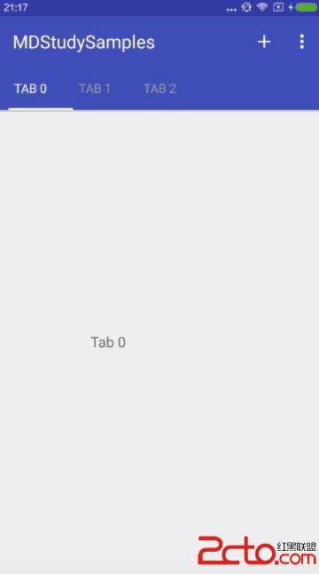 Android TabLayout 分分鐘打造一個滑動標簽頁
使用滾動的標簽指示器和滑動的內容頁面,是手機應用經常出現的一種設計風格,常見的比較出名的應用有:微信(首頁)、網易新聞、今日頭條和知乎等。有過幾年安卓開發經驗的朋友肯定知
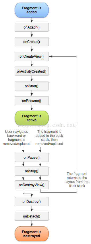 淺談Android中的 Fragment、生命周期回調方法 以及使用
Fragment 是個什麼東西?可以把Fragment理解成Activity中的模塊,這個模塊有自己的布局,有自己的生命周期,單獨處理自己的輸入,在Activity運行的
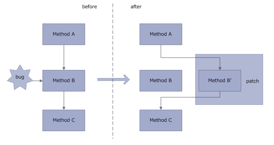 Android熱修復之AndFix使用教程
AndFix全稱Android hot-fix,是alibaba的Android熱修復框架,支持Android 2.3到6.0的版本,支持arm與X86系統架構,支持Da