編輯:關於Android編程
搭建基礎環境
以上配置不是必須,可自行選擇適合自己的環境,部分安裝過程可能會涉及到翻牆,需要配置代理
配置踩坑記錄
genymotion
這裡選擇genymotion模擬器來講解,也會提一下Android Studio自帶的模擬器的一些注意點,使用真機的朋友可跳過這段。
genymotion的安裝有2種模式,一種是帶有Oracle VM VirtualBox虛擬機,另外一種是純淨版,genymotion的運行依賴VirtualBox虛擬機。
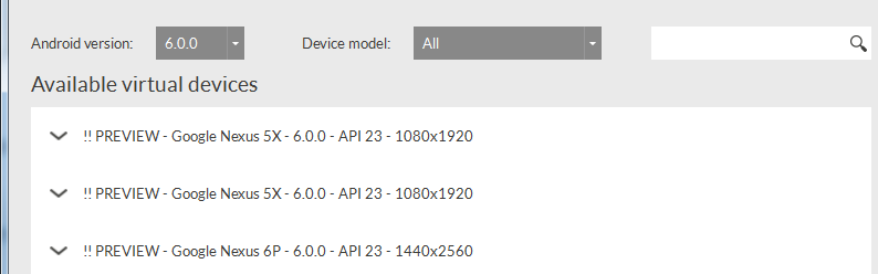
選擇下載android6.0-API 23模擬器
(如果無法顯示API列表,請配置代理Settings->NetWork->Use HTTP Proxy)
啟動模擬器,可能會有部分人卡在android啟動界面上面,無法進入

genymotion的運行基於X86的架構,比起arm,X86的性能更流暢。我們需要使用X86架構的話,還需要安裝HAXM。
1、打開SDK Manager->Extras->Intel x86 Emulator Accelerator,安裝即可,如果沒有任何東西顯示,還是代理問題,Tools->Options->Proxy Settings
2、進入C:\Users\用戶\AppData\Local\Android\sdk\extras\intel\Hardware_Accelerated_Execution_Manager
安裝intelhaxm-android.exe,安裝出錯,請參考這裡
至此我們就能進入模擬器界面
Android Studio
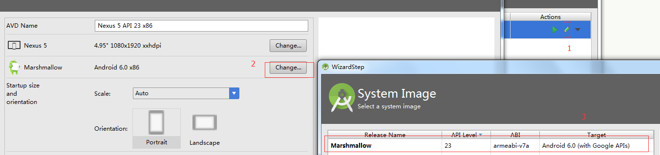
如果想使用android studio自帶模擬器,可以打開AVD Manager->Create Virtual Device->選擇自己需要的android版本
值得注意的是,模擬器默認選擇X86架構,如果你不喜歡,你需要自己手動改成arm架構
NVM
這裡選擇用NVM來控制node版本,如果你已經裝過node4.0以上的版本,就跳過這裡。
安裝方式和使用文檔,github上面講的很清楚,這裡說下代理的配置,其實也就是npm的代理,配置全局代理
npm config set proxy=you proxy
npm config set https-proxy=you https proxy
React-native初始化
心理默默祈禱以下命令千萬不要錯誤。。。
npm install -g react-native-cli
react-native init AwesomeProject
cd AwesomeProject
react-native start
react-native run-android
果然。。。好吧,這裡分享下自己遇到的一些問題
進入C:\Users\用戶\AppData\.gradle,打開gradle.properties(不存在就新建一個),修改
systemProp.https.proxyHost=You https proxy
systemProp.https.proxyPort=You https proxyPort
systemProp.http.proxyHost=You proxy
systemProp.http.proxyPort=You proxyPort
總算是把android應用程序跑起來了,真累人啊

布局
這裡以三種經典布局來講解react-native布局概念,主要以flexbox為主,react native中有兩個基本元素< View >與< Text >,分別類似於web端div和span,用於布局和修飾。需要注意的是,react native不是所有的CSS屬性都支持,這裡有react native所支持的CSS屬性。
准備工作
在JSX中寫樣式還是有點不習慣,這裡使用react-native-css模塊來編寫樣式,安裝、使用過程如下:
npm install react-native-css -g
react-native-css -i style.css -o style.js --watch
布局講解
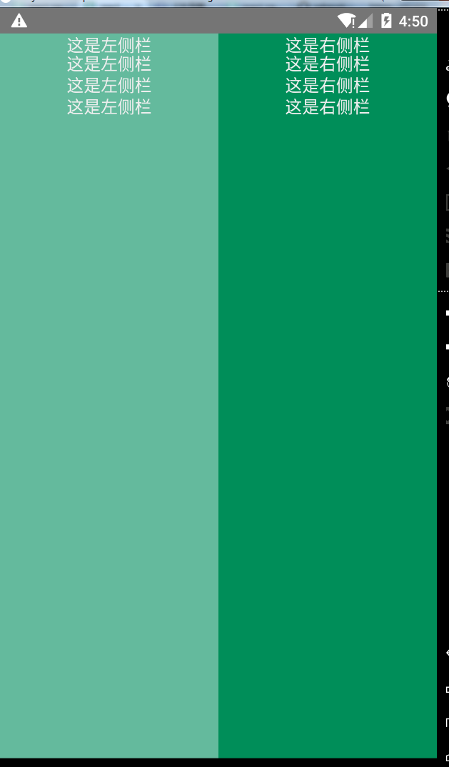
左右布局
由於是橫向布局,我們需要flex-direction: row(默認縱向布局),左右以1:1方式排版,就都需要flex:1,布局容器也需要加上flex:1,表示為伸縮容器。由於react native沒有br標簽,需要換行只能將換行符插入。
樣式表:
wrap {
 flex:1;
 flex-direction: row;
 background-color: yellow;
}

left{
 flex:1;
 background-color: #64BA9D;
}

right{
 flex:1;
 background-color: #008E59;
}

text{
 padding:10;
 font-size:16;
 color:#EEEEEE;
 line-height:20;
 text-align: center;
}
頁面結構:
<View style={styles.wrap}>
  <View style={styles.left}>
   <Text style={styles.text}>
    這是左側欄{'\n'}
    這是左側欄{'\n'}
    這是左側欄{'\n'}
    這是左側欄{'\n'}
   </Text>
  </View>
  <View style={styles.right}>
   <Text style={styles.text}>
    這是右側欄{'\n'}
    這是右側欄{'\n'}
    這是右側欄{'\n'}
    這是右側欄{'\n'}
   </Text>
  </View>
</View>
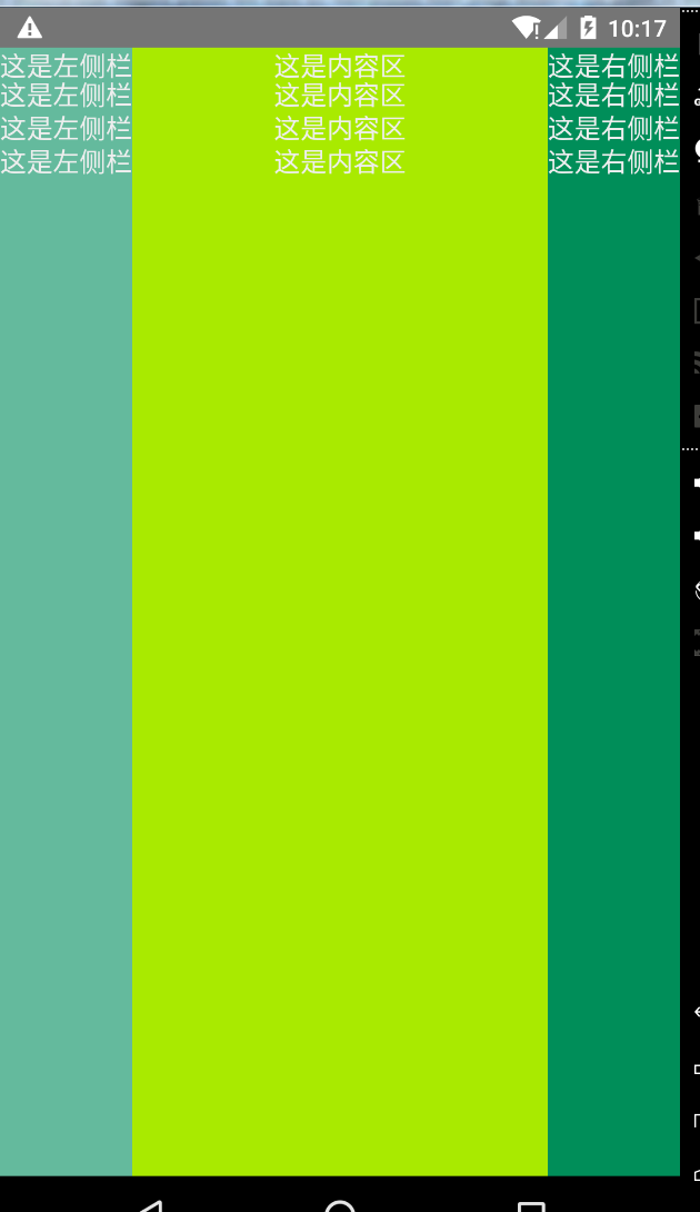
左中右布局
左右定寬,中間占滿。
樣式表:
wrap {
 flex:1;
 flex-direction: row;
 background-color: yellow;
}

left{
 width: 80;
 background-color: #64BA9D;
}

centent{
 flex:1;
 background-color: #a9ea00;
}

right{
 width: 80;
 background-color: #008E59;
}

text{
 padding:10;
 font-size:16;
 color:#EEEEEE;
 line-height:20;
 text-align: center;
}
頁面結構:
<View style={styles.wrap}>
  <View style={styles.left}>
   <Text style={styles.text}>
    這是左側欄{'\n'}
    這是左側欄{'\n'}
    這是左側欄{'\n'}
    這是左側欄{'\n'}
   </Text>
  </View>
  <View style={styles.centent}>
   <Text style={styles.text}>
    這是內容區{'\n'}
    這是內容區{'\n'}
    這是內容區{'\n'}
    這是內容區{'\n'}
   </Text>
  </View>
  <View style={styles.right}>
   <Text style={styles.text}>
    這是右側欄{'\n'}
    這是右側欄{'\n'}
    這是右側欄{'\n'}
    這是右側欄{'\n'}
   </Text>
  </View>
</View>
上中下布局
類似新聞和門戶APP的布局,上下貼邊,中間為內容區。
樣式表:
wrap {
 flex:1;
 flex-direction:column;
}

top{
 height: 40;
 background-color: #008E59;
}
centent{
 flex:1;
 background-color: #64BA9D;
}

bottom{
 height: 40;
 background-color: #a9ea00;
}

text{
 padding:10;
 font-size:16;
 color:#fff;
 line-height:20;
 text-align: center;
}
頁面結構:
<View style={styles.wrap}>
  <View style={styles.top}>
   <Text style={styles.text}>
    頭部信息
   </Text>
  </View>
  <View style={styles.centent}>
   <Text style={styles.text}>
    這是內容區{'\n'}
   </Text>
  </View>
  <View style={styles.bottom}>
   <Text style={styles.text}>
    尾部信息
   </Text>
  </View>
</View>
綜合布局
簡單模擬網易新聞APP布局:

我們可以簡單看看APP布局方式,總體來說就是上中下的布局方式,我們可以初步先編寫外部結構
頁面結構:
<View style={styles.wrap}>
  <View style={styles.top}>
   <Text>頭部</Text>
  </View>
  <View style={styles.cententWrap}>
   <Text>新聞主題</Text>
  </View>
  <View style={styles.bottom}>
   <Text>
    尾部導航
   </Text>
  </View>
</View>
樣式表:
wrap {
 flex:1;
 flex-direction:column;
}
top{
 height: 40;
 background-color: #EC403C;
}
cententWrap{
 flex:1;
 flex-direction:column;
}
bottom{
 height: 40;
}
大致結構算是搭建完畢,開始完善頭部展示(偷懶、不想切圖,就用個title代替就好啦~~~)
頁面結構:
<View style={styles.wrap}>
  <View style={styles.top}>
   <Text style={styles.topTitle}>網易</Text>
  </View>
  <View style={styles.cententWrap}>
   <Text>新聞主題</Text>
  </View>
  <View style={styles.bottom}>
   <Text>
    尾部導航
   </Text>
  </View>
</View>
樣式表:
topTitle{
 margin-top: 15;
 margin-left: 20;
 text-align: left;
 font-size: 14;
 color:#FFF;
}
頭部內容完成之後,就完善內容區域的導航條,但是react-native並沒有提供ul、li標簽(也許以後有),這個是要View來代替ul,Text代替li,代碼和數據如下:
頁面結構:
var cententNav = ['頭條', '熱點', '娛樂', '體育', '財經'];
return (
 <View style={styles.wrap}>
  <View style={styles.top}>
   <Text style={styles.topTitle}>網易</Text>
  </View>
  <View style={styles.cententWrap}>
   <View style={styles.cententNav}>
    {
     cententNav.map(function(el, index){
      return <Text style={styles.cententNavText}>
       <Text style={index == 0 ? styles.textR : ""}>{cententNav[index]}</Text>
      </Text>

     })
    }
   </View>
  </View>
  <View style={styles.bottom}>
   <Text>
    尾部導航
   </Text>
  </View>
 </View>
);
樣式表:
cententWrap{
 flex:1;
 flex-direction:column;
}
cententNav{
 flex-direction: row;
 height: 20;
 margin-left: 5;
 margin-top: 5;
 margin-right: 5;
}
cententNavText{
 width: 60;
 font-size: 14;
 color: #9C9C9C;
 margin-left: 10;
}
新聞主題方面可以劃分為左右兩欄,左欄固定寬,右欄占滿,由於react-native不支持overflow:scroll屬性,這裡會用到一個ScrollView的滾動條組件來展示新聞概述,篇幅可能較長,底部就不再編寫了(就是懶~~),大家各自完善吧,以下是全部的布局代碼和樣式。
頁面結構:
render: function() {
// var repeatArr = Array(100).join("1").split("")
var cententNav = ['頭條', '熱點', '娛樂', '體育', '財經'],
  NEW_DATA = [
   {
    img: "http://7xl041.com1.z0.glb.clouddn.com/new1.png",
    title: "李克強宴請上合各參會領導人",
    content: "稱會議闡釋了上合組織\“大家庭\”的深厚友誼和良好氛圍",
    typeImg: "http://7xl041.com1.z0.glb.clouddn.com/new-type1.png"
   },
   //.....類似數據
  ];

return (
 <View style={styles.wrap}>
  <View style={styles.top}>
   <Text style={styles.topTitle}>網易</Text>
  </View>
  <View style={styles.cententWrap}>
   <View style={styles.cententNav}>
    {
     cententNav.map(function(el, index){
      return <Text style={styles.cententNavText}>
       <Text style={index == 0 ? styles.textR : ""}>{cententNav[index]}</Text>
      </Text>

     })
    }
   </View>
   <ScrollView style={styles.centent}>
    {
     NEW_DATA.map(function(el, index){
      return (
       <View>
        <View style={styles.cententLi}>
         <Image source={{uri: NEW_DATA[index].img}} style={styles.cententImg} />
         <View style={styles.rightCentent}>
          <Text style={styles.cententTitle}>{NEW_DATA[index].title}</Text>
          <Text style={styles.cententCentent}>{NEW_DATA[index].content}</Text>
         </View>
         <Image source={{uri: NEW_DATA[index].typeImg}} style={styles.cententType} />
        </View>
        <View style={styles.line}></View>
       </View>
      )
     })
    }
   </ScrollView>
  </View>
  <View style={styles.bottom}>
   <Text style={styles.text}>
    尾部信息
   </Text>
  </View>
 </View>
);
}
樣式表:
wrap {
 flex:1;
 flex-direction:column;
}

top{
 height: 40;
 background-color: #EC403C;
}
topTitle{
 margin-top: 15;
 margin-left: 20;
 text-align: left;
 font-size: 14;
 color:#FFF;
}

cententWrap{
 flex:1;
 flex-direction:column;
}
cententNav{
 flex-direction: row;
 height: 20;
 margin-left: 5;
 margin-top: 5;
 margin-right: 5;
}
cententNavText{
 width: 60;
 font-size: 14;
 color: #9C9C9C;
 margin-left: 10;
}
centent{
 flex:1;
 flex-direction:column;
 borderBottomWidth:1;
}
cententLi{
 flex-direction: row;
 margin-left: 10;
 margin-right: 10;
}
cententImg{
 width: 80;
 height: 80;
}
cententTitle{
 font-size: 16;
 color: #232323;
 margin-bottom: 3;
}
cententCentent{
 font-size: 12;
}
rightCentent{
 flex: 1;
 padding-left: 5;
 padding-top: 5;
 padding-right: 5;
 padding-bottom: 5;
}
cententType{
 width: 40;
 height: 22;
 position: absolute;
 bottom: 0;
 right: 0;
}

bottom{
 height: 40;
}

text{
 padding:10;
 font-size:16;
 color:#000;
 line-height:20;
 text-align: center;
}

textR{
 font-weight: bold;
 color:#EC403C;
}
line{
 height: 1;
 background-color: #E4E4E4;
 margin-left: 10;
 margin-right: 10;
 margin-top: 7;
 margin-bottom: 7;
}
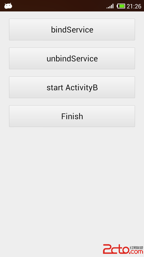 Android中bindService的使用及Service生命周期
Android中有兩種主要方式使用Service,通過調用Context的startService方法或調用Context的bindService方法,本文只探討純bin
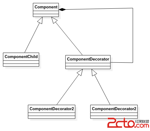 Android源碼裝飾模式---ContextWrapper
如果說Android源碼中哪個地方裝飾模式應用的最明顯的話,那肯定是非ContextWrapper莫屬了,ContextWrapper是一個透明的經典的裝飾模式。本文將通
 Android TextView顯示文字對齊
有時候利用android的TextView顯示中文跟數字的組合會對不齊,如下面截圖,文字還沒有到達屏幕右邊就開始換行了為了解決這個文字,自己子定義了一個TextView的
 android+json+php+mysql實現用戶反饋功能方法解析
相信每個項目都會有用戶反饋建議等功能,這個實現的方法很多,下面是我實現的方法,供大家交流。首先看具體界面,三個字段。名字,郵箱為選填,可以為空,建議不能為空。如有需要可以