編輯:關於Android編程
前言:
前兩篇介紹了自定義控件的基礎原理Android自定義控件基本原理詳解(一)、Android自定義控件之自定義屬性(二)。今天重點介紹一下如何通過自定義組合控件來提高布局的復用,降低開發成本,以及維護成本。
使用自定義組合控件的好處?
我們在項目開發中經常會遇見很多相似或者相同的布局,比如APP的標題欄,我們從三種方式實現標題欄來對比自定義組件帶來的好處,畢竟好的東西還是以提高開發效率,降低開發成本為導向的。
1.)第一種方式:直接在每個xml布局中寫相同的標題欄布局代碼
<?xml version="1.0" encoding="utf-8"?>
<LinearLayout xmlns:android="http://schemas.android.com/apk/res/android"
 xmlns:lee="http://schemas.android.com/apk/res-auto"
 android:layout_width="match_parent"
 android:layout_height="match_parent"
 android:orientation="vertical">

 <RelativeLayout
  android:layout_width="match_parent"
  android:background="@color/green"
  android:layout_height="45dp">

  <Button
   android:id="@+id/title_bar_left"
   android:layout_width="wrap_content"
   android:layout_height="wrap_content"
   android:layout_alignParentLeft="true"
   android:layout_centerVertical="true"
   android:layout_marginLeft="5dp"
   android:background="@mipmap/titlebar_back_icon"
   android:minHeight="45dp"
   android:minWidth="45dp"
   android:textSize="14sp" />

  <TextView
   android:id="@+id/title_bar_title"
   android:layout_width="wrap_content"
   android:layout_height="wrap_content"
   android:layout_centerInParent="true"
   android:text="登錄"
   android:singleLine="true"
   android:textSize="17sp" />

  <Button
   android:id="@+id/title_bar_right"
   android:layout_width="wrap_content"
   android:layout_height="wrap_content"
   android:layout_alignParentRight="true"
   android:layout_centerVertical="true"
   android:layout_marginRight="7dp"
   android:text="提交"
   android:textColor="@android:color/white"
   android:background="@null"
   android:minHeight="45dp"
   android:minWidth="45dp"
   android:textSize="14sp" />
 </RelativeLayout>

</LinearLayout>
這種方式沒有任何布局復用的概念,同時也讓當前的布局變得臃腫難以維護,開發效率低下,而且這個還需要要求每個開發人員必須細心否則有可能會做出參差不齊的標題欄,所以這種方式是最不推薦使用的。
2.)第二種方式:使用include標簽
首先定義標題欄布局
 <RelativeLayout
  android:layout_width="match_parent"
  android:background="@color/green"
  android:layout_height="45dp">

  <Button
   android:id="@+id/title_bar_left"
   android:layout_width="wrap_content"
   android:layout_height="wrap_content"
   android:layout_alignParentLeft="true"
   android:layout_centerVertical="true"
   android:layout_marginLeft="5dp"
   android:minHeight="45dp"
   android:minWidth="45dp"
   android:textSize="14sp" />

  <TextView
   android:id="@+id/title_bar_title"
   android:layout_width="wrap_content"
   android:layout_height="wrap_content"
   android:layout_centerInParent="true"
   android:singleLine="true"
   android:textSize="17sp" />

  <Button
   android:id="@+id/title_bar_right"
   android:layout_width="wrap_content"
   android:layout_height="wrap_content"
   android:layout_alignParentRight="true"
   android:layout_centerVertical="true"
   android:layout_marginRight="7dp"
   android:background="@null"
   android:minHeight="45dp"
   android:minWidth="45dp"
   android:textSize="14sp" />
 </RelativeLayout>
然後在需要的地方通過include標簽實現引用
<LinearLayout xmlns:android="http://schemas.android.com/apk/res/android"
 xmlns:lee="http://schemas.android.com/apk/res-auto"
 android:layout_width="match_parent"
 android:layout_height="match_parent"
 android:orientation="vertical">

 <include layout="@layout/view_title_bar" />

</LinearLayout>
通過上面的布局代碼,我們可以使用上面這種方式確實實現了布局的復用,而且也避免了開發人員開發出參差不齊標題欄的問題,但是同時也引入了新的問題,比如更加降低了開發效率,加大了開發成本,問題就在我們該如何為每個布局文件定義標題欄?只有通過代碼的方式來設置標題問題,左右按鈕等其他的屬性,導致布局屬性和Activity代碼耦合性比較高,所以這種方式也不是推薦的方式。
3.)第三種方式:通過自定義組合控件
這裡先不具體介紹如何實現一個自定義組合控件,這裡先介紹一下自定義組合控件帶來的好處。
•提高布局文件開發效率
•降低布局文件維護成本
•降低布局文件和Activity代碼耦合性
•容易擴展
•簡單易用
如何實現一個自定義組合控件
1.)先定義一個布局文件
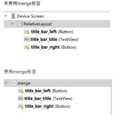
<merge xmlns:android="http://schemas.android.com/apk/res/android">

 <Button
  android:id="@+id/title_bar_left"
  android:layout_width="wrap_content"
  android:layout_height="wrap_content"
  android:layout_alignParentLeft="true"
  android:layout_centerVertical="true"
  android:layout_marginLeft="5dp"
  android:background="@null"
  android:minHeight="45dp"
  android:minWidth="45dp"
  android:textSize="14sp" />

 <TextView
  android:id="@+id/title_bar_title"
  android:layout_width="wrap_content"
  android:layout_height="wrap_content"
  android:layout_centerInParent="true"
  android:singleLine="true"
  android:textSize="17sp" />

 <Button
  android:id="@+id/title_bar_right"
  android:layout_width="wrap_content"
  android:layout_height="wrap_content"
  android:layout_alignParentRight="true"
  android:layout_centerVertical="true"
  android:layout_marginRight="7dp"
  android:background="@null"
  android:minHeight="45dp"
  android:minWidth="45dp"
  android:textSize="14sp" />

</merge>
注意:這裡為何要使用merge標簽,自定義組合控件時會繼承RelativeLayout、LinearLayout等控件,這樣導致布局的層級無形中增加了一層,如下是對比:
2.)定義自定義屬性
比如標題文字、標題欄左邊按鈕圖標等。
 <declare-styleable name="CustomTitleBar">
  <attr name="title_background_color" format="reference|integer" />
  <attr name="left_button_visible" format="boolean" />
  <attr name="right_button_visible" format="boolean" />
  <attr name="title_text" format="string" />
  <attr name="title_text_color" format="color" />
  <attr name="title_text_drawable" format="reference|integer" />
  <attr name="right_button_text" format="string" />
  <attr name="right_button_text_color" format="color" />
  <attr name="right_button_drawable" format="reference|integer" />
  <attr name="left_button_text" format="string" />
  <attr name="left_button_text_color" format="color" />
  <attr name="left_button_drawable" format="reference|integer" />
 </declare-styleable>
3.)自定義一個View根據需求繼承不同的ViewGroup子類,比如:RelativeLayout、LinearLayout等,我們這裡繼承RelativeLayout。
public class CustomTitleBar extends RelativeLayout {
 private Button titleBarLeftBtn;
 private Button titleBarRightBtn;
 private TextView titleBarTitle;

 public CustomTitleBar(Context context, AttributeSet attrs) {
  super(context, attrs);
  LayoutInflater.from(context).inflate(R.layout.custom_title_bar, this, true);
  titleBarLeftBtn = (Button) findViewById(R.id.title_bar_left);
  titleBarRightBtn = (Button) findViewById(R.id.title_bar_right);
  titleBarTitle = (TextView) findViewById(R.id.title_bar_title);

  TypedArray attributes = context.obtainStyledAttributes(attrs, R.styleable.CustomTitleBar);
  if (attributes != null) {
   //處理titleBar背景色
   int titleBarBackGround = attributes.getResourceId(R.styleable.CustomTitleBar_title_background_color, Color.GREEN);
   setBackgroundResource(titleBarBackGround);
   //先處理左邊按鈕
   //獲取是否要顯示左邊按鈕
   boolean leftButtonVisible = attributes.getBoolean(R.styleable.CustomTitleBar_left_button_visible, true);
   if (leftButtonVisible) {
    titleBarLeftBtn.setVisibility(View.VISIBLE);
   } else {
    titleBarLeftBtn.setVisibility(View.INVISIBLE);
   }
   //設置左邊按鈕的文字
   String leftButtonText = attributes.getString(R.styleable.CustomTitleBar_left_button_text);
   if (!TextUtils.isEmpty(leftButtonText)) {
    titleBarLeftBtn.setText(leftButtonText);
    //設置左邊按鈕文字顏色
    int leftButtonTextColor = attributes.getColor(R.styleable.CustomTitleBar_left_button_text_color, Color.WHITE);
    titleBarLeftBtn.setTextColor(leftButtonTextColor);
   } else {
    //設置左邊圖片icon 這裡是二選一 要麼只能是文字 要麼只能是圖片
    int leftButtonDrawable = attributes.getResourceId(R.styleable.CustomTitleBar_left_button_drawable, R.mipmap.titlebar_back_icon);
    if (leftButtonDrawable != -1) {
     titleBarLeftBtn.setBackgroundResource(leftButtonDrawable);
    }
   }

   //處理標題
   //先獲取標題是否要顯示圖片icon
   int titleTextDrawable = attributes.getResourceId(R.styleable.CustomTitleBar_title_text_drawable, -1);
   if (titleTextDrawable != -1) {
    titleBarTitle.setBackgroundResource(titleTextDrawable);
   } else {
    //如果不是圖片標題 則獲取文字標題
    String titleText = attributes.getString(R.styleable.CustomTitleBar_title_text);
    if (!TextUtils.isEmpty(titleText)) {
     titleBarTitle.setText(titleText);
    }
    //獲取標題顯示顏色
    int titleTextColor = attributes.getColor(R.styleable.CustomTitleBar_title_text_color, Color.WHITE);
    titleBarTitle.setTextColor(titleTextColor);
   }

   //先處理右邊按鈕
   //獲取是否要顯示右邊按鈕
   boolean rightButtonVisible = attributes.getBoolean(R.styleable.CustomTitleBar_right_button_visible, true);
   if (rightButtonVisible) {
    titleBarRightBtn.setVisibility(View.VISIBLE);
   } else {
    titleBarRightBtn.setVisibility(View.INVISIBLE);
   }
   //設置右邊按鈕的文字
   String rightButtonText = attributes.getString(R.styleable.CustomTitleBar_right_button_text);
   if (!TextUtils.isEmpty(rightButtonText)) {
    titleBarRightBtn.setText(rightButtonText);
    //設置右邊按鈕文字顏色
    int rightButtonTextColor = attributes.getColor(R.styleable.CustomTitleBar_right_button_text_color, Color.WHITE);
    titleBarRightBtn.setTextColor(rightButtonTextColor);
   } else {
    //設置右邊圖片icon 這裡是二選一 要麼只能是文字 要麼只能是圖片
    int rightButtonDrawable = attributes.getResourceId(R.styleable.CustomTitleBar_right_button_drawable, -1);
    if (rightButtonDrawable != -1) {
     titleBarRightBtn.setBackgroundResource(rightButtonDrawable);
    }
   }
   attributes.recycle();
  }
 }

 public void setTitleClickListener(OnClickListener onClickListener) {
  if (onClickListener != null) {
   titleBarLeftBtn.setOnClickListener(onClickListener);
   titleBarRightBtn.setOnClickListener(onClickListener);
  }
 }

 public Button getTitleBarLeftBtn() {
  return titleBarLeftBtn;
 }

 public Button getTitleBarRightBtn() {
  return titleBarRightBtn;
 }

 public TextView getTitleBarTitle() {
  return titleBarTitle;
 }
}
4.)在不同的XML布局中引用
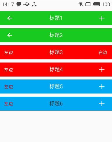
關於如何使用自定義屬性這裡就不再說明了,為了更加直觀的查看效果,我這裡在一個布局文件中實現不同要求的標題欄
<?xml version="1.0" encoding="utf-8"?>
<LinearLayout xmlns:android="http://schemas.android.com/apk/res/android"
 xmlns:lee="http://schemas.android.com/apk/res-auto"
 android:layout_width="match_parent"
 android:layout_height="match_parent"
 android:orientation="vertical">

 <com.whoislcj.views.CustomTitleBar
  android:layout_width="match_parent"
  android:layout_height="45dp"
  android:layout_marginTop="10dp"
  lee:right_button_drawable="@mipmap/titlebar_add_icon"
  lee:title_background_color="@color/green"
  lee:title_text="標題1" />

 <com.whoislcj.views.CustomTitleBar
  android:layout_width="match_parent"
  android:layout_height="45dp"
  android:layout_marginTop="10dp"
  lee:right_button_visible="false"
  lee:title_background_color="@color/green"
  lee:title_text="標題2" />

 <com.whoislcj.views.CustomTitleBar
  android:layout_width="match_parent"
  android:layout_height="45dp"
  android:layout_marginTop="10dp"
  lee:left_button_text="左邊"
  lee:right_button_text="右邊"
  lee:title_background_color="@color/red"
  lee:title_text="標題3" />

 <com.whoislcj.views.CustomTitleBar
  android:layout_width="match_parent"
  android:layout_height="45dp"
  android:layout_marginTop="10dp"
  lee:left_button_text="左邊"
  lee:right_button_drawable="@mipmap/titlebar_add_icon"
  lee:title_background_color="@color/red"
  lee:title_text="標題4" />

 <com.whoislcj.views.CustomTitleBar
  android:layout_width="match_parent"
  android:layout_height="45dp"
  android:layout_marginTop="10dp"
  lee:left_button_text="左邊"
  lee:left_button_text_color="@color/red"
  lee:right_button_drawable="@mipmap/titlebar_add_icon"
  lee:title_background_color="@color/blue"
  lee:title_text="標題5" />

 <com.whoislcj.views.CustomTitleBar
  android:layout_width="match_parent"
  android:layout_height="45dp"
  android:layout_marginTop="10dp"
  lee:left_button_text="左邊"
  lee:left_button_text_color="@color/red"
  lee:right_button_drawable="@mipmap/titlebar_add_icon"
  lee:title_background_color="@color/blue"
  lee:title_text="標題6"
  lee:title_text_color="@color/black" />

</LinearLayout>
顯示效果
總結:
通過本篇文章我們得知,通過自定義組合控件確實能夠提高開發效率,降低維護成本,但是也需要UI設計風格保持高度一致,不然的話只能呵呵哒了!所以想要做好一個app需要一個有共識的團隊才行。本篇介紹到此為止,下一篇要更新什麼我還沒有想好!有可能是自定義控件的事件回調,也有可能自定義ViewGroup實現流式布局,點擊查看。
以上就是本文的全部內容,希望對大家的學習有所幫助,也希望大家多多支持本站。
 Android仿IOS的AssistiveTouch的控件EasyTouch實現
概述:之前我聽到過一則新聞,就是說Ipone中的AssistiveTouch的設計初衷是給殘疾人使用的。而這一功能在亞洲(中國)的使用最為頻繁。雖不知道這新聞的可靠性,但
 Android項目編譯的時候出現:Caused by: java.lang.ClassNotFoundException: com.example.aaa.MainActivity
錯誤類型: 04-28 06:10:15.508: E/AndroidRuntime(849): Caused by: java.lang.ClassNotFoun
 Android之Notification的多種用法實例
我們在用手機的時候,如果來了短信,而我們沒有點擊查看的話,是不是在手機的最上邊的狀態欄裡有一個短信的小圖標提示啊?你是不是也想實現這種功能呢?今天的Notificatio
 安卓Android-X86 4.4休眠、關機常見問題解決
Q:安卓Android-x86 4.4 VMware虛擬機休眠後怎麼喚醒?按一下右Alt鍵旁邊的菜單鍵就可以喚醒系統了。Q:安卓Android-x86 4.