編輯:關於Android編程
先把來源貼上
http://zrgiu.com/blog/2011/01/making-your-android-app-look-better/
http://www.dibbus.com/2011/02/gradient-buttons-for-android/http://www.dibbus.com/2011/08/even-more-gradient-buttons-for-android/
然後再讓大家看看效果,這些都是xml布局文件實現的,一張圖片都未曾使用。
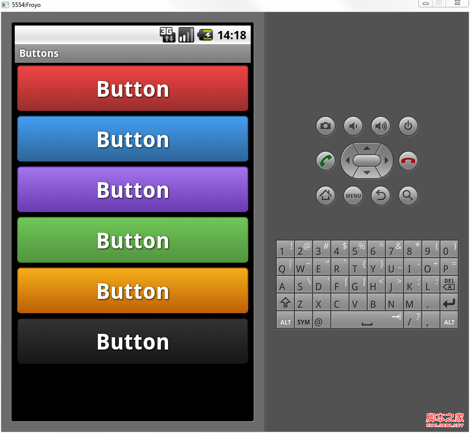
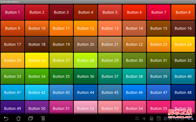
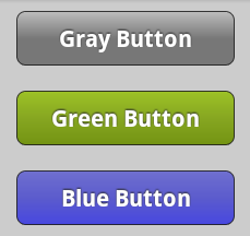
順便貼出幾個布局文件給大家看看:
復制代碼 代碼如下:
<?xml version="1.0" encoding="utf-8"?>
<selector xmlns:android="http://schemas.android.com/apk/res/android">
<item android:state_pressed="true" >
<shape>
<solid
android:color="#449def" />
<stroke
android:width="1dp"
android:color="#2f6699" />
<corners
android:radius="3dp" />
<padding
android:left="10dp"
android:top="10dp"
android:right="10dp"
android:bottom="10dp" />
</shape>
</item>
<item>
<shape>
<gradient
android:startColor="#449def"
android:endColor="#2f6699"
android:angle="270" />
<stroke
android:width="1dp"
android:color="#2f6699" />
<corners
android:radius="4dp" />
<padding
android:left="10dp"
android:top="10dp"
android:right="10dp"
android:bottom="10dp" />
</shape>
</item>
</selector>
復制代碼 代碼如下:
<?xml version=”1.0″ encoding=”UTF-8″?>
<shape xmlns:android=”http://schemas.android.com/apk/res/android”>
<solid android:color=”#F000″/>
<stroke android:width=”1px” android:color=”#BB000000″ />
<padding
android:left=”10dp”
android:top=”7dp”
android:right=”10dp”
android:bottom=”7dp”
/>
<corners
android:bottomRightRadius=”5dp”
android:bottomLeftRadius=”5dp”
android:topLeftRadius=”5dp”
android:topRightRadius=”5dp”
/>
<gradient
android:angle=”90″
android:startColor=”#4747e0″
android:centerColor=”#5b5bcd”
android:endColor=”#6f6fcf”
android:type=”linear”
/>
</shape>
這裡有個工程,開源的
http://code.google.com/p/android-gradients-sample/downloads/list
順便把這兩個網頁給收了,說不定以後能夠提供靈感或者參考
http://www.webdesignshock.com/css-button
http://www.jb51.net/css/23418.html
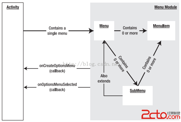 Android開發之Menu:OptionMenu(選項菜單)、ContextMenu(上下文菜單)、SubMenu(子菜單)
菜單的概念,現在已經很普及了。 Windows系統、Mac、桌面版Linux、Java Swing等,都有可視化菜單。 一、Android平台3種菜單 選項菜單(Op
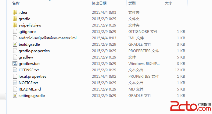 Android studio導入開源項目
前幾天從github上下載一個開源項目,發現他並不是以前Eclipse那種的目錄結構 而是最近在用到的android studio的文件目錄。從上圖中我們可以看到多次出
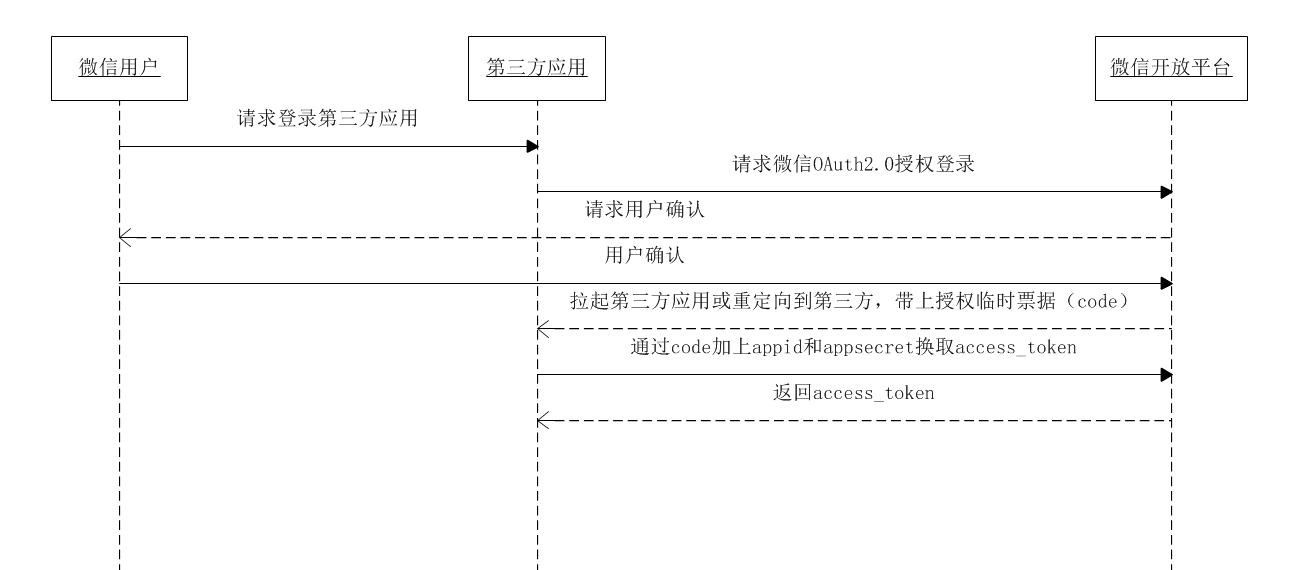 Android開發:微信授權登錄與微信分享完全解析
前言在移動互聯網浪潮中,聯網APP已經把單機拍死在沙灘上,很多公司都希望自家應用能夠有一套帳號系統,可是許多用戶卻並不一定買賬:我憑啥注冊你家應用的帳號?微博
 Android開發技巧——定制仿微信圖片裁剪控件
拍照——裁剪,或者是選擇圖片——裁剪,是我們設置頭像或上傳圖片時經常需要的一組操作。上篇講了Camera的使用,這篇講一下