編輯:關於Android編程
Android 線性布局: AbsoluteLayout布局和RelativeLayout布局。
1、絕對布局 AbsoluteLayout
絕對定位AbsoluteLayout,又可以叫做坐標布局,可以直接指定子元素的絕對位置,這種布局簡單直接,直觀性強,但是由於手機屏幕尺寸差別比較大,使用絕對定位的適應性會比較差。
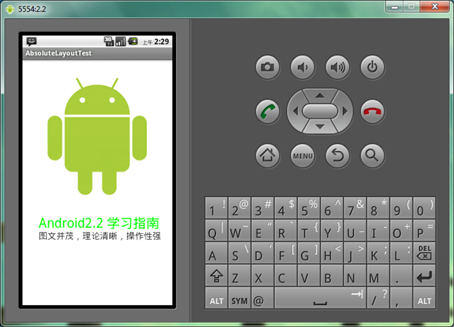
下面我們舉一個例子看看:例子裡的機器人圖片大小是250X250,可以看到我們使用android:layout_x和android:layout_y來指定子元素的縱橫坐標。
<?xml version=”1.0″ encoding=”utf-8″?>
<AbsoluteLayout android:id=”@+id/AbsoluteLayout01″
android:layout_width=”fill_parent”
android:layout_height=”fill_parent”
xmlns:android=”http://schemas.android.com/apk/res/android”
android:background=”#fff”><ImageView
android:src=”@drawable/android”
android:layout_y=”40dip”
android:layout_width=”wrap_content”
android:layout_x=”35dip”
android:id=”@+id/ImageView01″
android:layout_height=”wrap_content”>
</ImageView>
<TextView
android:layout_height=”wrap_content”
android:layout_width=”fill_parent”
android:id=”@+id/TextView01″
android:text=”Android2.2 學習指南”
android:textColor=”#0f0″
android:textSize=”28dip”
android:layout_y=”330dip”
android:layout_x=”35dip“>
</TextView>
<TextView
android:layout_height=”wrap_content”
android:layout_width=”fill_parent”
android:id=”@+id/TextView02″
android:text=”圖文並茂,理論清晰,操作性強”
android:textColor=”#333″
android:textSize=”18dip”
android:layout_y=”365dip”
android:layout_x=”35dip“>
</TextView>
</AbsoluteLayout>
讓我們看一下在WQVGA的模擬器下的顯示效果:
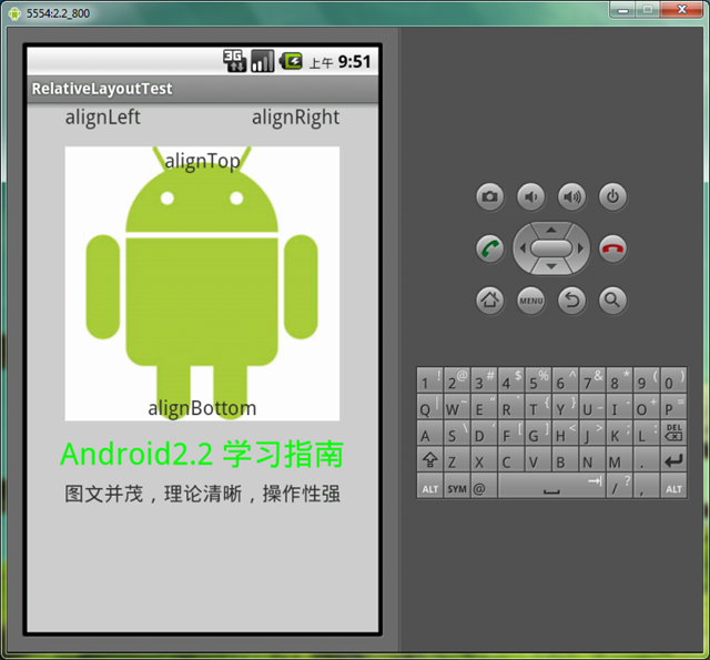
再在WVGA800的模擬器下看看顯示效果:
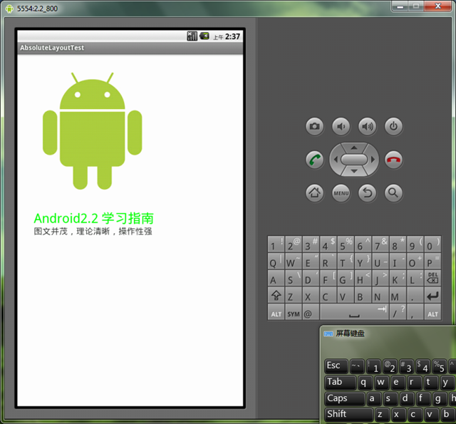
Tip: 在絕對定位中,如果子元素不設置layout_x和layout_y,那麼它們的默認值是0,也就是說它會像在FrameLayout一樣這個元素會出現在左上角。
2、相對布局 RelativeLayout
相對布局 RelativeLayout 允許子元素指定它們相對於其父元素或兄弟元素的位置,這是實際布局中最常用的布局方式之一。它靈活性大很多,當然屬性也多,操作難度也大,屬性之間產生沖突的的可能性也大,使用相對布局時要多做些測試。
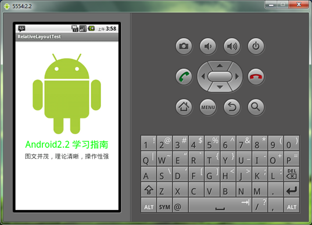
下面我們用相對布局再做一次上面的例子,首先放置一個圖片,其它兩個文本分別相對上一個元素定位:
<?xml version=”1.0″ encoding=”utf-8″?><RelativeLayout android:id=”@+id/RelativeLayout01″
android:layout_width=”fill_parent”
android:layout_height=”fill_parent”
android:background=”#fff”
xmlns:android=”http://schemas.android.com/apk/res/android”><ImageView android:id=”@+id/ImageView01″
android:src=”@drawable/android”
android:layout_width=”fill_parent”
android:layout_height=”wrap_content”
android:layout_marginTop=”40dip”
>
</ImageView>
<TextView
android:layout_height=”wrap_content”
android:layout_width=”wrap_content”
android:id=”@+id/TextView01″
android:text=”Android2.2 學習指南”
android:textColor=”#0f0″
android:textSize=”28dip”
android:layout_below=”@id/ImageView01″
android:layout_centerHorizontal=”true”
android:layout_marginTop=”10dip”>
</TextView>
<TextView
android:layout_height=”wrap_content”
android:layout_width=”wrap_content”
android:id=”@+id/TextView02″
android:text=”圖文並茂,理論清晰,操作性強”
android:textColor=”#333″
android:textSize=”18dip”
android:layout_below=”@id/TextView01″
android:layout_centerHorizontal=”true”
android:layout_marginTop=”5dip“>
</TextView>
</RelativeLayout>
讓我們看一下在WQVGA的模擬器下的顯示效果:
再看一下在更大屏幕(WVGA800)模擬器上的顯示效果:
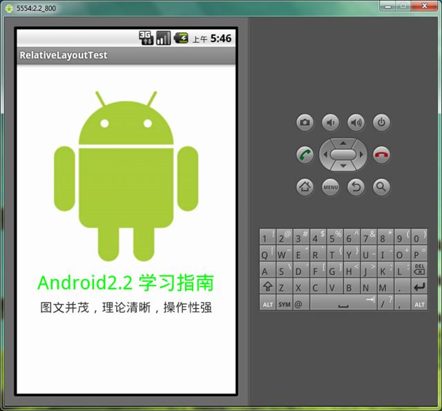
從上圖可以看到界面效果基本保持了一致,而不是像絕對定位一樣龜縮在左上角;同學們看到自動縮放的功能是采用了dip做單位帶來的好處。關於dip,不懂的同學可以看我在開發小知識裡寫的專門的文章。
下面介紹一下RelativeLayout用到的一些重要的屬性:
第一類:屬性值為true或false
第二類:屬性值必須為id的引用名“@id/id-name”
第三類:屬性值為具體的像素值,如30dip,40px
我們再把上面的例子重新做一遍,這一次多放一些屬性在裡面,大家試驗一下:
<?xml version=”1.0″ encoding=”utf-8″?><RelativeLayout android:id=”@+id/RelativeLayout01″
android:layout_width=”fill_parent”
android:layout_height=”fill_parent”
android:background=”#cfff” 色彩的設置是argb,第一個c是透明度
xmlns:android=”http://schemas.android.com/apk/res/android”><ImageView android:id=”@+id/ImageView01″
android:src=”@drawable/android”
android:layout_width=”wrap_content”
android:layout_height=”wrap_content”
android:layout_marginTop=”40dip”
android:layout_centerHorizontal=”true”>
</ImageView><TextView
android:layout_height=”wrap_content”
android:layout_width=”wrap_content”
android:id=”@+id/TextView01″
android:text=”Android2.2 學習指南”
android:textColor=”#0f0″
android:textSize=”28dip”
android:layout_below=”@id/ImageView01″
android:layout_centerHorizontal=”true”
android:layout_marginTop=”10dip”>
</TextView><TextView
android:layout_height=”wrap_content”
android:layout_width=”wrap_content”
android:id=”@+id/TextView02″
android:text=”圖文並茂,理論清晰,操作性強”
android:textColor=”#333″
android:textSize=”18dip”
android:layout_below=”@id/TextView01″
android:layout_centerHorizontal=”true”
android:layout_marginTop=”5dip”>
</TextView><TextView
android:layout_height=”wrap_content”
android:layout_width=”wrap_content”
android:id=”@+id/TextView03″
android:text=”alignTop”
android:textColor=”#333″
android:textSize=”18dip”
android:layout_alignTop=”@id/ImageView01″ 和ImageView01上邊緣對齊
android:layout_centerHorizontal=”true”>
</TextView><TextView
android:layout_height=”wrap_content”
android:layout_width=”wrap_content”
android:id=”@+id/TextView04″
android:text=”alignLeft”
android:textColor=”#333″
android:textSize=”18dip”
android:layout_alignLeft=”@id/ImageView01″
android:layout_centerHorizontal=”true”>
</TextView><TextView
android:layout_height=”wrap_content”
android:layout_width=”wrap_content”
android:id=”@+id/TextView05″
android:text=”alignRight”
android:textColor=”#333″
android:textSize=”18dip”
android:layout_alignRight=”@id/ImageView01″
android:layout_centerHorizontal=”true”>
</TextView><TextView
android:layout_height=”wrap_content”
android:layout_width=”wrap_content”
android:id=”@+id/TextView06″
android:text=”alignBottom”
android:textColor=”#333″
android:textSize=”18dip”
android:layout_alignBottom=”@id/ImageView01″
android:layout_centerHorizontal=”true”>
</TextView>
</RelativeLayout>
以上就是對Android AbsoluteLayout和RelativeLayout布局的介紹,後續繼續整理相關資料,謝謝大家對本站的支持!
 Android下拉刷新庫,利用viewdraghelper實現,集成了下拉刷新,底部加載更多,數據初始加載顯示loading等功能
Android下拉刷新庫,利用viewdraghelper實現。集成了下拉刷新,底部加載更多,以及剛進入加載數據的loadview。包括了listview與g
 android 內存進程管理分析
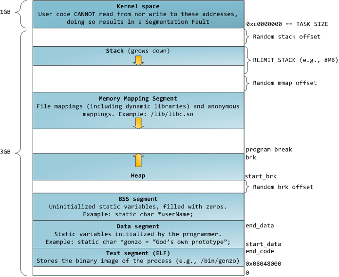
1、 進程的地址空間在32位操作系統中,進程的地址空間為0到4GB,示意圖如下: 圖1 這裡主要說明一下Stack和Heap:Stack空
 Android通訊錄模糊查詢搜索(號碼,姓名,首字母簡拼,全拼),批量選取聯系人
Android通訊錄模糊查詢搜索(號碼,姓名,首字母簡拼,全拼),批量選取聯系人 公司最近的項目中遇到一個需求需要讀取通訊錄聯系人,並需要支持對聯系人的模糊查詢及批量選
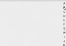 Android自定義View之用觀察者模式寫自定義監聽事件以及常用豎直型字母索引欄的寫法
概述:目前,豎直索引欄還是很流行的,微信、美團、手機通訊錄等各種常用軟件都要用到它。Demo寫一個自定義View,利用觀察者模式,自定義其中的點擊事件。public cl