編輯:關於Android編程
學會了Paint,Canvas的基本用法之後,我們就可以動手開始實踐了,先寫個簡單的圖片加載進度條看看。
按照慣例,先看效果圖,再決定要不要往下看:
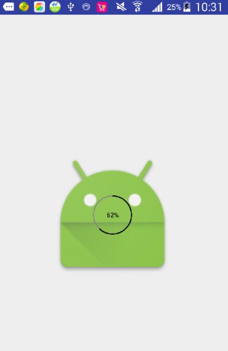
既然看到這裡了,應該是想了解這個圖片加載進度條了,我們先看具體用法,再看自定義View的實現:
<RelativeLayout xmlns:android="http://schemas.android.com/apk/res/android"
 xmlns:custom="http://schemas.android.com/apk/res-auto"
 android:layout_width="match_parent"
 android:layout_height="match_parent">
 <ImageView
 android:id="@+id/img"
 android:layout_width="200dp"
 android:layout_height="200dp"
 android:scaleType="centerCrop"
 android:layout_centerInParent="true"/>
 <com.example.circleprogresstest.CircleProgressView
 android:id="@+id/progressView"
 android:layout_width="60dp"
 android:layout_height="60dp"
 android:layout_centerInParent="true"
 custom:isShowProgress="true" />
</RelativeLayout>
ImageLoader.getInstance().displayImage(url, imageView, options,
 new SimpleImageLoadingListener() ,
 new ImageLoadingProgressListener() {
  @Override
  public void onProgressUpdate(String imageUri, View view, int current, int total) {
  if(current==total){
   progressView.setVisibility(View.GONE);
  }else{
   progressView.setSweepAngle((int)(360*current*1.0f/total));
   progressView.postInvalidate();
  }
  }
 }
);
可以看出,以上的用法,非常簡單,在xml中添加我們自定義的View,和添加textview或者button完全相同,只是多了我們自己的自定義屬性而已,可以設置圓的顏色,以及文字顏色,大小等等。之後,在MainActivity中使用的方法也是同樣簡單,只要在圖片的進度更新的時候,同時更新我們進度條的進度就行了。
下面我們具體說下我們實現自定義進度條的過程,我們只需要重寫onDraw()方法就夠了,很明顯,我們的進度條包括三部分,內圈圓,外圈圓弧,中間的文字,具體看代碼:
protected void onDraw(Canvas canvas) {
 mWidth=getMeasuredWidth();
 mHeight=getMeasuredHeight();
 radius=(float)(Math.min(mWidth,mHeight)*1.0/2)-strokeWidth/2;
 //繪制內圈圓
 mPaint.setColor(initColor);
 mPaint.setStyle(Paint.Style.STROKE);
 mPaint.setStrokeWidth(strokeWidth);
 canvas.drawCircle(mWidth/2,mHeight/2,radius,mPaint);
 //繪制覆蓋的圓弧
 mPaint.setColor(coverColor);
 RectF rectF=new RectF(mWidth/2-radius,mHeight/2-radius,mWidth/2+radius,mHeight/2+radius);
 canvas.drawArc(rectF,-90,sweepAngle,false,mPaint);
 //繪制中間的文本
 if(isShowProgress){
 progressText=String.format(getResources().getString(R.string.progress_text),(int)(sweepAngle*100.0/360));
 mPaint.setTextSize(textSize);
 mPaint.setColor(textColor);
 if(mBound==null){
  mBound=new Rect();
 }
 mPaint.getTextBounds(progressText,0,progressText.length(),mBound);
 mPaint.setStyle(Paint.Style.FILL);
 canvas.drawText(progressText,mWidth/2-mBound.width()/2,mHeight/2+mBound.height()/2,mPaint);
 }
}
當然,為了讓我們可以自定義進度條的大小顏色,我們還采用了自定義屬性,並且在構造器中,也需要加載xml中的各項屬性:
<resources>
 <declare-styleable name="CircleProgressView">
 <attr name="initColor" format="color"/>
 <attr name="coverColor" format="color"/>
 <attr name="strokeWidth" format="dimension"/>
 <attr name="progressTextSize" format="dimension"/>
 <attr name="progressTextColor" format="color"/>
 <attr name="isShowProgress" format="boolean"/>
 </declare-styleable>
</resources>
private void initValues(Context context, AttributeSet attrs, int defStyleAttr){
 TypedArray typedArray=context.getTheme().obtainStyledAttributes(attrs,R.styleable.CircleProgressView,defStyleAttr,0);
 int num=typedArray.getIndexCount();
 for(int i=0;i<num;i++){
 int attr=typedArray.getIndex(i);
 switch (attr){
  case R.styleable.CircleProgressView_initColor:
  initColor=typedArray.getColor(attr,Color.GRAY);
  break;
  case R.styleable.CircleProgressView_coverColor:
  coverColor=typedArray.getColor(attr,Color.BLACK);
  break;
  case R.styleable.CircleProgressView_strokeWidth:
  strokeWidth=typedArray.getDimensionPixelOffset(attr,5);
  break;
  case R.styleable.CircleProgressView_progressTextSize:
  textSize=typedArray.getDimensionPixelSize(attr,30);
  break;
  case R.styleable.CircleProgressView_progressTextColor:
  textColor=typedArray.getColor(attr,Color.BLACK);
  break;
  case R.styleable.CircleProgressView_isShowProgress:
  isShowProgress=typedArray.getBoolean(attr,false);
  break;
  default:
  break;
 }
 }
 typedArray.recycle();

 mPaint=new Paint();
 mPaint.setAntiAlias(true);
}
源碼下載:http://xiazai.jb51.net/201608/yuanma/circleprogress(jb51.net).rar
以上就是本文的全部內容,希望對大家的學習有所幫助,也希望大家多多支持本站。
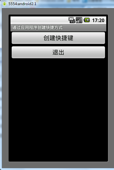 Android通過應用程序創建快捷方式的方法
本文實例講述了Android通過應用程序創建快捷方式的方法。分享給大家供大家參考。具體如下:Android 快捷方式是桌面最基本的組件。它用於直接啟動某一應用程序的某個組
 Android 利用ViewPager實現底部圓點導航左右滑動效果以及Fragment頁面切換
上一篇博文我們介紹了利用ViewPager和Fragment實現頂部滑塊左右滑動效果,具體參考(http://blog.csdn.net/a123demi/article
 調用meitu秀秀.so文件實現美圖功能
本文屬於實戰系列,是對《Android C代碼回調java方法》等文的實踐,調用meitu秀秀的libmtimage-jni.so文件來實現圖片的美化功能首先反編譯得到/
 Android app開發中的Fragment入門學習教程
在Android3.0上開始引入了一個新概念叫Fragment。它有自己的布局文件,可以作為組件排布,也可以相互組合去實現不同的布局顯示。使用Fragment可以重復利用