編輯:Android開發實例
繼android Theme使用總結之後,我總結了一下level 11的樣式。方法與android Theme使用總結一樣,都是將theme寫在AndroidManifest.xml中定義。
以下是level 11的theme,截圖我使用的是3.0的模擬器:
1、Theme_Holo
意思為:New Honeycomb全屏顯示樣式,默認是黑背景,
api原文:
New Honeycomb holographic theme. Dark version. The widgets in the holographic theme are translucent on their brackground, so applications must ensure that any background they use with this theme is itself dark; otherwise, it will be difficult to see the widgets. The new UI style also includes a full action bar by default. Styles used by the Holo theme are named using the convention Type.Holo.Etc. (For example, Widget.Holo.Button, TextAppearance.Holo.Widget.PopupMenu.Large.) Specific resources used by Holo are named using the convention @type/foo_bar_baz_holo with trailing _dark or _light specifiers if they are not shared between both light and dark versions of the theme. 效果圖如下:
1.1、Theme_Holo_Dialog
意思為:將activity顯示成對話框的樣式,
api原文:
Dialog themes for Holo Holo theme for dialog windows and activities, which is used by the Dialog class. This changes the window to be floating (not fill the entire screen), and puts a frame around its contents. You can set this theme on an activity if you would like to make an activity that looks like a Dialog. This is the default Dialog theme for applications targeting Honeycomb or newer. 效果圖如下:需自定義大小,否則像下圖一樣View顯示不全
1.1.1、Theme_Holo_Dialog_MinWidth
意思為:將activity顯示成對話框的樣式,顯示最小狀態時,
api原文:
Variation of Theme.Holo.Dialog that has a nice minumum width for a regular dialog. 效果圖如下:
1.1.2、Theme_Holo_DialogWhenLarge
意思為:將activity顯示成對話框的樣式,顯示最大狀態時,
api原文:
Theme for a window that will be displayed either full-screen on smaller screens (small, normal) or as a dialog on larger screens (large, xlarge). 效果圖如下:
1.1.3、Theme_Holo_DialogWhenLarge_NoActionBar
意思為:將activity顯示成對話框的樣式,顯示最大狀態時,且沒有action bar
api原文:
Theme for a window without a title bar that will be displayed either full-screen on smaller screens (small, normal) or as a dialog on larger screens (large, xlarge). 效果圖如下:
1.1.4、Theme_Holo_Dialog_NoActionBar
意思為:將activity顯示成對話框的樣式,且沒有action bar,默認狀態
api原文:
Variation of Theme.Holo.Dialog that does not include a title bar. 效果圖如下:需自定義大小,否則像下圖一樣View顯示不全
1.1.5、Theme_Holo_Dialog_NoActionBar_MinWidth
意思為:將activity顯示成對話框的樣式,且沒有action bar,顯示最小狀態時
api原文:
Variation of Theme.Holo.Dialog.NoActionVar that has a nice minumum width for a regular dialog. 效果圖如下:
1.2、Theme_Holo_InputMethod
意思為:
api原文:
Default theme for modern holo style input methods, which is used by the InputMethodService class. this inherits from Theme.Panel, but sets up IME appropriate animations and a few custom attributes. 效果圖如下:類似於panel;需自定義大小,否則像下圖一樣View顯示不全
1.3、Theme_Holo_NoActionBar
意思為: 默認狀態下,沒有action bar的樣式。
api原文:
Variant of the holographic (dark) theme with no action bar. 效果圖如下:
1.3.1、Theme_Holo_NoActionBar_Fullscreen
意思為: 默認狀態下,沒有action bar且全屏的樣式。 (這裡我很不解。為什麼與上一個顯示效果一樣。難道說Google認為現在的狀態就是全屏了?那麼下面的時間什麼的怎麼都在?)
api原文:
Variant of the holographic (dark) theme that has no title bar and fills the entire screen 效果圖如下:
1.4、Theme_Holo_Wallpaper
意思為: 使用牆紙做為樣式背景,默認狀態下。
api原文:
Default holographic (dark) for windows that want to have the user’s selected wallpaper appear behind them. 效果圖如下:
1.4.1、Theme_Holo_Wallpaper_NoActionBar
意思為: 使用牆紙做為樣式背景,且沒有action bar。
api原文:
Variant of the holographic (dark) theme with no title bar 效果圖如下:
1.5、Theme_Holo_Panel
意思為: 默認將一個activity顯示成一個對話框樣式,區別於對話框,這個沒有外邊框,沒有任何樣式元素只有一個空的矩形框。
api原文:
Default holo dark theme for panel windows. This removes all extraneous window decorations, so you basically have an empty rectangle in which to place your content. It makes the window floating, with a transparent background, and turns off dimming behind the window. 效果圖如下:需自定義大小,否則像下圖一樣View顯示不全
2、Theme_Holo_Light
意思為: 默認樣式,區別於黑背景,這個屬於亮背景。
api原文:
New Honeycomb holographic theme. Light version. The widgets in the holographic theme are translucent on their brackground, so applications must ensure that any background they use with this theme is itself light; otherwise, it will be difficult to see the widgets. The new UI style also includes a full action bar by default.
效果圖如下:
2.1、Theme_Holo_Light_Dialog
意思為: 默認將一個activity顯示成一個對話框樣式,區別於黑背景,這個屬於亮背景。
api原文:
Light holo dialog themes Holo light theme for dialog windows and activities, which is used by the Dialog class. This changes the window to be floating (not fill the entire screen), and puts a frame around its contents. You can set this theme on an activity if you would like to make an activity that looks like a Dialog. This is the default Dialog theme for applications targeting Honeycomb or newer. 效果圖如下:需自定義大小,否則像下圖一樣View顯示不全
2.1.1、Theme_Holo_Light_Dialog_MinWidth
意思為: 默認將一個activity顯示成一個對話框樣式,區別於黑背景,這個屬於亮背景,顯示最小狀態時。
api原文:
Variation of Theme.Holo.Light.Dialog that has a nice minumum width for a regular dialog. 效果圖如下:
2.1.2、Theme_Holo_Light_DialogWhenLarge
意思為: 默認將一個activity顯示成一個對話框樣式,區別於黑背景,這個屬於亮背景,顯示最大狀態時。
api原文:
Theme for a window that will be displayed either full-screen on smaller screens (small, normal) or as a dialog on larger screens (large, xlarge). 效果圖如下:
2.1.3、Theme_Holo_Light_DialogWhenLarge_NoActionBar
意思為: 默認將一個activity顯示成一個對話框樣式,區別於黑背景,這個屬於亮背景,顯示最大狀態,且沒有action bar時。
api原文:
Theme for a window without an action bar that will be displayed either full-screen on smaller screens (small, normal) or as a dialog on larger screens (large, xlarge). 效果圖如下:
2.1.4、Theme_Holo_Light_Dialog_NoActionBar
意思為: 默認將一個activity顯示成一個對話框樣式,區別於黑背景,這個屬於亮背景,且沒有action bar時。
api原文:
Theme for a window without an action bar that will be displayed either full-screen on smaller screens (small, normal) or as a dialog on larger screens (large, xlarge). 效果圖如下:需自定義大小,否則像下圖一樣View顯示不全
2.1.5、Theme_Holo_Light_Dialog_NoActionBar_MinWidth
意思為: 默認將一個activity顯示成一個對話框樣式,區別於黑背景,這個屬於亮背景,且沒有action bar時,顯示最小狀態時。
api原文:
Variation of Theme.Holo.Light.Dialog that has a nice minumum width for a regular dialog. 效果圖如下:
2.2、Theme_Holo_Light_Panel
意思為: 默認將一個activity顯示成一個對話框樣式,區別於對話框,這個沒有外邊框,沒有任何樣式元素只有一個空的矩形框,區別於黑背景,這個屬於亮背景。
api原文:
Default holo light theme for panel windows. This removes all extraneous window decorations, so you basically have an empty rectangle in which to place your content. It makes the window floating, with a transparent background, and turns off dimming behind the window.
效果圖如下:需自定義大小,否則像下圖一樣View顯示不全
3、Theme_NoTitleBar_OverlayActionModes
意思為:( 這裡我按照api翻譯為:沒有標題欄,但狀態欄將覆蓋應用內容,而不是將應用內容擠下去為自己騰出空間。)不太明白哪裡會用到此主題。留待以後去解決
api原文: 效果圖如下:
No title bar, but Action Mode bars will overlay application content instead of pushing it down to make room.
4、Theme_WithActionBar
意思為:顯示action Bar的主題樣式
api原文: 效果圖如下:
Default theme with an Action Bar.
總結,Honeycomb下的action bar相當於level 11以下的title bar,不同的是,Honeycomb在對話框樣式時會比level 11以下的title bar多一個橫線,起碼現在在模擬器上看來是多了一條橫線。
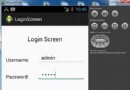
 Android圖片處理實例介紹(圖)
1.圖片處理 1.圓角圖片代碼如下:/** * 轉換成圓角 * &
 Android本地化
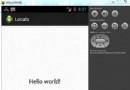
Android應用程序可以在許多不同地區的許多設備上運行。為了使應用程序更具交互性,應用程序應該處理以適合應用程序將要使用的語言環境方面的文字,數字,文件等。在本章中,我
 Android本地化
Android應用程序可以在許多不同地區的許多設備上運行。為了使應用程序更具交互性,應用程序應該處理以適合應用程序將要使用的語言環境方面的文字,數字,文件等。在本章中,我
 Android本地化
Android應用程序可以在許多不同地區的許多設備上運行。為了使應用程序更具交互性,應用程序應該處理以適合應用程序將要使用的語言環境方面的文字,數字,文件等。在本章中,我