編輯:關於Android編程
作者:泥沙磚瓦漿木匠
網站:http://blog.csdn.net/jeffli1993
個人簽名:打算起手不凡寫出鴻篇巨作的人,往往堅持不了完成第一章節。
交流QQ群:【編程之美 365234583】http://jq.qq.com/?_wv=1027&k=XVfBTo
繼續AndroidUI系列,UI其實是個前端活,美感是最終的boss階段。泥瓦匠的美感也就給你們評論評論哈哈,我等UI寫到一定地步。我想寫下Android的一系列簡單入門。為了鞏固提升呗。哈哈。下面介入正題。
有道是路漫漫其修遠兮,吾將上下而求索。任何東西都不是一步登天,愛情啥都一樣。錢也一樣,沒人願意給你1億,更何況也沒願意給你100的。為什麼?沒啥的,注意細節,一步一步來。讓你值得那一億就有了。但是要記住
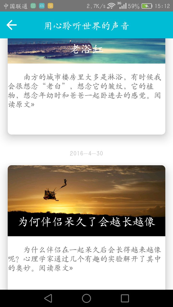
泥瓦匠是個愛扯的人。項目的進展也不錯,前天友人通了個宵,或是今天降溫了,想睡覺。晚上去鍛煉下,應該就好了。哈哈~扯淡完畢。今天我們來實現下面這個界面:雲通訊錄項目之雲端更新界面

先理理思路:
實現這個,首先我們得明白關於Canvas Paint的相關知識。這裡我也就把涉及到的東西講下。還是看效果說話吧。關於2D繪圖的api都在android.graphics和android.graphics.drawable包裡面。圖形相關的有Point(點),RetcF(矩形)等,還有動畫相關有AnimationDrawable、 BitmapDrawable和TransitionDrawable等。
本例中,其實我們用到的是很簡單的兩個操作。定義一個矩形(RetcF)然後再矩形區域,畫弧線。一個弧線是對應的白色底部,另一個弧線是對應的進度。算好角度,然後就自然而然的可以了。話不多說,泥瓦匠就上代碼了。(代碼裡面的詳細注解,你也應該可以方便的看的懂。)
1 2 3 4 5 6 7 8 9 10 11 12 13 14 15 16 17 18 19 20 21 22 23 24 25 26 27 28 29 30 31 32 33 34 35 36 37 38 39 40 41 42 43 44 45 46 47 48 49 50 51 52 53 54 55 56 57 58 59 60 61 62 63 64 65 66 67 68 69 70 71 72 73 74 75 76 77 78 79 80 81 82 83 84 85 86 87 88 89 90 91 92 93 94 95 96 97 98 99 100 101 102 103 104 105 106 107 108 109 110 111 112 113 114 115 116 117 118 119 120 121 122 123 124 125 126 127 128 129 130 131package
org.nsg.view;
import
 android.content.Context;
import
 android.graphics.Canvas;
import
 android.graphics.Color;
import
 android.graphics.Paint;
import
 android.graphics.Paint.Style;
import
 android.graphics.RectF;
import
 android.util.AttributeSet;
import
 android.view.View;
import
 android.view.animation.Animation;
import
 android.view.animation.RotateAnimation;
public
 class CircleProgressBar extends View
{
private
 int maxProgress = 100;
private
 int progress = 15;
private
 int progressStrokeWidth = 16;
private
 int marxArcStorkeWidth = 16;
/*
 畫圓所在的距形區域 */
RectF
 oval;
Paint
 paint;
public
 CircleProgressBar(Context context, AttributeSet attrs)
{
super(context,
 attrs);
oval
 = new RectF();
paint
 = new Paint();
}
@Override
protected
 void onDraw(Canvas canvas)
{
super.onDraw(canvas);
int
 width = this.getWidth();
int
 height = this.getHeight();
width
 = (width > height) ? height : width;
height
 = (width > height) ? height : width;
/*
 設置畫筆為抗鋸齒 */
paint.setAntiAlias(true);
/*
 設置畫筆顏色 */
paint.setColor(Color.WHITE);
/*
 白色背景 */
canvas.drawColor(Color.TRANSPARENT);
/*
 線寬 */
paint.setStrokeWidth(progressStrokeWidth);
paint.setStyle(Style.STROKE);
/*
 左上角x */
oval.left
 = marxArcStorkeWidth / 2;
/*
 左上角y */
oval.top
 = marxArcStorkeWidth / 2;
/*
 左下角x */
oval.right
 = width  - marxArcStorkeWidth / 2;
/*
 右下角y */
oval.bottom
 = height - marxArcStorkeWidth / 2;
/*
 繪制白色圓圈,即進度條背景 */
canvas.drawArc(oval,
 -90, 360, false, paint);
paint.setColor(Color.rgb(0x57,
 0x87, 0xb6));
paint.setStrokeWidth(marxArcStorkeWidth);
/*
 繪制進度圓弧,這裡是藍色 s*/
canvas.drawArc(oval,
 -90, ((float) progress / maxProgress) * 360,false, paint);
/*
 設置百分比文本 */
paint.setStrokeWidth(1);
String
 text = progress + "%";
int
 textHeight = height / 4;
paint.setTextSize(textHeight);
int
 textWidth = (int) paint.measureText(text, 0, text.length());
paint.setStyle(Style.FILL);
canvas.drawText(text,
 width / 2 - textWidth / 2, height / 2 + textHeight / 2, paint);
}
public
 int getMaxProgress()
{
return
 maxProgress;
}
public
 void setMaxProgress(int maxProgress)
{
this.maxProgress
 = maxProgress;
}
/**
 設置進度
*
 @param progress 進度百分比
*
 @param view  標識進度的節點視圖
*/
public
 void setProgress(int progress, View view)
{
this.progress
 = progress;
view.setAnimation(pointRotationAnima(0,(int)
 (((float) 360 / maxProgress) * progress)));
this.invalidate();
}
/**
 非UI線程調用 */
public
 void setProgressNotInUiThread(int progress, View view)
{
this.progress
 = progress;
view.setAnimation(pointRotationAnima(0,(int)
 (((float) 360 / maxProgress) * progress)));
this.postInvalidate();
}
/**
 進度標注點的動畫
*
 @param fromDegrees
*
 @param toDegrees
*/
private
 Animation pointRotationAnima(float fromDegrees, float toDegrees)
{
/*
 進度點起始位置(圖片偏移約54度) */
int
 initDegress = 300;
RotateAnimation
 animation =
new
 RotateAnimation(fromDegrees,
initDegress
 + toDegrees,
Animation.RELATIVE_TO_SELF,
0.5f,
Animation.RELATIVE_TO_SELF,
0.5f);
/*
 設置動畫執行時間 */
animation.setDuration(1);
/*
 設置重復執行次數 */
animation.setRepeatCount(1);
/*
 設置動畫結束後是否停留在結束位置 */
animation.setFillAfter(true);
return
 animation;
}
}
1
1
2
3
4
5
6
7
8
9
10
11
12
13
14
15
16
17
18
19
20
21
22
23
24
25
26
27
28
29
30
31
32
33
34
35
36
37
38
39
40
41
42
43
44
45
46
47
48
49
50
51
52
53
54
55
56
57
58
59
60
61
62
63
64
65
66
67
68
69
70
71
72
73
74
75
76
77
78
79
80
81
82
83
84
85
86
87
88
89
<RelativeLayout xmlns:android="http://schemas.android.com/apk/res/android"
xmlns:tools="http://schemas.android.com/tools"
android:layout_width="match_parent"
android:layout_height="match_parent"
tools:context=".MainActivity"
 >
<RelativeLayout
android:layout_width="match_parent"
android:layout_height="46dp"
android:background="@drawable/bg_black">
<ImageView
android:id="@+id/img_user_list_back"
android:layout_width="wrap_content"
android:layout_height="wrap_content"
android:layout_alignParentLeft="true"
android:paddingLeft="24dp"
android:paddingTop="10dp"
android:paddingBottom="10dp"
android:clickable="true"
android:focusable="true"
android:scaleType="fitXY"
android:src="@drawable/btn_return"/>
<TextView
android:layout_width="wrap_content"
android:layout_height="wrap_content"
android:text="雲端更新"/>
RelativeLayout>


     <org.nsg.main.CircleProgressBar

        android:id="@+id/sync_progress"

        android:layout_width="200dp"

        android:layout_height="200dp"

        android:layout_marginBottom="210dp"

        android:layout_alignBottom="@+id/lay_bottom"

        android:layout_centerHorizontal="true"

         />


     <LinearLayout

        android:layout_width="match_parent"

        android:layout_height="50dp"

        android:layout_marginBottom="140dp"

        android:layout_alignBottom="@+id/lay_bottom">


        <TextView

            android:id="@+id/syncText"

            android:layout_width="wrap_content"

            android:layout_height="wrap_content"

            android:textColor="@color/red"

            android:paddingLeft="50dp"

            android:textSize="15sp"

            android:text="溫馨提醒:"/>


        <TextView

            android:id="@+id/syncText"

            android:layout_width="wrap_content"

            android:layout_height="wrap_content"

            android:textColor="@color/black"

            android:textSize="15sp"

            android:text="在Wifi下,更新更有效果"/>


    LinearLayout>


    <Button

       android:id="@+id/syncButton"

       android:layout_width="fill_parent"

       android:layout_height="wrap_content"

       android:layout_marginLeft="20dp"

       android:layout_marginRight="20dp"

        android:layout_marginBottom="90dp"

        android:layout_alignBottom="@+id/lay_bottom"

        android:textColor="@color/white"

        android:textSize="22sp"

       android:background="@drawable/user_detail_call_bg"

       android:text="更新"
 />


    <LinearLayout

        android:id="@+id/lay_bottom"

        android:layout_width="fill_parent"


        android:layout_height="wrap_content"


        android:orientation="horizontal"


        android:layout_alignParentBottom="true">


        <ImageView

            android:layout_width="match_parent"

            android:layout_height="wrap_content"

            android:src="@drawable/libe_footer"
 />

    LinearLayout>


RelativeLayout>


定義好這個View之後,我們就把最難的東西搞定了。代碼裡面,最後用動畫的形式展現給大家,百分比會根據你設計的百分比進行變化。泥瓦匠和大家一樣,都想急切的看到效果圖,只要大家如下簡單的操作就好了。打開設計的xml文件詳細的xml設計我也方便大家貼出來了:其他設計都是簡單的,我這邊也不展開講了。

四、總結
   本章關於雲通訊錄的界面我會慢慢分享給大家。項目也放在下面的鏈接供大家下載學習。這期就到這裡,泥瓦匠也要休息了。關於代碼在下面的鏈接:http://files.cnblogs.com/Alandre/AndroidUI04.rar
   如以上文章或鏈接對你有幫助的話,別忘了在文章按鈕或到頁面右下角點擊 “贊一個” 按鈕哦。你也可以點擊頁面右邊“分享”懸浮按鈕哦,讓更多的人閱讀這篇文章
 RecyclerView和CardView實現列表功能,用LeanCloud所存儲的數據中填充RecyclerView
最近實現了一個使用最新推出的CardView和RecyclerView實現列表功能的Demo,接下來一一介紹:1.首先介紹我使用了哪些工具(1)LeanCloud的存儲功
 android---NDK開發helloworld(jni)
1)打開Android開發者的官網www.2cto.com/找到Develop點擊。 2)進入後再點擊Tools 3)進入後在左側找到NDK點擊,可以見
 Android中跨進程通信
Android跨進程通信的功能,下面就讓我們具體地學習一下。在上篇文章中我們知道了,Service其實是運行在主線程裡的,如果直接在Service中處理一些耗時的邏輯,就
 Android的ProgressBar進度條-android學習之旅(三十一)
ProgressBar 簡介ProgressBar是一種很常用的Ui,用於給復雜的操作顯示進度,提供更好的用戶相應。使用setProgress()incrementPro