編輯:關於Android編程
谷歌官方推出Material Design 設計理念已經有段時間了,為支持更方便的實現Material Design設計效果,官方給出了Android support design library 支持庫,讓開發者更容易的實現材料設計的效果。順便推薦官方的一個圖標庫:Material Icons
以下控件為v7包中
以下控件為v4包中
暫時想到這麼多,以後會逐步增加。
compile ‘com.android.support:design:23.2.1’
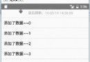
NavigationView主要和DrawerLayout框架結合使用,為抽屜導航實現側邊欄提供更簡單更方便的生成方式。慣例,先看效果圖:

app:headerLayout接收一個layout,作為導航菜單頂部的Header,可選項。menu
其中checked=”true”的item將會高亮顯示,這可以確保用戶知道當前選中的菜單項是哪個。
checkableBehavior:這組菜單項是否checkable。有效值:none,all(單選/單選按鈕radio button),single(非單選/復選類型checkboxes)
可以用setNavigationItemSelectedListener方法來設置當導航項被點擊時的回調。OnNavigationItemSelectedListener會提供給我們被選中的MenuItem,這與Activity的onOptionsItemSelected非常類似。
NavigationView navigationView = (NavigationView) findViewById(R.id.nav_view);
navigationView.setNavigationItemSelectedListener(this);

         @Override
    public boolean onNavigationItemSelected(MenuItem item) {
        // Handle navigation view item clicks here.
        int id = item.getItemId();

        if (id == R.id.nav_camera) {
            // Handle the camera action
        } else if (id == R.id.nav_gallery) {

        } else if (id == R.id.nav_slideshow) {

        } else if (id == R.id.nav_manage) {

        } else if (id == R.id.nav_share) {

        } else if (id == R.id.nav_send) {

        }

        DrawerLayout drawer = (DrawerLayout) findViewById(R.id.drawer_layout);
        drawer.closeDrawer(GravityCompat.START);
        return true;
    }
headerLayout
compile ‘com.android.support:design:23.2.1’
FloatingActionButton是繼承至ImageView,所以FloatingActionButton擁有ImageView的所有屬性。CoordinatorLayout可以用來配合FloatingActionButton浮動按鈕。

其他相關屬性:
app:backgroundTint - 設置FAB的背景顏色。 app:rippleColor - 設置FAB點擊時的背景顏色。 app:borderWidth - 該屬性尤為重要,如果不設置0dp,那麼在4.1的sdk上FAB會顯示為正方形,而且在5.0以後的sdk沒有陰影效果。所以設置為borderWidth=”0dp”。 app:elevation - 默認狀態下FAB的陰影大小。 app:pressedTranslationZ - 點擊時候FAB的陰影大小。 app:fabSize - 設置FAB的大小,該屬性有兩個值,分別為normal和mini,對應的FAB大小分別為56dp和40dp。 src - 設置FAB的圖標,Google建議符合Design設計的該圖標大小為24dp。 app:layout_anchor - 設置FAB的錨點,即以哪個控件為參照點設置位置。 app:layout_anchorGravity - 設置FAB相對錨點的位置,值有TextInputLayout是一個能夠把EditText包裹在當中的一個布局,當輸入文字時,它可以把Hint文字飄到EditText的上方。

mEdtUsername.addTextChangedListener(new TextWatcher() {
      @Override public void beforeTextChanged(CharSequence charSequence, int i, int i1, int i2) {

      }

      //檢測錯誤輸入,當輸入錯誤時,hint會變成紅色並提醒
      @Override public void onTextChanged(CharSequence charSequence, int i, int i1, int i2) {
        //檢查實際是否匹配,由自己實現
        if (checkType(charSequence.toString())) {
          mEdtUsernameHolder.setErrorEnabled(true);
          mEdtUsernameHolder.setError("輸入錯誤!");
          return;
        } else {
          mEdtUsernameHolder.setErrorEnabled(false);
        }
      }

      @Override public void afterTextChanged(Editable editable) {

      }
    });
compile ‘com.android.support:design:23.2.1’
Snackbar使用的時候需要一個控件容器用來容納Snackbar.官方推薦使用CoordinatorLayout這個另一個Android Support Design Library庫支持的控件容納。因為使用這個控件,可以保證Snackbar可以讓用戶通過向右滑動退出。

TabLayout主要可以和ViewPager結合使用,它就可以完成TabPageIndicator的效果,而且還是官方的,最好的是它可以兼容到2.2以上版本,包括2.2。

app:tabIndicatorColor 下方滾動的下劃線顏色 app:tabSelectedTextColortab 被選中後,文字的顏色 app:tabTextColor tab默認的文字顏色
 mTabLayout.setTabMode(TabLayout.MODE_FIXED);//設置tab模式,當前為系統默認模式
        mTabLayout.addTab(mTabLayout.newTab().setText(mTitleList.get(0)));//添加tab選項卡
        mTabLayout.addTab(mTabLayout.newTab().setText(mTitleList.get(1)));
        mTabLayout.addTab(mTabLayout.newTab().setText(mTitleList.get(2)));

  mTabLayout.setupWithViewPager(mViewPager);//將TabLayout和ViewPager關聯起來。
  mTabLayout.setTabsFromPagerAdapter(mAdapter);//給Tabs設置適配器
一個ViewGroup,配合ToolBar與CollapsingToolbarLayout等使用。
AppBarLayout的簡單使用,具體使用要和CoordinatorLayout或者CollapsingToolbarLayout結合使用,這個後面會講到。
CoordinatorLayout使用新的思路通過協調調度子布局的形式實現觸摸影響布局的形式產生動畫效果。主要用於作為頂層布局和協調子布局。
CoordinatorLayout與AppBarLayout
content_main.xml
MainActivity.java
TabLayout tabs = (TabLayout) findViewById(R.id.tabs);
        tabs.addTab(tabs.newTab().setText("tab1"));
        tabs.addTab(tabs.newTab().setText("tab2"));
        tabs.addTab(tabs.newTab().setText("tab3"));
scroll: 所有想滾動出屏幕的view都需要設置這個flag,CoordinatorLayout裡面,放一個帶有可滾動的View.如上的例子,放的是NestedScrollView,而NestedScrollView裡面是放多個TextView,是可以滾動的View。CoordinatorLayout包含的子視圖中帶有滾動屬性的View需要設置app:layout_behavior屬性。例如,示例中NestedScrollView設置了此屬性
app:layout_behavior=”@string/appbar_scrolling_view_behavior”
為了使得Toolbar有滑動效果,必須做到如下三點:
1. CoordinatorLayout作為布局的父布局容器。
2. 給需要滑動的組件設置 app:layout_scrollFlags=”scroll|enterAlways” 屬性。
3. 給滑動的組件設置app:layout_behavior屬性
AppBarLayout嵌套CollapsingToolbarLayout

content_main.xml:
CollapsingToolbarLayout可實現Toolbar的折疊效果。CollapsingToolbarLayout的子視圖類似於LinearLayout垂直方向排放的。
CollapsingToolbarLayout 提供以下屬性和方法使用:
Collapsing title:ToolBar的標題,當CollapsingToolbarLayout全屏沒有折疊時,title顯示的是大字體,在折疊的過程中,title不斷變小到一定大小的效果。你可以調用setTitle(CharSequence)方法設置title。
Content scrim:ToolBar被折疊到頂部固定時候的背景,你可以調用setContentScrim(Drawable)方法改變背景或者 在屬性中使用 app:contentScrim=”?attr/colorPrimary”來改變背景。
Status bar scrim:狀態欄的背景,調用方法setStatusBarScrim(Drawable)。只能在Android5.0以上系統有效果。
Parallax scrolling children:CollapsingToolbarLayout滑動時,子視圖的視覺差,可以通過屬性app:layout_collapseParallaxMultiplier=”0.6”改變。layout_collapseParallaxMultiplier值的范圍[0.0,1.0],值越大視察越大。
CollapseMode :子視圖的折疊模式,在子視圖設置,有兩種。“pin”:固定模式,在折疊的時候最後固定在頂端;“parallax”:視差模式,在折疊的時候會有個視差折疊的效果。我們可以在布局中使用屬性app:layout_collapseMode=”parallax”來改變。
CoordinatorLayout 還提供了一個 layout_anchor 的屬性,連同 layout_anchorGravity一起,可以用來放置與其他視圖關聯在一起的懸浮視圖(如 FloatingActionButton),上面已經介紹過。
使用CollapsingToolbarLayout實現折疊效果,需要注意:
1. AppBarLayout的高度固定
2. CollapsingToolbarLayout的子視圖設置layout_collapseMode屬性
3. 關聯懸浮視圖設置app:layout_anchor,app:layout_anchorGravity屬性
CoordinatorLayout功能如此強大,而他的神奇之處在於Behavior對象,CoordinatorLayout自己並不控制View,所有的控制權都在Behavior。這些Behavior實現了復雜的控制功能。系統的Behavior畢竟有限,我們可以通過自定義的方式來實現自己的Behavior。
通過 CoordinatorLayout.Behavior(YourView.Behavior.class) 來定義自己的Behavior,並在layout 文件中設置app:layout_behavior=”com.example.app.YourView$Behavior” 來達到效果。
自定義Behavior 需要重寫兩個方法:
public boolean layoutDependsOn(CoordinatorLayout parent, View child, View dependency)
public boolean onDependentViewChanged(CoordinatorLayout parent, View child, View dependency)
實現了點擊FloatingActionButton點擊旋轉90度,並適配Snackbar
public class RotateBehavior  extends CoordinatorLayout.Behavior {
    private static final String TAG = RotateBehavior.class.getSimpleName();

    public RotateBehavior() {
    }

    public RotateBehavior(Context context, AttributeSet attrs) {
        super(context, attrs);
    }

    @Override
    public boolean layoutDependsOn(CoordinatorLayout parent, FloatingActionButton child, View dependency) {
        return dependency instanceof Snackbar.SnackbarLayout;
    }

    @Override
    public boolean onDependentViewChanged(CoordinatorLayout parent, FloatingActionButton child, View dependency) {
        float translationY = getFabTranslationYForSnackbar(parent, child);
        float percentComplete = -translationY / dependency.getHeight();
        child.setRotation(-90 * percentComplete);
        child.setTranslationY(translationY);
        return false;
    }

    private float getFabTranslationYForSnackbar(CoordinatorLayout parent,
                                                FloatingActionButton fab) {
        float minOffset = 0;
        final List dependencies = parent.getDependencies(fab);
        for (int i = 0, z = dependencies.size(); i < z; i++) {
            final View view = dependencies.get(i);
            if (view instanceof Snackbar.SnackbarLayout && parent.doViewsOverlap(fab, view)) {
                minOffset = Math.min(minOffset,
                        ViewCompat.getTranslationY(view) - view.getHeight());
            }
        }

        return minOffset;
    }
}
到此,主要的相關控件已經介紹完了,但像BottomSheet、BottomSheetDialog等在support library 23以後添加的新控件以及v7、v4包中的新增的比較常用控件,留在下篇文章介紹總結。
 Android開發本地及網絡Mp3音樂播放器(六)實現獨立音樂播放界面
實現功能:功能1:點擊MyMusicListFragment(本地音樂)底部UI中的專輯封面圖片打開的PlayActivity(獨立音樂播放界面)PlayActivity
 ListView上拉加載和下拉刷新多種實現方式
該篇為ListView下拉刷新和上拉加載實現的各種方法大合集。可能在具體的細節邏輯上處理不太到位,但基本上完成邏輯的實現。細節方面,個人可以根據自己的需求進行完善。該博客
 Android中SparseArray性能優化的使用方法
之前一篇文章研究完橫向二級菜單,發現其中使用了SparseArray去替換HashMap的使用.於是乎自己查了一些相關資料,自己同時對性能進行了一些測試。首先先說一下Sp
 React Native 原生模塊開發筆記 (Android/iOS)
目錄: 環境 : Mac Xcode WebStorm Android Studio node v6.4.0 react-native-cli: 1.0.0 react