編輯:關於Android編程
因為在之前的一些項目用到圖表的次數較多,如果由自己一步步來畫的話,目前的水平和效果或者完成不了需求。而且現在網上的關於圖表的“輪子”也是比較豐富的,所以決定要找個“輪子”來玩玩。方便以後要是再需要用到圖表這樣的情況下,自己能熟悉地運用到。
打開github,在輸入框上輸入Android Charts就羅列出了一大堆比較火的圖表開源項目。在一一浏覽之下,最後我選擇了一個叫hellocharts-android的項目(–!,為什麼標題還寫MPAndroidChart)。在折騰一兩天之後,發現丫的這個項目最後的一些效果不太符合我想要的那種效果,就棄用了。最後就選擇了這次我要寫的這個開源項目MPAndroidChart。(這個故事教訓我們,怎樣在網上搜索適合的資源也是一門學問,如果選錯了,多浪費時間和精力啊!)好了,說了這麼多廢話,現在言歸正傳吧。
一般我們想要用上github上的開源項目時,都是直接在app模塊下的build.gradle文件裡直接compile。但這次我是直接把項目下載下來,再把MPChartLib導入到自己的項目中,方便以後直接拿過來用。(PS:在這裡我把MPChartLib改名為JNChartLib了,因為我在其中做了一些簡單的封裝)
導入JNChart依賴包
File-> New->Import Moudle,在路徑上選擇JNChartLib。
打開setting.gradle文件 include ':JNChartLib'
打開app模塊下的build.gradle文件 compile project (':JNChartLib')
圖表控件(以折線圖為例)
在這個項目中我的基礎顯示布局采用的是RadioButton+Fragment實現底部導航欄。一般我學習新的技術點需要敲代碼練練手都是用這樣的布局。所以這次的圖表控件都放在Fragment的布局上。
在Fragment上初始化圖表控件,設置數據等
public class Fragment1 extends android.support.v4.app.Fragment {
    private LineChart mLineChart;
    private Context context;
    @Nullable
    @Override
    public View onCreateView(LayoutInflater inflater, @Nullable ViewGroup container, @Nullable Bundle savedInstanceState) {
        View view = inflater.inflate(R.layout.fragment1_layout, container, false);
        this.context = getActivity();
        mLineChart = (LineChart) view.findViewById(R.id.lineChart);
        //設置圖表的描述
        mLineChart.setDescription("全省移網");

        //設置x軸的數據
        ArrayList xValues = new ArrayList<>();
        for (int i = 0; i < 15; i++) {
            xValues.add("" + i);
        }

        //設置y軸的數據
        ArrayList yValue = new ArrayList<>();
        yValue.add(new Entry(13, 1));
        yValue.add(new Entry(6, 2));
        yValue.add(new Entry(3, 3));
        yValue.add(new Entry(7, 4));
        yValue.add(new Entry(2, 5));
        yValue.add(new Entry(5, 6));
        yValue.add(new Entry(12, 7));
        //設置折線的名稱
        LineChartManager.setLineName("當月值");
        //創建一條折線的圖表
        //LineChartManager.initSingleLineChart(context,mLineChart,xValues,yValue);

        //設置第二條折線y軸的數據
        ArrayList yValue1 = new ArrayList<>();
        yValue1.add(new Entry(17, 1));
        yValue1.add(new Entry(3, 2));
        yValue1.add(new Entry(5, 3));
        yValue1.add(new Entry(4, 4));
        yValue1.add(new Entry(3, 5));
        yValue1.add(new Entry(7, 6));
        yValue1.add(new Entry(10, 7));
        LineChartManager.setLineName1("上月值");
        //創建兩條折線的圖表
        LineChartManager.initDoubleLineChart(context,mLineChart,xValues,yValue,yValue1);
        return view;
    }

}
代碼中的LineChartManager類就是我把圖表的創建,圖表的樣式,坐標軸的樣式的一個封裝類,這樣我們只需要在Activity中或Fragment中直接設置好圖表的數據,圖表的描述等就行,無須關心其他屬性的設定,從代碼中的注釋相信大家應該都能看懂吧。當然,如果你想把圖表定制成你想要的樣子,可以直接在LineChartManager這個封裝類中修改。下面來看看這個類吧。
public class LineChartManager {

    private static String lineName = null;
    private static String lineName1 = null;

    /**
     * @Description:創建兩條折線
     * @param context 上下文
     * @param mLineChart 折線圖控件
     * @param xValues 折線在x軸的值
     * @param yValue 折線在y軸的值
     */
    public static void initSingleLineChart(Context context, LineChart mLineChart, ArrayList xValues,
                                           ArrayList yValue) {
        initDataStyle(context,mLineChart);
        //設置折線的樣式
        LineDataSet dataSet = new LineDataSet(yValue, lineName);
        dataSet.setColor(Color.RED);
        dataSet.setCircleColor(Color.RED);
        dataSet.setDrawValues(false);
//        dataSet.setValueFormatter(new PercentFormatter(new DecimalFormat("%").format()));

        ArrayList dataSets = new ArrayList<>();
        dataSets.add(dataSet);

        //構建一個LineData  將dataSets放入
        LineData lineData = new LineData(xValues, dataSets);
        //將數據插入
        mLineChart.setData(lineData);

        //設置動畫效果
        mLineChart.animateY(2000, Easing.EasingOption.Linear);
        mLineChart.animateX(2000, Easing.EasingOption.Linear);
        mLineChart.invalidate();
    }
    /**
     * @Description:創建兩條折線
     * @param context 上下文
     * @param mLineChart 折線圖控件
     * @param xValues 折線在x軸的值
     * @param yValue 折線在y軸的值
     * @param yValue1 另一條折線在y軸的值
     */
    public static void initDoubleLineChart(Context context, LineChart mLineChart, ArrayList xValues,
                                           ArrayList yValue, ArrayList yValue1) {

        initDataStyle(context,mLineChart);

        LineDataSet dataSet = new LineDataSet(yValue, lineName);
        dataSet.setColor(Color.RED);
        dataSet.setCircleColor(Color.RED);
        dataSet.setDrawValues(false);

        LineDataSet dataSet1 = new LineDataSet(yValue1, lineName1);
        dataSet1.enableDashedLine(10f, 10f, 0f);//將折線設置為曲線
        dataSet1.setColor(Color.parseColor("#66CDAA"));
        dataSet1.setCircleColor(Color.parseColor("#66CDAA"));
        dataSet1.setDrawValues(false);

        //構建一個類型為LineDataSet的ArrayList 用來存放所有 y的LineDataSet   他是構建最終加入LineChart數據集所需要的參數
        ArrayList dataSets = new ArrayList<>();

        //將數據加入dataSets
        dataSets.add(dataSet);
        dataSets.add(dataSet1);

        //構建一個LineData  將dataSets放入
        LineData lineData = new LineData(xValues, dataSets);
        //將數據插入
        mLineChart.setData(lineData);
        //設置動畫效果
        mLineChart.animateY(2000, Easing.EasingOption.Linear);
        mLineChart.animateX(2000, Easing.EasingOption.Linear);
        mLineChart.invalidate();
    }

    /**
     *  @Description:初始化圖表的樣式
     * @param context
     * @param mLineChart
     */
    private static void initDataStyle(Context context, LineChart mLineChart) {
        //設置圖表是否支持觸控操作
        mLineChart.setTouchEnabled(true);
        mLineChart.setScaleEnabled(false);
        //設置點擊折線點時,顯示其數值
//        MyMakerView mv = new MyMakerView(context, R.layout.item_mark_layout);
//        mLineChart.setMarkerView(mv);
        //設置折線的描述的樣式(默認在圖表的左下角)
        Legend title = mLineChart.getLegend();
        title.setForm(Legend.LegendForm.LINE);
        //設置x軸的樣式
        XAxis xAxis = mLineChart.getXAxis();
        xAxis.setPosition(XAxis.XAxisPosition.BOTTOM);
        xAxis.setAxisLineColor(Color.parseColor("#66CDAA"));
        xAxis.setAxisLineWidth(5);
        xAxis.setDrawGridLines(false);
        //設置是否顯示x軸
        xAxis.setEnabled(true);

        //設置左邊y軸的樣式
        YAxis yAxisLeft = mLineChart.getAxisLeft();
        yAxisLeft.setAxisLineColor(Color.parseColor("#66CDAA"));
        yAxisLeft.setAxisLineWidth(5);
        yAxisLeft.setDrawGridLines(false);

        //設置右邊y軸的樣式
        YAxis yAxisRight = mLineChart.getAxisRight();
        yAxisRight.setEnabled(false);

    }

    /**
     * @Description:設置折線的名稱
     * @param name
     */
    public static void setLineName(String name){
        lineName = name;
    }

    /**
     * @Description:設置另一條折線的名稱
     * @param name
     */
    public static void setLineName1(String name){
        lineName1 = name;
    }
}
備注 在這次案例中,在代碼上我只封裝了折線圖,柱狀圖和折線柱狀混合圖這三種圖表,上面講解了折線圖的用法,其他兩種圖表的用法也很相似。柱狀圖的創建封裝在了BarChartManager類中,混合圖的創建封裝在了CombinedChartManager類中。更多具體用法我就不貼代碼了,可直接去我的github上直接clone下來參考。其中我還重寫了MarkView類,作用是當點擊折線點或柱狀圖時,會彈出一個視圖顯示其數值。要使用這個效果,就必須單獨創建一個只有textview的布局界面,然後再需要用到的管理類中調用,如下:
//設置點擊折線點時,顯示其數值
MyMakerView mv = new MyMakerView(context, R.layout.item_mark_layout);
mLineChart.setMarkerView(mv);
API 這個項目的具體的API調用,可參考文檔
https://jitpack.io/com/github/PhilJay/MPAndroidChart/v3.0.0-beta1/javadoc/
我還找到一個簡潔版的(不過是繁體字)

https://github.com/25sprout/ChartLib-Demo-Android
案例代碼的github地址
JNChartDemo
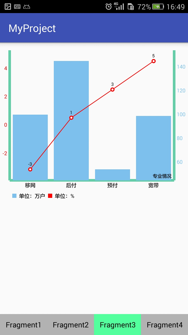
效果圖


 WindowManagerService計算activity大小的過程和窗口組織方式分析
我們知道,在Android系統中,同一時刻,只有一個Activity窗口是激活的,但是,對於WindowManagerService服務來說,這並不意味著它每次只需要管理
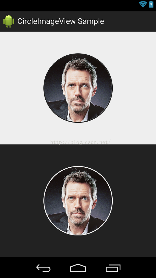 Android CircleImageView圓形ImageView
CircleImageView是github上一個第三方開源的實現圓形ImageView的項目。其在github上的項目主頁是:https://github.com/hd
 Android 高仿QQ圖片選擇器
當做一款APP,需要選擇本地圖片時,首先考慮的無疑是系統相冊,但是Android手機五花八門,再者手機像素的提升,大圖無法返回等異常因數,導致適配機型比較困難,微信、QQ
 android開發中Settings結構簡單分析
Setting是android系統很重要的模塊,這個模塊並不是很復雜,這部分也一直在看,很多時候都是在看某個具體的選項,比如WLAN,藍牙這樣具體的源碼,但是對於主界面的