編輯:關於Android編程
本文實例講述了Android自定義圓形進度條,分享給大家供大家參考。具體如下:
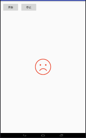
運行效果截圖如下:

具體代碼如下:
自定義的View:
import com.example.circlepregress.R;

import android.content.Context;
import android.content.res.TypedArray;
import android.graphics.Canvas;
import android.graphics.Color;
import android.graphics.Paint;
import android.graphics.RectF;
import android.graphics.Typeface;
import android.util.AttributeSet;
import android.util.Log;
import android.view.View;

public class RoundProgressBar extends View {

 // 畫筆對象的引用
 private Paint paint;

 // 圓環的顏色
 private int roundColor;

 // 圓環進度的顏色
 private int roundProgressColor;

 // 中間進度百分比的字符串的顏色
 private int textColor;

 // 中間進度百分比的字符串的字體
 private float textSize;

 // 圓環的寬度
 private float roundWidth;

 // 最大進度
 private int max;

 // 當前進度
 private int progress;

 // 是否顯示中間的進度
 private boolean textIsDisplayable;

 // 進度的風格,實心或者空心
 private int style;

 public static final int STROKE = 0;
 public static final int FILL = 1;

 /**
 * 構造方法
 */
 public RoundProgressBar(Context context) {
 this(context, null);
 }

 public RoundProgressBar(Context context, AttributeSet attrs) {
 this(context, attrs, 0);
 }

 public RoundProgressBar(Context context, AttributeSet attrs, int defStyle) {
 super(context, attrs, defStyle);

 paint = new Paint();

 TypedArray mTypedArray = context.obtainStyledAttributes(attrs,
  R.styleable.RoundProgressBar);

 // 獲取自定義屬性和默認值
 roundColor = mTypedArray.getColor(
  R.styleable.RoundProgressBar_roundColor, Color.RED);
 roundProgressColor = mTypedArray.getColor(
  R.styleable.RoundProgressBar_roundProgressColor, Color.GREEN);
 textColor = mTypedArray.getColor(
  R.styleable.RoundProgressBar_textColor, Color.GREEN);
 textSize = mTypedArray.getDimension(
  R.styleable.RoundProgressBar_textSize, 15);
 roundWidth = mTypedArray.getDimension(
  R.styleable.RoundProgressBar_roundWidth, 5);
 max = mTypedArray.getInteger(R.styleable.RoundProgressBar_max, 100);
 textIsDisplayable = mTypedArray.getBoolean(
  R.styleable.RoundProgressBar_textIsDisplayable, true);
 style = mTypedArray.getInt(R.styleable.RoundProgressBar_style, 0);

 mTypedArray.recycle();
 }

 @Override
 protected void onDraw(Canvas canvas) {
 super.onDraw(canvas);

 // 畫最外層的大圓環
 int centre = getWidth() / 2; // 獲取圓心的x坐標
 int radius = (int) (centre - roundWidth / 2); // 圓環的半徑
 paint.setColor(roundColor); // 設置圓環的顏色
 paint.setStyle(Paint.Style.STROKE); // 設置空心
 paint.setStrokeWidth(roundWidth); // 設置圓環的寬度
 paint.setAntiAlias(true); // 消除鋸齒
 canvas.drawCircle(centre, centre, radius, paint); // 畫出圓環

 Log.e("log", centre + "");

 /**
  * 畫進度百分比
  */
 paint.setStrokeWidth(0);
 paint.setColor(textColor);
 paint.setTextSize(textSize);
 paint.setTypeface(Typeface.DEFAULT_BOLD); // 設置字體
 int percent = (int) (((float) progress / (float) max) * 100); // 中間的進度百分比,先轉換成float在進行除法運算,不然都為0
 float textWidth = paint.measureText(percent + "%"); // 測量字體寬度,我們需要根據字體的寬度設置在圓環中間

 if (textIsDisplayable && percent != 0 && style == STROKE) {
  canvas.drawText(percent + "%", centre - textWidth / 2, centre
   + textSize / 2, paint); // 畫出進度百分比
 }

 /**
  * 畫圓弧 ,畫圓環的進度
  */

 // 設置進度是實心還是空心
 paint.setStrokeWidth(roundWidth); // 設置圓環的寬度
 paint.setColor(roundProgressColor); // 設置進度的顏色
 RectF oval = new RectF(centre - radius, centre - radius, centre
  + radius, centre + radius); // 用於定義的圓弧的形狀和大小的界限

 switch (style) {
 case STROKE: {
  paint.setStyle(Paint.Style.STROKE);
  canvas.drawArc(oval, 0, 360 * progress / max, false, paint); // 根據進度畫圓弧
  break;
 }
 case FILL: {
  paint.setStyle(Paint.Style.FILL_AND_STROKE);
  if (progress != 0)
  canvas.drawArc(oval, 0, 360 * progress / max, true, paint); // 根據進度畫圓弧
  break;
 }
 }

 }

 public synchronized int getMax() {
 return max;
 }

 /**
 * 設置進度的最大值
 *
 * @param max
 */
 public synchronized void setMax(int max) {
 if (max < 0) {
  throw new IllegalArgumentException("max not less than 0");
 }
 this.max = max;
 }

 /**
 * 獲取進度.需要同步
 *
 * @return
 */
 public synchronized int getProgress() {
 return progress;
 }

 /**
 * 設置進度,此為線程安全控件,由於考慮多線的問題,需要同步 刷新界面調用postInvalidate()能在非UI線程刷新
 *
 * @param progress
 */
 public synchronized void setProgress(int progress) {
 if (progress < 0) {
  throw new IllegalArgumentException("progress not less than 0");
 }
 if (progress > max) {
  progress = max;
 }
 if (progress <= max) {
  this.progress = progress;
  postInvalidate();
 }

 }

 /******************** 下邊是屬性的get、set方法 ***************/
 public int getCricleColor() {
 return roundColor;
 }

 public void setCricleColor(int cricleColor) {
 this.roundColor = cricleColor;
 }

 public int getCricleProgressColor() {
 return roundProgressColor;
 }

 public void setCricleProgressColor(int cricleProgressColor) {
 this.roundProgressColor = cricleProgressColor;
 }

 public int getTextColor() {
 return textColor;
 }

 public void setTextColor(int textColor) {
 this.textColor = textColor;
 }

 public float getTextSize() {
 return textSize;
 }

 public void setTextSize(float textSize) {
 this.textSize = textSize;
 }

 public float getRoundWidth() {
 return roundWidth;
 }

 public void setRoundWidth(float roundWidth) {
 this.roundWidth = roundWidth;
 }

}
所需要的資源文件:attrs.xml
<?xml version="1.0" encoding="UTF-8"?>
<resources>

 <declare-styleable name="RoundProgressBar">
 <attr name="roundColor" format="color" />
 <attr name="roundProgressColor" format="color" />
 <attr name="roundWidth" format="dimension"></attr>
 <attr name="textColor" format="color" />
 <attr name="textSize" format="dimension" />
 <attr name="max" format="integer"></attr>
 <attr name="textIsDisplayable" format="boolean"></attr>
 <attr name="style">
  <enum name="STROKE" value="0"></enum>
  <enum name="FILL" value="1"></enum>
 </attr>
 </declare-styleable>

</resources>
布局文件如下:
<RelativeLayout xmlns:android="http://schemas.android.com/apk/res/android"
 xmlns:android_custom="http://schemas.android.com/apk/res/com.example.circlepregress"
 xmlns:tools="http://schemas.android.com/tools"
 android:layout_width="match_parent"
 android:layout_height="match_parent" >

 <com.example.roundprogressbar.RoundProgressBar
 android:id="@+id/roundProgressBar2"
 android:layout_width="80dip"
 android:layout_height="80dip"
 android:layout_alignLeft="@+id/roundProgressBar1"
 android:layout_alignParentBottom="true"
 android:layout_marginBottom="78dp"
 android_custom:roundColor="#D1D1D1"
 android_custom:roundProgressColor="@android:color/black"
 android_custom:roundWidth="10dip"
 android_custom:textColor="#9A32CD"
 android_custom:textSize="18sp" />

 <com.example.roundprogressbar.RoundProgressBar
 android:id="@+id/roundProgressBar4"
 android_custom:
 android:layout_width="80dip"
 android:layout_height="80dip"
 android:layout_alignParentRight="true"
 android:layout_alignTop="@+id/roundProgressBar1"
 android:layout_marginRight="32dp"
 android_custom:roundProgressColor="#C2C2C2"
 android_custom:roundWidth="1dip" />

 <com.example.roundprogressbar.RoundProgressBar
 android:id="@+id/roundProgressBar3"
 android:layout_width="80dip"
 android:layout_height="80dip"
 android:layout_alignLeft="@+id/roundProgressBar4"
 android:layout_alignTop="@+id/roundProgressBar2"
 android_custom:roundColor="#C6E2FF"
 android_custom:roundProgressColor="#CD3333"
 android_custom:roundWidth="10dip"
 android_custom:textIsDisplayable="false" />

 <com.example.roundprogressbar.RoundProgressBar
 android:id="@+id/roundProgressBar5"
 android:layout_width="50dip"
 android:layout_height="50dip"
 android:layout_below="@+id/roundProgressBar1"
 android:layout_marginLeft="22dp"
 android:layout_toRightOf="@+id/roundProgressBar1" />

 <Button
 android:id="@+id/button1"
 android:layout_width="wrap_content"
 android:layout_height="wrap_content"
 android:layout_alignParentLeft="true"
 android:layout_alignParentRight="true"
 android:layout_alignParentTop="true"
 android:text="Button" />

 <com.example.roundprogressbar.RoundProgressBar
 android:id="@+id/roundProgressBar1"
 android:layout_width="80dip"
 android:layout_height="80dip"
 android:layout_alignParentLeft="true"
 android:layout_below="@+id/button1"
 android:layout_marginLeft="16dp"
 android:layout_marginTop="40dp" />

</RelativeLayout>
其中我們使用了這一句:
復制代碼 代碼如下:xmlns:android_custom=http://schemas.android.com/apk/res/com.example.circlepregress
xmlns:android_custom是我們自己定義的標簽,res/com.example.circlepregress其中res/後邊的就是我們自定義View所在的目錄
MainActivity.java如下:
import android.app.Activity;
import android.os.Bundle;
import android.view.View;
import android.view.View.OnClickListener;
import android.widget.Button;

import com.example.circlepregress.R;

public class MainActivity extends Activity {
 private RoundProgressBar mRoundProgressBar1, mRoundProgressBar2 ,mRoundProgressBar3, mRoundProgressBar4, mRoundProgressBar5;
 private int progress = 0;

 @Override
 protected void onCreate(Bundle savedInstanceState) {
 super.onCreate(savedInstanceState);
 setContentView(R.layout.activity_cricle_progress);

 mRoundProgressBar1 = (RoundProgressBar) findViewById(R.id.roundProgressBar1);
 mRoundProgressBar2 = (RoundProgressBar) findViewById(R.id.roundProgressBar2);
 mRoundProgressBar3 = (RoundProgressBar) findViewById(R.id.roundProgressBar3);
 mRoundProgressBar4 = (RoundProgressBar) findViewById(R.id.roundProgressBar4);
 mRoundProgressBar5 = (RoundProgressBar) findViewById(R.id.roundProgressBar5);

 ((Button)findViewById(R.id.button1)).setOnClickListener(new OnClickListener() {

  @Override
  public void onClick(View v) {
  new Thread(new Runnable() {

   @Override
   public void run() {
   while(progress <= 100){
    progress += 3;

    System.out.println(progress);

    mRoundProgressBar1.setProgress(progress);
    mRoundProgressBar2.setProgress(progress);
    mRoundProgressBar3.setProgress(progress);
    mRoundProgressBar4.setProgress(progress);
    mRoundProgressBar5.setProgress(progress);

    try {
    Thread.sleep(100);
    } catch (InterruptedException e) {
    e.printStackTrace();
    }
   }

   }
  }).start();
  }
 });

 }


}
項目免費下載: 《Android自定義圓形進度條》
希望本文所述對大家學習Android軟件編程有所幫助。
 android開發步步為營之34:四大組件之ContentProvider
ContentProvider,從字面意義上理解,內容提供者,這個類目的就是一個橋梁的作用,讓一個應用的數據(SQLiteDatabase, SharedPreferen
 Android 6.0 系統棉花糖新的特性和功能
Get you apps ready for Android 6.0 Marshmallow!新的功能:運行時的權限提醒,Doze(打盹模式)和備用電源,協助新技術,等等
 Android內核提取
Android設備啟動的時候有兩種模式:第一種是正常啟動,使用boot分區;第二種是啟動恢復過程,使用recovery分區。這兩種分區的結構是相同的,後面會介紹到。兩者的
 android-wheel控件實現三級聯動效果
本文實例為大家分享了android wheel省市縣三級聯動效果,供大家參考,具體內容如下在github上面有一個叫做 Android-wheel 的開源控件, 代碼地址