編輯:關於Android編程
下面先來一張效果圖
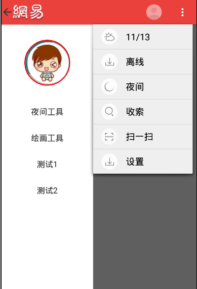
根據圖片分析,要實現的有側邊欄DrawerLayout,ActionBar的顏色和菜單以及ActionBarDrawerToggle的動畫效果.
在這之前,Theme要改成帶有ActionBar的主題
android:theme="@android:style/Theme.Holo.Light"
一:側邊欄-DrawerLayout
根據官方文檔,DrawerLayout布局的第一個視圖是activity的主視圖,第二個是側邊欄視圖
因此主布局可以如下這樣
FrameLayout為主視圖,include加載的則為左側邊欄,因此是start屬性
<android.support.v4.widget.DrawerLayout xmlns:android="http://schemas.android.com/apk/res/android"
  android:id="@+id/mdrawlaout"
  android:layout_width="match_parent"
  android:layout_height="match_parent"
  >

  <FrameLayout
    android:layout_width="match_parent"
    android:layout_height="match_parent"
    android:background="#ffeeeeee">
  <TextView
    android:layout_width="wrap_content"
    android:layout_height="wrap_content"
    android:text="這是主界面"/>

  </FrameLayout>

  <include
    android:layout_width="180dp"
    android:layout_height="match_parent"
    layout="@layout/drawer_layout_left"
    android:layout_gravity="start"
    android:clickable="true"
    />

  </android.support.v4.widget.DrawerLayout>
左側邊欄的實現,這裡用到一個開源項目circleimageview,可以設置圓形頭像,很簡單的使用.
<?xml version="1.0" encoding="utf-8"?>
<LinearLayout xmlns:android="http://schemas.android.com/apk/res/android"
  android:layout_width="match_parent"
  android:orientation="vertical"
  android:layout_height="match_parent"
  android:background="#ffffff">

  <!-- 圓形頭像-->
  <de.hdodenhof.circleimageview.CircleImageView xmlns:app="http://schemas.android.com/apk/res-auto"
    android:id="@+id/circleimageview"
    android:layout_width="90dp"
    android:layout_height="90dp"
    android:layout_marginLeft="45dp"
    android:layout_marginTop="30dp"
    android:src="@drawable/circlel_header"
    app:border_color="#ff0000"
    app:border_width="2dp" />
  <!-- 菜單列表-->

    <TextView
      android:id="@+id/tv_item1"
      android:layout_width="match_parent"
      android:layout_height="wrap_content"
      android:layout_marginTop="40dp"
      android:gravity="center"
      android:text="夜間工具"
      android:textSize="16sp" />

    <TextView
      android:id="@+id/tv_item2"
      android:layout_width="match_parent"
      android:layout_height="wrap_content"
      android:layout_marginTop="30dp"
      android:gravity="center"
      android:text="繪畫工具"
      android:textSize="16sp" />

    <TextView
      android:id="@+id/tv_item3"
      android:layout_width="match_parent"
      android:layout_height="wrap_content"
      android:layout_marginTop="30dp"
      android:gravity="center"
      android:text="測試1"
      android:textSize="16sp" />

    <TextView
      android:id="@+id/tv_item4"
      android:layout_width="match_parent"
      android:layout_height="wrap_content"
      android:layout_marginTop="30dp"
      android:gravity="center"
      android:text="測試2"
      android:textSize="16sp" />

</LinearLayout>
二:ActionBar的配置
ActionBar配置主要用代碼進行配置
  //取得ActionBar
    actionBar = getActionBar();
    //設置不顯示標題
    actionBar.setDisplayShowTitleEnabled(false);
    //設置使用logo
    actionBar.setDisplayUseLogoEnabled(true);
    //設置logo
    actionBar.setLogo(R.drawable.netease_top);
    //設置ActionBar背景
    Drawable background = getResources().getDrawable(R.drawable.top_bar_background);
    actionBar.setBackgroundDrawable(background);
    //設置是將應用程序圖標轉變成可點擊圖標,並添加返回按鈕
    actionBar.setDisplayHomeAsUpEnabled(true);
其中背景色主要通過xml文件進行配置
R.drawable.top_bar_background
<?xml version="1.0" encoding="utf-8"?>
<shape xmlns:android="http://schemas.android.com/apk/res/android" >
  <solid android:color="@color/top_title_bar_normal_backgrond_color"/>
</shape>
top_title_bar_normal_backgrond_color
<?xml version="1.0" encoding="utf-8"?>
<resources>

  <color name="red">#ff0000</color>
  <color name="gray">#bbbbbb</color>
  <color name="black">#000000</color>

  <color name="top_title_bar_normal_backgrond_color">#EB413D</color>
  <color name="top_title_bar_button_press_background_color">#D83C38</color>

</resources>
這樣就能顯示紅色的了
三:menu菜單的設置
這裡主要是修改menu_main.xml這個文件來設置,解析的話,as自動生成的onCreateOptionsMenu(Menu menu)會自動解析
<menu xmlns:android="http://schemas.android.com/apk/res/android"
   >

  <item
    android:id="@+id/action_settings"
    android:icon="@drawable/night_biz_pc_menu_icon"
    android:orderInCategory="1"
    android:title="@string/app_name"
    android:showAsAction="always"/>
  <item
    android:id="@+id/action_btn01"
    android:icon="@drawable/abc_ic_menu_moreoverflow_mtrl_alpha"
    android:orderInCategory="2"
    android:title="更多"
    android:showAsAction="always">
    <menu>
      <item
        android:id="@+id/action_btn02"
        android:icon="@drawable/biz_plugin_manage_weather"
        android:orderInCategory="100"
        android:title="11/13"
        android:showAsAction="never"/>
      <item
        android:id="@+id/action_btn03"
        android:icon="@drawable/biz_plugin_manage_offline"
        android:orderInCategory="100"
        android:title="離線"
        android:showAsAction="never"/>
      <item
        android:id="@+id/action_btn04"
        android:icon="@drawable/biz_plugin_manage_theme"
        android:orderInCategory="100"
        android:title="夜間"
        android:showAsAction="never"/>
      <item
        android:id="@+id/action_btn05"
        android:icon="@drawable/biz_plugin_manage_search"
        android:orderInCategory="100"
        android:title="搜索"
        android:showAsAction="never"/>
      <item
        android:id="@+id/action_btn06"
        android:icon="@drawable/biz_plugin_manage_qrcode"
        android:orderInCategory="100"
        android:title="掃一掃"
        android:showAsAction="never"/>
      <item
        android:id="@+id/action_btn07"
        android:icon="@drawable/biz_plugin_manage_offline"
        android:orderInCategory="100"
        android:title="設置"
        android:showAsAction="never"/>
    </menu>
  </item>

</menu>
四:ActionBarDrawerToggle的實現
ActionBarDrawerToggle是一個開關,用於打開/關閉DrawerLayout抽屜,ActionBarDrawerToggle 提供了一個方便的方式來配合DrawerLayout和ActionBar,以實現推薦的抽屜功能。即點擊ActionBar的home按鈕,即可彈出DrawerLayout抽屜。
在Activity中的兩個回調函數中使用它:
調用ActionBarDrawerToggle.syncState() 在Activity的onPostCreate()中;指示,ActionBarDrawerToggle與DrawerLayout的狀態同步,並將ActionBarDrawerToggle中的drawer圖標,設置為ActionBar的Home-Button的icon
//設置DrawerLayout的點擊事件
mdrawlayout.setDrawerListener(new MyAPPdrawerlistener());
 //設置抽屜開關
mActionBarDrawerToggle = new ActionBarDrawerToggle(
        this,this.mdrawlayout,R.string.drawer_open,R.string.drawer_close);


/**
   * 該方法會自動和actionBar關聯, 將開關的圖片顯示在了action上
   * 如果不設置,也可以有抽屜的效果,不過是默認的圖標
   * @param savedInstanceState
   */
  @Override
  protected void onPostCreate(Bundle savedInstanceState) {
    super.onPostCreate(savedInstanceState);
    mActionBarDrawerToggle.syncState();
  }


/**
   * 當設備配置改變的時候
   * @param newConfig
   */
  @Override
  public void onConfigurationChanged(Configuration newConfig) {
    super.onConfigurationChanged(newConfig);
    mActionBarDrawerToggle.onConfigurationChanged(newConfig);
  }


/**
   * 菜單點擊事件
   * @param item
   * @return
   */
  @Override
  public boolean onOptionsItemSelected(MenuItem item) {
    // Handle action bar item clicks here. The action bar will
    // automatically handle clicks on the Home/Up button, so long
    // as you specify a parent activity in AndroidManifest.xml.
    int id = item.getItemId();

    //noinspection SimplifiableIfStatement
    if (id == R.id.action_settings) {
      return true;
    }
    //添加mActionBarDrawerToggle點擊效果
    return mActionBarDrawerToggle.onOptionsItemSelected(item)||super.onOptionsItemSelected(item);
  }
最後在DrawerLayout的點擊事件中配置ActionBarDrawerToggle跟隨抽屜來改變即可
 private class MyAPPdrawerlistener implements DrawerLayout.DrawerListener{

    @Override
    public void onDrawerSlide(View drawerView, float slideOffset) {
      mActionBarDrawerToggle.onDrawerSlide(drawerView, slideOffset);
    }

    @Override
    public void onDrawerOpened(View drawerView) {
      mActionBarDrawerToggle.onDrawerOpened(drawerView);
    }

    @Override
    public void onDrawerClosed(View drawerView) {
      mActionBarDrawerToggle.onDrawerClosed(drawerView);
    }

    @Override
    public void onDrawerStateChanged(int newState) {
      mActionBarDrawerToggle.onDrawerStateChanged(newState);
    }
  }
備注一些用到的知識:
1.android:paddingLeft和android:layout_marginLeft區別:區別是android:layout_marginLef是設置整個布局離左邊的距離,android:paddingLeft是設置布局裡面的內容距離左邊
2.android:gravity:設置的是控件自身上面的內容位置,android:layout_gravity:設置控件本身相對於父控件的顯示位置
3.android:orderInCategory="1",actionbar裡每個item的優先級,值越大優先級越低,actionbar地方不夠就會放到overflow中
4.android studio導入github的項目的時候,直接把庫復制到原代碼下,然後在grade中添加作者給的引入語句即可.
以上就是本文的全部內容,希望對大家的學習有所幫助。
 android:照片塗畫功能實現過程及原理詳解
這個功能可以幫你實現,在圖片上進行隨意的塗抹,可以用於SNS產品。繪圖本身很簡單,但是要實現在圖片上指定的部分精確(位置,縮放)的繪圖,就有點麻煩了。下面講講實現過程及原
 Android Application Fundamentals——Android應用程序基礎知識
Application Fundamentals——應用程序基礎知識Key classes——關鍵類Activ
 Android開發之SQLite的使用方法
前言 SQLite是一種輕量級的小型數據庫,雖然比較小,但是功能相對比較完善,一些常見的數據庫基本功能也具有,在現在的嵌入式系統中使用該數據庫的比較多,因為它占用系統
 android 開發零起步學習筆記(九):android 控制控件的位置和大小及Layout相關屬性
方法一:Android的界面布局可以用兩種方法,一種是在xml中布局,一種是和JAVA中Swing一樣在JAVA代碼中實現Ui界面的布局,用xml的布局管理器布局是很方便