編輯:關於Android編程
通常情況下,Android實現自定義控件無非三種方式。
Ⅰ、繼承現有控件,對其控件的功能進行拓展。
Ⅱ、將現有控件進行組合,實現功能更加強大控件。
Ⅲ、重寫View實現全新的控件
本文來討論最難的一種自定義控件形式,重寫View來實現全新的控件。
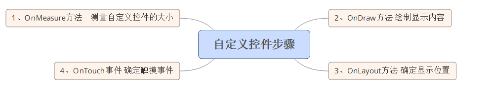
首先,我們要明白在什麼樣的情況下,需要重寫View來實現一種全新的控件,一般當我們遇到了原生控件無法滿足我們現有的需求的時候,我們此時就可以考慮創建一個全新的View來實現我們所需要的功能。創建一個全新View實現自定義控件,無非分成這麼幾步:
Ⅰ、在OnMeasure()方法中,測量自定義控件的大小,使自定義控件能夠自適應布局各種各樣的需求。
Ⅱ、在OnDraw()方法中,利用哼哈二將(Canvas與Paint)來繪制要顯示的內容。
Ⅲ、在OnLayout()方法中來確定控件顯示位置。
Ⅳ、在OnTouchEvent()方法處理控件的觸摸事件。
相應的思維導圖如下:
多說無益,我們通過幾個小案例,來講解到底如何實現自定義控件。
一、一個帶有比例進度的環形控件
首先看一下這個控件的示意圖:
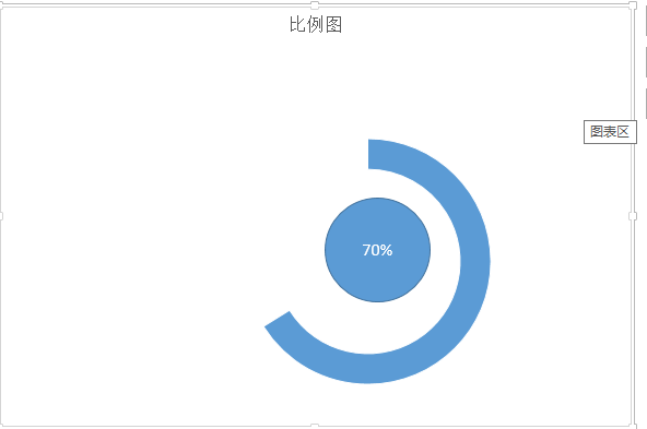
通過這個簡單的示意圖,我們對於項目所完成的比例,就一目了然了。通過這個簡單的示意圖,我們可以很快速的把這個圖形分成三個部分。Ⅰ、外層的環,Ⅱ、裡面的園,三、相應文字。有了這個思路以後,我們只需要在onDraw()方法中一個個進行繪制罷了。我這裡為了簡單起見,把這個控件的寬度設置為屏幕的寬度。
首先,還是老樣子,為自定義控件設置一些自定義屬性,便於調用者對其進行擴展,自定義屬性的設置代碼為:
 <declare-styleable name="circleView">
  <attr name="textSize" format="dimension" />
  <attr name="text" format="string" />
  <attr name="circleColor" format="color" />
  <attr name="arcColor" format="color" />
  <attr name="textColor" format="color" />
  <attr name="startAngle" format="integer" />
  <attr name="sweepAngle" format="integer" />
 </declare-styleable>
Ⅰ、textSize——對應中間文本文字的大小
Ⅱ、text——對應中間文本
Ⅲ、circleColor——對應內圓的顏色
Ⅳ、arcColor——對應外環的顏色
Ⅴ、textColor——對應文本的顏色
Ⅵ、startAngle——對應外環的起始角度
Ⅶ、sweepAngle——對應外環掃描角度
緊接著,就是在自定義控件的初始化方法中來獲取這些自定義屬性:
TypedArray ta = context.obtainStyledAttributes(attrs,
    R.styleable.circleView);
  if (ta != null) {
   circleColor = ta.getColor(R.styleable.circleView_circleColor, 0);
   arcColor = ta.getColor(R.styleable.circleView_arcColor, 0);
   textColor = ta.getColor(R.styleable.circleView_textColor, 0);
   textSize = ta.getDimension(R.styleable.circleView_textSize, 50);
   text = ta.getString(R.styleable.circleView_text);
   startAngle = ta.getInt(R.styleable.circleView_startAngle, 0);
   sweepAngle = ta.getInt(R.styleable.circleView_sweepAngle, 90);
   ta.recycle();
  }
這裡在多說一嘴子,為了釋放更多的資源,一定要將TypedArray這個對象進行資源的釋放。
接下來,在OnMeasure()方法中,初始化要繪制畫筆樣式,獲取屏幕的寬度,計算中間位置的坐標,以及指定外接矩形的寬高代碼如下:
 private void init() {
  int length = Math.min(width, height);
  mCircleXY = length / 2;
  mRadius = length * 0.5f / 2;
  mCirclePaint = new Paint(Paint.ANTI_ALIAS_FLAG);
  mCirclePaint.setColor(circleColor);
  mRectF = new RectF(length * 0.1f, length * 0.1f, length * 0.9f,
    length * 0.9f);

  mArcPaint = new Paint(Paint.ANTI_ALIAS_FLAG);
  mArcPaint.setColor(arcColor);
  mArcPaint.setStyle(Paint.Style.STROKE);
  mArcPaint.setStrokeWidth((width * 0.1f));

  mTextPaint = new Paint(Paint.ANTI_ALIAS_FLAG);
  mTextPaint.setTextSize(textSize);
  mTextPaint.setColor(textColor);
  mTextPaint.setTextAlign(Align.CENTER);

 }
將我們設置的自定義屬性,設置給不同筆刷。
做了這麼多准備以後,我們所需的就是在OnDraw方法中繪制內圓、外環與文字。代碼如下:
@Override
 protected void onDraw(Canvas canvas) {
  super.onDraw(canvas);
  drawSth(canvas);
 }

 private void drawSth(Canvas canvas) {
  canvas.drawCircle(mCircleXY, mCircleXY, mRadius, mCirclePaint);
  canvas.drawArc(mRectF, startAngle, sweepAngle, false, mArcPaint);
  canvas.drawText(text, 0, text.length(), mCircleXY, mCircleXY + textSize
    / 4, mTextPaint);
 }
需要指出的是,畫環形需要在一個指定矩形區域畫取,並且要指定起始角度,掃描角度,這些變量都是自定義屬性。
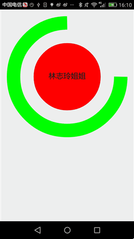
這個自定義控件的最終的運行效果為:
二、動態條形圖
條形圖,應該在圖表展示系統中再普通不過的一種圖標了。靜態示意圖就像這樣:
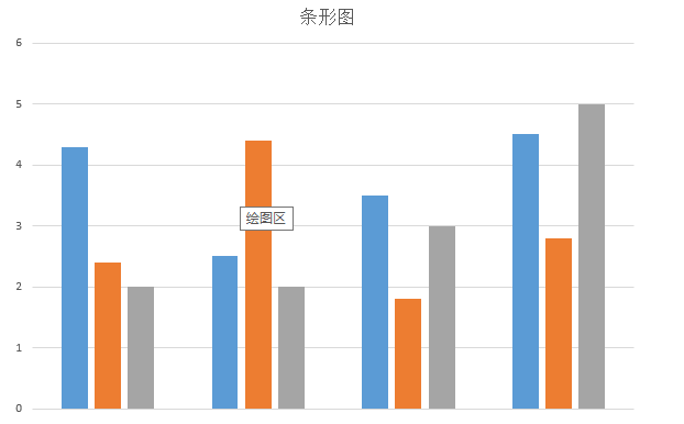
通過這個簡單的示意圖,我們所需要做的是,繪制一個個的矩形,然後將每一個矩形x坐標平移一定的單位,我們還看到這麼一個現象:每個條形圖的起始點不一致,而終止點是一樣的。起始坐標用個Random(隨機函數)剛剛好,實現靜態條形圖就是這樣的思路:
首先,在OnMeasure()方法中計算出每個矩形寬與高,這裡為了方便起見,每個矩形默認的高為屏幕的高,每個矩形的寬這裡定義為屏幕的寬度乘以80%除以矩形的個數。然後根據寬與高來初始化筆刷(Paint)。為什麼要根據寬與高來初始化筆刷了,這裡我為了使自定義View更加的逼真,我這裡使用LinearGradient(線性渲染器)進行了渲染,這個對象需要使用矩形寬與高。需要指出來的是這個自定義控件是動態的,我只需要onDraw方法不斷發生重繪,這裡為了防止控件刷新太快,我這裡每隔300毫秒刷新視圖。這個控件的完整源代碼如下:
public class VolumneView extends View {

 private Paint mPaint;
 private int mCount;
 private int mWidth;
 private int mRectHeight;
 private int mRectWidth;
 private LinearGradient mLinearGradient;
 private double mRandom;
 private float mcurrentHeight;

 public static final int OFFSET = 5;

 public VolumneView(Context context, AttributeSet attrs, int defStyleAttr) {
  super(context, attrs, defStyleAttr);
  initView(context, attrs);

 }

 private void initView(Context context, AttributeSet attrs) {
  mPaint = new Paint(Paint.ANTI_ALIAS_FLAG);
  mPaint.setColor(Color.GREEN);
  mPaint.setStyle(Paint.Style.FILL);
  TypedArray ta = context.obtainStyledAttributes(attrs,
    R.styleable.volumneView);
  if (ta != null) {
   mCount = ta.getInt(R.styleable.volumneView_count, 6);
   ta.recycle();
  }
 }

 public VolumneView(Context context, AttributeSet attrs) {
  this(context, attrs, 0);
 }

 public VolumneView(Context context) {
  this(context, null);
 }

 @Override
 protected void onSizeChanged(int w, int h, int oldw, int oldh) {
  super.onSizeChanged(w, h, oldw, oldh);
  mWidth = getMeasuredWidth();
  mRectHeight = getMeasuredHeight();
  mRectWidth = (int) (mWidth * 0.8 / mCount);
  mLinearGradient = new LinearGradient(0, 0, mRectWidth, mRectHeight,
    Color.GREEN, Color.YELLOW, TileMode.CLAMP);
  mPaint.setShader(mLinearGradient);

 }

 @Override
 protected void onDraw(Canvas canvas) {
  super.onDraw(canvas);
  for (int i = 0; i < mCount; i++) {
   mRandom = Math.random();
   mcurrentHeight = (float) (mRectHeight * mRandom);
   float width = (float) (mWidth * 0.4 / 2 + OFFSET);
   canvas.drawRect(width + i * mRectWidth, mcurrentHeight, width
     + (i + 1) * mRectWidth, mRectHeight, mPaint);
  }
  postInvalidateDelayed(300);
 }
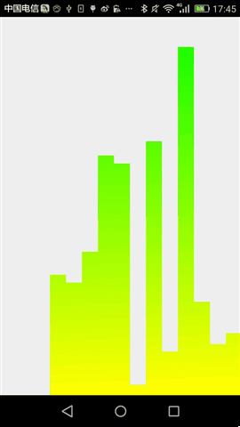
最終,運行效果如下:
後記,通過這兩個簡單控件,相信大家對於自定義控件基本步驟有說了解,當然,要真正做好自定義控件的話,我們還需要按這個步驟一步步的來,加油!
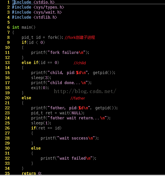 進程等待&程序替換
進程等待一個進程在終止時會關閉所有的文件描述符,釋放在用戶空間分配出來的內存,但它的PCB還保留著,而且內核中還保存著一些信息,如果是正常終止,則保存著退出狀態,如果是異
 05_android入門_GET方式實現登陸(在控件上顯示服務端返回的內容)
當點擊登陸之後,怎麼把服務器端返回的數據,寫到指定的控件上尼?,在android怎麼實現尼?下面我們通過具體的代碼進行分析和實現,希望能對你
 Android NDK工程的編譯和鏈接調試
前提條件:已經安裝了JDK 6.0、android SDK、NDK r9和eclipsele4.2開發環境.推薦下載Android開發的綜合套件adt-bundle-wi
 UI控件之顯示圖像控件ImageView(上)
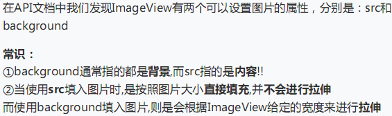
(一)概述ImageView主要是用來顯示圖片的控件,可以對圖片進行放大、縮小和旋轉的功能。(二)ImageView中src和BackGround屬性的區別No.1 &m