編輯:關於Android編程
Android中的控件的使用方式和iOS中控件的使用方式基本相同,都是事件驅動。給控件添加事件也有接口回調和委托代理的方式。今天這篇博客就總結一下Android中常用的基本控件以及布局方式。說到布局方式Android和iOS還是區別挺大的,在iOS中有Frame絕對布局和AutoLayout相對布局。而在Android中的布局方式就比較豐富了,今天博客中會介紹四種常用的布局方式。先總結一下控件,然後再搞一搞基本方式,開發環境還是用的Mac下的Android Studio。開始今天的正題, 雖然Android的控件和布局方式都可以拖拽實現,今天為了更詳細的了解控件和布局,我們就用純代碼的形式來進行實現和介紹。
一、常用基本控件
1.TextView
看到Android中的TextView, 我不禁的想到了iOS開發中的UILabel。從字面意思上看,TextView就是文本視圖,只是用來顯示文字的。在iOS中就叫做標簽,即為UILabel。要想在Activity中顯示TextView, 我們需要在相應的布局文件,也就是Activity對應的layout.xml文件去添加相應的控件標簽。這些xml標簽可以確定控件的位置,大小,顏色等屬性。下方是在Activity中顯示一個TextView。布局代碼如下:
<TextView
android:id="@+id/name_text_view"
android:layout_width="match_parent"
android:layout_height="wrap_content"
android:gravity="center"
android:textSize="sp"
android:textColor="#beea"
android:text="My name is ZeluLi"/>
標簽<TextView/>代表著我們要在Activity中添加一個個TextView, 標簽中可以設置一些屬性。
(1).android:id屬性代表著TextView的Id,也就是TextView的唯一標示,在java代碼中我們可以通過findViewById()方法來通過Id獲取控件。上述控件的唯一id為name_text_view。
(2).android:layout_width屬性代表著控件的寬度,該屬性的值是match_parent, 表示該控件的寬度與父視圖的寬度相同。
(3).android:layout_height屬性代表著控件的高度,該屬性的值是wrap_content,表示控件的高度根據內容的高度進行改變。
(4).android:gravity屬性代表著TextView中文字對齊方式,有多種方式,我們在此選的是center,居中顯示。
(5).android:textSize屬性代表著TextView中文字的型號,也就是文字的大小。
(6).android:textColor屬性設置的是TextView中文字的顏色,屬性值是16進制的色值。
(7).android:text屬性就是用來設置TextView顯示的值的。
我們如何在Java類,也就是Activity中獲取上述控件呢,下方的代碼就是使用findViewById()方法通過id獲取上述控件,並獲取TextView中的值以及設置TextView中的值。具體代碼如下。
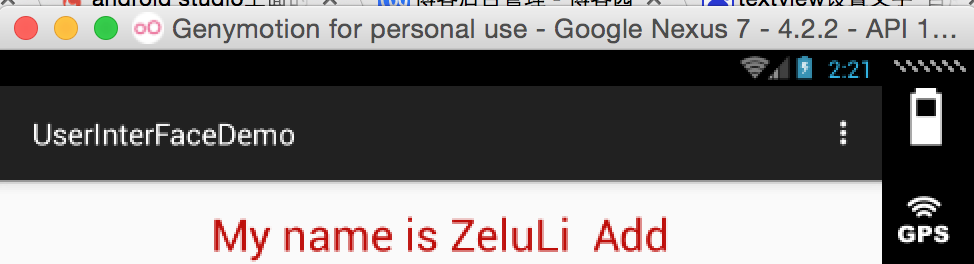
TextView myTextView = (TextView) findViewById(R.id.name_text_view);
String myText = myTextView.getText().toString();
myTextView.setText(myText+" Add");
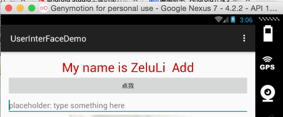
經過上面的屬性的設置,運行工程,你會在Activity中看到如下效果:
2.Button
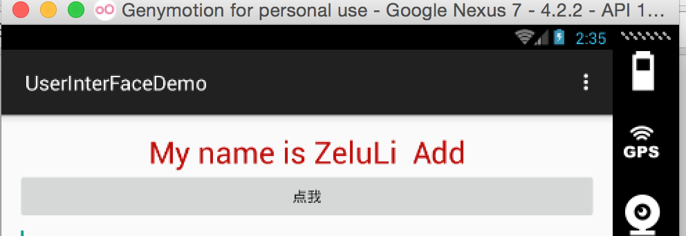
在Android中的按鈕就叫Button, 而在iOS中則叫UIButton。其兩者的用法極為相似。還是和上面類似,我們需要在Activity對應的布局文件layout.xml中添加一個Button, 具體的xml代碼如下所示。<Button/>標簽就是代表著Button, 其中的屬性和屬性值就不做過多的贅述了,上面已經提到了。
<Button
android:id="@+id/click_button"
android:layout_width="match_parent"
android:layout_height="wrap_content"
android:text="點我"/>
在Activity的類中也是使用findViewById來通過Id獲取該按鈕,獲取按鈕後我們需要給按鈕綁定點擊事件。也就是點擊按鈕要做的事情,下方給出了兩中方式,一種是塊的形式,一種是委托代理的形式。
(1).接口回調的形式綁定點擊事件
Button button = (Button) findViewById(R.id.click_button);
button.setOnClickListener(new View.OnClickListener() {
@Override
public void onClick(View v) {
//點擊按鈕要做的事情
}
});
(2)委托代理
button.setOnClickListener(this);
//重寫委托回調的方法
/**
* Called when a view has been clicked.
*
* @param v The view that was clicked.
*/
@Override
public void onClick(View v) {
switch (v.getId()){
case R.id.click_button:
//點擊按鈕後要做的事情
break;
default:
break;
}
}
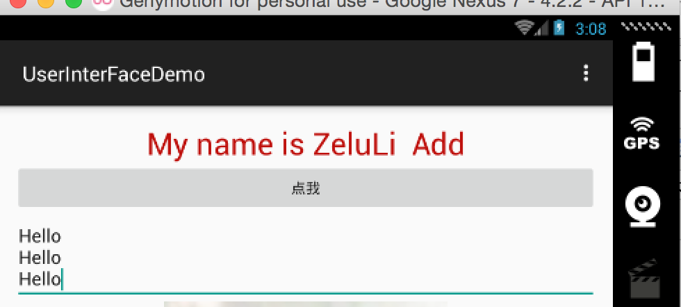
經過上面的步驟就會在TextView下面添加了一個按鈕,運行效果如下所示
3.EditText
接下來要為Activity添加一個輸入框,在Android中輸入框的類型和標簽都是EditText。iOS中的輸入框就是UITextField了,其實兩者用法類似,其功能都是接收用戶輸入的數據的。下方是其xml布局方式.
<EditText
android:id="@+id/edit_text"
android:layout_width="match_parent"
android:layout_height="wrap_content"
android:hint="placeHoder: type something here"
android:maxLines=""/>
上方EditText標簽中比之前多了兩個屬性:
(1).android:hint屬性後邊是一個字符串,其實就是用來占位用的字符串,功能是提示用戶該輸入框是干嘛的,在iOS開發中叫做Placeholder。
(2).android:macLines 用來設置輸入框的最大行數。
在Activity中獲取EditText對象,也是通過Id方式,下方代碼是獲取通過id實例化EditText對象,並獲取其中的文本在Toast上顯示。
EditText myEditText = (EditText) findViewById(R.id.edit_text);
String inputText = myEditText.getText().toString();
Toast.makeText(MainActivity.this, inputText, Toast.LENGTH_SHORT).show();
輸入框如下所示:
4.AlterDialog(警告框)
Toast用來顯示提示內容,而AlterDialog是警告框,上面可以有一些控件,比如按鈕等。AlterDialog其實就是iOS中的AlterView(在iOS8後有增加了UIAlterController)。下面的代碼是初始化AlterDialog並且進行顯示的代碼,下方的代碼是放在點擊按鈕所觸發的方法當中。
(1)AlterDialog通過AlterDialog的Builder進行創建,在創建的時候會指定該AlterDialog在那個Activity上進行顯示。
(2)通過setTitle方法給AlterDialog設置標題,通過setMessage給AlterDialog設置內容。
(3)setCancelable()方法,我們在這兒設置的時false,表示彈出的AlterDialog在用戶點擊返回鍵是不消失,該值默認是true。
(4)setPositiveButton()方法是設置點擊“確定”按鈕時的事件, setNegativeButton是設置點擊“取消”按鈕的事件。通過Toast來展示事件的點擊。
        AlertDialog.Builder alterDialog = new AlertDialog.Builder(MainActivity.this);
alterDialog.setTitle("提示框");
alterDialog.setMessage("提示內容");
alterDialog.setCancelable(false);
alterDialog.setPositiveButton("好的", new DialogInterface.OnClickListener() {
@Override
public void onClick(DialogInterface dialog, int which) {
Toast.makeText(MainActivity.this, "好的", Toast.LENGTH_SHORT).show();
}
});
alterDialog.setNegativeButton("取消", new DialogInterface.OnClickListener() {
@Override
public void onClick(DialogInterface dialog, int which) {
Toast.makeText(MainActivity.this, "取消", Toast.LENGTH_SHORT).show();
}
});
alterDialog.show();
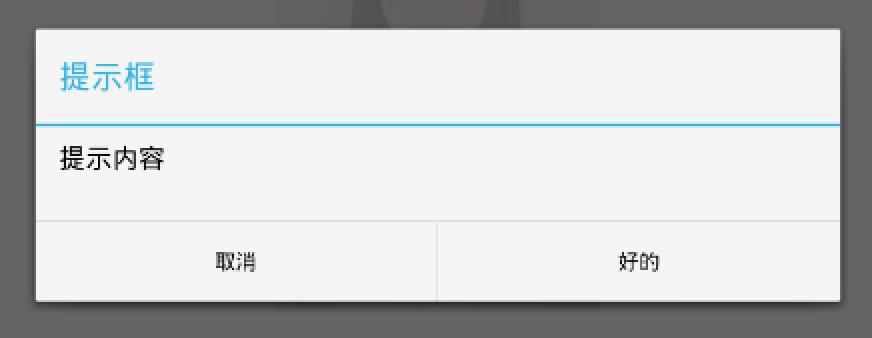
下面就是上面AlterDialog顯示後的效果。
5.ProgressBar(進度條)
進度條,就是平時下載東西常見到表示下載進度的控件。ProgressBar和iOS中的UIProgressView類似,用法也是非常類似的。首先需要在Activity對應的Xml文件中對ProgressBar進行布局和樣式的設定。下方是ProgressBar的布局和樣式。
<ProgressBar
android:id="@+id/my_progress_bar"
android:layout_width="match_parent"
android:layout_height="wrap_content"

android:max=""/>
我們可以通過android:max來設定ProgressBar的進度最大值,而style可以給ProgressBar設定不同的樣式。ProgressBar有多種樣式,可以根據不同的場景來選擇不同的樣式,下方是可選樣式。
在xml中配置好ProgressBar之後就可以在代碼中通過ID獲取,對ProgressBar進行一系列的操作了。下方的代碼也是放在按鈕的點擊事件中,每點擊一次進度條的進度就增加10,直到增到最大值時ProgressBar就會變成不可見。變為不可見後,接著就會把進度設置成0。
ProgressBar myProgressBar = (ProgressBar) findViewById(R.id.my_progress_bar);
myProgressBar.setProgress(myProgressBar.getProgress()+);
if (myProgressBar.getProgress() == myProgressBar.getMax()) {
myProgressBar.setVisibility(View.GONE);
myProgressBar.setProgress();
} else {
myProgressBar.setVisibility(View.VISIBLE);
}
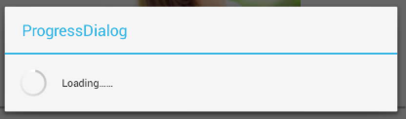
6.ProgressDialog(進度提示框)
ProgressDialog說白了就是在AlterDialog上添加Progress, ProgressDialog不需要在xml中進行配置,直接在代碼中進行生成即可。下方是在按鈕點擊的委托代理方法中添加的ProgressDialog,點擊按鈕時就顯示ProgressDialog。
/**
* Called when a view has been clicked.
*
* @param v The view that was clicked.
*/
@Override
public void onClick(View v) {
switch (v.getId()){
case R.id.click_button:
ProgressDialog myProgressDialog = new ProgressDialog(MainActivity.this);
myProgressDialog.setTitle("ProgressDialog");
myProgressDialog.setMessage("Loading……");
myProgressDialog.setCancelable(true);
myProgressDialog.show();
break;
default:
break;
}
}
運行效果如下:
二、四大布局方式
有的地方介紹的是五大布局,因為還有一種是絕對布局(AbsoluteLayout)就是通過坐標和寬高來控制控件的位置,此布局方式在Android開發中已經被棄用了,所以不再今天的討論范圍之內。今天要介紹的布局方式有線性布局(LinearLayout)、相對布局(RelativeLayout)、幀布局(FrameLayout)、表格布局(TableLayout)。前兩者是常用的,所以今天就著重的討論一下LinearLayout。
說到Android中的布局方式我想對比一下iOS開發中的布局方式。可以說iOS布局中基本的有兩種方式,一個是絕對布局,另一種就是相對布局。絕對布局就是通過Frame(x, y, width, height), 也就是給控件設置坐標原點以及寬高來確定控件的位置和大小。因為這種布局方式一旦設置Frame後,控件的位置和大小就固定了,所以被成為絕對布局。
另一種iOS中的布局方式就是相對布局了,在iOS開發中可以使用Autolayout + SizeClass來確定控件的位置和大小。我們可以給控件添加不同的約束(寬,高,上下左右邊距,上下左右居中,垂直水平居中)等方式來控制控件的大小和位置。這種方式在屏幕適配時更為靈活,在iOS開發中也常常被使用到。關於響度布局iOS開發中你可以通過VFL(Visual format language)給控件添加約束,你也可以通過Storyboard以可視化的方式來進行約束的添加。
iOS的布局方式就先聊到這兒,接下來回到安卓的布局方式當中。在Android開發的幾種布局方式當中,你不許指定控件的坐標點,也就是說你不許指定控件的位置,因為特定的布局方式有其特定計算控件坐標點的方法。但是在不同的布局方式中你需要為控件指定寬高。接下來具體的介紹一下Android開發中的布局方式。
1. LinearLayout (線性布局)
說到LinearLayout, 我想說一下流式布局。其實LinearLayout就是流式布局,流式布局有個特點,就是下一個控件的坐標原點由上一個控件來決定,你可以沿水平方向或者垂直方向上來排列你的控件。 如果你的控件是垂直排列的,那麼你可以給控件指定水平的居中方式(這一點可能說起來抽象,下方會通過實例來進行介紹)。接下來將通過一系列的實例來介紹一下LinearLayout。
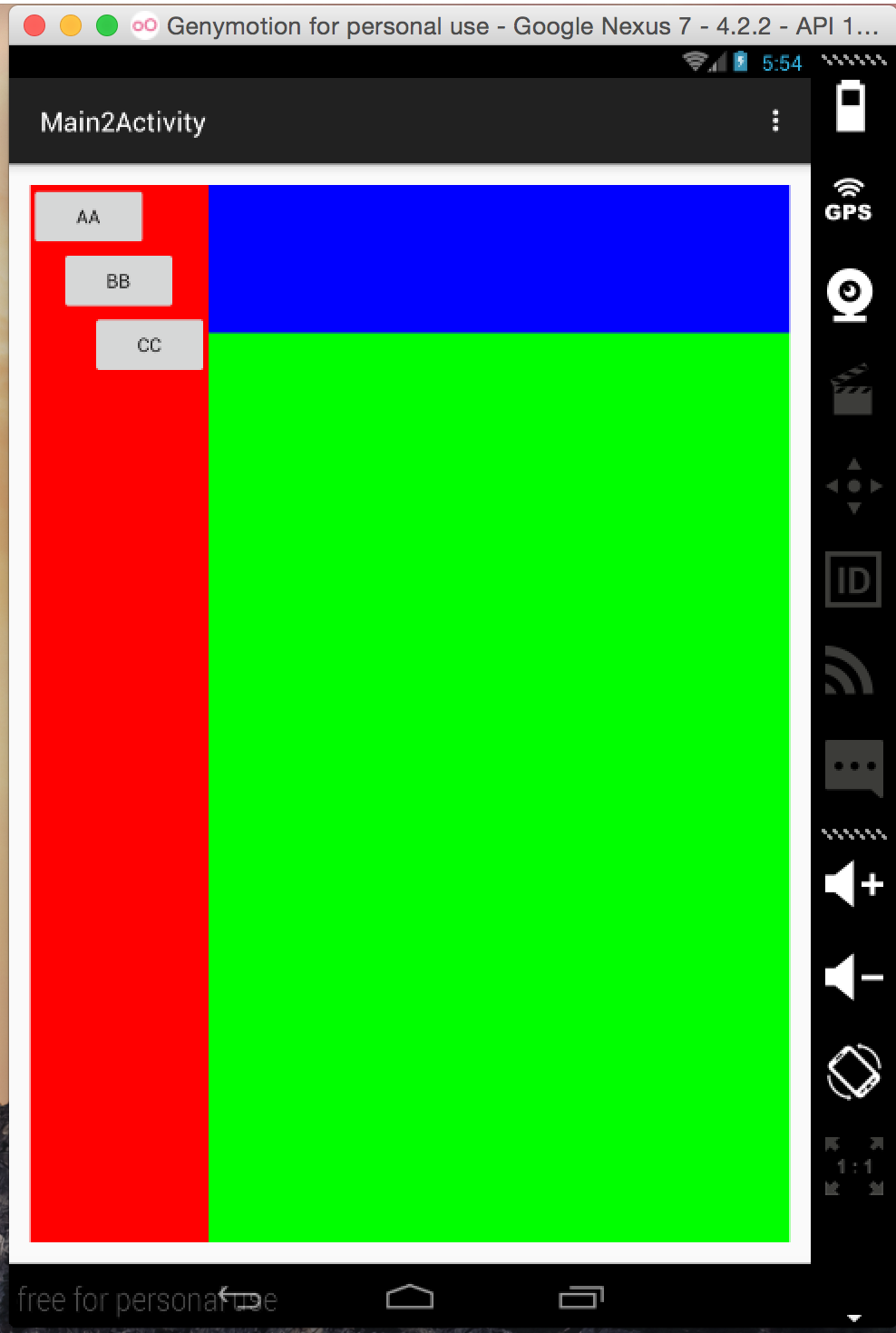
(1) 下方有張效果圖,我們想實現下方布局方式,如果使用LinearLayout來實現該如何去做呢。
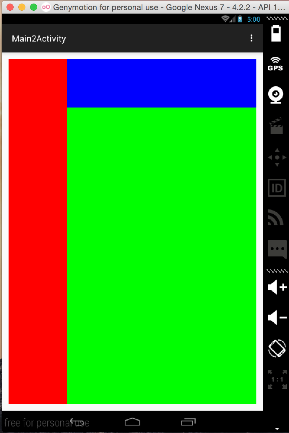
(2) 首先我們先分析布局方式,把每個塊進行拆分,分析,然後通過LinearLayout進行組合在一塊即可。我們對上述布局方式進行拆分,並且對使用的LinearLayout進行命名,並且指定子視圖的布局方式(V-垂直,H-水平),具體的請看下圖。最下方我們使用了一個水平布局的LinearLayout1, 在LinearLayout01上又有兩個高度等於父視圖高度的LinearLayout11和LinearLayout12,兩者子控件的布局方式都設置為垂直排列。在LinearLayout12中又有兩個子線性布局LinearLayout121和LinearLayout122, 這兩個子布局沿垂直方向排列於父布局之上,並且寬度與父布局相等。
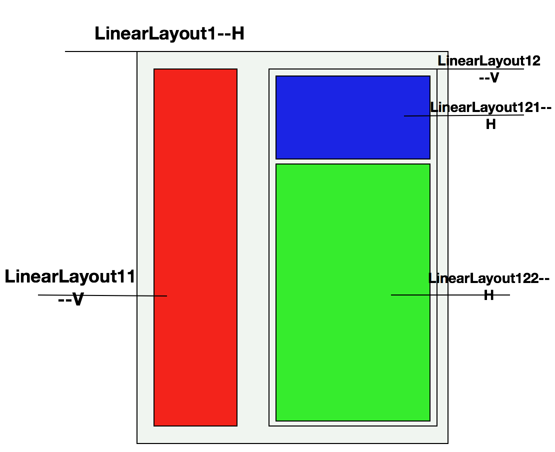
(3) 上方說了這麼多了,那麼接下來看一下上面布局的具體實現方式吧,其布局層次結構圖如下所示
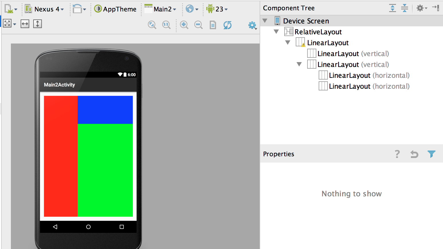
具體實現xml如下,在實現中你可以通過android:orientation屬性來設置是水平(horizontal)線性排列還是垂直(vertical)線性排列。關於pt等這種單位,下篇博客會給大家詳細的介紹一下。
<RelativeLayout xmlns:android="http://schemas.android.com/apk/res/android"
xmlns:tools="http://schemas.android.com/tools" android:layout_width="match_parent"
android:layout_height="match_parent" android:paddingLeft="@dimen/activity_horizontal_margin"
android:paddingRight="@dimen/activity_horizontal_margin"
android:paddingTop="@dimen/activity_vertical_margin"
android:paddingBottom="@dimen/activity_vertical_margin"
tools:context="com.example.lizelu.userinterfacedemo.MainActivity">
<LinearLayout
android:layout_width="match_parent"
android:layout_height="match_parent">
<!--垂直線性布局方式-->
<LinearLayout
android:layout_width="pt"
android:layout_height="match_parent"
android:background="#ff"
android:orientation="vertical">
</LinearLayout>
<LinearLayout
android:layout_width="match_parent"
android:layout_height="match_parent"
android:orientation="vertical">
<LinearLayout
android:layout_width="match_parent"
android:layout_height="pt"
android:background="#ff"
android:orientation="horizontal">
</LinearLayout>
<LinearLayout
android:layout_width="match_parent"
android:layout_height="match_parent"
android:background="#ff"
android:orientation="horizontal">
</LinearLayout>
</LinearLayout>
</LinearLayout>
</RelativeLayout>
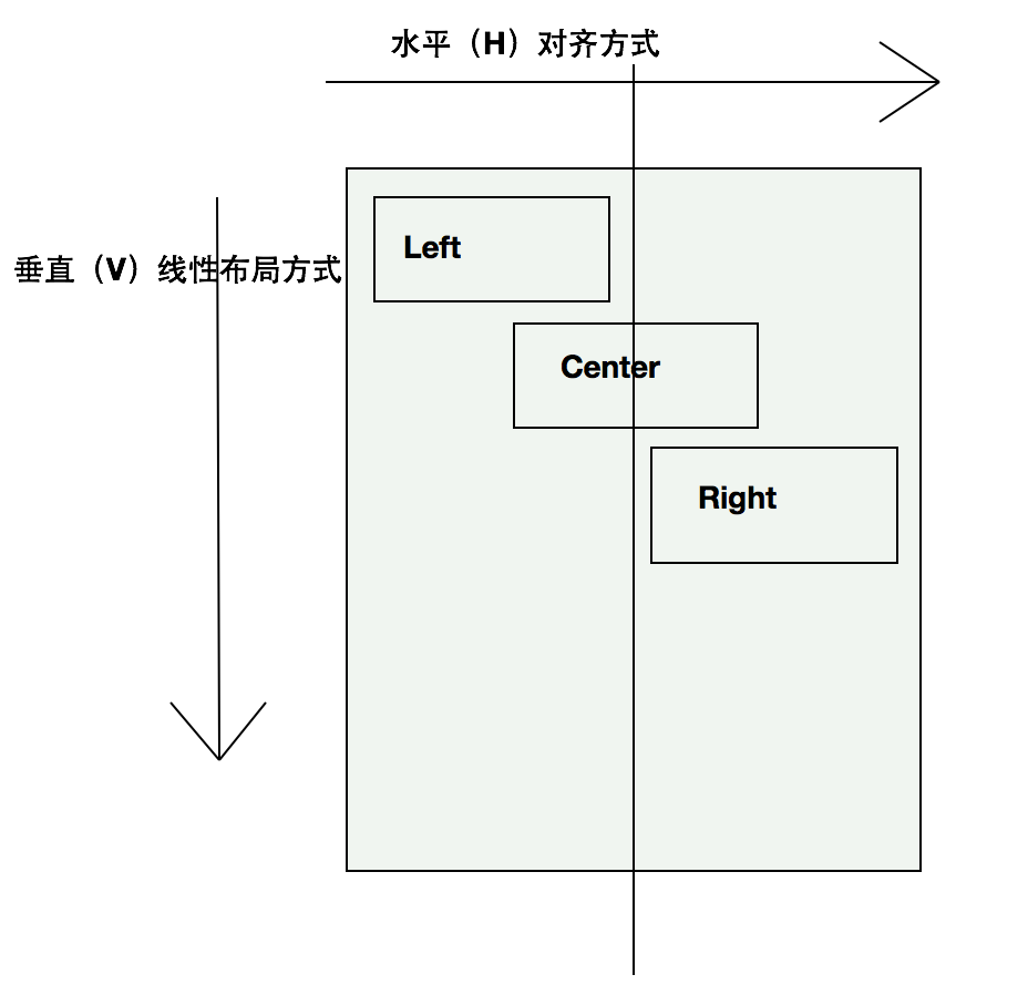
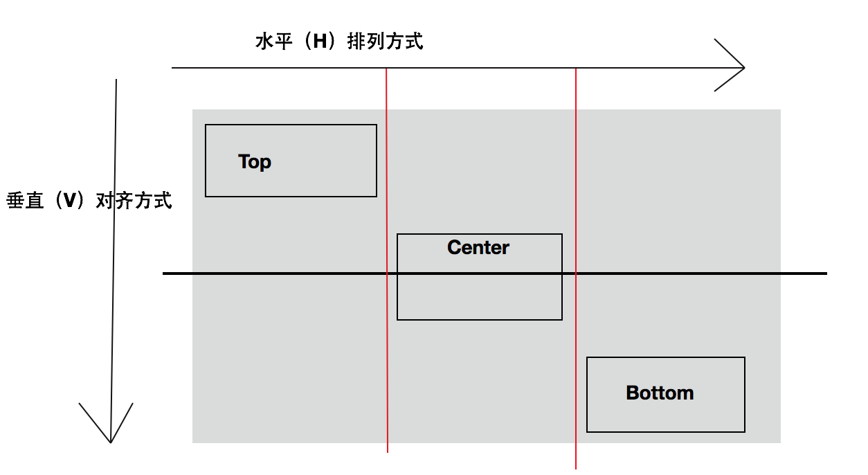
(4) 垂直布局控件的對齊方式(Left, Center, Right)。垂直布局的控件,我們可以對其指定水平方向的對對齊方式。為了說明這個問題我還是想畫個圖來解釋一下這個看似簡單的問題。我們可以通過控件的android:layout_gravity屬性來指定對其方式。在垂直布局中,垂直方向的對齊方式(top, center, bottom)是不起作用的,因為垂直方向的位置已經有垂直線性布局所決定了,所以layout_gravity就不起作用了。
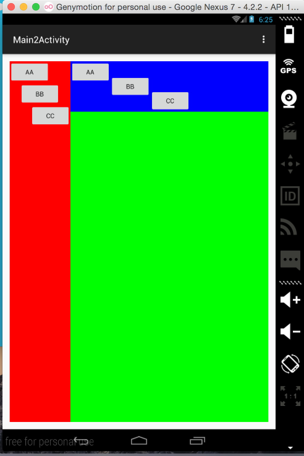
原理就先到這兒,接下來就是實現了,我們將在LinearLayout11布局中添加下方的子控件。每個子控件都指定了水平的對齊方式,具體代碼如下所示:
<Button
android:layout_width="wrap_content"
android:layout_height="wrap_content"
android:layout_gravity="left"
android:text="aa"/>
<Button
android:layout_width="wrap_content"
android:layout_height="wrap_content"
android:layout_gravity="center"
android:text="bb"/>
<Button
android:layout_width="wrap_content"
android:layout_height="wrap_content"
android:text="cc"
android:layout_gravity="right"/>
添加代碼後運行效果如下:
(5) 水平布局控件的對齊方式(Top, Center, Bottom)。如果控件是以水平的方式進行排列的,那麼我們就可以對其指定垂直方向的對齊方式,即Top, Center和Bottom。也是通過android:layout_gravity屬性來指定的。為了說明一下原理呢,我還是想用一張圖來表達一下:
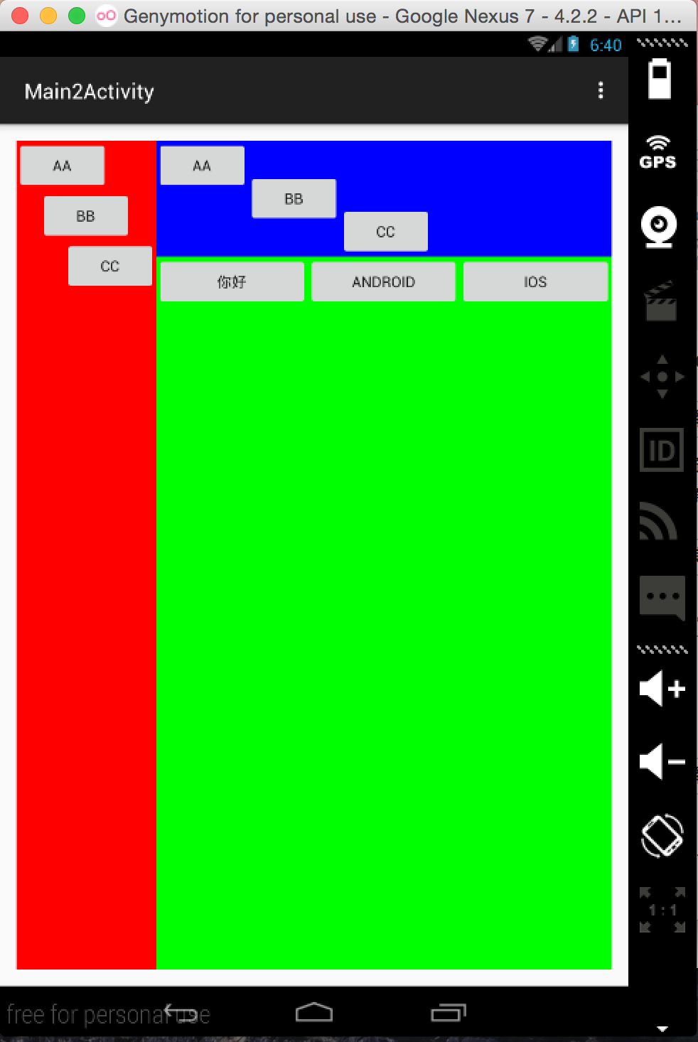
原理看完了,接下來按照上面的套路,我們以上面的布局和對齊方式,在LinearLayout121上添加三個上述布局的Button. 具體代碼如下所示:
<Button
android:layout_width="wrap_content"
android:layout_height="wrap_content"
android:layout_gravity="top"
android:text="aa"/>
<Button
android:layout_width="wrap_content"
android:layout_height="wrap_content"
android:text="bb"
android:layout_gravity="center" />
<Button
android:layout_width="wrap_content"
android:layout_height="wrap_content"
android:layout_gravity="bottom"
android:text="cc"/>
接下來就該運行了,下方是運行出來的結果:
(6)在線性布局中有一個不得不提的屬性就是android:layout_weight, 該屬性允許你以比例的形式來指定控件的大小。接下來我們要做的就是在LinearLayout122中添加三個水平方向上等分的按鈕。使用android:layout_weight屬性,很容易就可以實現,因為原理比較簡單,就不畫原理圖了,下方是具體的xml實現:
<Button
android:layout_width="pt"
android:layout_height="wrap_content"
android:layout_weight=""
android:text="你好"/>
<Button
android:layout_width="pt"
android:layout_height="wrap_content"
android:layout_weight=""
android:text="Android"/>
<Button
android:layout_width="pt"
android:layout_height="wrap_content"
android:layout_weight=""
android:text="iOS"/>
具體運行效果如下所示:
線性布局就先到這兒,因為線性布局方式在Android開發中經常使用到,所以介紹的會多一些。線性布局還有好多其他的用法,等後邊博客中用到的時候會詳細的介紹。
2.RelativeLayout (相對布局)
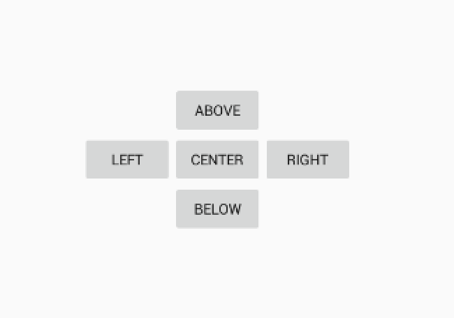
上面也說了一下相對布局, 相對布局的本質就是以不變應萬變。也就是說相對布局可以根據已經固定的控件來確定其他新加控件的位置。相對布局用的還是蠻多的,接下來我們將通過一個實例來介紹一下RelativeLayout。
首先我們先來看一下我們要實現的效果,實現思路是我們先根據父視圖的中心位置來確定center_button的位置,然後再由Center和Parent的位置來確定出其他按鈕的位置,這就是相對布局。
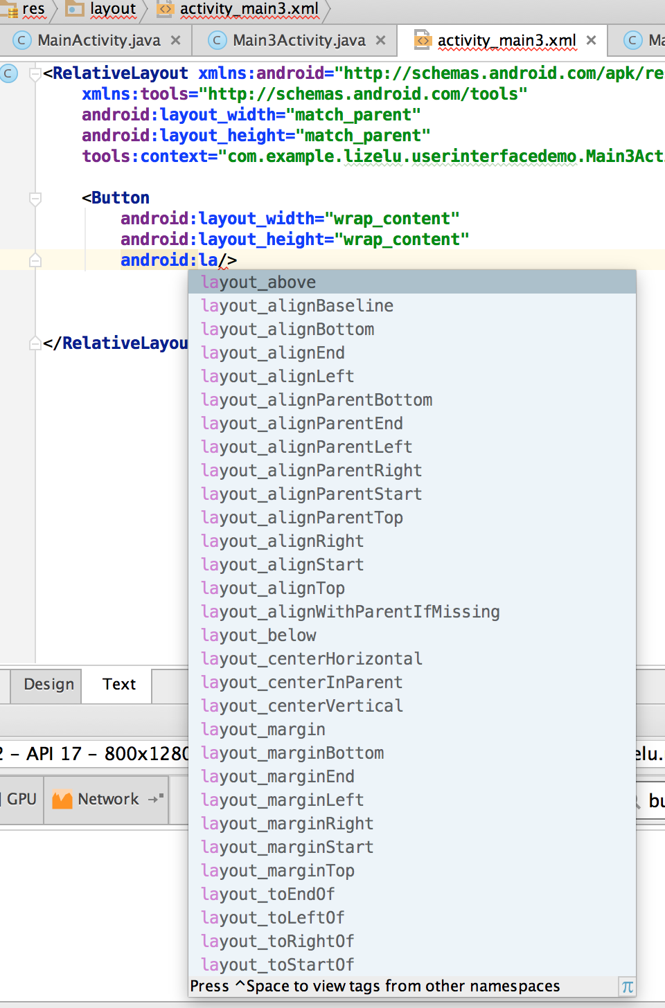
在相對布局中,你可以設置的屬性如下所示,還是蠻多的。在本篇博客中就不做一一介紹了,其用法都差不多。如下圖所示:
實現上述效果的xml代碼如下所示,相對布局使用起來和理解起來還是比較簡單的。
<RelativeLayout xmlns:android="http://schemas.android.com/apk/res/android"
xmlns:tools="http://schemas.android.com/tools"
android:layout_width="match_parent"
android:layout_height="match_parent"
tools:context="com.example.lizelu.userinterfacedemo.MainActivity">
<Button
android:id="@+id/button_center"
android:layout_width="wrap_content"
android:layout_height="wrap_content"
android:layout_centerInParent="true"
android:text="center"/>
<Button
android:id="@+id/button_above"
android:layout_width="wrap_content"
android:layout_height="wrap_content"
android:layout_above="@+id/button_center"
android:layout_centerInParent="true"
android:text="above"/>
<Button
android:id="@+id/button_below"
android:layout_width="wrap_content"
android:layout_height="wrap_content"
android:layout_below="@+id/button_center"
android:layout_centerInParent="true"
android:text="below"/>
<Button
android:id="@+id/button_left"
android:layout_width="wrap_content"
android:layout_height="wrap_content"
android:layout_toLeftOf="@+id/button_center"
android:layout_centerVertical="true"
android:text="left"/>
<Button
android:id="@+id/button_right"
android:layout_width="wrap_content"
android:layout_height="wrap_content"
android:layout_toRightOf="@+id/button_center"
android:layout_centerVertical="true"
android:text="right"/>
</RelativeLayout>
3.幀布局 (FrameLayout)
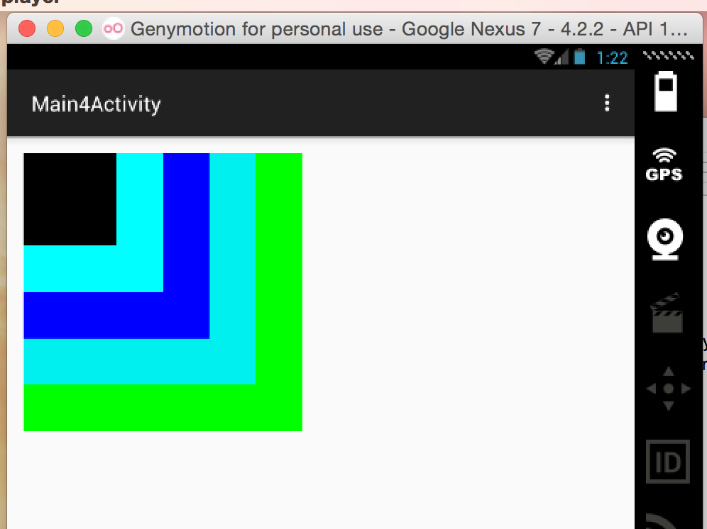
說到幀布局, 就比較簡單了,而且比較好理解,並且幀布局的用處不是很多,但他的存在還是有他的必要性的。FrameLayout中的Frame和iOS中的Frame不是一個概念,在iOS中的Frame你可以指定任意的坐標,而這個坐標點時相對於父視圖的。FrameLayout中的Frame的坐標原點是屏幕的左上角,位置固定,你只需為控件指定大小即可。接下來將通過一個實例來搞一下這個FrameLayout。
下面是使用FrameLayout做的一個效果,可以看出每塊區域中除了大小顏色不一樣外,他們的坐標點都是左上角的位置。這也是FrameLayout的特點,下面是運行效果截圖:
實現上方布局的xml如下:
<RelativeLayout xmlns:android="http://schemas.android.com/apk/res/android"
xmlns:tools="http://schemas.android.com/tools" android:layout_width="match_parent"
android:layout_height="match_parent" android:paddingLeft="@dimen/activity_horizontal_margin"
android:paddingRight="@dimen/activity_horizontal_margin"
android:paddingTop="@dimen/activity_vertical_margin"
android:paddingBottom="@dimen/activity_vertical_margin"
tools:context="com.example.lizelu.userinterfacedemo.MainActivity">
<FrameLayout
android:layout_width="pt"
android:layout_height="pt"
android:background="#ff">
<FrameLayout
android:layout_width="pt"
android:layout_height="pt"
android:background="#ff">
</FrameLayout>
<FrameLayout
android:layout_width="pt"
android:layout_height="pt"
android:background="#ff">
</FrameLayout>
<FrameLayout
android:layout_width="pt"
android:layout_height="pt"
android:background="#ffff">
</FrameLayout>
<FrameLayout
android:layout_width="pt"
android:layout_height="pt"
android:background="#">
</FrameLayout>
</FrameLayout>
</RelativeLayout>
4、表格布局(TableLayout)
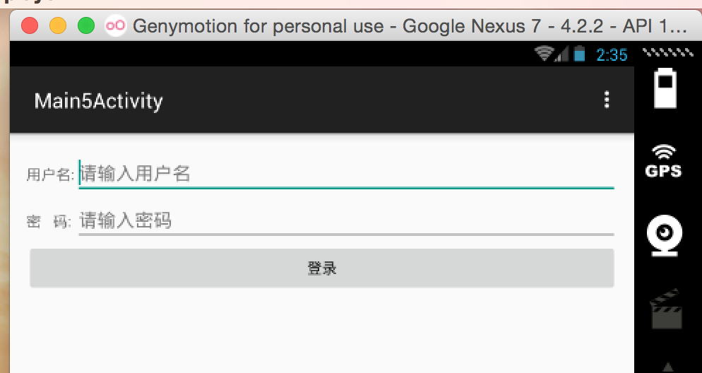
如果你接觸過Web前端的東西的話,雖然常用的時div + css , 但是Web前端也是有表格布局的。在安卓開發中的表格布局和Web前端中的表格布局的概念類似,也就是通過畫表表格的方式來實現布局。 在表格布局中,整個頁面就相當於一張大的表格,控件就放在每個Cell中。接下來我們就使用表格布局來畫一個表格,感受一下表格布局。接下來我們將會使用表格布局來實現一個比較經典的“登錄”頁面,下方是簡單畫的要實現效果圖:
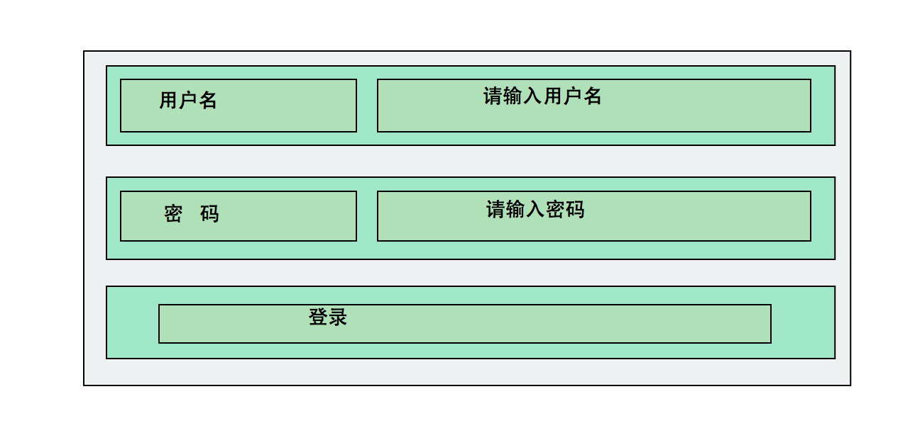
由上圖我們容易看出,上面就是一個表格結構。Table中有3行兩列,登錄按鈕占了一個整行,其余控件都占了一列。上面的布局還是蠻簡單的,說白了,再復雜的布局也是從簡單做起的。下方是實現上面布局的XML代碼。
<TableLayout
android:layout_width="match_parent"
android:layout_height="match_parent"
android:stretchColumns="">
<TableRow>
<TextView
android:layout_width="wrap_content"
android:layout_height="wrap_content"
android:text="用戶名:"/>
<EditText
android:layout_width="match_parent"
android:layout_height="wrap_content"
android:hint="請輸入用戶名"/>
</TableRow>
<TableRow>
<TextView
android:layout_width="wrap_content"
android:layout_height="wrap_content"
android:text="密 碼:"/>
<EditText
android:layout_width="match_parent"
android:layout_height="wrap_content"
android:hint="請輸入密碼"
android:inputType="textPassword"/>
</TableRow>
<TableRow>
<Button
android:layout_height="wrap_content"
android:layout_width="wrap_content"
android:text="登錄"
android:layout_span=""/>
</TableRow>
</TableLayout>
其中android:stretchColumns="1"屬性,表示讓第一列(列數從零開始算起)拉伸,以達到視頻屏幕的目的。所以你看到的輸入框是充滿後邊整個屏幕的。登錄按鈕中這個屬性android:layout_span="2" ,表明登錄按鈕跨兩列。上述布局xml運行後的效果如下:
到此4種布局方式已介紹完畢,其實再復雜的布局也是從簡單的開始。復雜的布局頁面有可能上述四種布局方式都會用到。由簡單到復雜這需要一個過程的,基礎的會了之後,接下來就是如何去運用基礎來構造更為復雜的布局方式。
以上內容是小編給大家介紹的Android開發之基本控件和四種布局方式詳解的全部內容,希望對大家有所幫助!
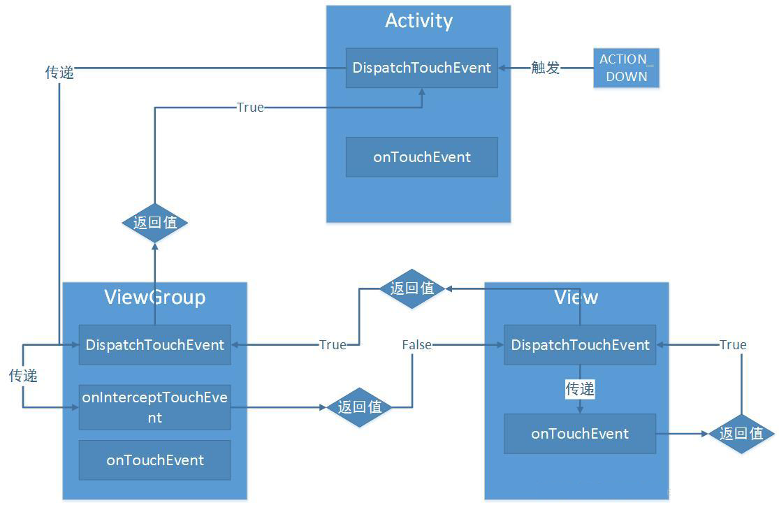 Android事件分發機制源碼分析之View篇
對於Android事件分發機制,我們在開發的過程中,肯定曾經遇到在最外層添加了ScrollView之後ListView無法正常滑動、我們的圖片輪播在左右滑動圖片為什麼感覺
 Android Studio導入Eclipse項目的兩種方法
Android Studio導入Eclipse項目有兩種方法,一種是直接把Eclipse項目導入Android Studio,另一種是在Eclipse項目裡面進行轉換,然
 貝塞爾曲線開發的藝術
貝塞爾曲線開發的藝術一句話概括貝塞爾曲線:將任意一條曲線轉化為精確的數學公式。很多繪圖工具中的鋼筆工具,就是典型的貝塞爾曲線的應用貝塞爾曲線中有一些比較關鍵的名詞,解釋如
 關於Android原生支持Gif動態圖的問題
大多人都說Android原生不支持Gif圖的動態展示,而我之前也是在這種影響下潛意識認為Android原生不支持Gif圖。但是我今天發現,其實WebView可以完美支持,