編輯:關於Android編程
Drawable天天用,可你是否對Drawable家族有一個完整的認知?今天我們就來系統的學習一下Drawable的使用。
1.概述
用過Drawable的筒子都知道Drawable有很多種,有的時候Drawable是一張圖片,有的時候Drawable是我們通過顏色構造出來的某種圖形。最常見的自己構造的Drawable圖形莫過於ShapeDrawable,我們在開發中可能經常需要自己繪制一個矩形、圓形、橢圓等等各種各樣的圖形。一般來說,Drawable並沒大小的概念(雖然可以通過getIntrinsicHeight和getIntrinsicWidth兩個方法獲取Drawable的寬和高,但是這兩個方法並不總是有效,因為如果我們的Drawable是圖片的話,那麼Drawable的大小就是圖片的大小,如果我們的Drawable本身就是顏色的話,那麼就沒有寬高的概念),因為我們在用Drawable的時候,大多數時候都是把它當作某一個控件的背景來使用的,此時Drawable會被拉伸到和View相同的大小,此時Drawable的大小實際上就是控件的大小。接下來我們來看看Drawable的繼承關系:
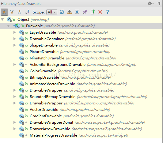
在Drawable的這些繼承類中我們常用的主要有以下幾種:LayerDrawable、ShapeDrawable、NinePatchDrawable、BitmapDrawable、StateListDrawable、LevelListDrawable、TransitionDrawable、InsetDrawable、ScaleDrawable、ClipDrawable等,下面我們會就這些不同的Drawable一一介紹。
2.BitmapDrawable
BitmapDrawable算是最最最最常見的Drawable之一,我們構造一個Bitmap對象的時候,有時候會用到BitmapDrawable,那麼BitmapDrawable的構造,除了在代碼中new一個BitmaDrawable之外,我們還可以使用XML來構造一個BitmapDrawable對象,在項目的drawable文件中新創建一個xml文件,代碼如下:
<?xml version="1.0" encoding="utf-8"?>
<bitmap xmlns:android="http://schemas.android.com/apk/res/android"
  android:antialias="true"
  android:src="@drawable/a2w"
  android:dither="true"
  android:filter="true"
  android:gravity="top|left"
  android:tileMode="mirror"
 >
</bitmap>
這裡只有src屬性是必須的,該屬性指這個BitmapDrawable要顯示的圖片,其他屬性看單詞意思都很容易明白,antialias表示是否開啟抗鋸齒,這個在自定義View創建Paint時經常用到;dither表示是否開啟抖動效果,作用是手機像素配置和圖片像素配置不一致時,系統會自動調整顯示效果,關於圖片像素問題參見Android開發之Bitmap二次采樣文章;filter表示是否開啟過濾效果,這個屬性也是為了使圖片被放大或者縮小時有一個較好的顯示效果;gravity屬性則表示當圖片的大小小於控件的大小時,圖片的顯示位置,tileMode表示平鋪模式,在我們的Windows電腦桌面設置的時候就有這個選項,該屬性共有四種取值,分別是disable、repeat、mirror、clamp四種,默認情況下是disable,就是不做任何處理,當我們在這裡使用了除disable之外的另外三種取值時,gravity屬性值失效。下面我們來看看這三種取值時的效果:
我的原圖是這樣的:

我的bitmapdrawable是這樣的:
<?xml version="1.0" encoding="utf-8"?>
<bitmap xmlns:android="http://schemas.android.com/apk/res/android"
  android:antialias="true"
  android:src="@drawable/p2"
  android:dither="true"
  android:filter="true"
  android:gravity="top|left"
  android:tileMode="repeat"
 >
</bitmap>
我的View是這樣的:
<?xml version="1.0" encoding="utf-8"?>
<RelativeLayout
 xmlns:android="http://schemas.android.com/apk/res/android"
 xmlns:tools="http://schemas.android.com/tools"
 android:layout_width="match_parent"
 android:layout_height="match_parent"
 tools:context="org.mobiletrain.drawable.MainActivity">

 <View
  android:layout_width="400dp"
  android:layout_height="400dp"
  android:background="@drawable/mybitmap"/>
</RelativeLayout>
這是顯示效果是這樣的:
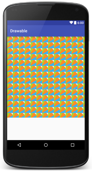
大家看到,當圖片的大小小於控件的大小時,圖片會在水平方向和垂直方向不斷的重復。如果我把tileMode屬性的值改為clamp,我們再來看看顯示效果:
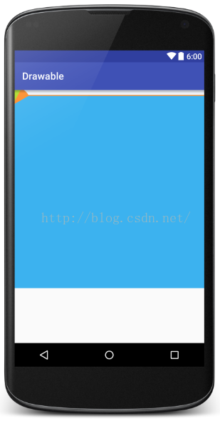
大家看到,這時當圖片小於控件的大小時,圖片在水平方向或者垂直方向末端的顏色會自動延伸直至將控件填充滿。最後我們再來看看mirror屬性,為了方便看到效果,我這裡把圖片換一下,我們再來看看顯示效果:
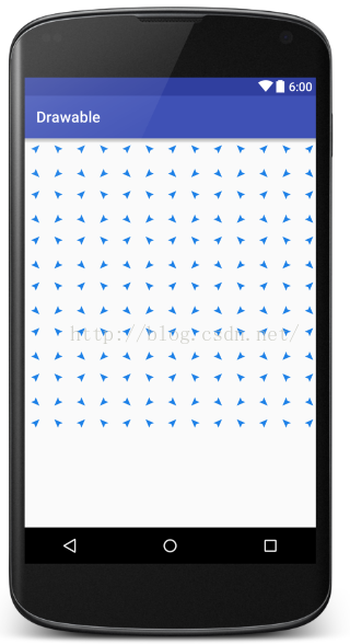
大家看到一個小飛機在水平方向和垂直方向以倒影的形式在不斷的重復。這就是mirror的顯示效果。
3.ShapeDrawable
shapeDrawable又是一個非常常用的Drawable,我們在開發中對於純色的背景一般來說都是繪制的,因為直接使用圖片會使App打包後變得比較大,通過XML來繪制純色背景是一個不錯的選擇。關於這個我這裡就不再多說了,大家查看這篇文章自行了解。android開發之shape詳解。
4.LayerDrawable
LayerDrawable表示一個層次化的Drawable,這個要怎麼理解呢?大家看看我之前的這篇文章就理解了博客關於ProgressBar的美化問題。
LayerDrawable中可以有n多個item,每個item就是一個Drawable,每一個Drawable依據代碼的順序相互覆蓋著顯示出來。先寫的先繪制,後寫的後繪制,最終顯示的效果是一個疊加的顯示效果,我們來看下面一個例子:
<?xml version="1.0" encoding="utf-8"?>
<layer-list xmlns:android="http://schemas.android.com/apk/res/android">
<item>
 <shape android:shape="rectangle">
  <solid android:color="@color/lineColor"/>
 </shape>
</item>
 <item android:bottom="8dp">
  <shape android:shape="rectangle">
   <solid android:color="@color/lineColor2"/>
  </shape>
 </item>
 <item android:bottom="1dp" android:left="1dp" android:right="1dp">
  <shape android:shape="rectangle">
   <solid android:color="@color/etbg"/>
  </shape>
 </item>
</layer-list>
我把這個Drawable作為EditText的背景,代碼如下:
<?xml version="1.0" encoding="utf-8"?>
<LinearLayout
 android:orientation="vertical"
 xmlns:android="http://schemas.android.com/apk/res/android"
 xmlns:tools="http://schemas.android.com/tools"
 android:layout_width="match_parent"
 android:layout_height="match_parent"
 android:padding="8dp"
 tools:context="org.mobiletrain.drawable.MainActivity">
 <EditText
  android:background="@drawable/textview_background"
  android:layout_width="match_parent"
  android:text="江南一點雨"
  android:layout_height="wrap_content"/>
 <EditText
  android:text="江南一點雨"
  android:layout_marginTop="20dp"
  android:layout_width="match_parent"
  android:layout_height="wrap_content"/>
</LinearLayout>
顯示效果如下(上面是加了背景的顯示效果,下面是正常的EditText的顯示效果):
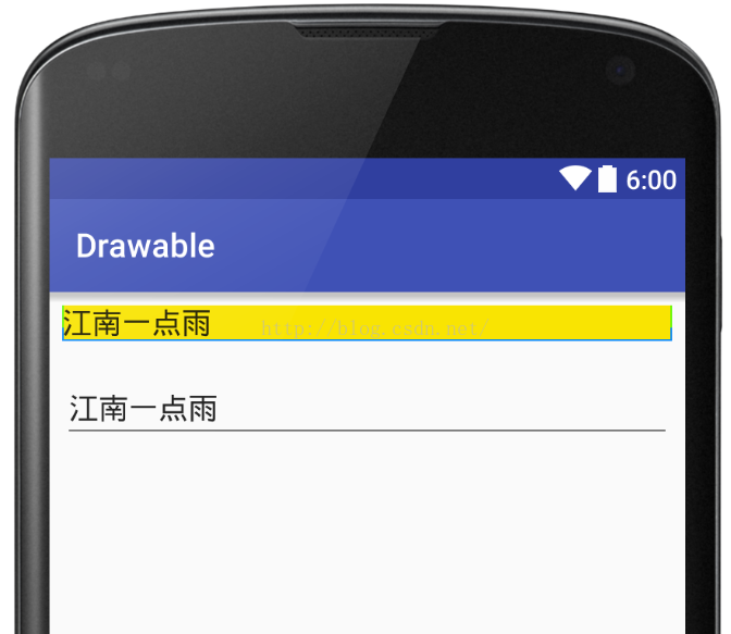
大家看到,上面的EditText有一點不同,原因在於我在LayerDrawable中首先繪制了一個藍色的矩形,然後又繪制了一個綠色的矩形,但是這個綠色矩形距離底部有8dp的高度,這就保證了輸入框有兩個向上翹起的藍色邊框,最後繪制整個背景色,整個背景色為黃色,但是背景色距離左右下三邊的距離分別為1dp,這樣就確保了另外三條線可以正常顯示出來。OK,就是這麼簡單,更酷炫的用法參見關於ProgressBar的美化問題。
5.LevelListDrawable
LevelListDrawable,顧名思義就是一個等級Drawable,它就是根據控件的不同等級來切換Drawable,有點類似於selector中的根據控件的狀態來更新Drawable。不同的是這裡是根據控件的level來更新。比如下面一個簡單的LevelListDrawable文件:
<?xml version="1.0" encoding="utf-8"?>
<level-list xmlns:android="http://schemas.android.com/apk/res/android">
 <item
  android:drawable="@drawable/p2"
  android:maxLevel="10"
  android:minLevel="0"/>
 <item
  android:drawable="@drawable/p1"
  android:minLevel="11"
  android:maxLevel="20"/>
</level-list>
這個levelListDrawable文件表示當控件的level處於0~10之間的時候,顯示圖片p2,當控件的level處於11~20之間的時候顯示圖片p1,我們來看看我的ImageView:
<ImageView
  android:layout_width="200dp"
  android:scaleType="centerCrop"
  android:id="@+id/iv"
  android:src="@drawable/level_list_drawable"
  android:layout_height="200dp"/>
在ImageView中將剛才的LevelListDrawable對象作為它的src,然後當我點擊按鈕的時候改變ImageView的level,這個時候圖片就會發生變化。點擊事件代碼如下:
public void toggle(View view) {
  if (flag) {
   iv.setImageLevel(5);
   flag = false;
  }else{
   iv.setImageLevel(15);
   flag = true;
  }
 }
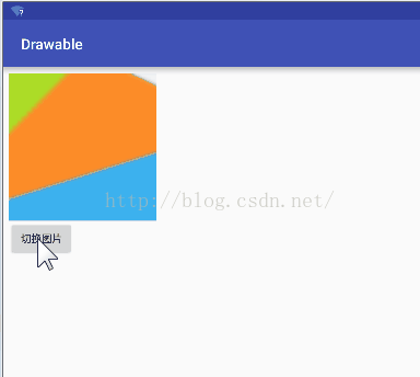
顯示效果如下:
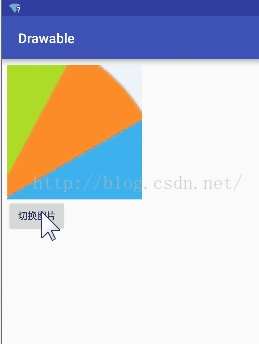
這裡大家需要注意的是level的取值范圍為0~10000,默認值為0。
6.TransitonDrawable
TransitionDrawable主要是實現兩個Drawable之間淡入淡出的效果。我們來看看TransitionDrawable文件:
<?xml version="1.0" encoding="utf-8"?>
<transition xmlns:android="http://schemas.android.com/apk/res/android">
 <item android:drawable="@drawable/p1"/>
 <item android:drawable="@drawable/p2"/>
</transition>
再來看看ImageView文件:
<ImageView
  android:layout_width="200dp"
  android:scaleType="centerCrop"
  android:id="@+id/iv"
  android:src="@drawable/transition_drawable"
  android:layout_height="200dp"/>
點擊事件如下:
public void toggle(View view) {
  TransitionDrawable drawable = (TransitionDrawable) iv.getDrawable();
  drawable.startTransition(2000);
 }
顯示效果如下 :
7.InsetDrawable
InsetDrawable表示可以將一個Drawable嵌入到自己當中。類似的效果使用LayerDrawable也能實現。來看看代碼:
<?xml version="1.0" encoding="utf-8"?>
<inset xmlns:android="http://schemas.android.com/apk/res/android"
  android:insetBottom="20dp"
  android:insetLeft="20dp"
  android:insetRight="20dp"
  android:insetTop="20dp">
 <shape android:shape="oval">
  <solid android:color="@color/colorAccent"/>
 </shape>
</inset>
表示中心的圓形與控件的上下左右四邊的間距都為20dp,當然這個設置圖像的地方也可以像下面這種方式來寫:
<?xml version="1.0" encoding="utf-8"?>
<inset xmlns:android="http://schemas.android.com/apk/res/android"
  android:insetBottom="20dp"
  android:drawable="@drawable/p1"
  android:insetLeft="20dp"
  android:insetRight="20dp"
  android:insetTop="20dp">
</inset>
8.ClipDrawable
表示根據一個Drawable的level對Drawable進行剪裁,代碼如下:
<?xml version="1.0" encoding="utf-8"?>
<clip
 android:drawable="@drawable/p1"
 android:clipOrientation="horizontal"
 android:gravity="left"
 xmlns:android="http://schemas.android.com/apk/res/android">
</clip>
drawable表示drawable圖像,clipOrientation表示剪裁的方向,是從水平方向剪裁還是從垂直方向剪裁,這個屬性配合gravity屬性才會生效,至於每次剪裁的百分比則是和level屬性的值有關,level屬性的取值范圍為0~10000,0表示完全剪裁,10000表示完全不剪裁,5000則表示剪裁一般,其它值依此類推。
原文鏈接:http://blog.csdn.net/u012702547/article/details/51594131
以上就是本文的全部內容,希望對大家的學習有所幫助,也希望大家多多支持本站。
 Day34-Animation 動畫
根據人眼視覺殘留現象,連續播放一些列的圖像,形成動畫效果。Android中的動畫:游戲:利用自定義View的繪制方法,開啟線程頻繁的刷新界面,形成動畫; Android
 Android數據庫高手秘籍(二)——創建表和LitePal的基本用法
我們學習了一些Android數據庫相關的基礎知識,和幾個頗為有用的SQLite命令,都是直接在命令行操作的。但是我們都知道,數據庫是要和程序結合在一起使用的,
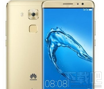 華為麥芒5和小米5哪個好 華為麥芒5和小米5對比評測
華為麥芒5和小米5哪個好?它們之間有什麼區別?下面小編將帶來華為麥芒5和小米5對比評測,大家一起來看看吧!華為麥芒5和小米5對比評測: 華為麥芒5介紹:
 Android 之 IPC 進程通信全解析
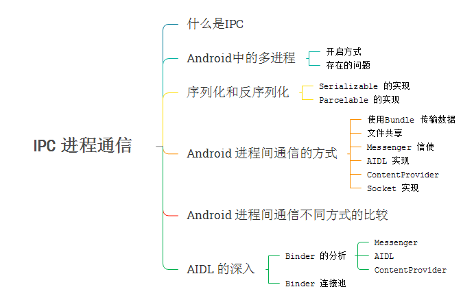
本篇博客的框架什麼是IPCIPC(Inter-Process Communication) 進程間通信,是指兩個不同進程之間數據交換的過程。在明確其之前,需要先搞懂幾個概