編輯:關於Android編程
在這裡,總結一下loading進度條的使用簡單總結一下。
一、說起進度條,必須說說條形進度條,經常都會使用到嘛,特別是下載文件進度等等,還有像騰訊QQ安裝進度條一樣,有個進度總給人良好的用戶體驗。
先來找圖看看,做這個圖完成不用圖片就可以做到了。

看下xml布局文件,其實就是直接用xml寫的在加兩個屬性設置一下就好了,一個style,另一個是background。
<ProgressBar
android:id=”@+id/pb_progressbar”
style=”@style/StyleProgressBarMini”
android:layout_width=”fill_parent”
android:layout_height=”wrap_content”
android:layout_margin=”30dp”
android:background=”@drawable/shape_progressbar_bg”
android:max=”100″
android:progress=”50″ />
先看style吧
<style name=”StyleProgressBarMini” parent=”@android:style/Widget.ProgressBar.Horizontal”>
<item name=”android:maxHeight”>50dip</item>
<item name=”android:minHeight”>10dip</item>
<item name=”android:indeterminateOnly”>false</item>
<item name=”android:indeterminateDrawable”>@android:drawable/progress_indeterminate_horizontal</item>
<item name=”android:progressDrawable”>@drawable/shape_progressbar_mini</item>
</style>
這裡的progressDrawable又是引用一個自定義drawable,不是圖片哦。
shape_progressbar_mini.xml
<?xml version=”1.0″ encoding=”utf-8″?>
<layer-list xmlns:android=”http://schemas.android.com/apk/res/android” >
<!– 背景 –>
<item android:id=”@android:id/background”>
<shape>
<corners android:radius=”5dip” />
<gradient
android:angle=”270″
android:centerY=”0.75″
android:endColor=”#FFFFFF”
android:startColor=”#FFFFFF” />
</shape>
</item>
<item android:id=”@android:id/secondaryProgress”>
<clip>
<shape>
<corners android:radius=”0dip” />
<gradient
android:angle=”270″
android:centerY=”0.75″
android:endColor=”#df0024″
android:startColor=”#df0024″ />
</shape>
</clip>
</item>
<item android:id=”@android:id/progress”>
<clip>
<shape>
<corners android:radius=”5dip” />
<gradient
android:angle=”270″
android:centerY=”0.75″
android:endColor=”#de42ec”
android:startColor=”#de42ec” />
</shape>
</clip>
</item>
</layer-list>
再來看看shape_progressbar_bg.xml
<?xml version=”1.0″ encoding=”UTF-8″?>
<shape xmlns:android=”http://schemas.android.com/apk/res/android”
android:shape=”rectangle” >
<!– 邊框填充的顏色 –>
<solid android:color=”#cecece” />
<!– 設置進度條的四個角為弧形 –>
<!– android:radius 弧形的半徑 –>
<corners android:radius=”90dp” />
<!–
padding:邊界的間隔–>
<padding
android:bottom=”1dp”
android:left=”1dp”
android:right=”1dp”
android:top=”1dp” />
</shape>
就這樣把一個漂亮的條形進度條做好了,在shape_progressbar_bg.xml中,邊框填充的顏色是一種挺好的方法,加了一個進度條的邊框。另外為了進度條四個角都是圓形的,就用了這個屬性<corners android:radius=”90dp” /> 。
搞定,這個時候可以開心一下了,去喝杯水先。
二、圓形進度條。另一個比較常用的就是圓形進度條,表示正在進行中。。。
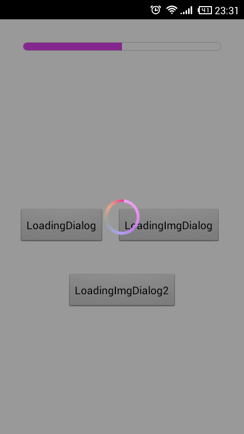
來看2張小圖
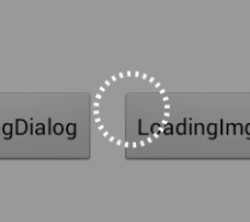
先看第一張,分析下代碼,用自定義的view,用pop來做的哦。LoadingDialog.java
public class LoadingDialog {
private Context context;
private PopupWindow popupDialog;
private LayoutInflater layoutInflater;
private RelativeLayout layout;
private RelativeLayout layout_bg;
private View circleView;
private RotateAnimation rotateAnim;
private AlphaAnimation alphaAnim_in;
private AlphaAnimation alphaAnim_out;
public LoadingDialog(Context context) {
layoutInflater = LayoutInflater.from(context);
this.context = context;
}
private void initAnim() {
rotateAnim = new RotateAnimation(0, 360, Animation.RELATIVE_TO_SELF, 0.5f, Animation.RELATIVE_TO_SELF, 0.5f);
rotateAnim.setDuration(2000);
rotateAnim.setRepeatMode(Animation.RESTART);
rotateAnim.setRepeatCount(-1);
rotateAnim.setInterpolator(new LinearInterpolator());
alphaAnim_in = new AlphaAnimation(0f, 1f);
alphaAnim_in.setFillAfter(true);
alphaAnim_in.setDuration(200);
alphaAnim_in.setInterpolator(new LinearInterpolator());
alphaAnim_out = new AlphaAnimation(1f, 0f);
alphaAnim_out.setFillAfter(true);
alphaAnim_out.setDuration(100);
alphaAnim_out.setInterpolator(new LinearInterpolator());
alphaAnim_out.setAnimationListener(new AnimationListener() {
@Override
public void onAnimationStart(Animation arg0) {
}
@Override
public void onAnimationRepeat(Animation arg0) {
}
@Override
public void onAnimationEnd(Animation arg0) {
dismiss();
}
});
}
/**
* 判斷是否顯示
* @return
*/
public boolean isShowing() {
if (popupDialog != null && popupDialog.isShowing()) {
return true;
}
return false;
}
/**
* 顯示
*/
public void show() {
dismiss();
initAnim();
layout = (RelativeLayout) layoutInflater.inflate(R.layout.view_loadingdialog, null);
circleView = (View) layout.findViewById(R.id.loading_dialog);
layout_bg = (RelativeLayout) layout.findViewById(R.id.bgLayout);
popupDialog = new PopupWindow(layout, LayoutParams.FILL_PARENT, LayoutParams.FILL_PARENT);
View parentView = ((Activity) context).getWindow().findViewById(Window.ID_ANDROID_CONTENT);
popupDialog.showAtLocation(parentView, Gravity.CENTER, 0, 0);
layout_bg.startAnimation(alphaAnim_in);
circleView.startAnimation(rotateAnim);
}
/**
* 隱藏
*/
public void dismiss() {
if (popupDialog != null && popupDialog.isShowing()) {
layout_bg.clearAnimation();
circleView.clearAnimation();
popupDialog.dismiss();
}
}
}
這裡呢引用了view_loadingdialog.xml,已作整個頁面的背景和loading框。
view_loadingdialog.xml
<?xml version=”1.0″ encoding=”utf-8″?>
<RelativeLayout xmlns:android=”http://schemas.android.com/apk/res/android”
android:layout_width=”match_parent”
android:layout_height=”match_parent” >
<RelativeLayout
android:id=”@+id/bgLayout”
android:layout_width=”match_parent”
android:layout_height=”match_parent”
android:background=”#66000000″ >
<View
android:id=”@+id/loading_dialog”
android:layout_width=”48dp”
android:layout_height=”48dp”
android:layout_centerInParent=”true”
android:background=”@drawable/shape_loading_dialog” />
</RelativeLayout>
</RelativeLayout>
再看看這個shape_loading_dialog.xml,繪制轉動的圓形性狀,又不用圖片挺好的。
<?xml version=”1.0″ encoding=”utf-8″?>
<shape xmlns:android=”http://schemas.android.com/apk/res/android”
android:shape=”oval” >
<stroke
android:width=”3dp”
android:dashWidth=”2dp”
android:dashGap=”3dp”
android:color=”#fff”/>
<gradient
android:startColor=”#00ffffff”
android:endColor=”#00ffffff”
android:angle=”180″/>
</shape>
就是這樣子,實現了第一個圓形進度條。
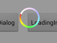
可是如果做有顏色的圓形進度條呢,或者彩色的,後來想想不如加個圖片來實現好了。
LoadingImgDialog.java
public class LoadingImgDialog {
private Context context;
private PopupWindow popupDialog;
private LayoutInflater layoutInflater;
private RelativeLayout layout;
private RelativeLayout layout_bg;
private int residBg;
private View loading_dialog;
/** 背景添加旋轉動畫效果,實現了轉動動作  **/
private RotateAnimation rotateAnim;
/** 透明度動畫效果 **/
private AlphaAnimation alphaAnim_in;
private AlphaAnimation alphaAnim_out;
public LoadingImgDialog(Context context, int residBg) {
layoutInflater = LayoutInflater.from(context);
this.residBg = residBg;
this.context = context;
}
private void initAnim() {
rotateAnim = new RotateAnimation(0, 360, Animation.RELATIVE_TO_SELF, 0.5f, Animation.RELATIVE_TO_SELF, 0.5f);
rotateAnim.setDuration(2000);
rotateAnim.setRepeatMode(Animation.RESTART);
rotateAnim.setRepeatCount(-1);
rotateAnim.setInterpolator(new LinearInterpolator());
alphaAnim_in = new AlphaAnimation(0f, 1f);
alphaAnim_in.setFillAfter(true);
alphaAnim_in.setDuration(200);
alphaAnim_in.setInterpolator(new LinearInterpolator());
alphaAnim_out = new AlphaAnimation(1f, 0f);
alphaAnim_out.setFillAfter(true);
alphaAnim_out.setDuration(100);
alphaAnim_out.setInterpolator(new LinearInterpolator());
/** 監聽動作,動畫結束時,隱藏LoadingColorDialog **/
alphaAnim_out.setAnimationListener(new AnimationListener() {
@Override
public void onAnimationStart(Animation arg0) {
}
@Override
public void onAnimationRepeat(Animation arg0) {
}
@Override
public void onAnimationEnd(Animation arg0) {
dismiss();
}
});
}
/**
* 判斷是否顯示
* @return
*/
public boolean isShowing() {
if (popupDialog != null && popupDialog.isShowing()) {
return true;
}
return false;
}
/**
* 顯示
*/
public void show() {
dismiss();
initAnim();
layout = (RelativeLayout) layoutInflater.inflate(R.layout.view_loadingcolordialog, null);
loading_dialog = (View) layout.findViewById(R.id.loading_dialog);
loading_dialog.setBackgroundResource(residBg);
layout_bg = (RelativeLayout) layout.findViewById(R.id.bgLayout);
popupDialog = new PopupWindow(layout, LayoutParams.FILL_PARENT, LayoutParams.FILL_PARENT);
View parentView = ((Activity) context).getWindow().findViewById(Window.ID_ANDROID_CONTENT);
popupDialog.showAtLocation(parentView, Gravity.CENTER, 0, 0);
layout_bg.startAnimation(alphaAnim_in);
loading_dialog.startAnimation(rotateAnim);
}
/**
* 隱藏
*/
public void dismiss() {
if (popupDialog != null && popupDialog.isShowing()) {
layout_bg.clearAnimation();
loading_dialog.clearAnimation();
popupDialog.dismiss();
}
}
}
其實就是修改了一個地方,加入residBg,用圖片資源設置圓形進度條那一小部分的背景。
稍稍修改一句代碼換一張圖片,就變成了另一個圓形進度條了,好玩吧。
loadingColorDialog = new LoadingImgDialog(this, R.drawable.img_loading);
loadingColorDialog2 = new LoadingImgDialog(this, R.drawable.img_loading2);
給看看全屏效果圖吧,就稍稍修改一句代碼換一張圖片哦。
最後給MainActivity.java看看
public class MainActivity extends Activity implements OnClickListener {
Button bt_loading_dialog;
Button bt_color_loading_dialog;
Button bt_color_loading_dialog2;
LoadingDialog loadingDialog;
LoadingImgDialog loadingColorDialog;
LoadingImgDialog loadingColorDialog2;
@Override
protected void onCreate(Bundle savedInstanceState) {
super.onCreate(savedInstanceState);
setContentView(R.layout.activity_main);
initView();
}
private void initView() {
bt_loading_dialog = (Button) findViewById(R.id.bt_loading_dialog);
bt_loading_dialog.setOnClickListener(this);
bt_color_loading_dialog = (Button) findViewById(R.id.bt_loading_img_dialog);
bt_color_loading_dialog.setOnClickListener(this);
bt_color_loading_dialog2 = (Button) findViewById(R.id.bt_loading_img_dialog2);
bt_color_loading_dialog2.setOnClickListener(this);
loadingDialog = new LoadingDialog(this);
loadingColorDialog = new LoadingImgDialog(this, R.drawable.img_loading);
loadingColorDialog2 = new LoadingImgDialog(this, R.drawable.img_loading2);
}
@Override
public void onClick(View view) {
switch (view.getId()) {
case R.id.bt_loading_dialog:
loadingDialog.show();
break;
case R.id.bt_loading_img_dialog:
loadingColorDialog.show();
break;
case R.id.bt_loading_img_dialog2:
loadingColorDialog2.show();
break;
default:
break;
}
}
@Override
protected void onDestroy() {
super.onDestroy();
loadingColorDialog.dismiss();
}
@Override
public void onBackPressed() {
if (loadingDialog.isShowing()) {
loadingDialog.dismiss();
} else if (loadingColorDialog.isShowing()){
loadingColorDialog.dismiss();
} else if (loadingColorDialog2.isShowing()){
loadingColorDialog2.dismiss();
} else {
finish();
}
}
}
以上就是對Android 進度條資料整理,後續繼續補充相關資料,謝謝大家對本站的支持!
 Android史上功能最全的日歷控件
※效果 ※使用方法 package com.fancyy.calendarweight; import java.u
 手機風雲直播關閉彈幕字幕的設置方法
第一步、打開風雲直播,點擊首頁右下角“我”。第二步、進入我的界面,點擊右上角“設置”按鍵,進入設置界面,將彈
 獲取Android手機CPU類型 ARM、ARMV7、NEON
1 查看手機CPU信息 cmd——adb shell——cd /proc------cat cpuinfo 2 獲取cpu的是arm指令集,armv7指令集、還是ne
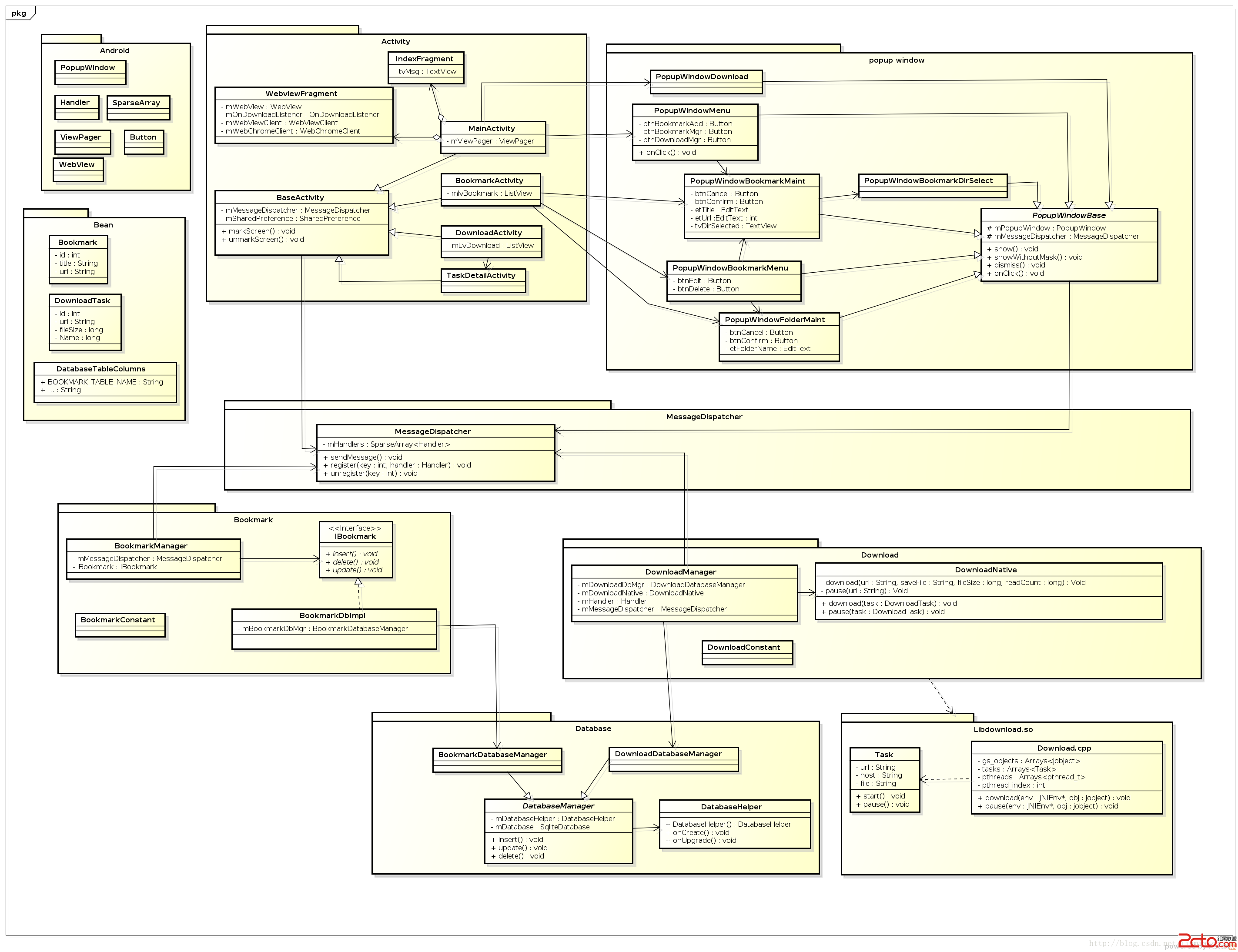 Android中利用Handler實現消息的分發機制(三)
在第二篇文章《Android中利用Handler實現消息的分發機制(一)》中,我們講到主線程的Looper是Android系統在啟動App的時候,已經幫我們創建好了,而如