編輯:關於Android編程
CoordinatorLayout 實現了多種Material Design中提到的滾動效果。目前這個框架提供了幾種不用寫動畫代碼就能工作的方法,這些效果包括:
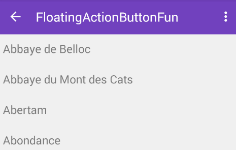
*讓浮動操作按鈕上下滑動,為Snackbar留出空間。
*擴展或者縮小Toolbar或者頭部,讓主內容區域有更多的空間。
*控制哪個view應該擴展還是收縮,以及其顯示大小比例,包括視差滾動效果動畫。
浮動操作按鈕與Snackbar
CoordinatorLayout可以用來配合浮動操作按鈕的 layout_anchor 和 layout_gravity屬性創造出浮動效果。
當Snackbar在顯示的時候,往往出現在屏幕的底部。為了給Snackbar留出空間,浮動操作按鈕需要向上移動。
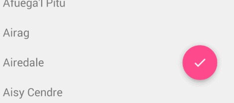
只要使用CoordinatorLayout作為基本布局,將自動產生向上移動的動畫。浮動操作按鈕有一個 默認的 behavior來檢測Snackbar的添加並讓按鈕在Snackbar之上呈現上移與Snackbar等高的動畫。
<android.support.design.widget.CoordinatorLayout
 xmlns:android="http://schemas.android.com/apk/res/android"
 xmlns:app="http://schemas.android.com/apk/res-auto"
 android:layout_width="match_parent"
 android:layout_height="match_parent">

 <android.support.v7.widget.RecyclerView
  android:id="@+id/rvToDoList"
  android:layout_width="match_parent"
  android:background="#9d9d9d"
  android:layout_height="match_parent"/>
 <android.support.design.widget.FloatingActionButton
  android:id="@+id/fab"
  android:layout_width="wrap_content"
  android:layout_height="wrap_content"
  android:layout_gravity="end|bottom"
  android:layout_margin="16dp"
  app:layout_anchor="@id/rvToDoList"
  app:layout_anchorGravity="bottom|right|end"/>
 <!--app:layout_anchor:意思是FAB浮動按鈕顯示在哪個布局區域。且設置當前錨點的位置
 app:layout_anchorGravity:意思FAB浮動按鈕在這個布局區域的具體位置。兩個屬性共同作用才是的FAB 浮動按鈕也能折疊消失,出現。
 -->

</android.support.design.widget.CoordinatorLayout>
protected void onCreate(Bundle savedInstanceState) {
  super.onCreate(savedInstanceState);
  setContentView(R.layout.activity_main);
  findViewById(R.id.fab).setOnClickListener(new View.OnClickListener() {
   @Override
   public void onClick(View v) {
    Snackbar.make(v, "test", Snackbar.LENGTH_LONG)
      .setAction("Cancel", new View.OnClickListener() {
       @Override
       public void onClick(View v) {
        //這裡的單擊事件代表點擊消除Action後的響應事件
        Toast.makeText(MainActivity.this,"asdasd",Toast.LENGTH_SHORT).show();
       }
      }).show();
   }
  });
 }
Toolbar的擴展與收縮
首先需要確保你不是使用已經過時的ActionBar,使用ToolBar作為actionbar。同樣,這裡也需要CoordinatorLayout作為主布局容器。
我們必須使用一個容器布局: AppBarLayout 來讓Toolbar響應滾動事件。響應滾動事件
<android.support.design.widget.AppBarLayout
  android:id="@+id/appbar"
  android:layout_width="match_parent"
  android:layout_height="@dimen/detail_backdrop_height"
  android:theme="@style/ThemeOverlay.AppCompat.Dark.ActionBar"
  android:fitsSystemWindows="true">

 <android.support.v7.widget.Toolbar
    android:id="@+id/toolbar"
    android:layout_width="match_parent"
    android:layout_height="?attr/actionBarSize"
    app:popupTheme="@style/ThemeOverlay.AppCompat.Light" />

 </android.support.design.widget.AppBarLayout>
然後,我們需要定義AppBarLayout與滾動視圖之間的聯系。在RecyclerView或者任意支持嵌套滾動的view比如NestedScrollView上添加app:layout_behavior。support library包含了一個特殊的字符串資源@string/appbar_scrolling_view_behavior,它和AppBarLayout.ScrollingViewBehavior相匹配,用來通知AppBarLayout 這個特殊的view何時發生了滾動事件,這個behavior需要設置在觸發事件(滾動)的view之上。注意:根據官方的谷歌文檔,AppBarLayout目前必須是第一個嵌套在CoordinatorLayout裡面的子view。
<android.support.v7.widget.RecyclerView
  android:id="@+id/rvToDoList"
  android:layout_width="match_parent"
  android:layout_height="match_parent"
  app:layout_behavior="@string/appbar_scrolling_view_behavior">
AppBarLayout裡面定義的view只要設置了app:layout_scrollFlags屬性,就可以在RecyclerView滾動事件發生的時候被觸發:當CoordinatorLayout發現RecyclerView中定義了這個屬性,它會搜索自己所包含的其他view,看看是否有view與這個behavior相關聯。AppBarLayout.ScrollingViewBehavior描述了RecyclerView與AppBarLayout之間的依賴關系。RecyclerView的任意滾動事件都將觸發AppBarLayout或者AppBarLayout裡面view的改變。
<android.support.design.widget.AppBarLayout
  android:layout_width="match_parent"
  android:layout_height="wrap_content"
  android:fitsSystemWindows="true"
  android:theme="@style/ThemeOverlay.AppCompat.Dark.ActionBar">

   <android.support.v7.widget.Toolbar
    android:id="@+id/toolbar"
    android:layout_width="match_parent"
    android:layout_height="?attr/actionBarSize"
    app:layout_scrollFlags="scroll|enterAlways"/>

 </android.support.design.widget.AppBarLayout>
app:layout_scrollFlags是一個非常重要的屬性,它裡邊的取值主要有五種,下面我分別來解釋:
1.scroll 表示CollapsingToolbarLayout可以滾動(不設置的話頭部的ImageView將不能折疊),如果想將所有的View能滾動出屏幕,必須設置個flag,若沒有設置flag的View,則會被固定在屏幕頂部
2.enterAlways 表示底部的滾動控件只要向下滾動,頭部就顯示出來,設置這個flag時,向下的滾動都會導致該view變為可見。當ScrollView往下滾動時,該View會直接往下滾動。而不用考慮ScrollView是否在滾動。
3.enterAlwaysCollapsed 表示當底部滾動控件滾動見頂時,頭部顯示出來,在ScrollView往上滑動時,首先是View把滑動事件“奪走”,由View去執行滑動,直到滑動最小高度後,把這個滑動事件“還”回去,讓ScrollView內部去上滑。
4.exitUntilCollapsed 表示頭部折疊到最小高度時(Toolbar的高度),就不再折疊,是enterAlways的附加選項,一般跟enterAlways一起使用,它是指,View在往下“出現”的時候,首先是enterAlways效果,當View的高度達到最小高度時,View就暫時不去往下滾動,直到ScrollView滑動到頂部不再滑動時,View再繼續往下滑動,直到滑到View的頂部結束。
5.snap 表示在滑動過程中如果停止滑動,則頭部會就近折疊(要麼恢復原狀,要麼折疊成一個Toolbar)
記住,要把帶有scroll flag的view放在前面,這樣收回的view才能讓正常退出,而固定的view繼續留在頂部。
制造折疊效果
如果想制造toolbar的折疊效果,我們必須把Toolbar放在CollapsingToolbarLayout中:
<android.support.design.widget.CoordinatorLayout
 xmlns:android="http://schemas.android.com/apk/res/android"
 xmlns:tools="http://schemas.android.com/tools"
 xmlns:app="http://schemas.android.com/apk/res-auto"
 android:layout_width="match_parent"
 android:layout_height="match_parent"
 android:id="@+id/main_content"
 tools:context="wxt.coordinatorlayout.AppBarLayout">
 <android.support.design.widget.AppBarLayout
  android:id="@+id/appbar"
  android:layout_width="match_parent"
  android:layout_height="wrap_content"
  >
  <android.support.design.widget.CollapsingToolbarLayout
   android:id="@+id/collapsing_toolbar"
   android:layout_width="match_parent"
   android:layout_height="match_parent"
   android:fitsSystemWindows="true"
   app:contentScrim="?attr/colorPrimary"
   app:expandedTitleMarginEnd="64dp"
   app:expandedTitleMarginStart="48dp"
   app:layout_scrollFlags="scroll|exitUntilCollapsed">

   <android.support.v7.widget.Toolbar
    android:id="@+id/toolbar"
    android:layout_width="match_parent"
    android:layout_height="?attr/actionBarSize"
    app:layout_scrollFlags="scroll|enterAlways"></android.support.v7.widget.Toolbar>
  </android.support.design.widget.CollapsingToolbarLayout>
 </android.support.design.widget.AppBarLayout>
 <android.support.v4.widget.NestedScrollView
  android:layout_width="match_parent"
  android:layout_height="wrap_content"
  app:layout_behavior="@string/appbar_scrolling_view_behavior">

  <TextView
   android:layout_width="match_parent"
   android:layout_height="wrap_content"
   android:text="aaaa\naaaa\naaaa\naaaa\naaaa\naaaa\naaaa\naaaa\naaaa\naaaa\naaaa\naaaa\naaaa\naaaa\naaaa\naaaa\naaaa\naaaa\naaaa\naaaa\naaaa\naaaa\naaaa\naaaa\naaaa\naaaa\naaaa\naaaa\naaaa\naaaa\naaaa\naaaa\naaaa\naaaa\naaaa\naaaa\naaaa\naaaa\naaaa\naaaa\naaaa\naaaa\naaaa\naaaa\naaaa\n" />
 </android.support.v4.widget.NestedScrollView>
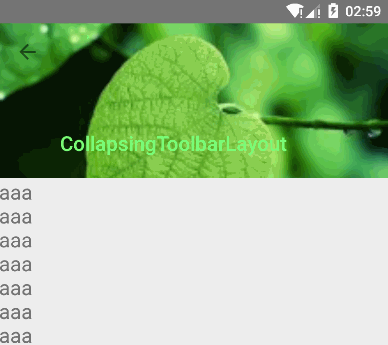
現在效果就成了:
通常,我們我們都是設置Toolbar的title,而現在,我們需要把title設置在CollapsingToolBarLayout上,而不是Toolbar。
CollapsingToolbarLayout collapsingToolbar =(CollapsingToolbarLayout) findViewById(R.id.collapsing_toolbar);
collapsingToolbar.setTitle("Title");
制造視差效果CollapsingToolbarLayout
CollapsingToolbarLayout還能讓我們做出更高級的動畫,比如在裡面放一個ImageView,然後在它折疊的時候漸漸淡出。同時在用戶滾動的時候title的高度也會隨著改變。
CollapsingToolbarLayout作用是提供了一個可以折疊的Toolbar,它繼承至FrameLayout,給它設置layout_scrollFlags,它可以控制包含在CollapsingToolbarLayout中的控件(如:ImageView、Toolbar)在響應layout_behavior事件時作出相應的scrollFlags滾動事件(移除屏幕或固定在屏幕頂端)。
使用CollapsingToolbarLayout:
<android.support.design.widget.AppBarLayout
  android:layout_width="match_parent"
  android:layout_height="256dp"
  android:fitsSystemWindows="true">
  <android.support.design.widget.CollapsingToolbarLayout
   android:id="@+id/collapsing_toolbar_layout"
   android:layout_width="match_parent"
   android:layout_height="match_parent"
   app:contentScrim="#30469b"
   app:expandedTitleMarginStart="48dp"
   app:layout_scrollFlags="scroll|exitUntilCollapsed">
   <ImageView
    android:layout_width="match_parent"
    android:layout_height="match_parent"
    android:scaleType="centerCrop"
    android:src="@mipmap/bg"
    app:layout_collapseMode="parallax"
    app:layout_collapseParallaxMultiplier="0.7" />
   <android.support.v7.widget.Toolbar
    android:id="@+id/toolbar"
    android:layout_width="match_parent"
    android:layout_height="?attr/actionBarSize"
    app:layout_collapseMode="pin" />
  </android.support.design.widget.CollapsingToolbarLayout>
 </android.support.design.widget.AppBarLayout>
我們在CollapsingToolbarLayout中設置了一個ImageView和一個Toolbar。並把這個CollapsingToolbarLayout放到AppBarLayout中作為一個整體。
1、在CollapsingToolbarLayout中:
其中還設置了一些屬性,簡要說明一下:
contentScrim - 設置當完全CollapsingToolbarLayout折疊(收縮)後的背景顏色。
expandedTitleMarginStart - 設置擴張時候(還沒有收縮時)title向左填充的距離。
2、在ImageView控件中:
我們設置了:
layout_collapseMode (折疊模式) - 有兩個值:
pin - 設置為這個模式時,當CollapsingToolbarLayout完全收縮後,Toolbar還可以保留在屏幕上。
parallax - 設置為這個模式時,在內容滾動時,CollapsingToolbarLayout中的View(比如ImageView)也可以同時滾動,實現視差滾動效果,通常和layout_collapseParallaxMultiplier(設置視差因子)搭配使用。
layout_collapseParallaxMultiplier(視差因子) - 設置視差滾動因子,值為:0~1。
3、在Toolbar控件中:
我們設置了layout_collapseMode(折疊模式):為pin。
綜上分析:當設置了layout_behavior的控件響應起了CollapsingToolbarLayout中的layout_scrollFlags事件時,ImageView會有視差效果的向上滾動移除屏幕,當開始折疊時CollapsingToolbarLayout的背景色(也就是Toolbar的背景色)就會變為我們設置好的背景色,Toolbar也一直會固定在最頂端。
【注】:使用CollapsingToolbarLayout時必須把title設置到CollapsingToolbarLayout上,設置到Toolbar上不會顯示。即:
mCollapsingToolbarLayout.setTitle(” “);
該變title的字體顏色:
擴張時候的title顏色:mCollapsingToolbarLayout.setExpandedTitleColor();
收縮後在Toolbar上顯示時的title的顏色:mCollapsingToolbarLayout.setCollapsedTitleTextColor();
這個顏色的過度變化其實CollapsingToolbarLayout已經幫我們做好,它會自動的過度,比如我們把收縮後的title顏色設為綠色。
CoordinatorLayout與CollapsingToolbarLayout:
CollapsingToolbarLayout的作用提供了一個可以折疊的Toolbar,對Toolbar進行再次包裝的ViewGroup,繼承FragmentLayout,它需要放在AppBarLayout布局裡面,並且作為AppBarLayout的直接子View。CollapsingToolbarLayout主要包括幾個功能:
①:折疊Title(Collapsing title):當布局內容全部顯示出來時,title是最大的,但是隨著View逐步移出屏幕頂部,title變得越來越小。你可以通過CollapsingToolbarLayout調用setTitle函數來設置title。
②:內容紗布(Content scrim):根據滾動的位置是否到達一個閥值,來決定是否對View“蓋上紗布”。可以通過setContentScrim(Drawable)來設置紗布的圖片.ToolBar被折疊到頂部固定時候的背景,你可以調用setContentScrim(Drawable)方法改變背景或者 在屬性中使用 app:contentScrim=”?attr/colorPrimary”來改變背景。
③:狀態欄紗布(Status bar scrim):根據滾動位置是否到達一個閥值決定是否對狀態欄“蓋上紗布”,你可以通過setStatusBarScrim(Drawable)來設置紗布圖片,調用方法setStatusBarScrim(,l)設置狀態欄的背景,但是只能在LOLLIPOP設備上面有作用。這個只能在Android5.0以上系統有效果。
④ollapseMode :子視圖的折疊模式,在子視圖設置,有兩種,想要明確的看到效果可以給Toolbar設置一個背景顏色
(1)“pin”:固定模式,在折疊的時候最後固定在頂端;
(2)“parallax”:視差模式,在折疊的時候會有個視差折疊的效果。我們可以在布局中使用屬性app:layout_collapseMode=”parallax”來改變:
(1):將子View位置固定(Pinned position children):子View可以選擇是否在全局空間上固定位置,這對於Toolbar來說非常有用,因為當布局在移動時,可以將Toolbar固定位置而不受移動的影響。 將app:layout_collapseMode設為pin。
(2):視差滾動子View(Parallax scrolling children):子View可以選擇在當前的布局當時是否以“視差”的方式來跟隨滾動。(:其實就是讓這個View的滾動的速度比其他正常滾動的View速度稍微慢一點)。將布局參數app:layout_collapseMode設為parallax,值的范圍[0.0,1.0],值越大視察越大。
app:layout_collapseMode=”parallax”表示ImageView的折疊和CollapsingToolbarLayout的折疊不同步,那麼這個不同步到底是怎樣一個不同步法呢?還有另外一個參數來設置不同步的參數,如下:
app:layout_collapseParallaxMultiplier=”0.5”表示視覺乘數,該數值的取值為0~1,數值越大,視覺差越大(如果這裡的值為0,則在頭部折疊的過程中,ImageView的頂部在慢慢隱藏,底部不動,如果這裡的值為1,ImageView的頂部不懂,底部慢慢隱藏,如果這裡的取值為0~1之間,則在折疊的過程中,ImageView的頂部和底部都會隱藏,但是頭部和底部隱藏的快慢是不一樣的,具體速度和視覺乘數有關)
app:layout_collapseMode這個屬性還有一個取值,是pin,該屬性表示當折疊完成時將該控件放在頁面的頭部.
最終的代碼:
<android.support.design.widget.CoordinatorLayout
 xmlns:android="http://schemas.android.com/apk/res/android"
 xmlns:app="http://schemas.android.com/apk/res-auto"
 xmlns:tools="http://schemas.android.com/tools"
 android:layout_width="match_parent"
 android:layout_height="match_parent"
 tools:context=".MainActivity">
 <android.support.design.widget.AppBarLayout
  android:layout_width="match_parent"
  android:layout_height="256dp"
  android:fitsSystemWindows="true">
  <android.support.design.widget.CollapsingToolbarLayout
   android:id="@+id/collapsing_toolbar_layout"
   android:layout_width="match_parent"
   android:layout_height="match_parent"
   app:contentScrim="#30469b"
   app:expandedTitleMarginStart="48dp"   app:expandedTitleTextAppearance="@style/TextAppearance.AppCompat.Title"   app:collapsedTitleTextAppearance="@style/TextAppearance.AppCompat.Title"
   app:layout_scrollFlags="scroll|exitUntilCollapsed">
   <ImageView
    android:layout_width="match_parent"
    android:layout_height="match_parent"
    android:scaleType="centerCrop"
    android:src="@mipmap/bg"
    app:layout_collapseMode="parallax"
    app:layout_collapseParallaxMultiplier="0.7" />
   <android.support.v7.widget.Toolbar
    android:id="@+id/toolbar"
    android:layout_width="match_parent"
    android:layout_height="?attr/actionBarSize"
    app:layout_collapseMode="pin" />
  </android.support.design.widget.CollapsingToolbarLayout>
 </android.support.design.widget.AppBarLayout>
 <LinearLayout
  android:layout_width="match_parent"
  android:layout_height="match_parent"
  android:orientation="vertical"
  app:layout_behavior="@string/appbar_scrolling_view_behavior">
  <android.support.v7.widget.RecyclerView
   android:id="@+id/recyclerView"
   android:layout_width="match_parent"
   android:layout_height="match_parent"
   android:scrollbars="none" />
 </LinearLayout>
</android.support.design.widget.CoordinatorLayout>
Java代碼
Toolbar mToolbar = (Toolbar) findViewById(R.id.toolbar);
  setSupportActionBar(mToolbar);
  getSupportActionBar().setDisplayHomeAsUpEnabled(true);
  mToolbar.setNavigationOnClickListener(new View.OnClickListener() {
   @Override
   public void onClick(View v) {
    onBackPressed();
   }
  });
  //使用CollapsingToolbarLayout必須把title設置到CollapsingToolbarLayout上,設置到Toolbar上則不會顯示
  CollapsingToolbarLayout mCollapsingToolbarLayout = (CollapsingToolbarLayout) findViewById(R.id.collapsing_toolbar_layout);
  mCollapsingToolbarLayout.setTitle("CollapsingToolbarLayout");
  //通過CollapsingToolbarLayout修改字體顏色
  mCollapsingToolbarLayout.setExpandedTitleColor(Color.WHITE);//設置還沒收縮時狀態下字體顏色
  mCollapsingToolbarLayout.setCollapsedTitleTextColor(Color.GREEN);//設置收縮後Toolbar上字體的顏色
以上就是本文的全部內容,希望對大家的學習有所幫助,也希望大家多多支持本站。
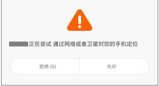 Android填坑系列:在小米系列等機型上放開定位權限後的定位請求彈框示例
背景近期因實際項目需要,在特定操作下觸發定位請求,取到用戶位置及附近位置。問題:經初步選型,最終決定接入百度定位,按照百度定位SDK Android文檔,接入過程相對順利
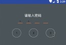 Android APP數字解鎖實例詳解
Android APP數字上鎖最近抽時間做了下數字解鎖的功能,手機有數字解鎖,App也可以做到,避免某些應用隱私洩漏,一下就是實現效果圖:序言:這兩天老大給了個任務,說是
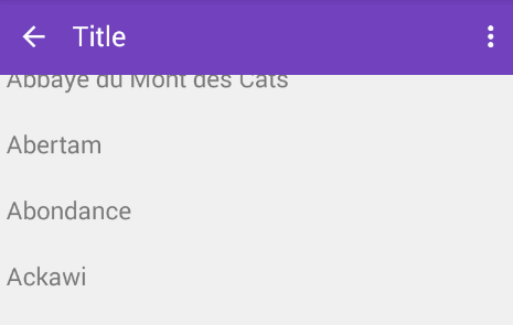
 Android仿微信實現首字母導航條
本文介紹Android實現首字母導航條,先看張效果圖,具體怎麼實現看代碼吧具體的步驟1.整體布局的顯示 2. 實現A-Z的分組 3. 自定義A-Z的導航條 4. 中間顯示
 Android開發學習之WallPaper設置壁紙詳細介紹與實例
今天和大家分享的是關於在Android中設置壁紙的方法,在Android中設置壁紙的方法有三種,分別是:1、使用WallpaperManager的setResource(