編輯:關於Android編程
前言
Android自定義控件經常會用到Canvas繪制2D圖形,在優化自己自定義控件技能之前,必須熟練掌握Canvas繪圖機制。本文從以下三個方面對Canvas繪圖機制進行講解:
畫布Canvas
畫筆Paint
示例圓形進度條
畫布Canvas
首先,來看一下Android官網對Canvas類的定義:
The Canvas class holds the “draw” calls。To draw something, you need 4 basic components: A Bitmap to hold the pixels, a Canvas to host the draw calls(writing into the bitmap), a drawing primitive(eg, Rect, Path, text, Bitmap), and a paint(to describe the colors and styles for the drawing).
簡單來說,Android進行2D繪圖必須要有Canvas類的支持,它位於“android.graphics.Canvas”包下。我們可以把Canvas理解成系統分配給我們的一塊用於繪圖的內存(ps:真正的內存是其包含的Bitmap)。
Canvas提供了兩個構造函數:
Canvas() : 創建一個空的Canvas對象。
Canvas(Bitmap bitmap) : 創建一個以bitmap位圖為背景的Canvas。
通常,我們會采用第二種包含Bitmap參數的構造函數方式或者直接使用onDraw方法中系統提供的Canvas。
既然Canvas主要用於繪圖,那麼它提供了很多相應的draw方法,方便我們在Canvas對象上繪圖,介紹幾個常用的draw方法:
void drawRect(RectF rect, Paint paint) : 繪制區域,參數為RectF的區域。
void drawOval(RectF oval, Paint paint) : 繪制矩形的內切橢圓。
void drawCircle(float cx, float cy, float radius, Paint paint) : 繪制圓形。cx和cy是圓心坐標,radius是半徑長度。
void drawArc(RectF oval, float startAngle, float sweepAngle. boolean useCenter, Paint paint) : 繪制圓弧形,也是以矩形的內切橢圓為標准。其中,startAngle為起始角度,sweepAngle為弧度大小,useCenter為true,則是繪制一個扇行,為false,則只是一段圓弧。(ps:startAngle為0時,是圓形鐘表3點鐘方向)。
void drawPath(Path path, Paint paint) : 根據給定的path,繪制連線。
void drawBitmap(Bitmap bitmap, Rect src, Rect dst, Paint paint) : 貼圖,參數bitmap是要進行繪制的bitmap對象,參數src是指bitmap的源區域(一般為null),dst是bitmap的目標區域,paint是畫筆,可為null。
void drawLine(float startX, float startY, float stopX, float stopY, Paint paint) : 根據給定的起點和結束點之間繪制連線。
void drawPoint(float x, float y, Paint paint) : 根據給定的坐標,繪制點。
void drawText(String text, float x, float y, Paint paint) : 根據給定的坐標,繪制文字。其中,x是文本起始的x軸坐標,y是文本縱向結束的y軸坐標。
畫筆Paint
從上面列舉的幾個Canvas.drawXXX()方法可以看到,其中都有一個類型為Paint的參數,可以把它理解成為”畫筆”,通過這個畫筆,在Canvas這張畫布上作畫。它位於“android.graphics.Paint”包下,主要用於設置繪圖風格,包括畫筆顏色。
Paint中提供了大量設置繪畫風格的方法,這裡僅列出一些常用的功能:
setARGB(int a, int r, int g, int b) : 設置ARGB顏色。
setColor(int color) : 設置顏色。
setAlpha(int a) : 設置透明度。
setAntiAlias(boolean aa) : 設置是否抗鋸齒。
setShader(Shader shader) : 設置Paint的填充效果。
setStrokeWidth(float width) : 設置Paint的筆觸寬度。
setStyle(Paint.Style style) : 設置Paint的填充風格。
setTextSize(float textSize) : 設置繪制文本時的文字大小。
自定義圓形進度條
這裡以一個自定義的圓形進度條為例,我們首先看一下效果圖:
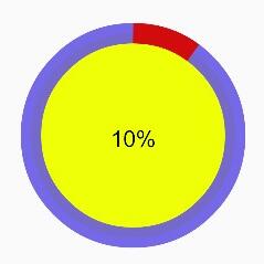
通過效果圖,我們首先抽象出自定義屬性,如下:
圓環內部填充色。
圓環進度條的背景色。
圓環進度條的顏色。
圓環半徑。
圓環進度條的寬度。
進度條起始的角度。
中間文字的顏色。
中間文字的大小。
中間文字是否需要顯示的標志位。
在Android中,可以在項目的res/values/目錄下,建立一個resources源文件,通過declare-styleable來聲明一個特定的屬性集合。
示例屬性集合如下所示(res/values/attrs_round_progress_bar.xml):
<resources>
  <declare-styleable name="RoundProgressBar">
    <attr name="startAngle" format="integer"></attr>
    <attr name="radius" format="dimension"></attr>
    <attr name="ringWidth" format="dimension"></attr>
    <attr name="centerColor" format="color"></attr>
    <attr name="ringColor" format="color"></attr>
    <attr name="progressColor" format="color"></attr>
    <attr name="textSize" format="dimension"></attr>
    <attr name="textColor" format="color"></attr>
    <attr name="isTextDisplay" format="boolean"></attr>
  </declare-styleable>
</resources>
自定義的屬性可以在自定義View的構造函數中,通過TypedArray數組獲取,我們來自定義一個圓形的View來實現上圖的效果(RoundProgressBar.java):
package love.com.progressbar.view;

import android.content.Context;
import android.content.res.TypedArray;
import android.graphics.Canvas;
import android.graphics.Color;
import android.graphics.Paint;
import android.graphics.RectF;
import android.graphics.Typeface;
import android.util.AttributeSet;
import android.util.TypedValue;
import android.view.View;

import love.com.progressbar.R;


public class RoundProgressBar extends View {
  private static final int START_ANGLE = -90;
  private static final String CENTER_COLOR = "#eeff06";
  private static final String RING_COLOR = "#FF7281E1";
  private static final String PROGRESS_COLOR = "#FFDA0F0F";
  private static final String TEXT_COLOR = "#FF000000";
  private static final int TEXT_SIZE = 30;
  private static final int CIRCLE_RADIUS = 20;
  private static final int RING_WIDTH = 5;

  /**
   * 圓弧的起始角度,參考canvas.drawArc方法
   */
  private int startAngle;

  /**
   * 圓形內半徑
   */
  private int radius;

  /**
   * 進度條的寬度
   */
  private int ringWidth;

  /**
   * 默認進度
   */
  private int mProgress = 0;

  /**
   * 圓形內部填充色
   */
  private int centerColor;

  /**
   * 進度條背景色
   */
  private int ringColor;

  /**
   * 進度條的顏色
   */
  private int progressColor;

  /**
   * 文字大小
   */
  private int textSize;

  /**
   * 文字顏色
   */
  private int textColor;

  /**
   * 文字是否需要顯示
   */
  private boolean isTextDisplay;

  private String textContent;

  private Paint mPaint;

  public RoundProgressBar(Context context) {
    this(context, null);
  }

  public RoundProgressBar(Context context, AttributeSet attrs) {
    this(context, attrs, 0);
  }

  public RoundProgressBar(Context context, AttributeSet attrs, int defStyle) {
    super(context, attrs, defStyle);

    // 獲取自定義屬性
    TypedArray a = context.obtainStyledAttributes(attrs, R.styleable.RoundProgressBar);
    for (int i = 0; i < a.length(); i ++) {
      int attr = a.getIndex(i);
      switch (attr) {
        case R.styleable.RoundProgressBar_startAngle:
          startAngle = a.getInteger(attr, START_ANGLE);
          break;
        case R.styleable.RoundProgressBar_centerColor:
          centerColor = a.getColor(attr, Color.parseColor(CENTER_COLOR));
          break;
        case R.styleable.RoundProgressBar_progressColor:
          progressColor = a.getColor(attr, Color.parseColor(PROGRESS_COLOR));
          break;
        case R.styleable.RoundProgressBar_ringColor:
          ringColor = a.getColor(attr, Color.parseColor(RING_COLOR));
          break;
        case R.styleable.RoundProgressBar_textColor:
          textColor = a.getColor(attr, Color.parseColor(TEXT_COLOR));
          break;
        case R.styleable.RoundProgressBar_textSize:
          textSize = (int) a.getDimension(attr, TypedValue.applyDimension(
              TypedValue.COMPLEX_UNIT_SP, TEXT_SIZE,
              getResources().getDisplayMetrics()));
          break;
        case R.styleable.RoundProgressBar_isTextDisplay:
          isTextDisplay = a.getBoolean(attr, true);
          break;
        case R.styleable.RoundProgressBar_radius:
          radius = (int) a.getDimension(attr, TypedValue.applyDimension(
              TypedValue.COMPLEX_UNIT_DIP, CIRCLE_RADIUS,
              getResources().getDisplayMetrics()
          ));
          break;
        case R.styleable.RoundProgressBar_ringWidth:
           ringWidth = (int) a.getDimension(attr, TypedValue.applyDimension(
              TypedValue.COMPLEX_UNIT_DIP, RING_WIDTH,
              getResources().getDisplayMetrics()
          ));
          break;
        default:
          break;
      }
    }
    a.recycle();

    // 初始化畫筆設置
    setPaint();
  }

  private void setPaint() {
    mPaint = new Paint();
    mPaint.setAntiAlias(true);
  }

  @Override
  protected void onDraw(Canvas canvas) {
    super.onDraw(canvas);

    // 獲取圓心坐標
    int cx = getWidth() / 2;
    int cy = cx;

    /**
     * 畫圓心顏色
     */
    if (centerColor != 0) {
      drawCenterCircle(canvas, cx, cy);
    }

    /**
     * 畫外層大圓
     */
    drawOuterCircle(canvas, cx, cy);

    /**
     * 畫進度圓弧
     */
    drawProgress(canvas, cx, cy);

    /**
     * 畫出進度百分比
     */
    drawProgressText(canvas, cx, cy);
  }

  private void drawProgressText(Canvas canvas, int cx, int cy) {
    if (!isTextDisplay) {
      return;
    }
    mPaint.setColor(textColor);
    mPaint.setTextSize(textSize);
    mPaint.setTypeface(Typeface.DEFAULT_BOLD);
    mPaint.setStrokeWidth(0);
    textContent = getProgress() + "%";
    float textWidth = mPaint.measureText(textContent);
    canvas.drawText(textContent, cx - textWidth / 2, cy + textSize / 2, mPaint);
  }

  private void drawProgress(Canvas canvas, int cx, int cy) {
    mPaint.setColor(progressColor);
    mPaint.setStrokeWidth(ringWidth);
    mPaint.setStyle(Paint.Style.STROKE);
    RectF mRectF = new RectF(cx - radius, cy - radius, cx + radius, cy + radius);
    float sweepAngle = (float) (mProgress * 360.0 / 100);
    canvas.drawArc(mRectF, startAngle, sweepAngle, false, mPaint);
  }

  private void drawOuterCircle(Canvas canvas, int cx, int cy) {
    mPaint.setStyle(Paint.Style.STROKE);
    mPaint.setColor(ringColor);
    mPaint.setStrokeWidth(ringWidth);
    canvas.drawCircle(cx, cy, radius, mPaint);
  }

  private void drawCenterCircle(Canvas canvas, int cx, int cy) {
    mPaint.setColor(centerColor);
    mPaint.setStyle(Paint.Style.FILL);
    canvas.drawCircle(cx, cy, radius, mPaint);
  }


  public synchronized int getProgress() {
    return mProgress;
  }

  public synchronized void setProgress(int progress) {
    if (progress < 0) {
      progress = 0;
    } else if (progress > 100) {
      progress = 100;
    }
    mProgress = progress;
    // 進度改變時,需要通過invalidate方法進行重繪
    postInvalidate();
  }
}
在MainActivity.java的布局文件中,可以這樣調用圓形進度條:
<?xml version="1.0" encoding="utf-8"?>
<RelativeLayout xmlns:android="http://schemas.android.com/apk/res/android"
  xmlns:round="http://schemas.android.com/apk/res-auto"
  android:layout_width="match_parent"
  android:layout_height="match_parent">

  <love.com.progressbar.view.RoundProgressBar
    android:id="@+id/id_round_progressbar"
    android:layout_width="400dp"
    android:layout_height="400dp"
    round:radius="100dp"
    round:ringWidth="20dp"
    round:startAngle="-90"
    round:centerColor="#eeff06"
    round:ringColor="#e16556e6"
    round:progressColor="#d20c0c"
    round:textColor="#000000"
    round:textSize="20sp"
    round:isTextDisplay="true"/>
</RelativeLayout>
其中,xmlns:round=”http://schemas.android.com/apk/res-auto是Android Studio中增加的導入自定義View屬性的命名空間寫法。
以上就是本文的全部內容,希望對大家的學習有所幫助,也希望大家多多支持本站。
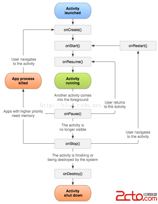 Android開發之Activity的生命周期
可能很多人會感覺Activity很簡單,但是經歷了半年的android開發,我發現我對Activity的的理解還是比較淺顯的,其實Activity並沒有我們想
 Android RecylerView入門教程
今年Google I/0大會,Google開放了兩個全新的視圖:RecyclerView和CardView。這篇文章會提供關於RecylerView的簡介。Recyler
 Android下多彩的StatusView的實現
概述 本文以學習、研究和分享為主,歡迎轉載,但必須在文章頁面明顯位置給出原文連接。願與志同道合的朋友一起成長在上一個博文 Anroid沉浸式狀態欄中提到了,畫了一個圖,這
 Android自定義控件之仿汽車之家下拉刷新
關於下拉刷新的實現原理我在上篇文章Android自定義控件之仿美團下拉刷新中已經詳細介紹過了,這篇文章主要介紹表盤的動畫實現原理汽車之家的下拉刷新分為三個狀態:第一個狀態