編輯:關於Android編程
此開源框架官網地址:https://github.com/astuetz/PagerSlidingTabStrip
可以理解為配合ViewPager使用的交互式頁面指示器控件。
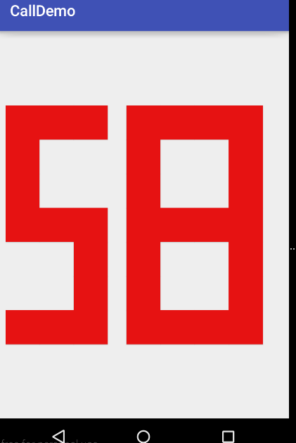
話不多說,先上效果圖:

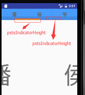
為了演示其中的pstsIndicatorHeight與pstsUnderlineHeight 的區別,進行了不同的設置已區分效果(做了去除actionbar處理)。大家可以很直觀的看出相比之前單獨使用ViewPager以及ViewPager與Fragement嵌套,本次演示PagerSlidingTabStrip的使用,為頁面導航提供了相對更加絢麗的切換效果,下面我們就介紹下PagerSlidingTabStrip的使用。
前期相關博文推薦:
Android中Fragment和ViewPager那點事兒
Android中使用ViewPager實現屏幕頁面切換和頁面輪播效果
一、基本屬性介紹
所有的屬性都有他們自己的getter和setter方法來隨時改變他們
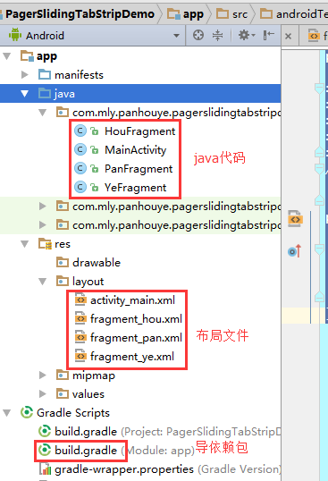
二、本次演示的代碼結構
三、設置去除ActionBar
在res/values/styles.xml中設置
<style name="AppTheme" parent="Theme.AppCompat.Light.NoActionBar">
整體xml文件如下:
<resources>
  <!-- Base application theme. -->
  <style name="AppTheme" parent="Theme.AppCompat.Light.NoActionBar">
    <!-- Customize your theme here. -->
    <item name="colorPrimary">@color/colorPrimary</item>
    <item name="colorPrimaryDark">@color/colorPrimaryDark</item>
    <item name="colorAccent">@color/colorAccent</item>
  </style>
</resources>
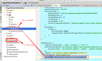
四、導依賴包
使用AndroidStudio2.2。仍然采用在build.gradle下中dependencies下直接添加如下代碼:
compile 'com.astuetz:pagerslidingtabstrip:1.0.1'
五、layout布局文件
布局前對顏色做了一些引用設置,res/values/colors.xml文件如下:
<?xml version="1.0" encoding="utf-8"?>
<resources>
  <color name="colorPrimary">#3F51B5</color>
  <color name="colorPrimaryDark">#303F9F</color>
  <color name="colorAccent">#FF4081</color>

  <color name="color_theme">#489cfa</color>
  <color name="transparent">#00000000</color>
  <color name="yellow">#fc9630</color>
</resources>
(1)主布局文件activity_main.xml
PagerSlidingTabStrip配合ViewPager一起使用,本次將ViewPager放置在PagerSlidingTabStrip下面,具體布局文件如下(大家根據前文中的屬性解釋來對照不理解的屬性,注意添加app命名空間):
<?xml version="1.0" encoding="utf-8"?>
<RelativeLayout xmlns:android="http://schemas.android.com/apk/res/android"
  xmlns:tools="http://schemas.android.com/tools"
  xmlns:app="http://schemas.android.com/apk/res-auto"
  android:id="@+id/activity_main"
  android:layout_width="match_parent"
  android:layout_height="match_parent"
  tools:context="com.mly.panhouye.pagerslidingtabstripdemo.MainActivity">
  <com.astuetz.PagerSlidingTabStrip
    android:id="@+id/pst"
    android:layout_width="match_parent"
    android:layout_height="48dip"
    android:background="@color/color_theme"
    app:pstsShouldExpand="true"
    app:pstsTabBackground="@color/transparent"
    app:pstsIndicatorHeight="5dp"
    app:pstsIndicatorColor="@color/yellow"
    app:pstsTextAllCaps="false"
    app:pstsUnderlineHeight="15dp"
  />
  <android.support.v4.view.ViewPager
    android:id="@+id/pager"
    android:layout_width="match_parent"
    android:layout_height="match_parent"
    android:layout_below="@+id/pst"/>
</RelativeLayout>
(2)對應的Fragment布局文件
本次僅演示簡單效果,fragment_pan, fragment_hou, fragment_ye每個布局文件僅僅文字不同,這裡僅演示其中一個fragment_pan.xml:
<?xml version="1.0" encoding="utf-8"?>
<LinearLayout xmlns:android="http://schemas.android.com/apk/res/android"
  android:orientation="vertical" android:layout_width="match_parent"
  android:layout_height="match_parent">
  <TextView
    android:layout_width="match_parent"
    android:layout_height="match_parent"
    android:gravity="center"
    android:text="潘"
    android:textSize="100sp"
    />
</LinearLayout>
(3)每個fragment要用來填充對應的fragment類,演示ragment_pan.xml布局對應的fragmen類HouFragment.java:
package com.mly.panhouye.pagerslidingtabstripdemo;
import android.os.Bundle;
import android.support.v4.app.Fragment;
import android.view.LayoutInflater;
import android.view.View;
import android.view.ViewGroup;
/**
 * Created by panchengjia on 2017/1/15 0015.
 */
public class HouFragment extends Fragment {
  @Override
  public View onCreateView(LayoutInflater inflater, ViewGroup container, Bundle savedInstanceState) {
    View view =inflater.inflate(R.layout.fragment_hou,null);
    return view;
  }
}
六、Java實現代碼
package com.mly.panhouye.pagerslidingtabstripdemo;

import android.os.Bundle;
import android.support.v4.app.Fragment;
import android.support.v4.app.FragmentManager;
import android.support.v4.app.FragmentPagerAdapter;
import android.support.v4.view.ViewPager;
import android.support.v7.app.AppCompatActivity;
import com.astuetz.PagerSlidingTabStrip;
import java.util.ArrayList;

public class MainActivity extends AppCompatActivity {
  PagerSlidingTabStrip pst;
  ViewPager viewPager;
  ArrayList<Fragment> fragments;
  //聲明pst的標題
  String[] titles = {"潘","侯","爺"};
  @Override
  protected void onCreate(Bundle savedInstanceState) {
    super.onCreate(savedInstanceState);
    setContentView(R.layout.activity_main);
    pst= (PagerSlidingTabStrip) findViewById(R.id.pst);
    viewPager= (ViewPager) findViewById(R.id.pager);

    fragments = new ArrayList<>();
    HouFragment houFragment = new HouFragment();
    PanFragment panFragment = new PanFragment();
    YeFragment yeFragment = new YeFragment();
    //添加fragment到集合中時注意順序
    fragments.add(panFragment);
    fragments.add(houFragment);
    fragments.add(yeFragment);
    FragmentManager fragmentManager = getSupportFragmentManager();
    viewPager.setAdapter(new MyPagerAdapter(fragmentManager,titles,fragments));
    viewPager.setCurrentItem(0);
    //當ViewPager的onPagerChangeListener回調時,PagerSlidingTabStrip也一起隨之變動
    //具體做法都已封裝到了PagerSlidingTabStrip.setViewPager()方法裡,使用時調用實例如下
    pst.setViewPager(viewPager);
    pst.setTextSize(30);
  }

  /**
   * 自定義適配器
   */
  class MyPagerAdapter extends FragmentPagerAdapter {
    private String[] titles;
    ArrayList<Fragment> fragments;
    //根據需求定義構造方法,方便外部調用
    public MyPagerAdapter(FragmentManager fm, String[] titles, ArrayList<Fragment> fragments) {
      super(fm);
      this.titles = titles;
      this.fragments = fragments;
    }
    //設置每頁的標題
    @Override
    public CharSequence getPageTitle(int position) {
      return titles[position];
    }
    //設置每一頁對應的fragment
    @Override
    public Fragment getItem(int position) {
      return fragments.get(position);
    }
    //fragment的數量
    @Override
    public int getCount() {
      return fragments.size();
    }
  }
}
本次僅僅演示的是PagerSlidingTabStrip最最基本的使用方法,大家可以嘗試使用它搞出更加絢麗的切換效果,干吧。
以上就是本文的全部內容,希望對大家的學習有所幫助,也希望大家多多支持本站。
 幾個比較好用的Androidstudio插件
Android Studio是一個功能全面的開發環境,裝備了為各種設備——從智能手表到汽車——開發Android應用程序所
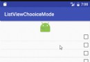 Android中ListView + CheckBox實現單選、多選效果
還是先來看看是不是你想要的效果:不廢話,直接上代碼,很簡單,代碼裡都有注釋1 單選public class SingleActivity extends AppCompa
 Android開發之動畫效果淺析(一)
Android開發之動畫效果淺析 請尊重他人的勞動成果,轉載請注明出處:Android開發之動畫效果淺析 程序運行效果圖: Android動畫主要包含補間動畫
 截取BlueStacks安卓模擬器屏幕圖片
截取BlueStacks安卓模擬器屏幕圖片,有時候想截圖分享一下屏幕,那麼改如何快速截取整個BlueStacks屏幕哪,怎樣把BlueStacks屏幕圖片保