編輯:Android資訊
繼前面寫的兩篇文章之後( 有問題歡迎反饋哦 ):
接著來寫寫Android系統UI新特性,本文是我對最近開發過程中應用 NavigationDrawer 特性的詳細總結。 本文涉及到的所有代碼實現細節,會在文末附上源碼地址。有問題歡迎在下方留言討論 。
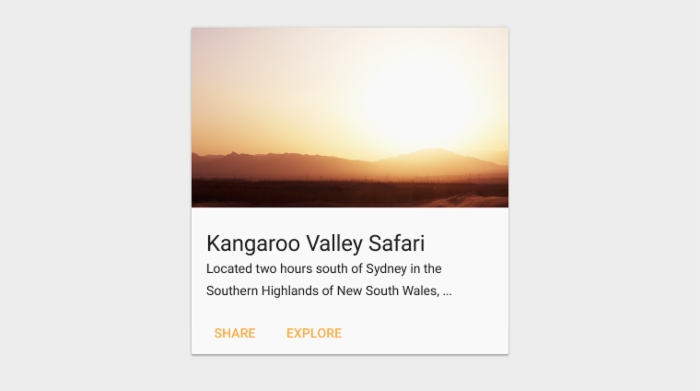
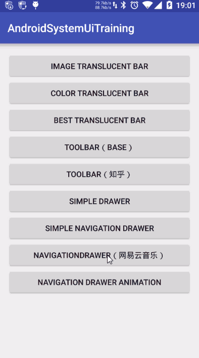
NavigationDrawer是 Google 在 Material Design 中推出的一種側滑導航欄設計風格。說起來可能很抽象,我們直接來看看 網易雲音樂 的側滑導航欄效果
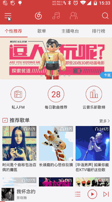
網易雲音樂側滑導航欄效果
Google 為了支持這樣的導航效果,推出一個新控件 —— DrawerLayout 。而在 DrawerLayout 沒誕生之前,需求中需要實現側滑導航效果時,我們必然會選擇去選擇一些成熟的第三方開源庫(如最有名的 SlidingMenu )來完成開發 。效果上,普遍都像 手Q 那樣:
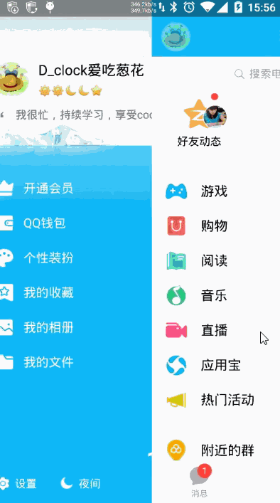
手Q的SlidingMenu實現側滑效果
在對比過 DrawerLayout 和 SlidingMenu 的實現效果後,基於以下的幾點,我認為完全可以在開發中使用 DrawerLayout 取代以前的 SlidingMenu :
到這裡,要是你還沒有引入 DrawerLayout 開發的沖動,請繼續聽我為你好好安利一番。
一般情況下,在 DrawerLayout 布局下只會存在兩個子布局,一個 內容布局 和 一個 側滑菜單布局 ,這兩個布局關鍵在於 android:layout_gravity 屬性的設置。如果你想把其中一個子布局設置成為左側滑菜單,只需要設置 android:layout_gravity=”start” 即可(也可以是 left,右側滑則為 end 或 right ),而沒有設置的布局則自然成為 內容布局 。那麼,使用 DrawerLayout 到底有多簡單呢,我們先直接看看下面的布局文件
<?xml version="1.0" encoding="utf-8"?>
<RelativeLayout xmlns:android="http://schemas.android.com/apk/res/android"
    android:layout_width="match_parent"
    android:layout_height="match_parent">

    <android.support.v4.widget.DrawerLayout
        android:id="@+id/simple_navigation_drawer"
        android:layout_width="match_parent"
        android:layout_height="match_parent">

        <!--內容視圖-->
        <include
            android:id="@+id/tv_content"
            layout="@layout/drawer_content_layout"
            android:layout_width="match_parent"
            android:layout_height="match_parent" />

        <!--左側滑菜單欄-->
        <include
            layout="@layout/drawer_menu_layout"
            android:layout_width="250dp"
            android:layout_height="match_parent"
            android:layout_gravity="start" />

        <!--右側滑菜單欄-->
        <include
            layout="@layout/drawer_menu_layout"
            android:layout_width="250dp"
            android:layout_height="match_parent"
            android:layout_gravity="end" />
    </android.support.v4.widget.DrawerLayout>

</RelativeLayout>
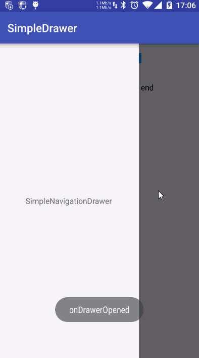
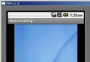
到此,你在 Activity 裡面什麼都不用做,就已經完成了下面側滑效果的實現了,簡單到害怕有木有。

最簡單的側滑效果實現
在欣賞著 DrawerLayout 簡單方便的同時,Google 也為我們提供了 DrawerLayout 很多常用的API,其中包括:打開或關閉側滑欄、控制側滑欄的方向、設置滑動時漸變的陰影顏色和監聽滑動事件等。
SimpleDrawerActivity運行效果
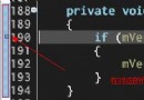
具體詳細代碼請參加工程中的 SimpleDrawerActivity,此處就不貼代碼了。還有一處 DrawerLayout 使用的小細節需要溫馨提醒一下,有一次,我手誤把 DrawerLayout 的 android:layout_width 設置成 wrap_content ,就出現下面的異常了
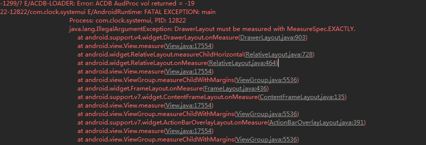
DrawerLayout的wrap_content錯誤
遇到過相同情況的童鞋,只需要把 android:layout_width 設置成 match_parent 即可。
在 Google 推出 NavigationDrawer 設計中, NavigationView 和 DrawerLayout 是官方推薦的最佳組合。在使用 NavigationView 前,因為它是在 Material Design 的兼容包中,所以需要先在 build.gradle 中引入
compile 'com.android.support:design:23.1.1'
這裡因為我工程配置的 compileSdkVersion 是 23 ,所以需要引入 com.android.support:design:23.x.x 的版本。需要吐槽的是,這裡如果你引入了 com.android.support:design:23.1.0 ,工程運行後 NavigationView 會報一個 android.view.InflateException:xxxxxx 的錯誤(又是一個大坑)。
接下來簡單的介紹一下 NavigationView 的使用,我們繼續看看幾個相關布局文件 layout/activity_simple_navigation_drawer.xml 、 layout/navigation_drawer_header.xml 、 menu/navigation_drawer_menu.xml 和 實現效果:
<?xml version="1.0" encoding="utf-8"?>
<android.support.v4.widget.DrawerLayout xmlns:android="http://schemas.android.com/apk/res/android"
    xmlns:app="http://schemas.android.com/apk/res-auto"
    android:id="@+id/drawer"
    android:layout_width="match_parent"
    android:layout_height="match_parent">

    <LinearLayout
        android:layout_width="match_parent"
        android:layout_height="match_parent"
        android:orientation="vertical">

        <TextView
            android:layout_width="match_parent"
            android:layout_height="match_parent"
            android:gravity="center"
            android:text="NavigationDrawerContent" />
    </LinearLayout>

    <android.support.design.widget.NavigationView
        android:id="@+id/navigation_view"
        android:layout_width="wrap_content"
        android:layout_height="match_parent"
        android:layout_gravity="start"
        app:headerLayout="@layout/navigation_drawer_header"
        app:menu="@menu/navigation_drawer_menu" />

</android.support.v4.widget.DrawerLayout>
<?xml version="1.0" encoding="utf-8"?>
<RelativeLayout xmlns:android="http://schemas.android.com/apk/res/android"
    android:layout_width="match_parent"
    android:layout_height="250dp"
    android:background="@color/color_512da8">

    <TextView
        android:layout_width="wrap_content"
        android:layout_height="wrap_content"
        android:layout_alignParentBottom="true"
        android:layout_alignParentLeft="true"
        android:layout_margin="10dp"
        android:text="HeaderLayout"
        android:textColor="@android:color/white"
        android:textSize="18sp" />
</RelativeLayout>
<?xml version="1.0" encoding="utf-8"?>
<menu xmlns:android="http://schemas.android.com/apk/res/android">

    <group android:checkableBehavior="single">
        <item
            android:id="@+id/item_green"
            android:icon="@mipmap/green"
            android:title="Green" />
        <item
            android:id="@+id/item_blue"
            android:icon="@mipmap/blue"
            android:title="Blue" />
        <item
            android:id="@+id/item_pink"
            android:icon="@mipmap/pink"
            android:title="Pink" />
    </group>

    <item android:title="SubItems">
        <menu>
            <item
                android:id="@+id/subitem_01"
                android:icon="@mipmap/ic_launcher"
                android:title="SubItem01" />
            <item
                android:id="@+id/subitem_02"
                android:icon="@mipmap/ic_launcher"
                android:title="SubItem02" />
            <item
                android:id="@+id/subitem_03"
                android:icon="@mipmap/ic_launcher"
                android:title="SubItem03" />
        </menu>
    </item>

    <item android:title="SubItems">
        <menu>
            <item
                android:id="@+id/subitem_04"
                android:icon="@mipmap/ic_launcher"
                android:title="SubItem04" />
            <item
                android:id="@+id/subitem_05"
                android:icon="@mipmap/ic_launcher"
                android:title="SubItem05" />
            <item
                android:id="@+id/subitem_06"
                android:icon="@mipmap/ic_launcher"
                android:title="SubItem06" />
        </menu>
    </item>
</menu>
最終得到下面的效果
activity_simple_navigation_drawer.xml實現效果
總的來說, NavigationView 比較關鍵的屬性就只有 app:headerLayout 和 app:menu ,它們分別對應效果圖中頂部的 紫色區域(layout/navigation_drawer_header.xml) 和 下方的 填充菜單項(menu/navigation_drawer_menu.xml) 。其實是用起來也和 DrawerLayout 一樣,非常簡單。
其實談到 NavigationView,個人認為它設計並不實用,而且是比較呆板的。最直接的一點是,它的菜單圖標
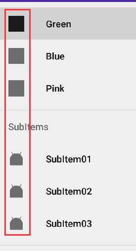
NavigationView默認圖標顏色
第一次運行代碼的時候,把我五顏六色的圖標居然跑出來這效果,差點沒一口水噴在屏幕上。好在代碼中可以調用下面這個API
mNavigationView.setItemIconTintList(null);//設置菜單圖標恢復本來的顏色
還原菜單圖標廬山真面目。(著實看不懂 Google 的設計了…)
其次,是關於菜單相中圖標大小和文字間距之類的設置,從 Google 的設計文檔來看,
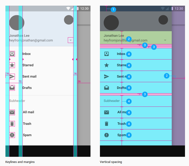
NavigationView設計
NavigationView 基本已經規定設置好了大小距離,留給我們可以改動的空間並不多。如果你想調整一下菜單的布局寬高之類的,基本是不可能的了(即使可能,也估計非常蛋疼)。所以,目前我基本還沒見過國內哪個 app 是直接使用了 NavigationView 來做導航(如果有的話,歡迎告知一下)。
以上關於 NavigationView 不實用,僅是本人的一些看法,如果你有不同看法,歡迎留言討論。為了加深一下 NavigationDrawer 設計的實踐,下面來大致的模仿實現網易雲音樂的導航效果。
先來看看網易雲音樂的效果
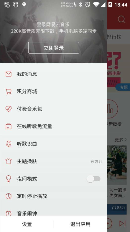
雲音樂導航菜單
主要就是一個線性布局的菜單並結合了 Translucent System Bar 的特性(還不知道的童鞋請看我前面寫的文章哈),下面就直接看看大致實現的布局文件 :
<?xml version="1.0" encoding="utf-8"?>
<android.support.v4.widget.DrawerLayout xmlns:android="http://schemas.android.com/apk/res/android"
    android:id="@+id/drawer"
    android:layout_width="match_parent"
    android:layout_height="match_parent"
    android:background="@color/color_cd3e3a">

    <LinearLayout
        android:layout_width="match_parent"
        android:layout_height="match_parent"
        android:fitsSystemWindows="true"
        android:orientation="vertical">

        <TextView
            android:layout_width="match_parent"
            android:layout_height="65dp"
            android:background="@color/color_cd3e3a"
            android:gravity="center"
            android:text="網易雲音樂"
            android:textColor="@android:color/white"
            android:textSize="18sp" />

        <LinearLayout
            android:layout_width="match_parent"
            android:layout_height="match_parent"
            android:background="@android:color/white"
            android:orientation="vertical">

        </LinearLayout>
    </LinearLayout>

    <LinearLayout
        android:id="@+id/navigation_view"
        android:layout_width="match_parent"
        android:layout_height="match_parent"
        android:layout_gravity="start"
        android:background="@android:color/white"
        android:fitsSystemWindows="true"
        android:orientation="vertical">

        <ImageView
            android:layout_width="match_parent"
            android:layout_height="180dp"
            android:scaleType="centerCrop"
            android:src="@mipmap/topinfo_ban_bg" />

        <LinearLayout
            android:layout_width="match_parent"
            android:layout_height="50dp"
            android:gravity="center_vertical"
            android:orientation="horizontal">

            <ImageView
                android:layout_width="40dp"
                android:layout_height="40dp"
                android:layout_marginLeft="10dp"
                android:layout_marginRight="10dp"
                android:src="@mipmap/topmenu_icn_msg" />

            <TextView
                android:layout_width="wrap_content"
                android:layout_height="wrap_content"
                android:text="我的消息"
                android:textColor="@android:color/black"
                android:textSize="15sp" />
        </LinearLayout>

        ...
        ...
        ...

    </LinearLayout>
</android.support.v4.widget.DrawerLayout>
最終即可實現類似網易雲音樂的效果。
仿造網易雲音樂
左上角的導航動畫
經常會看有些 app 的左上角有這些帶感的導航動畫,之前想要引入這種效果,都是來自第三方的開源代碼,諸如下面兩個比較有名的:
而現在再也不需要了,Google 推出的 ActionBarDrawerToggle 也能實現這樣的效果了,具體查看我在 NavigationDrawerAnimationActivity 中的實現代碼
ActionBarDrawerToggle實現效果
如果你對上面這種動畫,效果不滿意,也可以考慮一下 material-menu 的另一種實現效果。
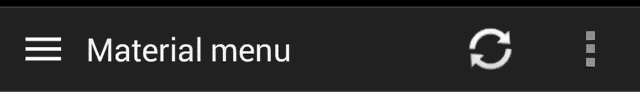
material-menu動畫效果
前面提到 NavigationView 的不實用性,如果你真的要實現 NavigationView那樣的效果,又渴望比較高的自由度。這個功能強大且自由度很高的開源庫 MaterialDrawer 應該是個很不錯的選擇。
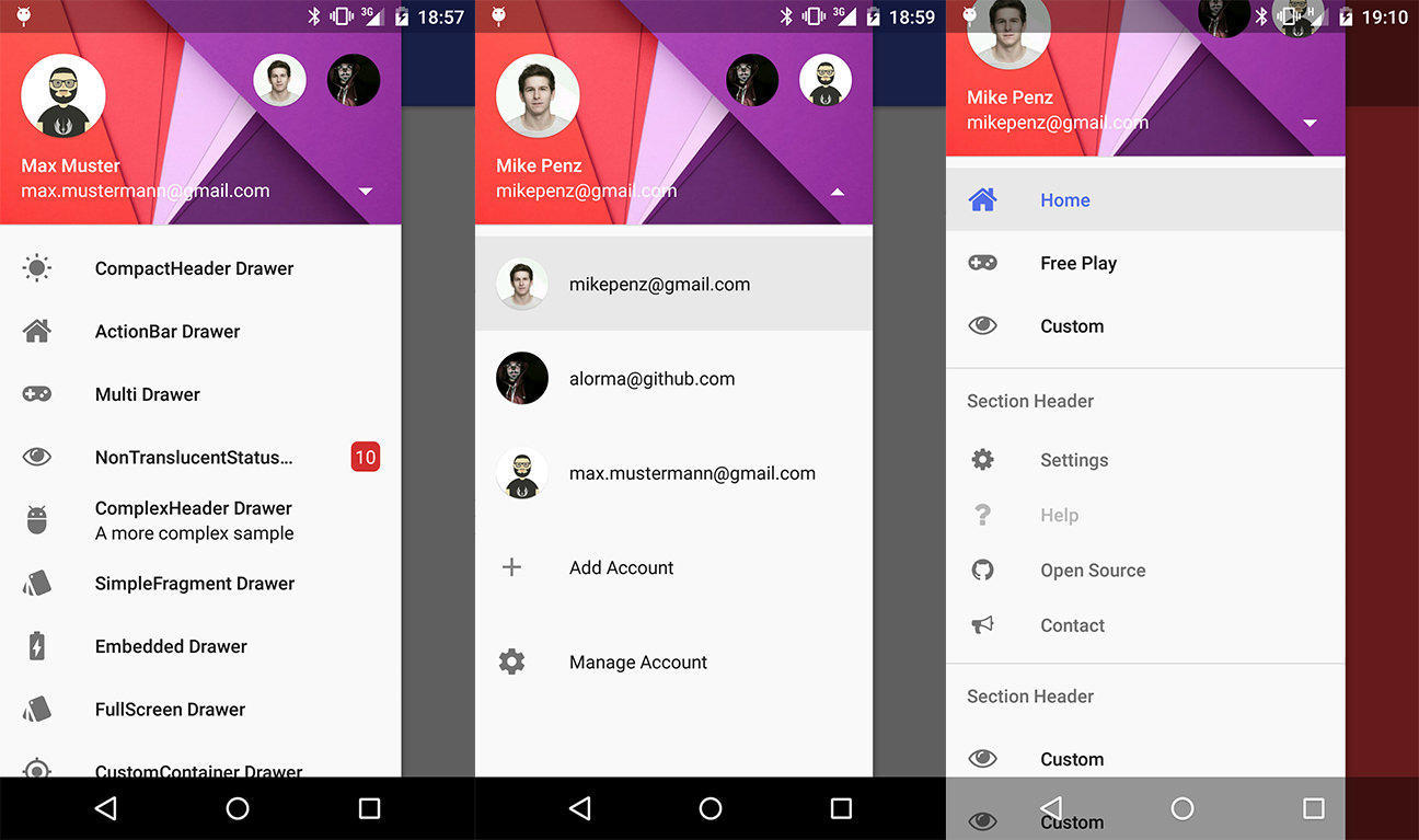
MaterialDrawer 效果圖一
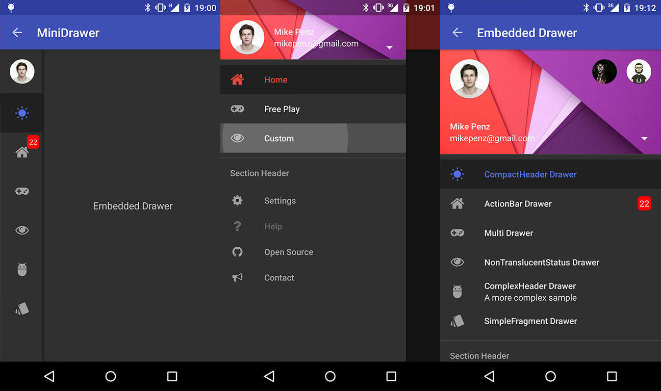
MaterialDrawer 效果圖二
到此,對於 NavigationDrawer 的實踐總結基本結束。整體給我的感覺是,自從 Material Design 設計開始推出後,Google 推出的這些新控件使用起來更加簡單,這能讓我們更好的把精力放在編寫業務代碼上。很多以前需要借助第三方開源庫才能實現的效果,現在已經慢慢的不需要了。當然,我們依舊可以去深入的學習這些優秀開源代碼,沉澱到更多的干貨。這樣,小菜也就慢慢成為大牛了。
分享即美德,源代碼請看: https://github.com/D-clock/AndroidSystemUiTraining ,本篇的主要實現代碼如下紅圈所示
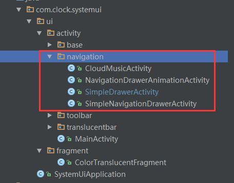
主要示例代碼
 Android UI控件系列:ImageButton(帶圖標的按鈕)
除了Android系統自帶的Button按鈕以外,還提供了帶圖標的按鈕ImageButton 要制作帶圖標的按鈕,首先要在布局文件中定義ImageButton,然
 高質量 Android 開發框架 LoonAndroid 詳解
整個框架式不同於androidannotations,Roboguice等ioc框架,這是一個類似spring的實現方式。在整應用的生命周期中找到切入點,然後對a
 Android UI 實現廣告 Banner 輪播效果
前言 本文主要來分享一個Android UI開發中實現廣告Banner的輪播效果,因為Banner效果在Android應用中比較常見,所以我們也來嘗試實現以下。下
 Android左右滑動效果的代碼實現
我們經常會在Android應用中看到左右滑動的效果,那麼這種左右滑動效果是如何實現的呢?本文通過對Android代碼的講解,來分析Android中左右滑動效果的代