編輯:Android開發實例
Android原生控件只有橫向進度條一種,而且沒法變換樣式,比如原生rom的樣子
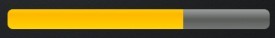
很丑是吧,當偉大的產品設計要求更換前背景,甚至縱向,甚至圓弧狀的,咋辦,比如:
ok,我們開始吧:
一)變換前背景
先來看看progressbar的屬性:
代碼如下:
<ProgressBar
android:id="@+id/progressBar"
android:layout_width="match_parent"
android:layout_height="wrap_content"
android:layout_margin="5dip"
android:layout_toRightOf="@+id/progressBarV"
android:indeterminate="false"
android:padding="2dip"
android:progress="50" />
根據,我們找到源碼中的style.xml
代碼如下:
<style name="Widget.ProgressBar.Horizontal">
<item name="android:indeterminateOnly">false</item>
<item name="android:progressDrawable">@android:drawable/progress_horizontal</item>
<item name="android:indeterminateDrawable">@android:drawable/progress_indeterminate_horizontal</item>
<item name="android:minHeight">20dip</item>
<item name="android:maxHeight">20dip</item>
</style>
看到:
代碼如下:
<item name="android:progressDrawable">@android:drawable/progress_horizontal</item>
木有,繼續發掘源碼,找到drawable下面的progress_horizontal.xml,這就是我們今天的主角了:
代碼如下:
<layer-list xmlns:android="http://schemas.android.com/apk/res/android">
<item android:id="@android:id/background">
<shape>
<corners android:radius="5dip" />
<gradient
android:startColor="#ff9d9e9d"
android:centerColor="#ff5a5d5a"
android:centerY="0.75"
android:endColor="#ff747674"
android:angle="270"
/>
</shape>
</item>
<item android:id="@android:id/secondaryProgress">
<clip>
<shape>
<corners android:radius="5dip" />
<gradient
android:startColor="#80ffd300"
android:centerColor="#80ffb600"
android:centerY="0.75"
android:endColor="#a0ffcb00"
android:angle="270"
/>
</shape>
</clip>
</item>
<item android:id="@android:id/progress">
<clip>
<shape>
<corners android:radius="5dip" />
<gradient
android:startColor="#ffffd300"
android:centerColor="#ffffb600"
android:centerY="0.75"
android:endColor="#ffffcb00"
android:angle="270"
/>
</shape>
</clip>
</item>
</layer-list>
看到android:id="@android:id/progress"木有,看到android:id="@android:id/secondaryProgress"木有
把這個文件復制到自己工程下的drawable,就可以隨心所欲的修改shape的屬性,漸變,圓角等等
那麼怎麼放一個圖片進去呢,ok,新建progress_horizontal1.xml:
代碼如下:
<?xml version="1.0" encoding="utf-8"?>
<layer-list xmlns:android="http://schemas.android.com/apk/res/android">
<item android:id="@android:id/progress" android:drawable="@drawable/progressbar" />
</layer-list>
在android:drawable中指定你處理好的圖片
然後回到布局中:
代碼如下:
<ProgressBar
android:id="@+id/progressBar1"
android:layout_width="match_parent"
android:layout_height="wrap_content"
android:layout_below="@+id/progressBar"
android:layout_margin="5dip"
android:layout_toRightOf="@+id/progressBarV"
android:background="@drawable/progress_bg"
android:indeterminate="false"
android:indeterminateOnly="false"
android:maxHeight="20dip"
android:minHeight="20dip"
android:padding="2dip"
android:progress="50"
android:progressDrawable="@drawable/progress_horizontal1" />
android:background="@drawable/progress_bg"指定背景
android:progressDrawable="@drawable/progress_horizontal1"前景使用上面的progress_horizontal1
ok,搞定
注意看,四角還是有圓倒角的,貌似是系統自己加上去的,總之我的圖片裡面是沒有做這個倒角處理的
二)縱向進度條
還是得從源碼入手,看回progress_horizontal.xml
代碼如下:
<item android:id="@android:id/progress">
<clip>
<shape>
<corners android:radius="5dip" />
<gradient
android:startColor="#ffffd300"
android:centerColor="#ffffb600"
android:centerY="0.75"
android:endColor="#ffffcb00"
android:angle="270"
/>
</shape>
</clip>
</item>
為什麼shape外面要包一層clip呢,官方文檔解釋是clipdrawable是可以自我復制的,來看看定義
代碼如下:
<?xml version="1.0" encoding="utf-8"?>
<clip
xmlns:android="http://schemas.android.com/apk/res/android"
android:drawable="@drawable/drawable_resource"
android:clipOrientation=["horizontal" | "vertical"]
android:gravity=["top" | "bottom" | "left" | "right" | "center_vertical" |
"fill_vertical" | "center_horizontal" | "fill_horizontal" |
"center" | "fill" | "clip_vertical" | "clip_horizontal"] />
android:clipOrientation有兩個屬性,默認為horizontal
android:gravity有兩個屬性,默認為left
那我們試試改成vertical和bottom會有什麼效果,新建一個progress_vertical.xml,把源碼progress_horizontal.xml的內容復制過來,這裡去掉了secondaryProgress,修改了clip,shape的漸變中心centerY改為centerX
代碼如下:
<item android:id="@android:id/progress">
<clip
android:clipOrientation="vertical"
android:gravity = "bottom">
<shape>
<corners android:radius="5dip" />
<gradient
android:startColor="#ffffd300"
android:centerColor="#ffffb600"
android:centerX="0.75"
android:endColor="#ffffcb00"
android:angle="90"
/>
</shape>
</clip>
</item>
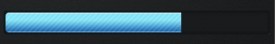
布局中android:progressDrawable="@drawable/progress_vertical"
ok,搞定,就是這麼簡單:

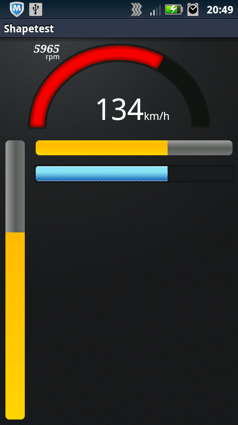
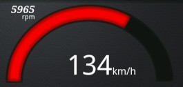
三)弧形bar
這個也許算不上是進度條,用的也不多,最多也就儀表盤用用,不然誰會把進度條整成圓弧的呢。好吧這個可不是改改源碼就能搞定的,看代碼:
代碼如下:
public class Arcs extends View {
private Paint mArcPaint;
private Paint mArcBGPaint;
private RectF mOval;
private float mSweep = 0;
private int mSpeedMax = 200;
private int mThreshold = 100;
private int mIncSpeedValue = 0;
private int mCurrentSpeedValue = 0;
private float mCenterX;
private float mCenterY;
private float mSpeedArcWidth;
private final float SPEED_VALUE_INC = 2;
..........
}
首先是一堆成員變量,兩個Paint用來畫圓弧一個前景一個背景,一個RectF圓弧就畫在上面,然後是一些控制參數比如sweep圓弧掃過的角度,xy坐標等等。
代碼如下:
mArcPaint = new Paint(Paint.ANTI_ALIAS_FLAG);
mArcPaint.setStyle(Paint.Style.STROKE);
mArcPaint.setStrokeWidth(mSpeedArcWidth);
// mPaint.setStrokeCap(Paint.Cap.ROUND);
mArcPaint.setColor(0xff81ccd6);
BlurMaskFilter mBlur = new BlurMaskFilter(8, BlurMaskFilter.Blur.INNER);
mArcPaint.setMaskFilter(mBlur);
mArcBGPaint = new Paint(Paint.ANTI_ALIAS_FLAG);
mArcBGPaint.setStyle(Paint.Style.STROKE);
mArcBGPaint.setStrokeWidth(mSpeedArcWidth+8);
mArcBGPaint.setColor(0xff171717);
BlurMaskFilter mBGBlur = new BlurMaskFilter(8, BlurMaskFilter.Blur.INNER);
mArcBGPaint.setMaskFilter(mBGBlur);
設置兩個畫筆,顏色,寬度,樣式等等,BlurMaskFilter筆是邊緣模糊效果,有幾種,可以自己嘗試。
代碼如下:
@Override
protected void onSizeChanged(int w, int h, int ow, int oh) {
super.onSizeChanged(w, h, ow, oh);
Log.i("onSizeChanged w", w+"");
Log.i("onSizeChanged h", h+"");
mCenterX = w * 0.5f; // remember the center of the screen
mCenterY = h - mSpeedArcWidth;
mOval = new RectF(mCenterX - mCenterY, mSpeedArcWidth, mCenterX + mCenterY, mCenterY * 2);
}
重寫父類View的onSizeChanged,為的是自己根據布局中的大小做居中處理
代碼如下:
@Override
protected void onDraw(Canvas canvas) {
drawSpeed(canvas);
calcSpeed();
}
private void drawSpeed(Canvas canvas) {
canvas.drawArc(mOval, 179, 181, false, mArcBGPaint);
mSweep = (float) mIncSpeedValue / mSpeedMax * 180;
if (mIncSpeedValue > mThreshold) {
mArcPaint.setColor(0xFFFF0000);
}
else {
mArcPaint.setColor(0xFF00B0F0);
}
canvas.drawArc(mOval, 180, mSweep, false, mArcPaint);
}
private void calcSpeed() {
if (mIncSpeedValue < mCurrentSpeedValue) {
mIncSpeedValue += SPEED_VALUE_INC;
if (mIncSpeedValue > mCurrentSpeedValue) {
mIncSpeedValue = mCurrentSpeedValue;
}
invalidate();
}
else if (mIncSpeedValue > mCurrentSpeedValue) {
mIncSpeedValue -= SPEED_VALUE_INC;
if (mIncSpeedValue < mCurrentSpeedValue) {
mIncSpeedValue = mCurrentSpeedValue;
}
invalidate();
}
}
重寫onDraw以便重繪canvas
drawSpeed裡面
通過計算mSweep = (float) mIncSpeedValue / mSpeedMax * 180;
然後canvas.drawArc(mOval, 180, mSweep, false, mArcPaint);
會根據mSweep的變化,畫出相應長度的弧度來
根據與阈值的對比,還可以設定不同的 顏色:
代碼如下:
if (mIncSpeedValue > mThreshold) {
mArcPaint.setColor(0xFFFF0000);
}
else {
mArcPaint.setColor(0xFF00B0F0);
}
calcSpeed通過一個步進來控制增量或減量,以使弧度自然過渡,減少跳躍
ok,大功告成。
 Android加載Spinner
可以顯示在的Android任務,通過加載進度條的進展。進度條有兩種形狀。加載欄和加載微調(spinner)。在本章中,我們將討論微調(spinner)。Spinner 用
 Android JSON解析器
JSON代表JavaScript對象符號。它是一個獨立的數據交換格式,是XML的最佳替代品。本章介紹了如何解析JSON文件,並從中提取所需的信息。Android提供了四個
 Android登錄實例
登錄應用程序的屏幕,詢問憑據登錄到一些特定的應用。可能需要登錄到Facebook,微博等本章介紹了,如何創建一個登錄界面,以及如何管理安全問題和錯誤嘗試。首先,必須定義兩
 Android JSON解析器
JSON代表JavaScript對象符號。它是一個獨立的數據交換格式,是XML的最佳替代品。本章介紹了如何解析JSON文件,並從中提取所需的信息。Android提供了四個