編輯:Android編程入門
Drawable有很多種,它們表示一種圖像概念,但它們不全是圖片。Drawable是什麼呢?下面是Google Android API中的定義:
A Drawable is a general abstraction for “something that can be drawn.” Most often you will deal with Drawable as the type of resource retrieved for drawing things to the screen; the Drawable class provides a generic API for dealing with an underlying visual resource that may take a variety of forms. Unlike a View, a Drawable does not have any facility to receive events or otherwise interact with the user.
它大致的意思是:Drawable一種圖像概念。通常,你會把它當成一種能夠在屏幕上顯示的資源類型來處理,Drawable類提供了一個通用的API來處理不同形式的圖像資源。與View不同,Drawable不能接受事件,也不能和用戶交互。
下面介紹幾種Drawable
BitmapDrawable幾乎是最簡單的了,它表示一張圖片。通常在開發中我們就直接引用圖片即可,比如: R.drawable.image(drawable目錄下有一個image.jpg或者image.png的圖片資源),但是我們也可以用xml來描述Drawable。xml文件如下:
 <?xml version="1.0" encoding="utf-8"?>
 <bitmap xmlns:android="http://schemas.android.com/apk/res/android"
         android:src="@mipmap/ic_launcher"
         android:antialias="true|false"
         android:dither="true|false"
         android:filter="true|false"         android:gravity="top|bottom|left|right|center_vertical|fill_vertical|center_horizontal|fill_horizontal|center|fill|clip_vertical|clip_horizontal"
         android:mipMap="true|false"
         android:tileMode="disabled|clamp|repeat|mirror"/>
這是一種很常見的Drawable,通常是通過編寫xml文件來創建的,因此有些復雜。ShapeDrawable通常是通過顏色來構建圖形的,既可以是純色,也可以具有漸變效果。使用大致如下所示:
 <?xml version="1.0" encoding="utf-8"?>
 <shape xmlns:android="http://schemas.android.com/apk/res/android"
     android:shape="rectangle|oval|line|ring">
     <corners
         android:bottomLeftRadius="integer"
         android:bottomRightRadius="integer"
         android:radius="integer"
         android:topLeftRadius="integer"
         android:topRightRadius="integer" />
     <gradient
         android:angle="integer"
         android:centerColor="integer"
         android:centerX="integer"
         android:centerY="integer"
         android:endColor="color"
         android:gradientRadius="integer"
         android:startColor="color"
         android:type="linear|radial|sweep"
         android:useLevel="true|false" />
     <padding
         android:bottom="integer"
         android:left="integer"
         android:right="integer"
         android:top="integer" />
     <size
         android:width="integer"
         android:height="integer" />
     <solid android:color="color" />
     <stroke
         android:width="integer"
         android:color="color"
         android:dashGap="integer"
         android:dashWidth="integer" />

 </shape>
< gradient> 漸變效果,與< solid>標簽互斥
< solid> 純色填充 通過android:color即可指定shape的顏色
它是一種層次化的Drawable,在< layer-list>< /layer-list>結點下有多個< item>< /item>其中後面的< item>< /item>疊加在前面的< item>< /item>上面,想愛你面是一耳光文本輸入框的例子:
 <?xml version="1.0" encoding="utf-8"?>
 <layer-list xmlns:android="http://schemas.android.com/apk/res/android">
     <item>
         <shape android:shape="rectangle">
             <solid android:color="#0ac39e" />
         </shape>
     </item>
     <item android:bottom="6dp">
         <shape android:shape="rectangle">
             <solid android:color="#ffffff" />
         </shape>
     </item>
     <item
         android:bottom="1dp"
         android:left="1dp"
         android:right="1dp">
         <shape android:shape="rectangle">
             <solid android:color="#ffffff" />
         </shape>
     </item>

 </layer-list>
StateListDrawable對應< selector>標簽,這個大家應該比較熟悉。我們經常會給Button設置一個selector。StateListDrawable表示Drawable的集合,集合中的每個Drawable都對應著View的一種狀態,系統會根據View的狀態來給View設定相應的Drawable,下面是一個selector的創建樣例:
 <?xml version="1.0" encoding="utf-8"?>
 <selector xmlns:android="http://schemas.android.com/apk/res/android">
     <item android:drawable="@android:color/black"/>    <!-- 表示默認狀態-->
     <item android:state_focused="true"
           android:drawable="@android:color/holo_orange_dark"/><!-- 表示獲取焦點狀態-->
     <item android:state_pressed="true"
           android:drawable="@android:color/holo_red_dark"/><!-- 表示被點擊狀態-->
 </selector>
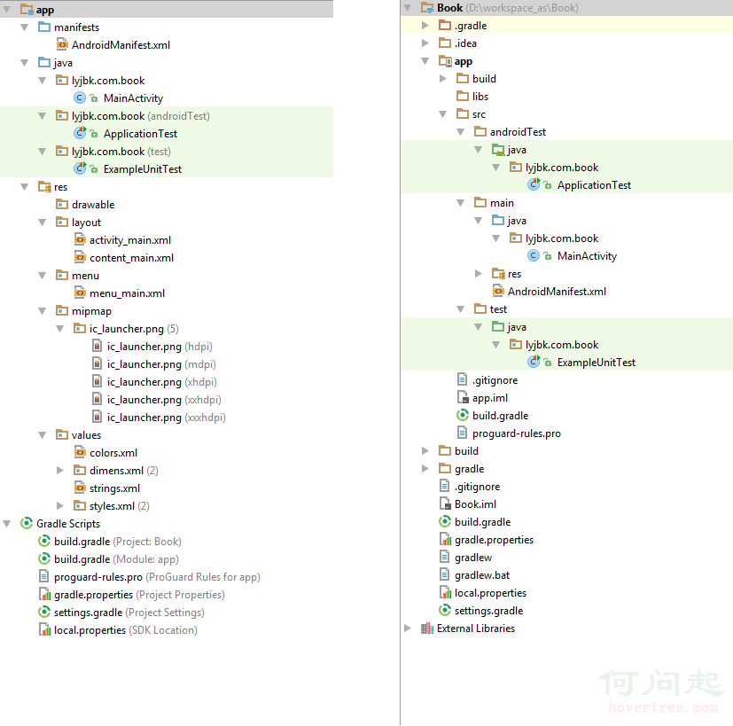 【入門篇】Android學習筆記——項目結構及相關基礎知識
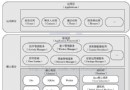
Android項目具有其自身的結構規范,完好的遵循結構規范,可以讓開發事半功倍。下圖分別從Android視圖和Project視圖展示了Android項目的項目結構:圖中左
 Andriod系統內部架構
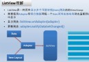 Android——列表視圖 ListView(一)Arrayadapter
一、ArrayAdapter 只顯示文字activitylistview_layout.xml<?xml version=1.0 encoding=utf-8?&g
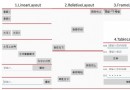 android 基本布局(RelativeLayout、TableLayout等)使用方法及各種屬性
本文介紹 Android 界面開發中最基本的四種布局LinearLayout、RelativeLayout、FrameLayout、TableLayout 的使用方法及這