編輯:關於android開發
To create complex lists and cards with material design styles in your apps, you can use the RecyclerView and CardView widgets.
//想要創建復雜的帶有material design風格的列表,使用RecyclerView 和 CardView widget
The RecyclerView widget is a more advanced and flexible version of ListView. This widget is a container for displaying large data sets that can be scrolled very efficiently by maintaining a limited number of views. Use the RecyclerView widget when you have data collections whose elements change at runtime based on user action or network events.
The RecyclerView class simplifies the display and handling of large data sets by providing:
You also have the flexibility to define custom layout managers and animations for RecyclerView widgets.

Figure 1. The RecyclerView widget.
To use the RecyclerView widget, you have to specify an adapter and a layout manager. To create an adapter, extend the RecyclerView.Adapter class. The details of the implementation depend on the specifics of your dataset and the type of views. For more information, see the examples below.

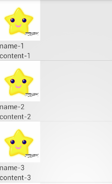
Figure 2 - Lists with RecyclerView.
A layout manager positions item views inside a RecyclerView and determines when to reuse item views that are no longer visible to the user. To reuse (or recycle) a view, a layout manager may ask the adapter to replace the contents of the view with a different element from the dataset. Recycling views in this manner improves performance by avoiding the creation of unnecessary views or performing expensive findViewById() lookups.
//layout manager負責排布recyclerview中的視圖條目,並且決定當一些條目不在可見時什麼時候重用條目。為了重用view,layout manager可能會向adapter請求用不同的數據庫的數據帶替換view中的內容。
RecyclerView provides these built-in layout managers:
LinearLayoutManager shows items in a vertical or horizontal scrolling list. //以水平或者垂直的滾動列表形式顯示條目GridLayoutManager shows items in a grid. //以網格形式顯示StaggeredGridLayoutManager shows items in a staggered grid.//以交錯網格形式展示To create a custom layout manager, extend the RecyclerView.LayoutManager class.
Animations for adding and removing items are enabled by default in RecyclerView. To customize these animations, extend the RecyclerView.ItemAnimator class and use the RecyclerView.setItemAnimator()method.
//為了定制動畫,繼承RecyclerView.ItemAnimator 類,並且使用RecyclerView.setItemAnimator()方法來設置
The following code example demonstrates how to add the RecyclerView to a layout:
<!-- A RecyclerView with some commonly used attributes -->
<android.support.v7.widget.RecyclerView
    android:id="@+id/my_recycler_view"
    android:scrollbars="vertical"
    android:layout_width="match_parent"
    android:layout_height="match_parent"/>
Once you have added a RecyclerView widget to your layout, obtain a handle to the object, connect it to a layout manager, and attach an adapter for the data to be displayed:
public class MyActivity extends Activity {
    private RecyclerView mRecyclerView;
    private RecyclerView.Adapter mAdapter;
    private RecyclerView.LayoutManager mLayoutManager;

    @Override
    protected void onCreate(Bundle savedInstanceState) {
        super.onCreate(savedInstanceState);
        setContentView(R.layout.my_activity);
        mRecyclerView = (RecyclerView) findViewById(R.id.my_recycler_view);

        // use this setting to improve performance if you know that changes
        // in content do not change the layout size of the RecyclerView
        //使用這個設置來提高性能,如果你已經知道了內容的修改不會改變recyclerview的布局大小
        mRecyclerView.setHasFixedSize(true);

        // use a linear layout manager
        mLayoutManager = new LinearLayoutManager(this);
        mRecyclerView.setLayoutManager(mLayoutManager);

        // specify an adapter (see also next example)
        mAdapter = new MyAdapter(myDataset);
        mRecyclerView.setAdapter(mAdapter);
    }
    ...
}
The adapter provides access to the items in your data set, creates views for items, and replaces the content of some of the views with new data items when the original item is no longer visible. The following code example shows a simple implementation for a data set that consists of an array of strings displayed using TextView widgets:
public class MyAdapter extends RecyclerView.Adapter<MyAdapter.ViewHolder> {
    private String[] mDataset;

    // Provide a reference to the views for each data item
    // Complex data items may need more than one view per item, and
    // you provide access to all the views for a data item in a view holder
    public static class ViewHolder extends RecyclerView.ViewHolder {
        // each data item is just a string in this case
        public TextView mTextView;
        public ViewHolder(TextView v) {
            super(v);
            mTextView = v;
        }
    }

    // Provide a suitable constructor (depends on the kind of dataset)
    public MyAdapter(String[] myDataset) {
        mDataset = myDataset;
    }

    // Create new views (invoked by the layout manager)
    @Override
    public MyAdapter.ViewHolder onCreateViewHolder(ViewGroup parent,
                                                   int viewType) {
        // create a new view
        View v = LayoutInflater.from(parent.getContext())
                               .inflate(R.layout.my_text_view, parent, false);
        // set the view's size, margins, paddings and layout parameters
        ...
        ViewHolder vh = new ViewHolder(v);
        return vh;
    }

    // Replace the contents of a view (invoked by the layout manager)
    @Override
    public void onBindViewHolder(ViewHolder holder, int position) {
        // - get element from your dataset at this position
        // - replace the contents of the view with that element
        holder.mTextView.setText(mDataset[position]);

    }

    // Return the size of your dataset (invoked by the layout manager)
    @Override
    public int getItemCount() {
        return mDataset.length;
    }
}

Figure 3. Card examples.
CardView extends the FrameLayout class and lets you show information inside cards that have a consistent look across the platform. CardView widgets can have shadows and rounded corners.
To create a card with a shadow, use the card_view:cardElevation attribute. CardView uses real elevation and dynamic shadows on Android 5.0 (API level 21) and above and falls back to a programmatic shadow implementation on earlier versions. For more information, see Maintaining Compatibility.
//為了創建帶有陰影的卡片,使用card_view:cardElevation屬性,cardview使用真是的正視圖和動態的陰影效果在Android 5.0及以上的平台上,在較早版本上使用代碼來實現。
Use these properties to customize the appearance of the CardView widget:
card_view:cardCornerRadius attribute. //為了設置布局的圓角,使用card_view:cardCornerRadius屬性CardView.setRadius method. //在代碼中設置圓角,使用CardView.setRadius方法card_view:cardBackgroundColor attribute. //給卡片設置背景的屬性The following code example shows you how to include a CardView widget in your layout:
<LinearLayout xmlns:android="http://schemas.android.com/apk/res/android"
    xmlns:tools="http://schemas.android.com/tools"
    xmlns:card_view="http://schemas.android.com/apk/res-auto"
    ... >
    <!-- A CardView that contains a TextView -->
    <android.support.v7.widget.CardView
        xmlns:card_view="http://schemas.android.com/apk/res-auto"
        android:id="@+id/card_view"
        android:layout_gravity="center"
        android:layout_width="200dp"
        android:layout_height="200dp"
        card_view:cardCornerRadius="4dp">

        <TextView
            android:id="@+id/info_text"
            android:layout_width="match_parent"
            android:layout_height="match_parent" />
    </android.support.v7.widget.CardView>
</LinearLayout>
For more information, see the API reference for CardView.
The RecyclerView and CardView widgets are part of the v7 Support Libraries. To use these widgets in your project, add these Gradle dependencies to your app's module:
dependencies {
    ...
    compile 'com.android.support:cardview-v7:21.0.+'
    compile 'com.android.support:recyclerview-v7:21.0.+'
}
 幀布局實現霓虹燈效果,布局實現霓虹燈
幀布局實現霓虹燈效果,布局實現霓虹燈Framelayout即幀布局,使用這種布局可以把幾個控件疊加在一起。使用Framelayout結合textview就可以實現一個簡單
 界面優化處理技術之(二)編輯文本框組件優化處理,文本框組件
界面優化處理技術之(二)編輯文本框組件優化處理,文本框組件開發步驟: 在res下drawable下創建xml文件 添加標簽設置顯示效果 1 <?xml ver
 Android開發之Android Material Design Toolbar自定義隨筆,androidtoolbar
Android開發之Android Material Design Toolbar自定義隨筆,androidtoolbar一、自定義Toolbar的menu: 在menu
 Android開發學習——ListView+BaseAdapter的使用,androidbaseadapter
Android開發學習——ListView+BaseAdapter的使用,androidbaseadapterListView 就是用來顯示一行一行的條目的MVC結構&n
 Android Studio 優秀插件(二): Parcelable Code Generator,androidparcelable
Android Studio 優秀插件(二): Parcelable C