編輯:關於android開發
CoordinatorLayout的使用筆記
首先第一個子控件是AppBarLayout存放首部控件,裡面放了一個CollapsingToolbarLayout。代碼如下:

 <android.support.design.widget.CollapsingToolbarLayout
android:id="@+id/collapsing_toolbar"
android:layout_width="match_parent"
android:layout_height="match_parent"
android:fitsSystemWindows="true"
app:contentScrim="#b06ee2"//折疊後的顏色
app:expandedTitleMarginEnd="64dp"
app:expandedTitleMarginStart="48dp"
app:layout_scrollFlags="scroll|exitUntilCollapsed"//設置滾動動畫
app:title="標題"
>

        <ImageView
android:id="@+id/backdrop"
android:layout_width="match_parent"
android:layout_height="match_parent"
android:fitsSystemWindows="true"
android:scaleType="centerCrop"
android:src="@drawable/fengzheng"
app:layout_collapseMode="parallax"//滾動後消失
/>

        <android.support.v7.widget.Toolbar
android:id="@+id/toolbar"
android:layout_width="match_parent"
android:layout_height="?attr/actionBarSize"
app:layout_collapseMode="pin"//滾動後固定在頂部
app:popupTheme="@style/ThemeOverlay.AppCompat.Dark"
/>

    </android.support.design.widget.CollapsingToolbarLayout>
</android.support.design.widget.AppBarLayout>
CollapsingToolbarLayout有兩個Children.ImageView用來顯示大圖.而Toolbar就是折疊後看到的頂欄Toolbar.
app:contentScrim="?attr/colorPrimary" ,CollapsingToolbarLayout這個屬性是設置折疊後Toolbar的顏色.
1. Collapsing title:ToolBar的標題,當CollapsingToolbarLayout全屏沒有折疊時,title顯示的是大字體,在折疊的過程中,title不斷變小到一定大小的效果。你可以調用setTitle(CharSequence)方法設置title。
2. Content scrim:ToolBar被折疊到頂部固定時候的背景,你可以調用setContentScrim(Drawable)方法改變背景或者 在屬性中使用 app:contentScrim=”?attr/colorPrimary”來改變背景。
3. Status bar scrim:狀態欄的背景,調用方法setStatusBarScrim(Drawable)。還沒研究明白,不過這個只能在Android5.0以上系統有效果。
4. Parallax scrolling
children:CollapsingToolbarLayout滑動時,子視圖的視覺差,可以通過屬性app:layout_collapseParallaxMultiplier=”0.6”改變。值de的范圍[0.0,1.0],值越大視察越大。
5. CollapseMode
:子視圖的折疊模式,在子視圖設置,有兩種“pin”:固定模式,在折疊的時候最後固定在頂端;“parallax”:視差模式,在折疊的時候會有個視差折疊的效果。我們可以在布局中使用屬性app:layout_collapseMode=”parallax”來改變。
layout_scrollFlags的屬性
1) Scroll, 表示向下滾動列表時候,CollapsingToolbarLayout會滾出屏幕並且消失(原文解釋:this flag should be set for all views that want to scroll off the screen - for views that do not use this flag, they’ll remain pinned to the top of the screen)
2) exitUntilCollapsed, 表示這個layout會一直滾動離開屏幕范圍,直到它收折成它的最小高度.(原文解釋:this flag causes the view to scroll off until it is ‘collapsed’ (its minHeight) before exiting)
app:layout_collapseMode="parallax", 這是控制滾出屏幕范圍的效果的
1) parallax, 表示滾動過程中,會一直保持可見區域在正中間.
2) pin, 表示不會被滾出屏幕范圍.
CoordinatorLayout 還提供了一個 layout_anchor 的屬性,連同 layout_anchorGravity 一起,可以用來放置與其他視圖關聯在一起的懸浮視圖(如 FloatingActionButton)。本例中使用FloatingActionButton。
<android.support.design.widget.FloatingActionButton
android:layout_width="wrap_content"
android:layout_height="wrap_content"
android:clickable="true"
app:backgroundTint="#f58585"//設置按鈕的顏色
app:layout_anchor="@id/appbar"//關聯appbarlayout
app:layout_anchorGravity="center|bottom"//設置布局相對位置
app:rippleColor="#64a8ec"/>//點擊後的顏色
然後在其中添加一個滾動控件。效果如下:
滾動後:
文章寫得簡陋,自我做的一個筆記,見諒。
<android.support.design.widget.CoordinatorLayout
xmlns:android="http://schemas.android.com/apk/res/android"
xmlns:app="http://schemas.android.com/apk/res-auto"
xmlns:tools="http://schemas.android.com/tools"
android:id="@+id/activity_main"
android:layout_width="match_parent"
android:layout_height="match_parent"
android:fitsSystemWindows="true"
tools:context="com.doopol.coordinatorlayouttest.MainActivity">

    <android.support.design.widget.AppBarLayout
android:id="@+id/appbar"
android:layout_width="match_parent"
android:layout_height="256dp"
android:fitsSystemWindows="true"
android:theme="@style/ThemeOverlay.AppCompat.Dark.ActionBar">

        <android.support.design.widget.CollapsingToolbarLayout
android:id="@+id/collapsing_toolbar"
android:layout_width="match_parent"
android:layout_height="match_parent"
android:fitsSystemWindows="true"
app:contentScrim="#b06ee2"
app:expandedTitleMarginEnd="64dp"
app:expandedTitleMarginStart="48dp"
app:layout_scrollFlags="scroll|exitUntilCollapsed"
app:title="標題"
>

            <ImageView
android:id="@+id/backdrop"
android:layout_width="match_parent"
android:layout_height="match_parent"
android:fitsSystemWindows="true"
android:scaleType="centerCrop"
android:src="@drawable/fengzheng"
app:layout_collapseMode="parallax"
/>

            <android.support.v7.widget.Toolbar
android:id="@+id/toolbar"
android:layout_width="match_parent"
android:layout_height="?attr/actionBarSize"
app:layout_collapseMode="pin"
app:popupTheme="@style/ThemeOverlay.AppCompat.Dark"
/>

        </android.support.design.widget.CollapsingToolbarLayout>
    </android.support.design.widget.AppBarLayout>

    <android.support.v4.widget.NestedScrollView
android:layout_width="match_parent"
android:layout_height="match_parent"
app:layout_behavior="@string/appbar_scrolling_view_behavior">

        <LinearLayout
android:layout_width="match_parent"
android:layout_height="match_parent"
android:orientation="vertical"
android:paddingTop="24dp">

            <android.support.v7.widget.CardView
android:layout_width="match_parent"
android:layout_height="wrap_content"
android:layout_margin="16dp">

                <LinearLayout
android:layout_width="match_parent"
android:layout_height="match_parent"
android:orientation="vertical">

                    <TextView
android:layout_width="match_parent"
android:layout_height="wrap_content"
android:text="CardView"
android:textAppearance="@style/TextAppearance.AppCompat.Title"/>

                    <TextView
android:layout_width="match_parent"
android:layout_height="wrap_content"
android:text="qwertyuiopasdfghjklzxcvbnmjsjjsjsjjsjjjjjjjjjjjjjjjjjjjjjjjjsjsjsjsjj"/>
                </LinearLayout>

            </android.support.v7.widget.CardView>


            <android.support.v7.widget.CardView
android:layout_width="match_parent"
android:layout_height="wrap_content"
android:layout_margin="16dp">

                <LinearLayout
android:layout_width="match_parent"
android:layout_height="match_parent"
android:orientation="vertical">

                    <TextView
android:layout_width="match_parent"
android:layout_height="wrap_content"
android:text="CardView"
android:textAppearance="@style/TextAppearance.AppCompat.Title"/>

                    <TextView
android:layout_width="match_parent"
android:layout_height="wrap_content"
android:text="qwertyuiopasdfghjklzxcvbnmjsjjsjsjjsjjjjjjjjjjjjjjjjjjjjjjjjsjsjsjsjj"/>
                </LinearLayout>
            </android.support.v7.widget.CardView>
  。。。。。。。
  。。。。。
  。。。
  。
        </LinearLayout>
    </android.support.v4.widget.NestedScrollView>


    <android.support.design.widget.FloatingActionButton
android:layout_width="wrap_content"
android:layout_height="wrap_content"
android:clickable="true"
app:backgroundTint="#f58585"
app:layout_anchor="@id/appbar"
app:layout_anchorGravity="center|bottom"
app:rippleColor="#64a8ec"/>


</android.support.design.widget.CoordinatorLayout>
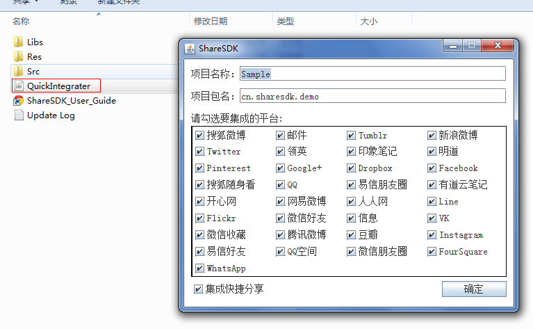 Android ShareSDK快速實現分享功能,androidsharesdk
Android ShareSDK快速實現分享功能,androidsharesdk第一步 :獲取ShareSDK 為了集成ShareSDK,您首先需要到ShareSDK
 android Fragment詳細講述,包括問題隱患
android Fragment詳細講述,包括問題隱患 Fragment是安卓v4包的新東西,名為碎片化布局,該布局的目的就是為了取代過時的tabhost.使操作更加方便
 計算器Pro應用項目源碼,計算器pro源碼
計算器Pro應用項目源碼,計算器pro源碼 本計算器實現了一些簡單的功能,可能本身還存在一些缺陷,希望大家提建議,能夠改進一下。 源碼項目我已經上傳到源碼天堂那
 nagios分組出圖代碼實現講解[2]
nagios分組出圖代碼實現講解[2]簡介、 承接上一節,在4.1小節我們實現了分組全選功能,分組沿用nagios默認的,在此基礎之上新增復選框,實現了同組機器的選擇及
 Android開發4: Notification編程基礎、Broadcast的使用及其靜態注冊、動態注冊方式,靜態庫與動態庫編程
Android開發4: Notification編程基礎、Broadca