編輯:Android開發教程
最終效果如下:
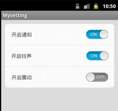
具體來說就是實現了checkbox自定義選中和為選擇樣式,菜單項根據不同位置設置不同背景.
先上整體布局文件代碼:
<LinearLayout xmlns:android="http://schemas.android.com/apk/res/android"
xmlns:tools="http://schemas.android.com/tools"
android:layout_width="match_parent"
android:layout_height="match_parent"
android:background="#DFE1E0"
android:orientation="vertical">
    <LinearLayout        style="@style/SettingItemTop"
        android:background="@drawable/setting_list_top"
        xmlns:android="http://schemas.android.com/apk/res/android"
        xmlns:tools="http://schemas.android.com/tools"
        android:layout_width="match_parent"
        android:layout_height="wrap_content"
         android:orientation="horizontal">
         <TextView
            style="@style/MySettingText"
            android:layout_width="wrap_content"
            android:layout_height="wrap_content"
            android:text="開啟通知"             />
        <CheckBox
             style="@style/MyCheckBox"
            android:layout_width="wrap_content"
            android:layout_height="wrap_content" />
    </LinearLayout>
        <LinearLayout
        style="@style/SettingItemMiddle"
        android:layout_width="match_parent"
        android:layout_height="wrap_content"
         android:orientation="horizontal">
        <TextView
            style="@style/MySettingText"
            android:layout_width="wrap_content"
            android:layout_height="wrap_content"
            android:text="開啟鈴聲"             />
        <CheckBox
            style="@style/MyCheckBox"
            android:layout_width="wrap_content"
            android:layout_height="wrap_content" />
    </LinearLayout>
        <LinearLayout
        style="@style/SettingItemBottom"
        android:layout_width="match_parent"
        android:layout_height="wrap_content"
         android:orientation="horizontal">
         <TextView
            style="@style/MySettingText"
            android:layout_width="wrap_content"
            android:layout_height="wrap_content"
            android:text="開啟震動"             />
        <CheckBox
             style="@style/MyCheckBox"
            android:layout_width="wrap_content"
            android:layout_height="wrap_content" />
    </LinearLayout>
</LinearLayout>
注意到:
style="@style/MySettingText"
這一句,這裡用了style.xml這個文件來控制樣式.Android實際開發中,會有很多時候一些部件的屬性是要重復出現的,如果每個控件都要單獨的 把這些屬性單獨的輸入一次,那樣會很沒有效率.可以將重復的代碼添加到style.xml中,設置成一種樣式,在用到這些屬性是引用這個樣式即 可.style="@style/MySettingText"這個是設置文字的屬性,代碼如下:
<style name="MySettingText">
        <item name="android:layout_margin">10dp</item>
        <item name="android:layout_weight">6</item>
</style>
這裡僅用了兩個屬性.開發中可以根據實際需要自行修改.以後每個設置項的文字不需要再把這些屬性再添加一邊,引用一下這個style即可.
CheckBox樣式自定義用到了selector.
style="@style/MyCheckBox"
此句對應的代碼:
<style name="MyCheckBox" parent="@android:style/Widget.CompoundButton.CheckBox">
        <item name="android:button">@drawable/check</item>
        <item name="android:layout_margin">10dp</item>
        <item name="android:layout_weight">1</item>
</style>
注意到此句:
<item name="android:button">@drawable/check</item>
這裡就用了selector自定義樣式.
在res/drawable下建立一名為check(自定)的xml文件,代碼如下:
<?xml version="1.0" encoding="UTF-8"?>
<selector xmlns:android="http://schemas.android.com/apk/res/android">
  <item android:state_checked="true" android:drawable="@drawable/on" />
  <item android:state_checked="false" android:drawable="@drawable/off" />
</selector>
其中
@drawable/on為選擇時checkbox的圖像,@drawable/off反之.
還注意到菜單中第一項上方為圓角,中間項為四角都為方,最後一項為下部圓角,這個就是通過設置不同的背景圖片實現的了,具體不細表.
 新的引導程序讓你開機時選擇進入Android ICS系統
使用Android系統最大的優點就是刷機,並且良好的兼容性和自由的可擴展性成為開發者的“樂土”,比如CM等自定義ROM,那麼你有沒有想過將Andr
 jdk+eclip+android sdk實現Android開發環境搭建
一 相關下載(1) java JDK下載:進入該網頁: http://java.sun.com/javase/downloads/index.jsp (或者直接點擊下載)
 android虛擬機詳解
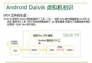
android5.0之前使用的虛擬機是Dalvik虛擬機,這個虛擬機在JVM的基礎上做了一定的優化。android5.0之後,android采用了新的虛擬機ART,本文主
 Android可視化調試工具Hierarchy Viewer的使用
Android的SDK工具包中,有很多十分有用的工具,可以幫助程序員開發和測試Android應用程序,大大提高其工作效率。其中的一款叫Hierachy Viewer的可視