編輯:關於Android編程
還是我們自定View的那幾個步驟:
1、自定義View的屬性
2、在View的構造方法中獲得我們自定義的屬性
[ 3、重寫onMesure ]
4、重寫onDraw
1、自定義屬性:
<?xml version="1.0" encoding="utf-8"?>
<resources>
 <declare-styleable name="CustomTitleView">
  <attr name="mSpeed" format="integer" />
  <attr name="mFirstColor" format="color" />
  <attr name="mSecondColor" format="color" />
  <attr name="mCircleWidth" format="dimension"/>
  <attr name="textSize" format="dimension"/>
 </declare-styleable>
</resources>
2、在View的構造方法中獲得我們自定義的屬性
/**
 * 當前進度
 */
 private int mProgress;
 /**
 * 第一圈的顏色
 */
 private int mFirstColor;
 /**
 * 第二圈的顏色
 */
 private int mSecondColor;
 /**
 * 圈的寬度
 */
 private int mCircleWidth;
 /**
 * 速度
 */
 private int mSpeed;
 /**
 * 中間進度百分比的字符串的字體
 */
 private float textSize;
 private boolean isNext = false;
 private Paint mPaint;

 public CustomTitleView(Context context, AttributeSet attrs) {
  super(context, attrs);
  TypedArray typearray = context.obtainStyledAttributes(attrs, R.styleable.CustomTitleView);
  int count= typearray.getIndexCount();
  for(int i=0;i<count;i++){
   int attr =typearray.getIndex(i);
   switch(attr){
    case R.styleable.CustomTitleView_mFirstColor:
     mFirstColor=typearray.getColor(attr,Color.BLACK);
     break;
    case R.styleable.CustomTitleView_mSecondColor:
     mSecondColor=typearray.getColor(attr,Color.RED);
     break;
    case R.styleable.CustomTitleView_mCircleWidth:
     mCircleWidth = typearray.getDimensionPixelSize(attr,(int)TypedValue.applyDimension(
       TypedValue.COMPLEX_UNIT_PX,20,getResources().getDisplayMetrics()));
     break;

    case R.styleable.CustomTitleView_textSize:
     textSize = typearray.getDimensionPixelSize(attr,(int)TypedValue.applyDimension(
       TypedValue.COMPLEX_UNIT_PX,30,getResources().getDisplayMetrics()));
     break;
    case R.styleable.CustomTitleView_mSpeed:
     mSpeed = typearray.getInt(attr,100);// 默認100
     break;
   }
  }
  Log.v("----",mSpeed+"");
  typearray.recycle();
  mPaint = new Paint();
  new Thread()
  {
   public void run()
   {
    while (true)
    {
     mProgress++;
     if (mProgress == 360)
     {
      mProgress = 0;
      if (!isNext)
       isNext = true;
      else
       isNext = false;
     }
     postInvalidate();
     try
     {
      Thread.sleep(mSpeed);
     } catch (InterruptedException e)
     {
      e.printStackTrace();
     }
    }
   };
  }.start();
 }
3、直接重寫onDraw,這不需要重寫onMeasure
protected void onMeasure(int widthMeasureSpec, int heightMeasureSpec){
    super.onMeasure(widthMeasureSpec, heightMeasureSpec);
 }
 protected void onDraw(Canvas canvas)
 {
  /**
  * 畫進度百分比
  */
  mPaint.setStrokeWidth(0);
  mPaint.setColor(Color.BLACK);
  mPaint.setTextSize(textSize);
  mPaint.setTypeface(Typeface.DEFAULT_BOLD); //設置字體
  int percent = (int)(((float)mProgress / (float)360) * 100);
  int centre = getWidth() / 2; // 獲取圓心的x坐標
  int radius = centre - mCircleWidth / 2;// 半徑
  float textWidth = mPaint.measureText(percent + "%"); //測量字體寬度,我們需要根據字體的寬度設置在圓環中間
  canvas.drawText(percent + "%",centre-textWidth/ 2,centre+textSize/2, mPaint); //畫出進度百分比
  mPaint.setStrokeWidth(mCircleWidth); // 設置圓環的寬度
  mPaint.setAntiAlias(true); // 消除鋸齒
  mPaint.setStyle(Paint.Style.STROKE); // 設置空心
  RectF oval = new RectF(centre - radius, centre - radius, centre + radius, centre + radius); // 用於定義的圓弧的形狀和大小的界限
  if(isNext){
   mPaint.setColor(mSecondColor); // 設置圓環的顏色
   canvas.drawCircle(centre, centre, radius, mPaint); // 畫出圓環
   mPaint.setColor(mFirstColor); // 設置圓環的顏色
   canvas.drawArc(oval, -90, mProgress, false, mPaint); // 根據進度畫圓弧
  }else{
   mPaint.setColor(mFirstColor); // 設置圓環的顏色
   canvas.drawCircle(centre, centre, radius, mPaint); // 畫出圓環
   mPaint.setColor(mSecondColor); // 設置圓環的顏色
   canvas.drawArc(oval, -90, mProgress, false, mPaint); // 根據進度畫圓弧
  }
 }
activity_main.xml
<?xml version="1.0" encoding="utf-8"?>
<RelativeLayout xmlns:android="http://schemas.android.com/apk/res/android"
 xmlns:custom="http://schemas.android.com/apk/res-auto"
 android:layout_width="match_parent"
 android:layout_height="match_parent"
 android:padding="20dp"
 >
 <view.CustomTitleView
  android:layout_width="200dp"
  android:layout_height="400dp"
  custom:mSpeed="50"
  custom:mFirstColor="#7300e6"
  custom:mSecondColor="#39ac39"
  custom:mCircleWidth="10px"
  custom:textSize="20px"
  android:id="@+id/one"
 />
 <view.CustomTitleView
  android:layout_toEndOf="@id/one"
  android:layout_width="200dp"
  android:layout_height="400dp"
  custom:mSpeed="100"
  custom:mFirstColor="#0040ff"
  custom:mSecondColor="#40ff00"
  custom:mCircleWidth="20px"
  custom:textSize="30px"
  />
</RelativeLayout>
效果預覽

源碼下載:http://xiazai.jb51.net/201701/yuanma/AndroidProgressbar(jb51.net).rar
以上就是本文的全部內容,希望對大家的學習有所幫助,也希望大家多多支持本站。
 Android搶紅包助手開發全攻略
背景:新年之際,微信微博支付寶紅包是到處飛,但是,自己的手速總是比別人慢一點最後導致紅包沒搶到,紅包助手就應運而生。需求:收到紅包的時候進行提醒,然後跳轉到紅包的界面方便
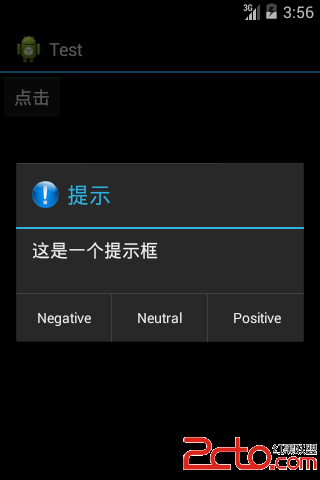 android開發之AlertDialog
幾個常用的方法:1.setTitle()設置對話框顯示的標題。2.setIcon()設置對話框的圖標,值得注意的是,如果沒有使用setTitle()方法,setIcon(
 手機浏覽器哪個省流量
流量是小編最苦惱的一個問題,小編在愉快的工作上網之余小編總是要關注一下自己的流量損耗程度。所以說中國的手機用戶無疑是全世界最“悲催”
 微信好用錢貸款利息怎麼算
微信好用錢是一款進行借款貸款的平台,最近這個平台很熱,不少小伙伴都開始在該平台上借款,借款前除了了解該平台的安全性靠譜性外,還需要對該平台利息的算法有所了解