編輯:關於android開發
Android開發者在編程過程中經常要涉及到美工方面的工作,而美工對開發者而言往往是不太擅長的。本文就從簡潔易用的角度跟大家分享shape的使用方法。
Android中常常使用shape來定義控件的一些顯示屬性,在看了關於shape的一些用法技巧後,對shape有了大體的了解,下面進行大致的總結。
先看下面的代碼:
XML/HTML代碼solid:實心,就是填充的意思
android:color指定填充的顏色。
gradient:漸變
android:startColor和android:endColor分別為起始和結束顏色,ndroid:angle是漸變角度,必須為45的整數倍。
另外漸變默認的模式為android:type="linear",即線性漸變,可以指定漸變為徑向漸變,android:type="radial",徑向漸變需要指定半徑android:gradientRadius="50"。
stroke:描邊
android:width="2dp" 描邊的寬度,android:color 描邊的顏色。
我們還可以把描邊弄成虛線的形式,設置方式為:
android:dashWidth="5dp"
android:dashGap="3dp"
其中android:dashWidth表示'-'這樣一個橫線的寬度,android:dashGap表示之間隔開的距離。
corners:圓角
android:radius為角的弧度,值越大角越圓。
我們還可以把四個角設定成不同的角度,方法為:
XML/HTML代碼這裡有個地方需要注意,bottomLeftRadius是右下角,而不是左下角,這個有點郁悶,不過不影響使用,記得別搞錯了就行。
還有網上看到有人說設置成0dp無效,不過我在測試中發現是可以的,我用的是2.2,可能修復了這個問題吧,如果無效的話那就只能設成1dp了。
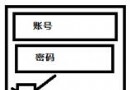
padding:間隔
這個就不用多說了,XML布局文件中經常用到。
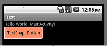
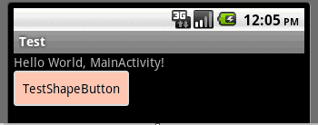
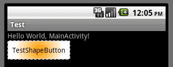
大體的就是這樣,以下是一個使用的具體示例:用在Selector中作為Button的背景,分別定義了按鈕的一般狀態、獲得焦點狀態和按下時的狀態,具體代碼如下:
main.xml:
XML/HTML代碼button_selector.xml:
XML/HTML代碼運行效果如下圖:
一般狀態:
獲得焦點狀態:
按下狀態:
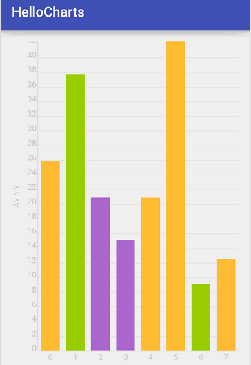 圖表框架HelloCharts(2)柱狀圖,hellocharts柱狀圖
圖表框架HelloCharts(2)柱狀圖,hellocharts柱狀圖1.效果圖 2.xml代碼 activity_column_chart.xml <Fram
 Android自定義ViewGroup打造各種風格的SlidingMenu
Android自定義ViewGroup打造各種風格的SlidingMenu 看鴻洋大大的QQ5.0側滑菜單的視頻課程,對於側滑的時的動畫效果的實現有了新的認識,似乎打
 Android NDK開發Hello Word!,androidndk
Android NDK開發Hello Word!,androidndk 在之前的博客中已經為大家介紹了,如何在win環境下配置DNK程序,本篇我將帶大家實現一個簡單的H
 電商、商城類APP常用標簽"hot"--第三方開源--LabelView,app--labelview
電商、商城類APP常用標簽"hot"--第三方開源--LabelView,app--labelview LabelView是在githu