編輯:安卓省電與加速
源代碼及demo下載(此進度條開源項目後續會持續添加、更新)
在開發交流群中,一童鞋說要實現這個進度條,但在網上沒有找到開源項目。

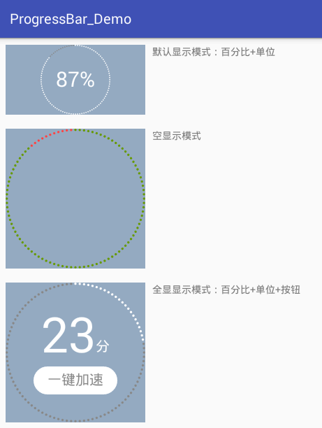
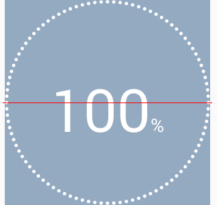
看到這個圖片,很熟悉吧?有木有想點它的沖動?覺得有點意思,可以研究一下,再說也有一段時間沒寫自定義控件了,正好復習復習(說實話,一段時間沒寫,思路有,但就是不知道從哪開始)。昨天花了一天的時間才把它搞定,先看效果圖:
3種顯示模式:
模擬進度動畫效果:

說說它的特點:
顯示模式有三種可選。如上展示; 全顯在控件范圍內。控件寬高不一時,會以小的為邊界; 所有顏色都可自定義; 百分比、單位、按鈕的字體大小都可自定義; 單位和按鈕的文字可自定義; 單位與百分比的對齊方式可選。詳見下面的“繪制單位”; 按鈕與百分比垂直間距可調; 按鈕可設置點擊事件(好像是廢話,不然為什麼叫按鈕); 可在子線程中直接更新進度。看到這個圖,首先可以確定,它包括四個部分:
最外層的圓點 百分比 單位 按鈕當然先得知道自定義控件的步驟,參考了這位牛人的博文。
先總結下自定義控件的步驟:
分析控件的每個部分,設定其屬性。在res/values/attrs.xml中定義好; 實現基本的三個構造方法,並在構造方法中獲取屬性值或默認值; 重寫onDraw(Canvas canvas)方法,在此方法中繪制界面; 【可選】處理觸摸事件; 在布局文件中使用。在基布局中別忘了添加命名空間(如:xmlns:zjun=”http://schemas.android.com/apk/res-auto”),這樣才能使用自定義屬性。然後逐個分析。。。
最外層的圓點,看上就很多,一圈下來感覺有100個,它當前百分比是65,數了下,確實是65個白點,灰點就不用數了,肯定就是剩下的35個。這樣,一圈上點的總個數確定下來,就是100個。
點與點之間的空白距離,看上去就是一個點的空間。一圈下來,就是200個連續圓點。圓點應該內切控件邊界。
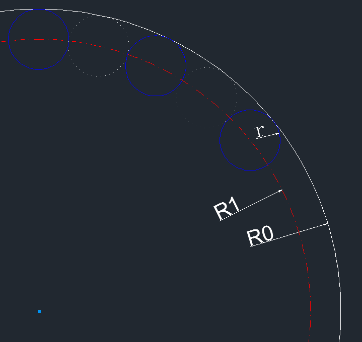
它們的關系是: R0 = R1 + r; ······ ①
其中R0控件大小(min(getWidth(), getHeight()))的一半;R1就是圓點的圓心組成的圓軌跡的半徑;r是圓點半徑;
另外200個連續圓點在以R1為半徑的圓上,圓點與圓點都是外切關系。所以每個圓點所占的角度就是360°/200 = 1.8°
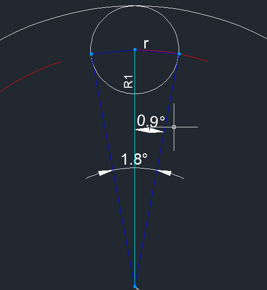
它們的關系:
由①和②可知,r與R0的關系:
這樣出來的效果,實際圓點間距離太大,最後把sin(0.9°)提高到sin(1°)。這樣就比較飽滿了。
mSin_1 = (float) Math.sin(Math.toRadians(1));
// 計算圓點半徑
float outerRadius = (getWidth() < getHeight() ? getWidth() : getHeight()) / 2f;
float dotRadius = mSin_1 * outerRadius / (1 + mSin_1);
求出了圓點半徑,圓點圓心所在的位置也知道了。畫圓點,一圈共100個,可以使用了canvas的旋轉來繪制,每繪制一個圓點,就旋轉3.6°(360°/100)。
至於進度,可以先畫已完成進度,再畫未完成進度。也可以先把未完成進度畫完,把其當背景,再畫已完成進度。
我這選擇了第一種方法,理由:為了不重復繪制,另一個就是防止已完成進度的顏色是帶透明度的,這樣疊加就不是想要的顏色了。
float centerX = getWidth() / 2f;
float centerY = getHeight() / 2f;

// 1 畫進度
mPaint.setColor(dotColor);
mPaint.setStyle(Paint.Style.FILL);
int count = 0;
// 1.1 當前進度
while (count++ < percent) {
    canvas.drawCircle(centerX, centerY - outerRadius + dotRadius, dotRadius, mPaint);
    canvas.rotate(3.6f, centerX, centerY);
}
// 1.2 未完成進度
mPaint.setColor(dotBgColor);
count--;
while (count++ < 100) {
    canvas.drawCircle(centerX, centerY - outerRadius + dotRadius, dotRadius, mPaint);
    canvas.rotate(3.6f, centerX, centerY);
}
百分比就是文字,直接用canvas.drawText()繪制就好了。
mPaint.setTextSize(percentTextSize);
mPaint.setColor(percentTextColor);
canvas.drawText(percent + "", centerX - textWidth / 2, baseline, mPaint);
繪制的時候,要找好開始繪制的位置,注意兩個方向的對齊方法:
這個簡單,先測量一下文字的寬度,左邊起始位置就是centerX - textWidth/2。上面用textWidth是因為還要加上單位字體的寬度。
mPaint.setTextSize(percentTextSize);
float percentTextWidth = mPaint.measureText(percent + "");
baseline是y方向的起始位置,最初設置的是centerY + percentTextSize/2。在默認顯示模式下,結果是醬紫:
擦,這哪是垂直對齊啊。難道有萬有引力?
後來找到了原因(參考)。因為它的y坐標位置是baseline,而不是我們想象中的bottom。請看下圖(ascent與參考的博客有點不一樣,但不用懷疑我這的准確性,因為這圖是直接通過自定義控件繪制出來的)
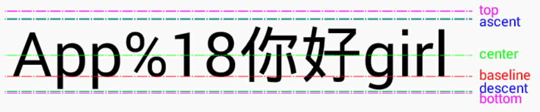
說明:
而FontMetrics在設置字體大小後可以獲取到:
mPaint.setTextSize(textHeight);
Paint.FontMetrics fm = mPaint.getFontMetrics();
所以要居中對齊,baseline比較准確的值是:
baseline = centerY + (fm.descent - fm.ascent)/2 - fm.descent;
這我理解了半天才弄明白。可以這麼理解:當文字在正中間的時候,center線的y坐標值就是centerY,加上(fm.descent - fm.ascent)/2就到了descent線(要區分fm.descent的值),減去fm.descent就到了baseline線。
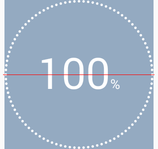
修正後的結果:
另一個比較准確的值:
baseline = centerY + (fm.bottom- fm.top)/2 - fm.bottom;
繪制方式同百分比,他繪制的起始x坐標緊接著百分比的。
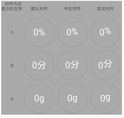
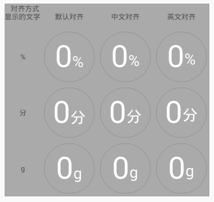
但,,,如果單位不是%,而是“分”,這樣就不能與百分比的數字在底部對齊了。看需求吧,有的地方允許這樣,但在強迫症的驅動下,又給自己整了一壺。
看看上面baseline的分析,特別是那張圖。是不是發現字母、數字、漢字的底部對齊方式不太一樣(裡面的文字是有用途的,不是鬧著玩的)。
所以添加了一個這樣獨特的屬性:unitTextAlignMode,意為單位與百分比的對齊方式。有三種方式:
DEFAULT:只要與baseline線底部對齊的都可以用這個,eg: %, a, b, … CN:中文,就用它 EN:主要針對英文字母和字符中帶尾巴的,eg: g, j, p, q, y, [, ], {, }, |, …原理就是根據文字大小,進行了微調:
switch (unitTextAlignMode) {
    case UNIT_TEXT_ALIGN_MODE_CN:
        baseline -= fm_unit.descent / 4;
        break;
    case UNIT_TEXT_ALIGN_MODE_EN:
        baseline -= fm_unit.descent * 2/3;
}
效果咋樣?別急,客官,我們這裡又展品,看完再選也不遲:
百分比與單位字體大小一樣:
百分比字體比單位字體大:

主要是背景,仔細看,可以這麼去繪制:先把背景分三部分,中間一個長方形,兩邊各一個半圓。長方形的長等於字體的寬度,高是字體高度的2倍。
繪制的時候,可通過Path來一次性繪制完畢:
mPath.reset();
mPath.moveTo(mButtonRect_start.x, mButtonRect_start.y);
mPath.rLineTo(buttonTextWidth, 0);
float left = centerX + buttonTextWidth/2 - mButtonRadius;
float top = centerY + buttonTopOffset;
float right = left + 2 * mButtonRadius;
float bottom = top + 2 * mButtonRadius;
mRectF.set(left, top, right, bottom);
mPath.arcTo(mRectF, 270, 180); // 參數1:內切這個方形,參數2:開始角度,參數3:畫的角度范圍
mPath.rLineTo(-buttonTextWidth, 0);
mRectF.offset(-buttonTextWidth, 0); // 平移位置
mPath.arcTo(mRectF, 90, 180);
mPath.close();
canvas.drawPath(mPath, mPaint);
要處理按鈕的點擊事件,首先要判斷觸摸點是否在按鈕中,跟繪制一樣,分別判斷是否在方形、左半圓、右半圓中。
方形好判斷,左半圓和右半圓的判斷,我們利用解析幾何的辦法:判斷一個點(x, y)是否在圓(
代碼實現如下:
/**
 * 判斷坐標是否在按鈕中
 * @param x 坐標的x
 * @param y 坐標的y
 * @return true-在按鈕中,false-不在按鈕中
 */
private boolean isTouchInButton(final float x, final float y) {
    // 判斷是否在按鈕矩形中
    if (x >= mButtonRect_start.x && x <= mButtonRect_end.x
            && y >= mButtonRect_start.y && y <= mButtonRect_end.y) {
        return true;
    }

    // 判斷是否在左邊半圓中:另一半圓在矩形中,也屬於按鈕范圍,所以直接判斷整個圓即可
    // 把坐標系移到圓心再判斷
    float centerX = mButtonRect_start.x;
    float centerY = (mButtonRect_start.y + mButtonRect_end.y) / 2;
    float newX = x - centerX;
    float newY = y - centerY;
    if (newX * newX + newY * newY <= mButtonRadius * mButtonRadius) {
        return true;
    }

    // 判斷是否在右邊半圓中
    centerX = mButtonRect_end.x;
    newX = x - centerX;
    return newX * newX + newY * newY <= mButtonRadius * mButtonRadius;
}
按鈕的處理事件,在onTouchEvent()中進行攔截,這樣能區別按鈕被點擊,和控件(除按鈕區域)被點擊
@Override
public boolean onTouchEvent(MotionEvent event) {
    if (showMode == SHOW_MODE_ALL) {
        switch (event.getAction()) {
            case MotionEvent.ACTION_DOWN:
                if (isTouchInButton(event.getX(), event.getY())) {
                    mIsButtonTouched = true;
                    postInvalidate();
                }
                break;
            case MotionEvent.ACTION_MOVE:
                if (mIsButtonTouched) {
                    if (!isTouchInButton(event.getX(), event.getY())) {
                        mIsButtonTouched = false;
                        postInvalidate();
                    }
                }
                break;
            case MotionEvent.ACTION_UP:
                if (mIsButtonTouched && mButtonClickListener != null) {
                    mButtonClickListener.onClick(this);
                }
                mIsButtonTouched = false;
                postInvalidate();
        }
        if (mIsButtonTouched) {
            return true;
        }
    }

    return super.onTouchEvent(event);
}
除了上面按鈕事件處理方法外,還有2個主要的方法:
構造方法中獲取屬性值或默認值 onDraw()中
public CircleDotProgressBar(Context context, AttributeSet attrs, int defStyleAttr) {
    super(context, attrs, defStyleAttr);

    TypedArray ta = context.obtainStyledAttributes(attrs, R.styleable.CircleDotProgressBar);

    // 獲取自定義屬性值或默認值
    progressMax = ta.getInteger(R.styleable.CircleDotProgressBar_progressMax, 100);
    dotColor = ta.getColor(R.styleable.CircleDotProgressBar_dotColor, Color.WHITE);
    dotBgColor = ta.getColor(R.styleable.CircleDotProgressBar_dotBgColor, Color.GRAY);
    showMode = ta.getInt(R.styleable.CircleDotProgressBar_showMode, SHOW_MODE_PERCENT);

    if (showMode != SHOW_MODE_NULL) {
        percentTextSize = ta.getDimension(R.styleable.CircleDotProgressBar_percentTextSize, dp2px(30));
        percentTextColor = ta.getInt(R.styleable.CircleDotProgressBar_percentTextColor, Color.WHITE);

        unitText = ta.getString(R.styleable.CircleDotProgressBar_unitText);
        unitTextSize = ta.getDimension(R.styleable.CircleDotProgressBar_unitTextSize, percentTextSize);
        unitTextColor = ta.getInt(R.styleable.CircleDotProgressBar_unitTextColor, Color.WHITE);
        unitTextAlignMode = ta.getInt(R.styleable.CircleDotProgressBar_unitTextAlignMode, UNIT_TEXT_ALIGN_MODE_DEFAULT);

        if (unitText == null) {
            unitText = "%";
        }
    }

    if (showMode == SHOW_MODE_ALL) {
        buttonText = ta.getString(R.styleable.CircleDotProgressBar_buttonText);
        buttonTextSize = ta.getDimension(R.styleable.CircleDotProgressBar_buttonTextSize, dp2px(15));
        buttonTextColor = ta.getInt(R.styleable.CircleDotProgressBar_buttonTextColor, Color.GRAY);
        buttonBgColor = ta.getInt(R.styleable.CircleDotProgressBar_buttonBgColor, Color.WHITE);
        buttonClickColor = ta.getInt(R.styleable.CircleDotProgressBar_buttonClickColor, buttonBgColor);
        buttonClickBgColor = ta.getInt(R.styleable.CircleDotProgressBar_buttonClickBgColor, buttonTextColor);
        buttonTopOffset = ta.getDimension(R.styleable.CircleDotProgressBar_buttonTopOffset, dp2px(15));
        if (buttonText == null) {
            buttonText = context.getString(R.string.CircleDotProgressBar_speed_up_one_key);
        }
    }
    ta.recycle();

    // 其他准備工作
    mSin_1 = (float) Math.sin(Math.toRadians(1)); // 求sin(1°)。角度需轉換成弧度
    mPaint = new Paint();
    mPaint.setAntiAlias(true); // 消除鋸齒
    mPath = new Path();
    mRectF = new RectF();
    mButtonRect_start = new PointF();
    mButtonRect_end = new PointF();
}

@Override
protected void onDraw(Canvas canvas) {
    super.onDraw(canvas);

    // 計算圓點半徑
    float outerRadius = (getWidth() < getHeight() ? getWidth() : getHeight()) / 2f;
    float centerX = getWidth() / 2f;
    float centerY = getHeight() / 2f;

    // outerRadius = innerRadius + dotRadius
    // sin((360°/200)/2) = sin(0.9°) = dotRadius / innerRadius;
    // 為了讓圓點飽滿一些,把角度0.9°增加0.1°到1°
    float dotRadius = mSin_1 * outerRadius / (1 + mSin_1);


    // 1 畫進度
    mPaint.setColor(dotColor);
    mPaint.setStyle(Paint.Style.FILL);
    int count = 0;
    // 1.1 當前進度
    while (count++ < percent) {
        canvas.drawCircle(centerX, centerY - outerRadius + dotRadius, dotRadius, mPaint);
        canvas.rotate(3.6f, centerX, centerY);
    }
    // 1.2 未完成進度
    mPaint.setColor(dotBgColor);
    count--;
    while (count++ < 100) {
        canvas.drawCircle(centerX, centerY - outerRadius + dotRadius, dotRadius, mPaint);
        canvas.rotate(3.6f, centerX, centerY);
    }

    if (showMode == SHOW_MODE_NULL) {
        return;
    }

    if (showMode == SHOW_MODE_PERCENT) {
        // 2 畫百分比和單位:水平和垂直居中
        // 測量寬度
        mPaint.setTextSize(percentTextSize);
//            mPaint.setTypeface(Typeface.DEFAULT_BOLD); // 粗體
        float percentTextWidth = mPaint.measureText(percent + "");

        mPaint.setTextSize(unitTextSize);
        float unitTextWidth = mPaint.measureText(unitText);
        Paint.FontMetrics fm_unit = mPaint.getFontMetrics();

        float textWidth = percentTextWidth + unitTextWidth;
        float textHeight = percentTextSize > unitTextSize ? percentTextSize : unitTextSize;

        // 計算Text垂直居中時的baseline
        mPaint.setTextSize(textHeight);
        Paint.FontMetrics fm = mPaint.getFontMetrics();
        // 字體在垂直居中時,字體中間就是centerY,加上字體實際高度的一半就是descent線,減去descent就是baseline線的位置(fm中以baseline為基准)
        float baseline = centerY + (fm.descent - fm.ascent)/2 - fm.descent;

        // 2.1 畫百分比
        mPaint.setTextSize(percentTextSize);
        mPaint.setColor(percentTextColor);
        canvas.drawText(percent + "", centerX - textWidth / 2, baseline, mPaint);

        // 2.2 畫單位
        mPaint.setTextSize(unitTextSize);
        mPaint.setColor(unitTextColor);
        // 單位對齊方式
        switch (unitTextAlignMode) {
            case UNIT_TEXT_ALIGN_MODE_CN:
                baseline -= fm_unit.descent / 4;
                break;
            case UNIT_TEXT_ALIGN_MODE_EN:
                baseline -= fm_unit.descent * 2/3;
        }
        canvas.drawText(unitText, centerX - textWidth / 2 + percentTextWidth, baseline, mPaint);
    }else if (showMode == SHOW_MODE_ALL) {
        // 2 畫百分比和單位:水平居中,垂直方向的baseline在centerY
        // 測量寬度
        mPaint.setTextSize(percentTextSize);
//            mPaint.setTypeface(Typeface.DEFAULT_BOLD); // 粗體
        float percentTextWidth = mPaint.measureText(percent + "");

        mPaint.setTextSize(unitTextSize);
        float unitTextWidth = mPaint.measureText(unitText);
        Paint.FontMetrics fm_unit = mPaint.getFontMetrics();

        float textWidth = percentTextWidth + unitTextWidth;

        // 2.1 畫百分比
        mPaint.setTextSize(percentTextSize);
        mPaint.setColor(percentTextColor);
        float baseline_per = centerY;
        canvas.drawText(percent + "", centerX - textWidth / 2, baseline_per, mPaint);

        // 2.2 畫單位
        mPaint.setTextSize(unitTextSize);
        mPaint.setColor(unitTextColor);
        // 單位對齊方式
        switch (unitTextAlignMode) {
            case UNIT_TEXT_ALIGN_MODE_CN:
                baseline_per -= fm_unit.descent / 4;
                break;
            case UNIT_TEXT_ALIGN_MODE_EN:
                baseline_per -= fm_unit.descent * 2/3;
        }
        canvas.drawText(unitText, centerX - textWidth / 2 + percentTextWidth, baseline_per, mPaint);

        // 3 畫按鈕
        mPaint.setTextSize(buttonTextSize);
        float buttonTextWidth = mPaint.measureText(buttonText);
        Paint.FontMetrics fm = mPaint.getFontMetrics();

        // 3.1 畫按鈕背景
        mPaint.setStyle(Paint.Style.FILL);
        mPaint.setColor(mIsButtonTouched ? buttonClickBgColor : buttonBgColor);
        float buttonHeight = 2 * buttonTextSize;
        mButtonRadius = buttonHeight / 2;

        mButtonRect_start.set(centerX - buttonTextWidth / 2, centerY + buttonTopOffset);
        mButtonRect_end.set(centerX + buttonTextWidth/2, centerY + buttonTopOffset + buttonHeight);

        mPath.reset();
        mPath.moveTo(mButtonRect_start.x, mButtonRect_start.y);
        mPath.rLineTo(buttonTextWidth, 0);
        float left = centerX + buttonTextWidth/2 - mButtonRadius;
        float top = centerY + buttonTopOffset;
        float right = left + 2 * mButtonRadius;
        float bottom = top + 2 * mButtonRadius;
        mRectF.set(left, top, right, bottom);
        mPath.arcTo(mRectF, 270, 180); // 參數1:內切這個方形,參數2:開始角度,參數3:畫的角度范圍
        mPath.rLineTo(-buttonTextWidth, 0);
        mRectF.offset(-buttonTextWidth, 0); // 平移位置
        mPath.arcTo(mRectF, 90, 180);
        mPath.close();
        canvas.drawPath(mPath, mPaint);

        // 3.2 畫按鈕文本
        mPaint.setColor(mIsButtonTouched ? buttonClickColor : buttonTextColor);
        float baseline = centerY + buttonTopOffset + buttonTextSize + (fm.descent - fm.ascent)/2 - fm.descent;
        canvas.drawText(buttonText, centerX - buttonTextWidth / 2, baseline, mPaint);

    }
}

/**
 * 設置進度
 * 同步,允許多線程訪問
 * @param progress 進度
 */
public synchronized void setProgress(int progress) {
    if (progress < 0 || progress > progressMax) {
        throw new IllegalArgumentException(String.format("progress must between 0 and max(%d)", progressMax));
    }
    this.progress = progress;
    percent = progress * 100 / progressMax;
    postInvalidate(); // 可以直接在子線程中調用,而invalidate()必須在主線程(UI線程)中調用
}

public synchronized void setProgressMax(int progressMax) {
    if (progressMax < 0) {
        throw new IllegalArgumentException("progressMax mustn't smaller than 0");
    }
    this.progressMax = progressMax;
}
 聯想樂檬K5 Note提升流暢度 一鍵清理後台的省電方法
來說一下聯想樂檬K5 Note提升流暢度 一鍵清理後台的省電方法了,聯想K5 Note是一款搭載了MTK全新的Helio P10 處理器的手機,配置了2GB
 三星I9220 4.0.4ROM基於官方刷機教程 穩定省電
版本簡介: ROM名稱:星I9220 4.0.4ROM基於官方刷機教程 Android版本:4.0.4 ROM格式:zip ROM大小:511MB R
 魅族Pro 5怎麼省電?省電方法介紹
對於所有使用智能手機的用戶們來說,尤其是安卓用戶,電池不夠用大概是很多人都很頭疼的一個問題,於是很多廠商們在續航方面一直做不懈的努力,各種大容量電池的手機也不斷湧現。不過
 三星S6超級省電模式是什麼 開啟方法詳細介紹
三星S6手機作為新旗艦機型受到了很多人的歡迎,這手機還配有這超級省電模式,這個省電模式要怎麼去開啟呢?下面就一起來