編輯:關於Android編程
要實現以上效果:當checkbox被選中之後,checkbox的邊框被加粗(顏色改變、字體改變可容易實現,不再贅述)。暫時的解決方案是使用layer-list。
layer-list:圖層的累加,字面上是多個層,也就是你可以把多個layer放在一起,然後一其顯現出來。
tab-widget中自定義的視圖checkbox所處布局:
[html]
<LinearLayout xmlns:android="http://schemas.android.com/apk/res/android"
xmlns:tools="http://schemas.android.com/tools"
android:layout_width="match_parent"
android:layout_height="40dp"
android:orientation="vertical">
<CheckBox
android:id="@+id/checkMsg"
style="@style/tab_checkbox"
android:layout_width="match_parent"
android:layout_height="40dp" />
</LinearLayout>
checkbox style.xml 樣式文件:
[html]
<style name="tab_checkbox">
<item name="android:background">@drawable/msg_tab_widget_sharp</item>
<item name="android:button" >@null</item>
<item name="android:textColor">@color/gray</item>
<item name="android:textSize" >16sp</item>
<item name="android:gravity" >center</item>
</style>
<style name="tab_checkbox">
<item name="android:background">@drawable/msg_tab_widget_sharp</item>
<item name="android:button" >@null</item>
<item name="android:textColor">@color/gray</item>
<item name="android:textSize" >16sp</item>
<item name="android:gravity" >center</item>
</style>
msg_tab_widget_sharp.xml checkbox style.xml 樣式文件中的background 的布局文件:
[html]
<?xml version="1.0" encoding="utf-8"?>
<selector xmlns:android="http://schemas.android.com/apk/res/android">
<item android:drawable="@drawable/msg_tab_widget1" android:state_checked="true"></item>
<item android:drawable="@drawable/msg_tab_widget2" android:state_checked="false"></item>
<item android:drawable="@drawable/msg_tab_widget2"></item>
</selector>
msg_tab_widget1.xml 當checkbox被選中時:
[html]
<?xml version="1.0" encoding="utf-8"?>
<layer-list xmlns:android="http://schemas.android.com/apk/res/android" >
<item>
<!-- This is the border color -->
<shape>
<solid android:color="#0066CC" />
</shape>
</item>
<item android:bottom="3dp" android:right="1dp">
<!-- This is the main color -->
<shape>
<solid android:color="#E9F2FC" />
<padding
android:bottom="5dp"
android:left="5dp"
android:right="5dp"
android:top="5dp" />
</shape>
</item>
</layer-list>
msg_tab_widget2.xml 當checkbox未被選中時,即默認顯示的狀態:
[html]
<?xml version="1.0" encoding="utf-8"?>
<layer-list xmlns:android="http://schemas.android.com/apk/res/android" >
<item>
<!-- This is the border color -->
<shape>
<solid android:color="#0066CC" />
</shape>
</item>
<item
android:bottom="1dp"
android:right="1dp">
<!-- This is the main color -->
<shape>
<solid android:color="#E9F2FC" />
<padding
android:bottom="5dp"
android:left="5dp"
android:right="5dp"
android:top="5dp" />
</shape>
</item>
</layer-list>
其他使用demo:如在 android:style/Widget.ProgressBar.Large 或者其他的progressbar風格
[html]
<style
name="progressBarStyleSmall"
parent="android:style/Widget.ProgressBar.Large" >
<item name="android:indeterminateDrawable">@drawable/progress</item>
</style>
<layer-list xmlns:android="http://schemas.android.com/apk/res/android" >
<!-- <item android:drawable="@android:drawable/progress_circular_background" /> -->
<!--
<item>
<shape android:shape="ring" android:innerRadiusRatio="3.4" android:thicknessRatio="6.0">
<gradient android:useLevel="true" android:type="sweep" android:startColor="#ff000000" android:endColor="#ffffffff" />
</shape>
</item>
-->
<item>
<rotate
android:drawable="@drawable/load2"
android:fromDegrees="0"
android:pivotX="50%"
android:pivotY="50%"
android:toDegrees="370" />
</item>
</layer-list>
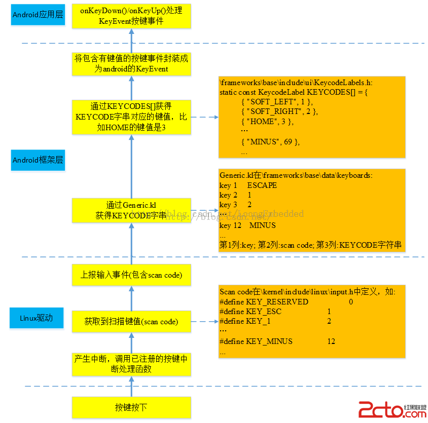 MSM8909+Android5.1.1鍵盤驅動淺析
MSM8909+Android5.1.1鍵盤驅動------概述 采用SN7326帶智能指掃描的鍵盤擴展芯片,通過I2C接口來讀取其狀態寄存器的值就可知道是單按
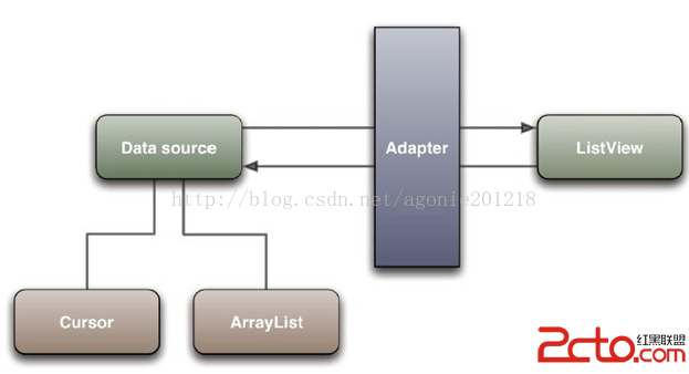 Android的Adapter用法總結
Android之Adapter用法總結1.Adapter概念定義為將一個類的接口變換成客戶端所期待的一種接口,從而使原本因接口不匹配而無法在一起工作的兩個類能夠在一起工作
 VideoView播放視頻初體驗
這幾個月一直在忙項目上的事情,所以已經有一段時間不寫博客,抽時間整理下最近的收藏夾,感覺還是有一些新的知識點可以分享的。先從最近的說起,近期項目上需要支持視頻播放功能,雖
 Android提高之使用NDK把彩圖轉換灰度圖的方法
一般而言在Android上使用JAVA實現彩圖轉換為灰度圖,與J2ME上的實現方法類似,不過遇到頻繁地轉換或者是大圖轉換時,就必須使用NDK來提高速度了。本文主要通過JA