編輯:關於Android編程
這裡先貼出原文,下次再來翻譯;:p
原文地址:http://developer.android.com/training/basics/actionbar/styling.html
The action bar provides your users a familiar and predictable way to perform actions and navigate your app, but that doesn't mean it needs to look exactly the same as it does in other apps. If you want to style the action bar to better fit your product brand, you can easily do so using Android's style and theme resources.
Android includes a few built-in activity themes that include "dark" or "light" action bar styles. You can also extend these themes to further customize the look for your action bar.
Note: If you are using the Support Library APIs for the action bar, then you must use (or override) theTheme.AppCompat family
of styles (rather than the Theme.Holo family,
available in API level 11 and higher). In doing so, each style property that you declare must be declared twice: once using the platform's style properties (the android: properties)
and once using the style properties included in the Support Library (theappcompat.R.attr properties—the
context for these properties is actually your app). See the examples below for details.
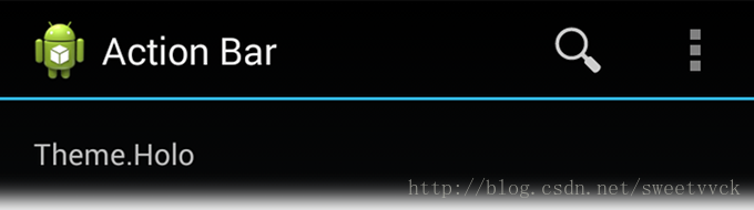
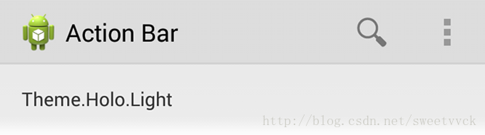
Android includes two baseline activity themes that dictate the color for the action bar:
Theme.Holo for
a "dark" theme.Theme.Holo.Light for
a "light" theme.
You can apply these themes to your entire app or to individual activities by declaring them in your manifest file with the android:theme attribute for the element
or individual elements.
For example:
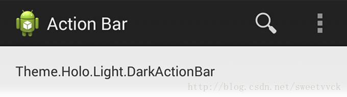
You can also use a dark action bar while the rest of the activity uses the light color scheme by declaring the Theme.Holo.Light.DarkActionBar theme.
When using the Support Library, you must instead use the Theme.AppCompat themes:
Theme.AppCompat for
the "dark" theme.Theme.AppCompat.Light for
the "light" theme.Theme.AppCompat.Light.DarkActionBar for
the light theme with a dark action bar.
Be sure that you use action bar icons that properly contrast with the color of your action bar. To help you, theAction Bar Icon Pack includes standard action icons for use with both the Holo light and Holo dark action bar.
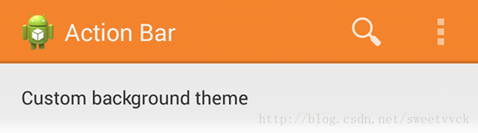
To change the action bar background, create a custom theme for your activity that overrides theactionBarStyle property.
This property points to another style in which you can override the backgroundproperty
to specify a drawable resource for the action bar background.
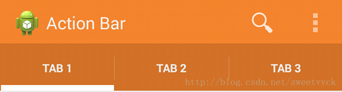
If your app uses navigation tabs or the split
action bar, then you can also specify the background for these bars using the backgroundStacked and backgroundSplit properties,
respectively.
Caution: It's important that you declare an appropriate parent theme from which your custom theme and style inherit their styles. Without a parent style, your action bar will be without many style properties unless you explicitly declare them yourself.
When supporting Android 3.0 and higher only, you can define the action bar's background like this:
res/values/themes.xml
Then apply your theme to your entire app or individual activities:
When using the Support Library, the same theme as above must instead look like this:
res/values/themes.xml
Then apply your theme to your entire app or individual activities:
To modify the color of text in the action bar, you need to override separate properties for each text element:
textColor property and specify that style for thetitleTextStyle property
in your custom actionBarStyle.
Note: The custom style applied to titleTextStyle should
useTextAppearance.Holo.Widget.ActionBar.Title as
the parent style.
actionBarTabTextStyle in
your activity theme.actionMenuTextColor in
your activity theme.
When supporting Android 3.0 and higher only, your style XML file might look like this:
res/values/themes.xml
When using the Support Library, your style XML file might look like this:
res/values/themes.xml
To change the indicator used for the navigation tabs, create an activity theme that overrides theactionBarTabStyle property.
This property points to another style resource in which you override thebackground property
that should specify a state-list drawable.
Note: A state-list drawable is important so that the tab currently selected indicates its state with a background different than the other tabs. For more information about how to create a drawable resource that handles multiple button states, read the State List documentation.
For example, here's a state-list drawable that declares a specific background image for several different states of an action bar tab:
res/drawable/actionbar_tab_indicator.xml
When supporting Android 3.0 and higher only, your style XML file might look like this:
res/values/themes.xml
When using the Support Library, your style XML file might look like this:
res/values/themes.xml
More resources
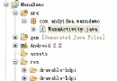
 [Android Studio] *.jar 與 *.aar 的生成與*.aar導入項目方法
主要講解Android Studio中生成aar文件以及本地方式使用aar文件的方法。 在Android Studio中對一個自己庫進行生成操作時將會同時生成*.jar與
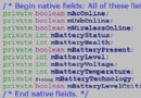 android電池管理系統
1、概述 隨著移動智能設備的快速發屏,電池的續航能力在很大情況下誘導了大眾消費者的購買選擇,android系統對電源管理的合理與否直接影響到電池的續航能力,
 Android實現類似於PC中的右鍵彈出菜單效果
Android系統中的ContextMenu(上下文菜單)類似於PC中的右鍵彈出菜單,當一個視圖注冊到一個上下文菜單時,執行一個在該對象上的“長按”動作,將出
 Android TextView實現跑馬燈效果的方法
本文為大家分享一個非常簡單但又很常用的控件,跑馬燈狀態的TextView。當要顯示的文本長度太長,又不想換行時用它來顯示文本,一來可以完全的顯示出文本,二來效果也挺酷,實