編輯:關於Android編程
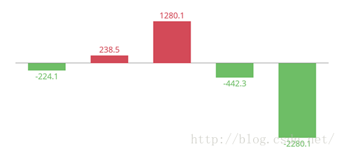
MPAndroidChart 是 Android 系統上一款開源的圖表庫。目前提供線圖和餅圖,支持選擇、縮放和拖放。
android開源圖表庫MPAndroidChar的githu地址:
https://github.com/PhilJay/MPAndroidChart
文檔地址:https://github.com/PhilJay/MPAndroidChart/wiki API地址:https://jitpack.io/com/github/PhilJay/MPAndroidChart/v2.2.5/javadoc/在Activity或者Fragment中引用
 // in this example, a LineChart is initialized from xml
    LineChart chart = (LineChart) findViewById(R.id.chart);
或者直接創建
// programmatically create a LineChart
    LineChart chart = new LineChart(Context);

    // get a layout defined in xml
    RelativeLayout rl = (RelativeLayout) findViewById(R.id.relativeLayout);
    rl.add(chart); // add the programmatically created chart
public interface OnChartValueSelectedListener {
    /**
    * Called when a value has been selected inside the chart.
    *
    * @param e The selected Entry.
    * @param dataSetIndex The index in the datasets array of the data object
    * the Entrys DataSet is in.
    * @param h the corresponding highlight object that contains information
    * about the highlighted position
    */
    public void onValueSelected(Entry e, int dataSetIndex, Highlight h);
    /**
    * Called when nothing has been selected or an "un-select" has been made.
    */
    public void onNothingSelected();
}
讓你的需要接收回調的類實現接口,將它作為監聽器設置給chart
chart.setOnChartValueSelectedListener(this);
public interface OnChartGestureListener {

    /**
     * Callbacks when a touch-gesture has started on the chart (ACTION_DOWN)
     *
     * @param me
     * @param lastPerformedGesture
     */
    void onChartGestureStart(MotionEvent me, ChartTouchListener.ChartGesture lastPerformedGesture);

    /**
     * Callbacks when a touch-gesture has ended on the chart (ACTION_UP, ACTION_CANCEL)
     *
     * @param me
     * @param lastPerformedGesture
     */
    void onChartGestureEnd(MotionEvent me, ChartTouchListener.ChartGesture lastPerformedGesture);

    /**
     * Callbacks when the chart is longpressed.
     *
     * @param me
     */
    public void onChartLongPressed(MotionEvent me);

    /**
     * Callbacks when the chart is double-tapped.
     *
     * @param me
     */
    public void onChartDoubleTapped(MotionEvent me);

    /**
     * Callbacks when the chart is single-tapped.
     *
     * @param me
     */
    public void onChartSingleTapped(MotionEvent me);

    /**
     * Callbacks then a fling gesture is made on the chart.
     *
     * @param me1
     * @param me2
     * @param velocityX
     * @param velocityY
     */
    public void onChartFling(MotionEvent me1, MotionEvent me2, float velocityX, float velocityY);

   /**
     * Callbacks when the chart is scaled / zoomed via pinch zoom gesture.
     *
     * @param me
     * @param scaleX scalefactor on the x-axis
     * @param scaleY scalefactor on the y-axis
     */
    public void onChartScale(MotionEvent me, float scaleX, float scaleY);

   /**
    * Callbacks when the chart is moved / translated via drag gesture.
    *
    * @param me
    * @param dX translation distance on the x-axis
    * @param dY translation distance on the y-axis
    */
    public void onChartTranslate(MotionEvent me, float dX, float dY);
}
YAxis leftAxis = chart.getAxisLeft();

LimitLine ll = new LimitLine(140f, "Critical Blood Pressure");
ll.setLineColor(Color.RED);
ll.setLineWidth(4f);
ll.setTextColor(Color.BLACK);
ll.setTextSize(12f);
// .. and more styling options

leftAxis.addLimitLine(ll);
XAxis xAxis = chart.getXAxis();
XAxis xAxis = chart.getXAxis();
xAxis.setPosition(XAxisPosition.BOTTOM);
xAxis.setTextSize(10f);
xAxis.setTextColor(Color.RED);
xAxis.setDrawAxisLine(true);
xAxis.setDrawGridLines(false);
// set a custom value formatter
xAxis.setXValueFormatter(new MyCustomFormatter());
// and more...
YAxis leftAxis = chart.getAxisLeft();
YAxis rightAxis = chart.getAxisRight();

YAxis leftAxis = chart.getAxis(AxisDependency.LEFT);

YAxis yAxis = radarChart.getYAxis(); // this method radarchart only
// data has AxisDependency.LEFT
YAxis left = mChart.getAxisLeft();
left.setDrawLabels(false); // no axis labels
left.setDrawAxisLine(false); // no axis line
left.setDrawGridLines(false); // no grid lines
left.setDrawZeroLine(true); // draw a zero line
mChart.getAxisRight().setEnabled(false); // no right axis
YAxis yAxis = mChart.getAxisLeft();
yAxis.setTypeface(...); // set a different font
yAxis.setTextSize(12f); // set the textsize
yAxis.setAxisMaxValue(100f); // the axis maximum is 100
yAxis.setTextColor(Color.BLACK);
yAxis.setValueFormatter(new MyValueFormatter());
yAxis.setLabelCount(6, true); // force 6 labels
//... and more
 Android面試之JAVA基礎Junit了解
什麼叫Junit Junit是一個java單元測試框架 是 對程序進行白盒測試 一般來說要對一個方法進行測試其結果 可以寫一個main入口 然後調用其方法來進行測
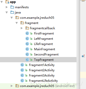 Android——Fragment和Activity之間的通信+Frangment生命周期
Fr'agment和Activity之間的通信1.在Fragment中聲明一個接口。2.在Activity中實現在Fargment中聲明的接口。3.在Fragme
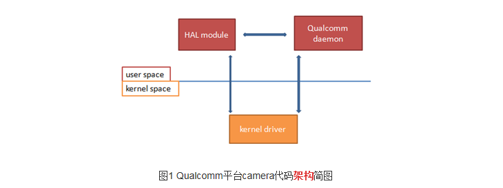 在高通平台添加或者移植一個完整的camera
OV88651、kernel部分:A、kernel_driver:把驅動文件ov8865_qtech_f8865ac.c 放到kernel/drivers/media/p
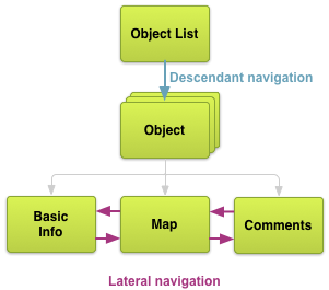 Android最佳實踐之高效的應用導航
設計(一)- 規劃Screens和他們之間的關系原文地址:http://developer.android.com/training/design-navigation/