編輯:關於Android編程
本文實例講述了Android編程實現自定義進度條顏色的方法。分享給大家供大家參考,具體如下:
android 自定義進度條顏色
先看圖
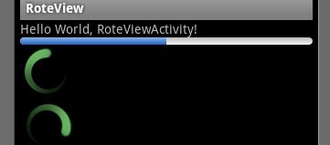
基於產品經理各種自定義需求,經過查閱了解,下面是自己對android自定義進度條的學習過程!
這個沒法了只能看源碼了,還好下載了源碼, sources\base\core\res\res\ 下應有盡有,修改進度條顏色只能找progress ,因為是改變樣式,首先找styles.xml
找到xml後,進去找到
<style name="Widget.ProgressBar">
    <item name="android:indeterminateOnly">true</item>
    <item name="android:indeterminateDrawable">@android:drawable/progress_medium_white</item>
    <item name="android:indeterminateBehavior">repeat</item>
    <item name="android:indeterminateDuration">3500</item>
    <item name="android:minWidth">48dip</item>
    <item name="android:maxWidth">48dip</item>
    <item name="android:minHeight">48dip</item>
    <item name="android:maxHeight">48dip</item>
</style>
這是默認轉圈的效果style,但今天我們修改的是水平進度條顏色!
所以找到
<style name="Widget.ProgressBar.Horizontal">
    <item name="android:indeterminateOnly">false</item>
    <item name="android:progressDrawable">@android:drawable/progress_horizontal</item>
    <item name="android:indeterminateDrawable">@android:drawable/progress_indeterminate_horizontal</item>
    <item name="android:minHeight">20dip</item>
    <item name="android:maxHeight">20dip</item>
</style>
你看系統一步一步關聯的,擴展性很性,低耦合,所以我們現在只要改變進度條是怎麼樣畫出來的就行了 ,但是負責畫進度條的是
<item name="android:progressDrawable"> 所以我們可以找到"drawable下的 progress_horizontal 文件,改變他就可以改變進度條顏色
<?xml version="1.0" encoding="utf-8"?>
<!-- Copyright (C) 2008 The Android Open Source Project
   Licensed under the Apache License, Version 2.0 (the "License");
   you may not use this file except in compliance with the License.
   You may obtain a copy of the License at
     http://www.apache.org/licenses/LICENSE-2.0
   Unless required by applicable law or agreed to in writing, software
   distributed under the License is distributed on an "AS IS" BASIS,
   WITHOUT WARRANTIES OR CONDITIONS OF ANY KIND, either express or implied.
   See the License for the specific language governing permissions and
   limitations under the License.
-->
<layer-list xmlns:android="http://schemas.android.com/apk/res/android">
  <item android:id="@android:id/background">
    <shape>
      <corners android:radius="5dip" />
      <gradient
          android:startColor="#ff9d9e9d"
          android:centerColor="#ff5a5d5a"
          android:centerY="0.75"
          android:endColor="#ff747674"
          android:angle="270"
      />
    </shape>
  </item>
  <item android:id="@android:id/secondaryProgress">
    <clip>
      <shape>
        <corners android:radius="5dip" />
        <gradient
            android:startColor="#80ffd300"
            android:centerColor="#80ffb600"
            android:centerY="0.75"
            android:endColor="#a0ffcb00"
            android:angle="270"
        />
      </shape>
    </clip>
  </item>
  <item android:id="@android:id/progress">
    <clip>
      <shape>
        <corners android:radius="5dip" />
        <gradient
            android:startColor="#ffffd300"
            android:centerColor="#ffffb600"
            android:centerY="0.75"
            android:endColor="#ffffcb00"
            android:angle="270"
        />
      </shape>
    </clip>
  </item>
</layer-list>
看到沒有,這是系統的進度條畫出的布局條件
android:startColor="#80ffd300"
android:centerColor="#80ffb600"
android:endColor="#ff747674"
我們只要改變這個色值就能改變他的顏色,主要改變的是<item android:id="@android:id/progress">下的色值就行了
說了這麼多,到底怎麼做呢, 很簡單
1. 在我們的項目下新建一個 style.xml 文件
創建一個style 標簽,集成系統默認樣式,然後自定義一個新的progressDrawable 文件,隨後面在layout 中的progress 中引用這個文件就行
<style name="ProgressBar_Mini" parent="@android:style/Widget.ProgressBar.Horizontal">
    <item name="android:maxHeight">50dip</item>
    <item name="android:minHeight">8dip</item>
    <item name="android:indeterminateOnly">false</item>
    <item name="android:indeterminateDrawable">@android:drawable/progress_indeterminate_horizontal</item>
    <item name="android:progressDrawable">@drawable/progressbar_mini</item>
</style>
下面是我的 progressbar_mini 文件,改變了下android:endColor="#F5F5F5" android:startColor="#BEBEBE" 的色值
<layer-list xmlns:android="http://schemas.android.com/apk/res/android" >
  <item android:id="@android:id/background">
     <shape >
        <corners android:radius="5dip" />
        <gradient
          android:angle="270"
          android:centerY="0.75"
          android:endColor="#F5F5F5"
          android:startColor="#BEBEBE" />
      </shape>
  </item>
  <item android:id="@android:id/secondaryProgress">
    <clip >
      <shape >
        <corners android:radius="0dip" />
        <gradient
          android:angle="270"
          android:centerY="0.75"
          android:endColor="#165CBC"
          android:startColor="#85B0E9" />
      </shape>
    </clip>
  </item>
  <item android:id="@android:id/progress">
    <clip >
      <shape >
        <corners android:radius="5dip" />
        <gradient
          android:angle="270"
          android:centerY="0.75"
          android:endColor="#165CBC"
          android:startColor="#85B0E9" />
      </shape>
    </clip>
  </item>
</layer-list>
最後在中引用就可以了
<ProgressBar
    android:id="@+id/progress"

    android:layout_width="fill_parent"
    android:layout_height="wrap_content"
    android:progress="50" />

希望本文所述對大家Android程序設計有所幫助。
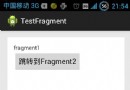 Android:Activity+Fragment及它們之間的數據交換(一)
簡介:為什麼要用Fragment?使用Fragment可以在一個Activity中實現不同的界面。Fragment與Fragment之間的動畫切換,遠比Activity與
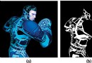 GraphicsLab Project之輝光(Glare,Glow)效果
引言從GraphicsLab Project項目立項以來,一直都在忙著搭建Shader的實驗環境,現在基本的實驗環境已經搭建完畢,所以就試著使用它來編寫一些效果。本篇文章
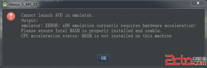 Android Studio創建AVD
Android Studio是專門為Android開發設計的IDE,比Eclipse開發Android更加方便、快捷。安裝Android Studio以後,想運行AVD,
 java/android 設計模式學習筆記(20)---迭代器模式
我們這篇博客來介紹一下迭代器模式(Iterator Pattern),又稱為游標(Cursor Pattern)模式,是行為型設計模式之一。迭代器模式算是一個比較古老的設