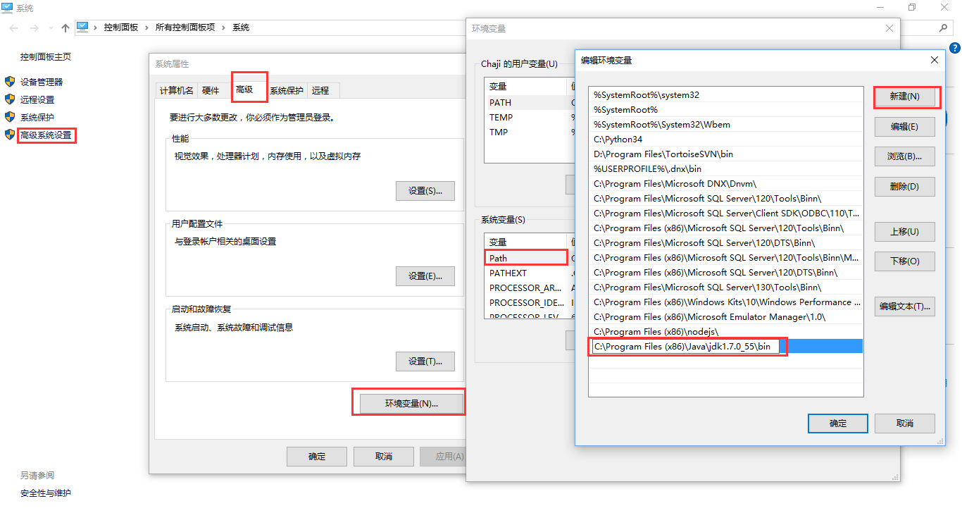
編輯:關於Android編程
本文實例講述了Android編程之selector下設置背景屬性值的方法。分享給大家供大家參考,具體如下:
在res/drawable文件夾新增一個文件,此文件設置了圖片的觸發狀態,你可以設置 state_pressed,state_checked,state_pressed,state_selected,state_focused,state_enabled 等幾個狀態:
android:state_pressed
Boolean. "true" if this item should be used when the object is pressed (such as when a button is touched/clicked); "false" if this item should be used in the default, non-pressed state.
如果是true,當被點擊時顯示該圖片,如果是false沒被按下時顯示默認。
android:state_focused
Boolean. "true" if this item should be used when the object is focused (such as when a button is highlighted using the trackball/d-pad); "false" if this item should be used in the default, non-focused state.
true,獲得焦點時顯示;false,沒獲得焦點顯示默認。
android:state_selected
Boolean. "true" if this item should be used when the object is selected (such as when a tab is opened); "false" if this item should be used when the object is not selected.
true,當被選擇時顯示該圖片;false,當未被選擇時顯示該圖片。
android:state_checkable
Boolean. "true" if this item should be used when the object is checkable; "false" if this item should be used when the object is not checkable. (Only useful if the object can transition between a checkable and non-checkable widget.)
true,當CheckBox能使用時顯示該圖片;false,當CheckBox不能使用時顯示該圖片。
android:state_checked
Boolean. "true" if this item should be used when the object is checked; "false" if it should be used when the object is un-checked.
true,當CheckBox選中時顯示該圖片;false,當CheckBox為選中時顯示該圖片。
android:state_enabled
Boolean. "true" if this item should be used when the object is enabled (capable of receiving touch/click events); "false" if it should be used when the object is disabled.
true,當該組件能使用時顯示該圖片;false,當該組件不能使用時顯示該圖片。
android:state_window_focused
Boolean. "true" if this item should be used when the application window has focus (the application is in the foreground), "false" if this item should be used when the application window does not have focus (for example, if the notification shade is pulled down or a dialog appears).
true,當此activity獲得焦點在最前面時顯示該圖片;false,當沒在最前面時顯示該圖片。
<?xml version="1.0" encoding="utf-8"?>
<selector xmlns:android="http://schemas.android.com/apk/res/android">
  <item android:state_pressed="true"
     android:drawable="@drawable/button_pressed"/><!-- pressed -->
  <item android:state_focused="true"
     android:drawable="@drawable/button_focused"/><!-- focused -->
  <itemandroid:drawable="@drawable/button_normal"/><!-- default -->
</selector>
更多關於Android開發相關內容感興趣的讀者可查看本站專題:《Android開發入門與進階教程》
希望本文所述對大家Android程序設計有所幫助。
 android浮動搜索框的使用
引言在我們的應用程序中經常需要提供搜索服務,比如搜索聯系人, 搜索商品信息等等。我們可以自己在布局中自定義我們的搜索框,實現我們的搜索邏輯。但是還有一種更簡單的方法:使用
 Android中數據庫和安裝包分離
我們在做Android應用尤其是商業應用的時候,很多時候都需要後期版本升級,如果我們的數據庫文件非常大,比如游戲之類的,這時候就不應該每次版本更新都去重新復制數據庫。將數
 Xamarin自學教程(Android)之一
廢話少說,我們直接開始吧。有興趣的就一起,我慢慢寫,咱們一起慢慢學。希望兩個月內能基本完成基於Xamarin的Android開發內容。還是一樣,先來安裝開發環境吧。跟著做
 Android Scroller完全解析
在Android中,任何一個控件都是可以滾動的,因為在View類當中有scrollTo()和scrollBy()這兩個方法,如下圖所示: 這兩個方法的主要作用是將View