編輯:關於Android編程
我們來講一下自定義組合控件,相信大家也接觸過自定義組合控件吧,話不多說,直接干(哈~哈~):
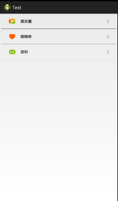
大家看到這個覺得這不是很簡單的嗎,這不就是寫個布局文件就搞定嘛,沒錯,確實直接上布局就行,不過,我只是用這個簡單的例子來講一下自定義組合控件的用法。
首先看看,這一行行的條目看起來都長得差不多,只是圖片和文字不一樣,沒錯,就是看中這一點,我們可以把一個條目做成一個組合控件,做為一個整體,這樣不管你有幾個條目,就寫幾個組合控件就行了。
步驟:
1.先建立組合控件的布局
myView.xml
<RelativeLayout xmlns:android="http://schemas.android.com/apk/res/android"
 android:layout_width="match_parent"
 android:layout_height="60dp" >

 <ImageView
  android:id="@+id/icon_Iv"
  android:layout_width="35dp"
  android:layout_height="35dp"
  android:layout_centerVertical="true"
  android:layout_marginLeft="30dp"
  android:src="@drawable/phone_qiyi_explore_friends" />

 <TextView
  android:id="@+id/tv"
  android:layout_width="wrap_content"
  android:layout_height="match_parent"
  android:layout_marginLeft="80dp"
  android:gravity="center"
  android:text="朋友圈"
  android:textSize="15sp"
  android:text />

 <ImageView
  android:layout_width="wrap_content"
  android:layout_height="match_parent"
  android:layout_alignParentRight="true"
  android:layout_marginRight="20dp"
  android:src="@drawable/phone_my_inc_arrow" />

 <View
  android:layout_width="match_parent"
  android:layout_height="0.5dp"
  android:layout_alignParentBottom="true"
  android:layout_marginLeft="5dp"
  android:layout_marginRight="5dp"
  android:background="#000" />

</RelativeLayout>
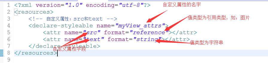
2.自定義屬性(圖片資源和文本)
在values/目錄下新建attrs.xml文件
attrs.xml:
<?xml version="1.0" encoding="utf-8"?>
<resources>
 <!-- 自定義屬性:src和text -->
 <declare-styleable name="myView_attrs">
  <attr name="src" format="reference"></attr>
  <attr name="text" format="string"></attr>
 </declare-styleable>
</resources>
3.新建一個類MyView繼承RelativeLayout,將自定義的布局文件加載進來並且獲取自定義的屬性,然後取得自定義屬性字段的值,最後將相應的值設置在相應的組件上
/**
 * 自定義組合控件(包括一個ImageView和TextView)
 * @author Administrator
 *
 */
public class MyView extends RelativeLayout{

 private TextView tv;
 private ImageView icon_Iv;
 public MyView(Context context) {
  this(context,null);
 }
 public MyView(Context context, AttributeSet attrs) {
  super(context, attrs);
  initView(context);
  //拿到自定義的屬性
  TypedArray ta = context.obtainStyledAttributes(attrs, R.styleable.myView_attrs);
  //獲取自定義屬性的值
  String text = ta.getString(R.styleable.myView_attrs_text);
  Drawable drawable = ta.getDrawable(R.styleable.myView_attrs_src);
  //把值設置到相應組件上
  icon_Iv.setImageDrawable(drawable);
  tv.setText(text);
 }
 private void initView(Context context) {
  //把自定義的布局加載進來
  View.inflate(context,R.layout.myview,this);
  //找到布局中的組件
  icon_Iv = (ImageView) this.findViewById(R.id.icon_Iv);
  tv = (TextView) this.findViewById(R.id.tv);

 }
}
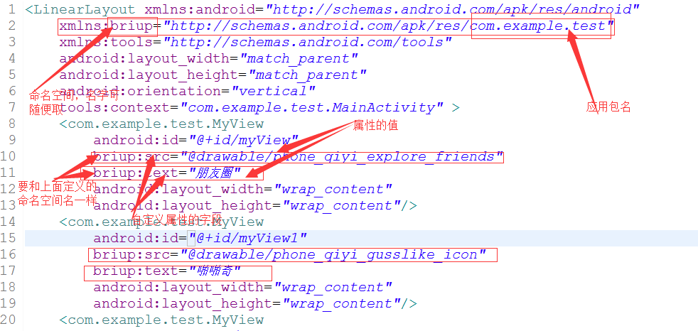
4.在main.xml文件中添加自定義組合控件
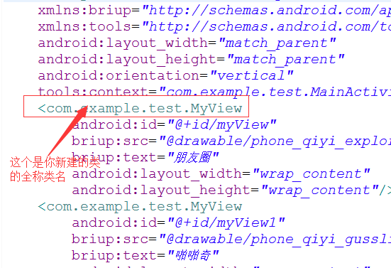
注:記得加上命名空間
有幾個條目就加幾個控件
main.xml:
<LinearLayout xmlns:android="http://schemas.android.com/apk/res/android xmlns:briup="http://schemas.android.com/apk/res/com.example.test"
 xmlns:tools="http://schemas.android.com/tools"
 android:layout_width="match_parent"
 android:layout_height="match_parent"
 android:orientation="vertical"
 tools:context="com.example.test.MainActivity" >
 <com.example.test.MyView
  android:id="@+id/myView"
  briup:src="@drawable/phone_qiyi_explore_friends"
  briup:text="朋友圈"
  android:layout_width="wrap_content"
  android:layout_height="wrap_content"/>
 <com.example.test.MyView
  android:id="@+id/myView1"
  briup:src="@drawable/phone_qiyi_gusslike_icon"
  briup:text="啪啪奇"
  android:layout_width="wrap_content"
  android:layout_height="wrap_content"/>
 <com.example.test.MyView
  android:id="@+id/myView2"
  briup:text="消息"
  briup:src="@drawable/phone_qiyi_message_icon"
  android:layout_width="wrap_content"
  android:layout_height="wrap_content"/>
</LinearLayout>
注:
做到以上步驟就可以了,希望本文所述對大家學習Android自定義控件有所幫助。
 Android IPC Binder
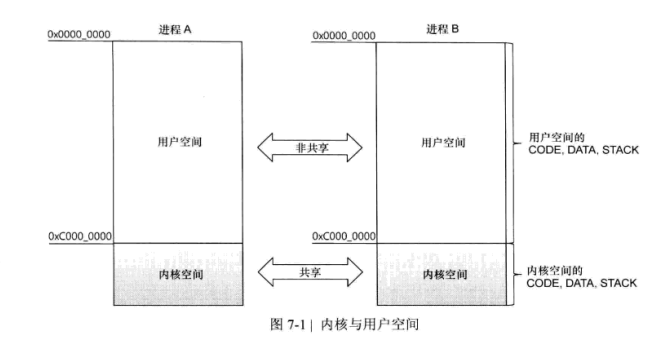
(一)前言Binder原本是IPC工具,但是在Android中它的主要作用是支持RPC(Remote Procedure Call),使得當前進程調用另一個進程的函數就像
 Android開發本地及網絡Mp3音樂播放器(十八)新下載歌曲加載准備SdcardSearchToList
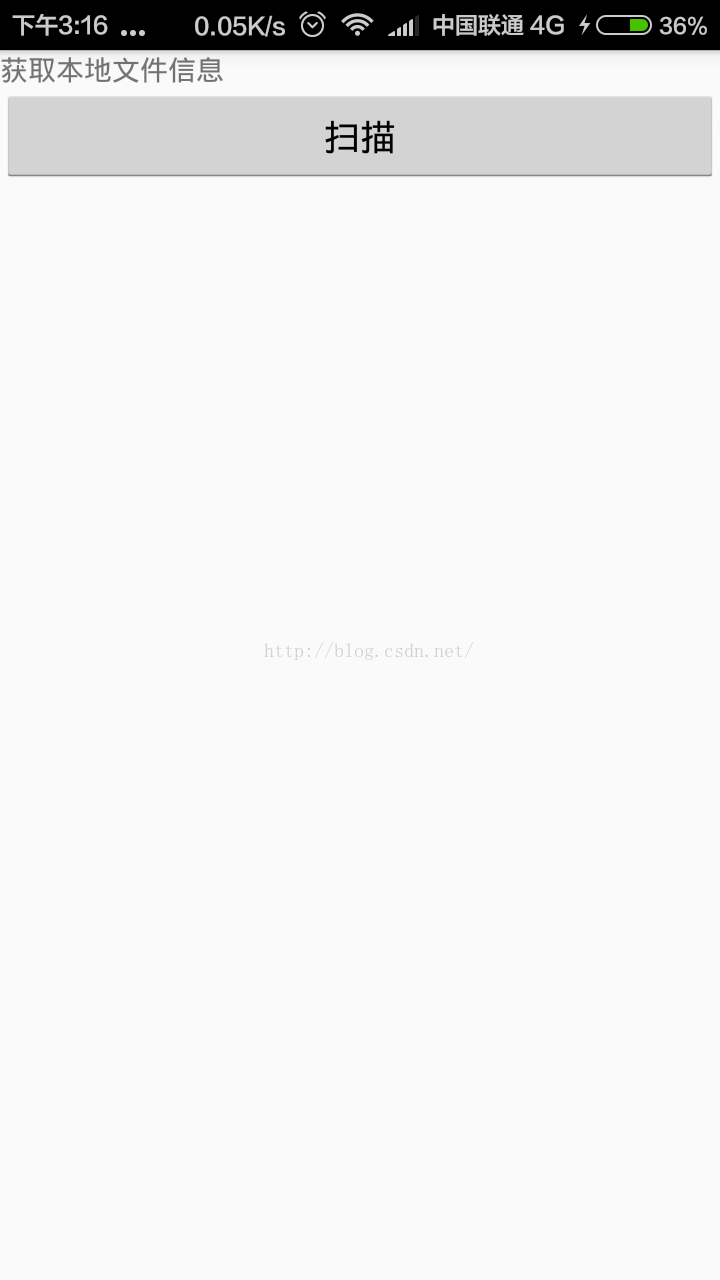
掃描本地文件加載到item不限於應用到音樂播放器,其他Android工程,也可以使用SdcardSearchToList其他Android工程也可以使用,我現在做了很小的
 Android ImageView繪制圓角效果
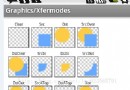
前言Android 開發中,我們經常需要實現圖片的圓形/圓角的效果,我們可以使用兩種方式來實現這樣的效果。一種是使用Xfermode,另一種是BitmapShader來實
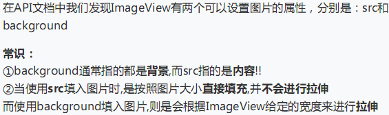 UI控件之顯示圖像控件ImageView(上)
(一)概述ImageView主要是用來顯示圖片的控件,可以對圖片進行放大、縮小和旋轉的功能。(二)ImageView中src和BackGround屬性的區別No.1 &m